How can I help you?
Apply custom style to pivot cells in ASP.NET Core Pivotview component
24 Apr 20265 minutes to read
The ASP.NET Core Pivot Table component allows you to alter the appearance of pivot cells using event handlers. This guide demonstrates how to apply custom styling to specific cells in your pivot table.
Overview
You can apply custom styles to different types of cells in the pivot table:
- Use the
queryCellInfoevent to style row headers and value cells. - Use the
headerCellInfoevent to style column headers.
Both events are available through the e-gridSettings property of the Pivot Table component.
Implementation example
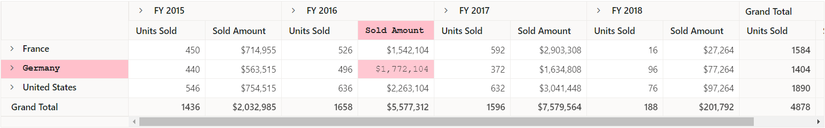
The following example shows how to apply styles to:
- The column header “Sold Amount” under “FY 2016” using the
headerCellInfoevent. - The row header “Germany” and its aggregated values using the
queryCellInfoevent. - Styles are applied by adding the “e-custom” CSS class to the cell elements.
<ejs-pivotview id="PivotView" height="300">
    <e-datasourcesettings dataSource="@ViewBag.DataSource" expandAll="false">
        <e-formatsettings>
            <e-field name="Amount" format="C0"></e-field>
        </e-formatsettings>
        <e-rows>
            <e-field name="Country"></e-field>
            <e-field name="Products"></e-field>
        </e-rows>
        <e-columns>
            <e-field name="Year" caption="Year"></e-field>
            <e-field name="Quarter"></e-field>
        </e-columns>
        <e-values>
            <e-field name="Sold" caption="Units Sold"></e-field>
            <e-field name="Amount" caption="Sold Amount"></e-field>
        </e-values>
    </e-datasourcesettings>
     <e-gridSettings columnWidth=120 queryCellInfo="queryCell" headerCellInfo="headerCellInfo"></e-gridSettings>
</ejs-pivotview>
<style>
    .e-custom {
        font-family: 'Courier New', Courier, monospace;
        font-size: 12px !important;
        background-color: pink !important;
    }
</style>
<script>
    function queryCell(args) {
         var colIndex = Number(args.cell.getAttribute('data-colindex'));
         var cells = args.data[colIndex] ? args.data[colIndex] : {};
         // Here by using 'actualText' option, a custom class can be added to the specific row header and its value to apply custom style.
         if (cells.actualText === 'Germany') {
              args.cell.classList.add('e-custom');
         } else if (cells.actualText === 'Amount' &&
              cells.columnHeaders === 'FY 2016' && cells.rowHeaders === 'Germany') {
              args.cell.classList.add('e-custom');
         }
    }
    function headerCellInfo(args) {
            var customAttributes = args.cell.column.customAttributes;
            // Here custom class can be added to the specific column header by using unique level name, to apply custom style.
            if (args.node.classList.contains('e-columnsheader') && customAttributes &&
                customAttributes.cell.valueSort.levelName === 'FY 2016.Sold Amount') {
                args.node.classList.add('e-custom');
            }
    }
</script>
public ActionResult Index()
{
var data = GetPivotData();
ViewBag.DataSource = data;
return View();
}
NOTE
The dot(.) character in FY 2016.Sold Amount is used by default to identify the header levels in the pivot table’s row and column. It can be changed by setting the
headerDelimiterin thee-valuesortsettingsproperty to any other delimiter instead of the default separator.