How can I help you?
Appearance in ASP.NET Core Linear Gauge
21 Dec 20229 minutes to read
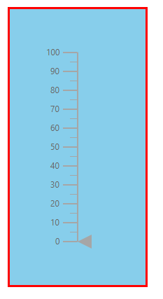
Customizing the Linear Gauge area
The following property and classes are available in the ejs-lineargauge to customize the Linear Gauge area.
-
Background- Applies the background color for the Linear gauge. -
e-lineargauge-border- To customize the color and width of the border in Linear Gauge. -
e-lineargauge-margin- To customize the margins of the Linear Gauge.
@using Syncfusion.EJ2.LinearGauge

<ejs-lineargauge id="linear" Background="skyblue">
    <e-lineargauge-border Color="red" Width="3"></e-lineargauge-border>
    <e-lineargauge-margin Left="20" Top="20" Bottom="20" Right="20"></e-lineargauge-margin>
</ejs-lineargauge>
using System;
using System.Collections.Generic;
using System.Diagnostics;
using System.Linq;
using System.Threading.Tasks;
using Microsoft.AspNetCore.Mvc;
using EJ2_Core_Application.Models;
using Newtonsoft.Json;
using Syncfusion.EJ2.Charts;
using Syncfusion.EJ2.LinearGauge;
namespace EJ2_Core_Application.Controllers
{
public class HomeController : Controller
{
public IActionResult Index()
{
return View();
}
}
}
Setting up the Linear Gauge title
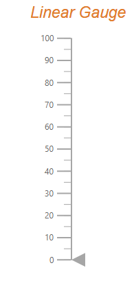
The title for the Linear Gauge can be set using Title property in ejs-lineargauge. Its appearance can be customized using the TitleStyle with the below properties.
-
Color- Specifies the text color of the title. -
FontFamily- Specifies font family of the title. -
FontStyle- Specifies font style of the title. -
FontWeight- Specifies font weight of the title. -
Opacity- Specifies the opacity of the title. -
Size- Specifies the font size of the title.
@using Syncfusion.EJ2.LinearGauge

@{
    var titlestyle = new LinearGaugeTitleStyleLinearGauge
    {
        FontFamily = "Arial",
        FontStyle = "italic",
        FontWeight = "regular",
        Color = "#E27F2D",
        Size ="23px",
        Opacity = 1
    };
}

<ejs-lineargauge id="linear" Title="Linear Gauge" TitleStyle="titlestyle"></ejs-lineargauge>
using System;
using System.Collections.Generic;
using System.Diagnostics;
using System.Linq;
using System.Threading.Tasks;
using Microsoft.AspNetCore.Mvc;
using EJ2_Core_Application.Models;
using Newtonsoft.Json;
using Syncfusion.EJ2.Charts;
using Syncfusion.EJ2.LinearGauge;
namespace EJ2_Core_Application.Controllers
{
public class HomeController : Controller
{
public IActionResult Index()
{
return View();
}
}
}
Customizing the Linear Gauge container
The area used to render the ranges and pointers at the center position of the gauge is called container. The following types of container to be applicable for Linear Gauge.
- Normal
- Rounded Rectangle
- Thermometer
The type of the container can be modified by using the Type property in e-lineargauge-container. The container can be customized by using the following properties and class in e-lineargauge-container.
-
Offset- To place the container with the specified distance from the axis of the Linear Gauge. -
Width- To set the thickness of the container. -
Height- To set the length of the container. -
BackgroundColor- To set the background color of the container. -
Border- To set the color and width for the border of the container.
Normal
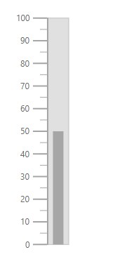
The “Normal” type will render the container as a rectangle and this is the default container type.
@using Syncfusion.EJ2.LinearGauge

<ejs-lineargauge id="linear">
    <e-lineargauge-container Type="Normal" Width="30"></e-lineargauge-container>
    <e-lineargauge-axes>
        <e-lineargauge-axis>
            <e-lineargauge-pointers>
                <e-lineargauge-pointer Type="Bar" Width="15" Value="50"></e-lineargauge-pointer>
            </e-lineargauge-pointers>
        </e-lineargauge-axis>
    </e-lineargauge-axes>
</ejs-lineargauge>
using System;
using System.Collections.Generic;
using System.Diagnostics;
using System.Linq;
using System.Threading.Tasks;
using Microsoft.AspNetCore.Mvc;
using EJ2_Core_Application.Models;
using Newtonsoft.Json;
using Syncfusion.EJ2.Charts;
using Syncfusion.EJ2.LinearGauge;
namespace EJ2_Core_Application.Controllers
{
public class HomeController : Controller
{
public IActionResult Index()
{
return View();
}
}
}
Rounded Rectangle
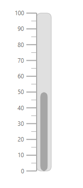
The RoundedRectangle type will render the container as a rectangle with rounded corner radius. The rounded corner radius of the container can be customized using the RoundedCornerRadius property in LinearGaugeContainer.
@using Syncfusion.EJ2.LinearGauge

<ejs-lineargauge id="linear">
    <e-lineargauge-container Type="RoundedRectangle" Width="30"></e-lineargauge-container>
    <e-lineargauge-axes>
        <e-lineargauge-axis>
            <e-lineargauge-pointers>
                <e-lineargauge-pointer Type="Bar" Width="15" Value="50"></e-lineargauge-pointer>
            </e-lineargauge-pointers>
        </e-lineargauge-axis>
    </e-lineargauge-axes>
</ejs-lineargauge>
using System;
using System.Collections.Generic;
using System.Diagnostics;
using System.Linq;
using System.Threading.Tasks;
using Microsoft.AspNetCore.Mvc;
using EJ2_Core_Application.Models;
using Newtonsoft.Json;
using Syncfusion.EJ2.Charts;
using Syncfusion.EJ2.LinearGauge;
namespace EJ2_Core_Application.Controllers
{
public class HomeController : Controller
{
public IActionResult Index()
{
return View();
}
}
}
Thermometer
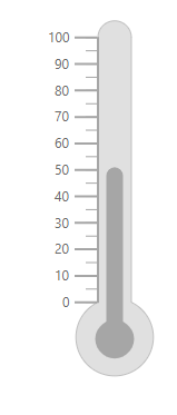
The Thermometer type will render the container similar to the appearance of thermometer.
@using Syncfusion.EJ2.LinearGauge

<ejs-lineargauge id="linear">
    <e-lineargauge-container Type="Thermometer" Width="30"></e-lineargauge-container>
    <e-lineargauge-axes>
        <e-lineargauge-axis>
            <e-lineargauge-pointers>
                <e-lineargauge-pointer Type="Bar" Width="15" Value="50"></e-lineargauge-pointer>
            </e-lineargauge-pointers>
        </e-lineargauge-axis>
    </e-lineargauge-axes>
</ejs-lineargauge>
using System;
using System.Collections.Generic;
using System.Diagnostics;
using System.Linq;
using System.Threading.Tasks;
using Microsoft.AspNetCore.Mvc;
using EJ2_Core_Application.Models;
using Newtonsoft.Json;
using Syncfusion.EJ2.Charts;
using Syncfusion.EJ2.LinearGauge;
namespace EJ2_Core_Application.Controllers
{
public class HomeController : Controller
{
public IActionResult Index()
{
return View();
}
}
}
Fitting the Linear Gauge to the control
The Linear Gauge component is rendered with margin by default. To remove the margin around the Linear Gauge, the AllowMargin property in ejs-lineargauge is set as false.
@using Syncfusion.EJ2.LinearGauge

<ejs-lineargauge id="linear" Orientation="Horizontal" Background="skyblue" AllowMargin="false" Height="100%" Width="100%">
    <e-lineargauge-border Width="3" Color="red"></e-lineargauge-border>
    <e-lineargauge-margin Left="0" Right="0" Top="0" Bottom="0"></e-lineargauge-margin>
    <e-lineargauge-axes>
        <e-lineargauge-axis></e-lineargauge-axis>
    </e-lineargauge-axes>
</ejs-lineargauge>
using System;
using System.Collections.Generic;
using System.Diagnostics;
using System.Linq;
using System.Threading.Tasks;
using Microsoft.AspNetCore.Mvc;
using EJ2_Core_Application.Models;
using Newtonsoft.Json;
using Syncfusion.EJ2.Charts;
using Syncfusion.EJ2.LinearGauge;
namespace EJ2_Core_Application.Controllers
{
public class HomeController : Controller
{
public IActionResult Index()
{
return View();
}
}
}
NOTE
To use this feature, set the
AllowMarginproperty to false, theWidthproperty to 100% and the properties ofe-lineargauge-marginto 0.