Caption Template in ASP.NET Core Data Grid
7 Sep 20268 minutes to read
The Data Grid provides the captionTemplate property to customize the content displayed in group caption rows. This capability enhances the presentation of grouped data by enabling the display of grouped values, record counts, and custom elements such as icons and images.
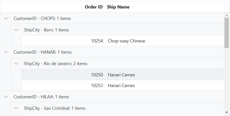
The captionTemplate property supports dynamic content through the data parameter, which exposes properties such as field, headerText, key, and count. These values can be used to display grouped values, record counts, custom text, localized content, and custom UI elements within group caption rows.
The following example illustrates displaying the headerText, key, and count within a customized group caption.
<ejs-grid id="grid" dataSource="@ViewBag.dataSource" allowGrouping="true" height="350px">
    <e-grid-groupsettings captionTemplate="#captiontemplate" showDropArea="false" columns="@(new string[] { "CustomerID", "ShipCity"})"></e-grid-groupsettings>
    <e-grid-columns>
        <e-grid-column field="OrderID" headerText="Order ID" textAlign="Right" width="120"></e-grid-column>
        <e-grid-column field="CustomerID" headerText="Customer ID" width="150"></e-grid-column>
        <e-grid-column field="ShipCity" headerText="Ship City" width="150"></e-grid-column>
        <e-grid-column field="Freight" headerText="Freight" format="C2" textAlign="Right" width="150"></e-grid-column>
    </e-grid-columns>
</ejs-grid>
<script id="captiontemplate" type="text/x-template">
    <span class="groupItems">
        ${field} - ${key}: ${count} items
    </span>
</script>
public IActionResult Index()
{
ViewBag.dataSource =OrderDetails.GetAllRecords();;
return View();
}
Add custom text to group captions
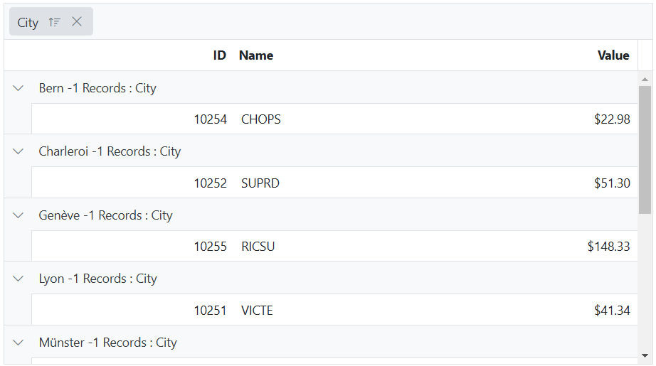
The Data Grid supports adding custom text to group captions with the captionTemplate property. This feature makes group captions more informative by including grouped values, record counts, or descriptive text, and the template can also display custom HTML elements such as icons or images.
In the following example, the data parameter displays the key, count, and headerText of the grouped column, along with custom text within the caption.
<ejs-grid id="grid" dataSource="@ViewBag.dataSource" allowGrouping="true" height="330px">
    <e-grid-groupsettings captionTemplate="#captiontemplate"></e-grid-groupsettings>
    <e-grid-columns>
        <e-grid-column field="OrderID" headerText="ID" textAlign="Right" width="100"></e-grid-column>
        <e-grid-column field="CustomerID" headerText="Name" width="100"></e-grid-column>
        <e-grid-column field="ShipCity" headerText="City" width="100"></e-grid-column>
        <e-grid-column field="Freight" headerText="Value" width="100"></e-grid-column>
    </e-grid-columns>
</ejs-grid>
<script id="captiontemplate" type="text/x-template">
    <div>${template(data)}</div>
</script>
<script type="text/javascript">
    function template(args) {
        return args.key + " -" + args.count + " Records : " + args.headerText;
    }
</script>
public IActionResult Index()
{
ViewBag.dataSource =OrderDetails.GetAllRecords();;
return View();
}
Customize group caption text using locale
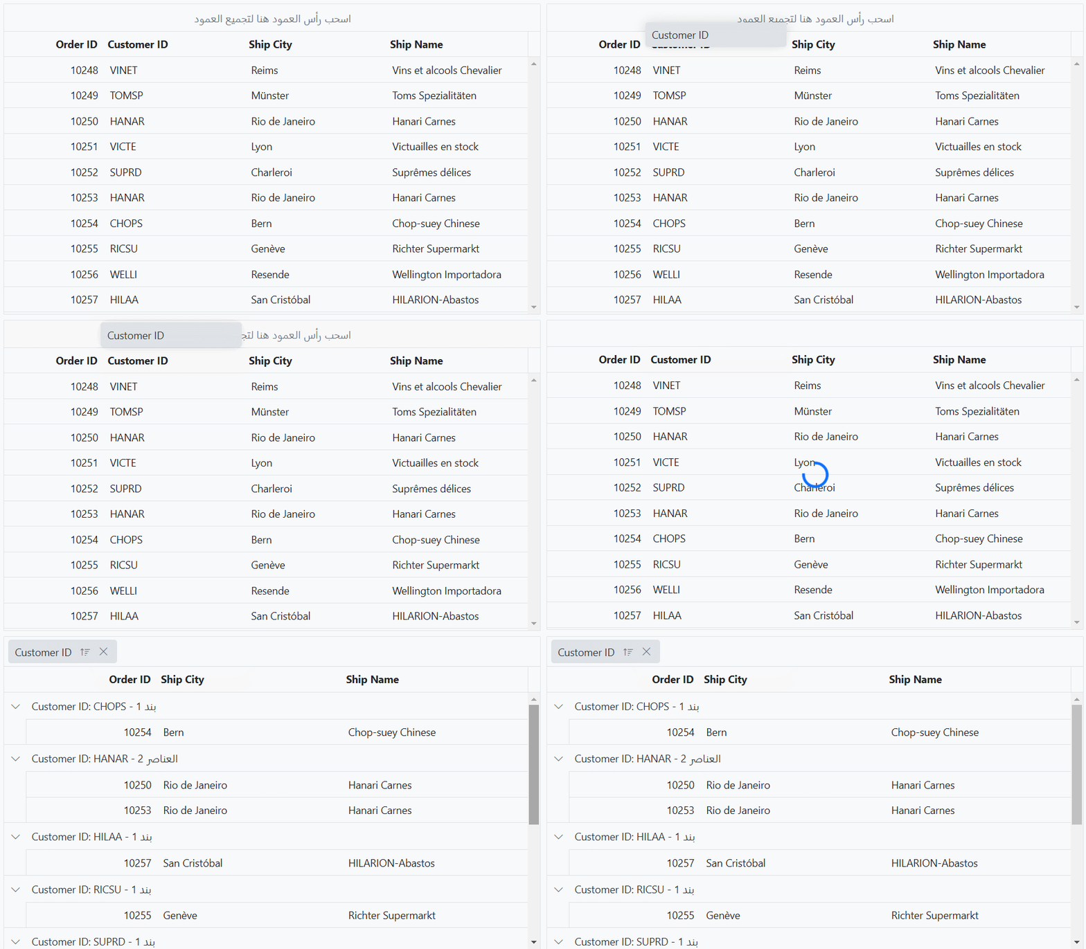
The Data Grid supports localization of group caption text, enabling the display of translated or region-specific content within group captions.
Localization can be achieved using the L10n.load() and setCulture() methods from the @syncfusion/ej2-base package. The L10n.load() method defines localized strings, while setCulture() applies the desired locale to the Data Grid. The following example demonstrates customizing group caption text for the “ar” (Arabic) locale.
<ejs-grid id="grid" dataSource="@ViewBag.dataSource" allowGrouping="true" height="350px">
    <e-grid-columns>
        <e-grid-column field="OrderID" headerText="Order ID" textAlign="Right" width="120"></e-grid-column>
        <e-grid-column field="CustomerID" headerText="Customer ID" width="150"></e-grid-column>
        <e-grid-column field="ShipCity" headerText="Ship City" width="150"></e-grid-column>
        <e-grid-column field="ShipName" headerText="Ship Name" width="150"></e-grid-column>
    </e-grid-columns>
</ejs-grid>
<script>
    ej.base.L10n.load({
       ar: {
          grid: {
             GroupDropArea: 'اسحب رأس العمود هنا لتجميع العمود',
             Item: 'بند',
             Items: 'العناصر',
             GroupCaption: ' هي خلية تسمية توضيحية جماعية',
          },
       },
    });
    ej.base.setCulture('ar');
 </script>
public IActionResult Index()
{
ViewBag.dataSource =OrderDetails.GetAllRecords();;
return View();
}
Render custom component in group captions
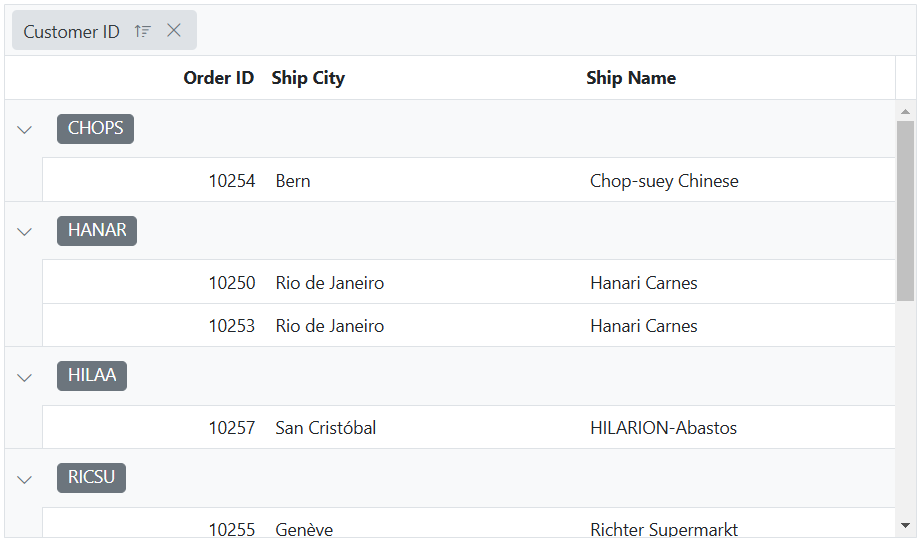
The Data Grid supports rendering custom components within group captions using the captionTemplate property. This functionality enables the integration of interactive UI elements, such as buttons, icons, or dropdowns, directly within the group caption row, enhancing both functionality and presentation.
In the following example, the Chips component is rendered through the caption template, with its text value dynamically assigned based on the group key.
<ejs-grid id="grid" dataSource="@ViewBag.dataSource" allowGrouping="true" height="350px" dataBound="dataBound">
    <e-grid-groupsettings captionTemplate="#groupSettingsCaptionTemplate"></e-grid-groupsettings>
    <e-grid-columns>
        <e-grid-column field="OrderID" headerText="Order ID" textAlign="Right" width="120"></e-grid-column>
        <e-grid-column field="CustomerID" headerText="Customer ID" width="150"></e-grid-column>
        <e-grid-column field="ShipCity" headerText="Ship City" width="150"></e-grid-column>
        <e-grid-column field="ShipName" headerText="Ship Name" width="150"></e-grid-column>
    </e-grid-columns>
</ejs-grid>
<script id="groupSettingsCaptionTemplate" type="text/x-template">
    <div class='chip'>${key}</div>
</script>
<script>
    function dataBound() {
        let groupCaptions = document.getElementsByClassName('chip');
        for (let i = 0; i < groupCaptions.length; i++) {
            let chip = new ej.buttons.ChipList({});
            chip.appendTo(groupCaptions[i]);
        }
    }
</script>
public IActionResult Index()
{
ViewBag.dataSource =OrderDetails.GetAllRecords();;
return View();
}