How can I help you?
Excel like filter in ASP.NET Core Grid component
14 Apr 202520 minutes to read
The Syncfusion® Grid component offers an Excel-like filter feature, providing a familiar and user-friendly interface for filtering data within the grid. This feature simplifies complex filtering operations on specific columns, allowing for quick data location and manipulation, similar to Microsoft Excel. Excel like filtering is especially useful when dealing with large datasets and complex filtering requirements.
Here is an example that showcasing how to render the excel like filter within the Syncfusion® ASP.NET Core Grid:
<ejs-grid id="grid" dataSource="@ViewBag.dataSource" allowFiltering="true" allowPaging="true" height="352px">
    <e-grid-filterSettings type="Excel"></e-grid-filterSettings>
    <e-grid-pageSettings pageSize=10></e-grid-pageSettings>
    <e-grid-columns>
        <e-grid-column field="OrderID" headerText="Order ID" textAlign="Right" width="100"></e-grid-column>
        <e-grid-column field="CustomerID" headerText="Customer Name" width="120"></e-grid-column>
        <e-grid-column field="Freight" headerText="Freight" format="C2" textAlign="Right" width="100"></e-grid-column>
        <e-grid-column field="ShipCountry" headerText="Ship Country" width="100"></e-grid-column>
    </e-grid-columns>
</ejs-grid>
public IActionResult Index()
{
ViewBag.dataSource = OrderDetails.GetAllRecords();
return View();
}
- The Excel-like filter feature supports various filter conditions, including text-based, number-based, date-based, and boolean-based filters.
- The filter dialog provides additional options, such as sorting filter values, searching for specific values, and clearing applied filters.
Checkbox filtering
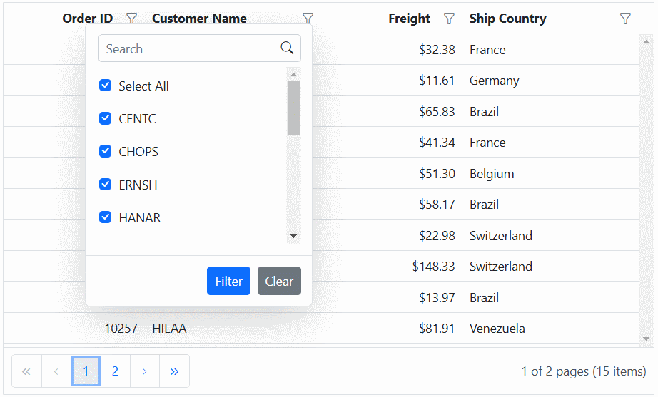
The checkbox filtering feature in Syncfusion® ASP.NET Core Grid enables you to filter data based on checkbox selections within a column. This powerful filtering option simplifies the process of narrowing down data, providing a more efficient and user-friendly experience. The check box filter feature is particularly useful when dealing with columns containing categorical data.
Here is an example that showcasing how to render the check box filter within the Syncfusion® ASP.NET Core Grid:
<ejs-grid id="grid" dataSource="@ViewBag.dataSource" allowFiltering="true" allowPaging="true" height="352px">
    <e-grid-filterSettings type="CheckBox"></e-grid-filterSettings>
    <e-grid-pageSettings pageSize=10></e-grid-pageSettings>
    <e-grid-columns>
        <e-grid-column field="OrderID" headerText="Order ID" textAlign="Right" width="100"></e-grid-column>
        <e-grid-column field="CustomerID" headerText="Customer Name" width="120"></e-grid-column>
        <e-grid-column field="Freight" headerText="Freight" format="C2" textAlign="Right" width="100"></e-grid-column>
        <e-grid-column field="ShipCountry" headerText="ShipCountry" width="100"></e-grid-column>
    </e-grid-columns>
</ejs-grid>
public IActionResult Index()
{
ViewBag.dataSource = OrderDetails.GetAllRecords();
return View();
}
Customize the filter choice count
By default, the filter choice count is set to 1000, which means that the filter dialog will display a maximum of 1000 distinct values for each column as a checkbox list data. This default value ensures that the filter operation remains efficient, even with large datasets. Additionally, the filter dialog retrieves and displays distinct data from the first 1000 records bind to the Grid to optimize performance, while the remaining records are returned as a result of the search option within the filter dialog.
The Grid component allows you to customize the number of distinct data displayed in the checkbox list of the excel/checkbox type filter dialog. This can be useful when you want to customize the default filter choice count values while using large datasets.
However, you have the flexibility to increase or decrease the filter choice count based on your specific requirements. This can be achieved by adjusting the filterChoiceCount value.
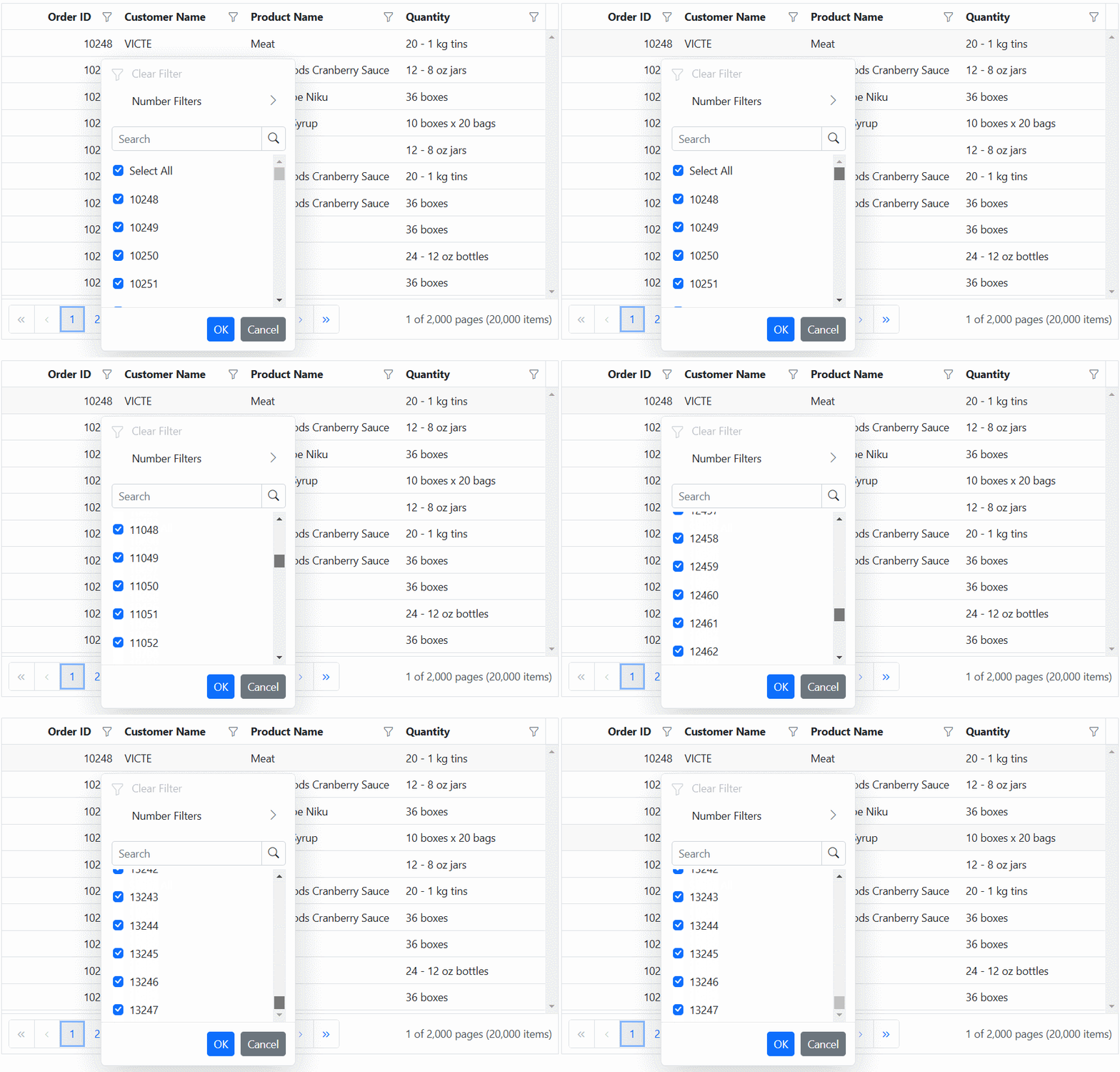
The following example demonstrates how to customize the filter choice count in the checkbox list of the filter dialog. In the actionBegin event, you need to check if the requestType is either filterChoiceRequest or filterSearchBegin, and then you can set the filterChoiceCount property to the desired value.
<ejs-grid id="grid" dataSource="@ViewBag.dataSource" allowFiltering="true" actionBegin="actionBegin" allowPaging="true" height="352px">
    <e-grid-filterSettings type="Excel"></e-grid-filterSettings>
    <e-grid-pageSettings pageSize=10></e-grid-pageSettings>
    <e-grid-columns>
        <e-grid-column field="OrderID" headerText="Order ID" textAlign="Right" width="100"></e-grid-column>
        <e-grid-column field="CustomerID" headerText="Customer Name" width="120"></e-grid-column>
        <e-grid-column field="ProductName" headerText="Product Name" width="100"></e-grid-column>
        <e-grid-column field="Quantity" headerText="Quantity" width="100"></e-grid-column>
    </e-grid-columns>
</ejs-grid>
<script>
    function actionBegin(args){
        if (args.requestType === "filterchoicerequest" || args.requestType === "filtersearchbegin") {
           args.filterChoiceCount = 3000;
       }
    }
</script>
public IActionResult Index()
{
ViewBag.dataSource =OrderDetails.GetAllRecords();
return View();
}
The specified filter choice count value determines the display of unique items as a checkbox list in the Excel/checkbox type filter dialog. This can result in a delay in rendering these checkbox items when opening the filter dialog. Therefore, it is advisable to set a restricted filter choice count value.
Add current selection to filter Checkbox/Excel
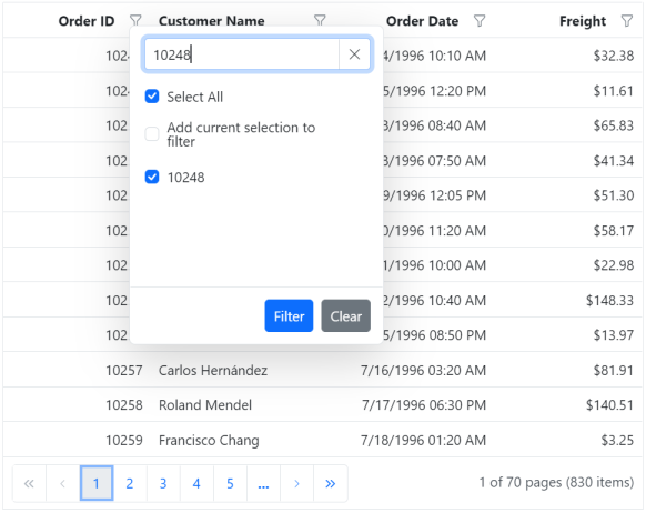
By default, the Checkbox/Excel filter can only filter the selected items. If filtering is done multiple times on the same column, the previously filtered values in the column will be cleared. Now, it is possible to retain those previous values by using the Add current selection to filter Checkbox/Excel filter. This checkbox is displayed when data is searched in the search bar of the Checkbox/Excel filter.
The following image describes the above mentioned behavior.
Show customized text in checkbox list data
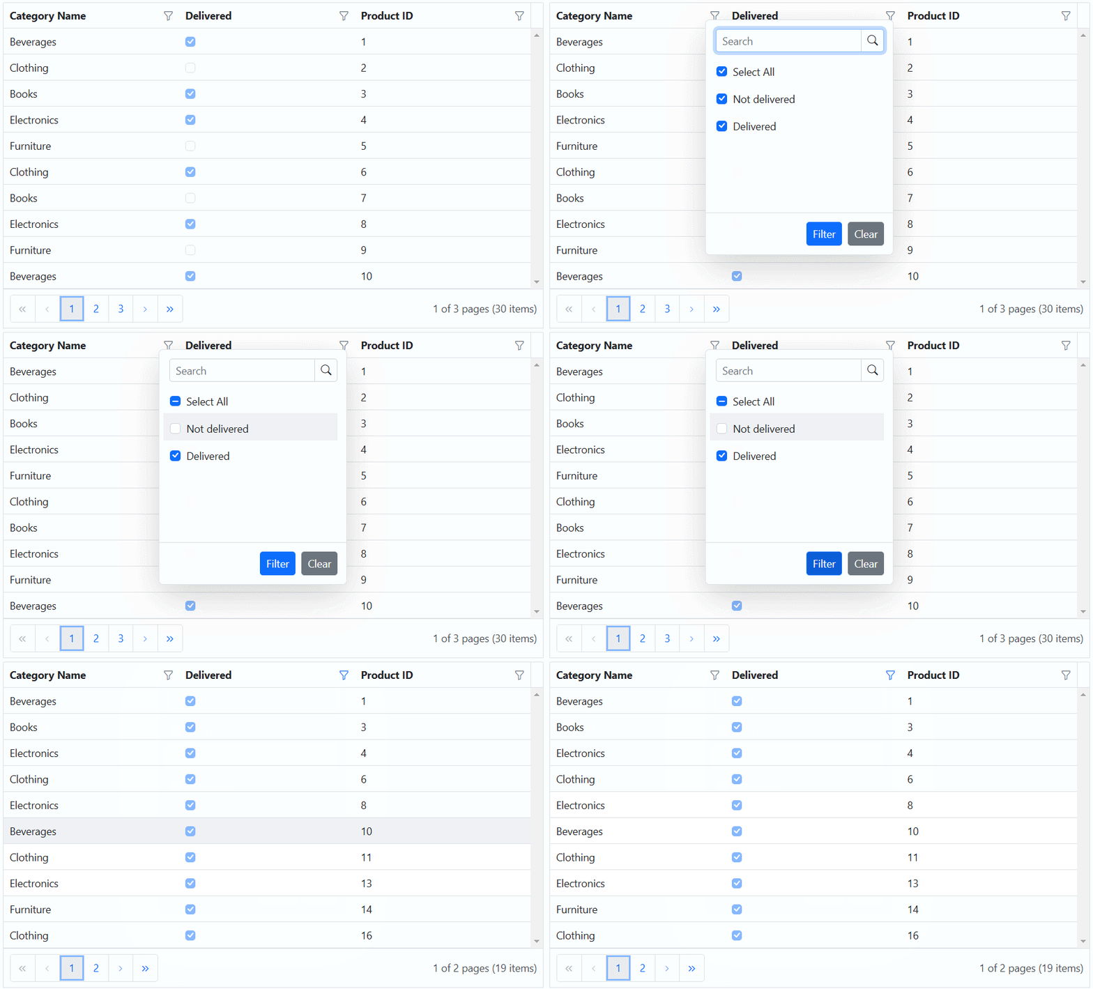
The Syncfusion® ASP.NET Core Grid component provides you with the flexibility to customize the text displayed in the Excel/Checkbox filtering options. This allows you to modify the default text and provide more meaningful and contextual labels for the filtering.
To customize the text in the Excel/Checkbox filter, you can define a filterItemTemplate and bind it to the desired column. The filterItemTemplate property allows you to create custom templates for filter items. You can use any logic and HTML elements within this template to display the desired text or content.
In the example below, you can see how you can customize the text displayed in the filter checkbox list for the Delivered column. This is achieved by defining a filterItemTemplate within the
@{
    var filter = new
    {
        type = "CheckBox",
        itemTemplate = "#filterItemTemplate"
    };
}
<ejs-grid id="grid" dataSource="@ViewBag.dataSource" allowFiltering="true" allowPaging="true" height="352px">
    <e-grid-filterSettings type="Excel"></e-grid-filterSettings>
    <e-grid-pageSettings pageSize=6></e-grid-pageSettings>
    <e-grid-columns>
        <e-grid-column field="CategoryName" headerText="CategoryName" width="120"></e-grid-column>
        <e-grid-column field="Delivered" headerText="Delivered" displayAsCheckBox=true filter=filter width="100"></e-grid-column>
        <e-grid-column field="ProductID" headerText="ProductID" width="100"></e-grid-column>
    </e-grid-columns>
</ejs-grid>
<script id='filterItemTemplate' type='text/x-template'>
    ${itemTemplate(data)}
</script>
<script>
    function itemTemplate(args) {
      return args.Delivered ? 'Delivered' : 'Not delivered';
    }
</script>
public IActionResult Index()
{
ViewBag.dataSource = OrderDetails.GetAllRecords();
return View();
}
Show template in checkbox list data
The filterItemTemplate property in the Syncfusion® ASP.NET Core Grid allows you to customize the appearance of filter items in the grid’s filter checkbox list for a specific column. This property is useful when you want to provide a custom UI or additional information within the filter checkbox list, such as icons, text, or any HTML elements, alongside the default filter items.
In this example, you can see how to use the filterItemTemplate to render icons along with the category names in the filter checkbox list for the Category Name column.
@{
    var filter = new
    {
        type = "CheckBox",
        itemTemplate = "#filterItemTemplate"
    };
}
<head>
    <link rel="stylesheet" href="https://cdnjs.cloudflare.com/ajax/libs/font-awesome/5.15.3/css/all.min.css">
</head>
<ejs-grid id="grid" dataSource="@ViewBag.dataSource" allowFiltering="true" allowPaging="true" height="352px">
    <e-grid-filterSettings type="Excel"></e-grid-filterSettings>
    <e-grid-pageSettings pageSize=6></e-grid-pageSettings>
    <e-grid-columns>
        <e-grid-column field="CategoryName" headerText="CategoryName" filter=filter width="120"></e-grid-column>
        <e-grid-column field="Delivered" headerText="Delivered" displayAsCheckBox=true width="100"></e-grid-column>
        <e-grid-column field="ProductID" headerText="ProductID" width="100"></e-grid-column>
    </e-grid-columns>
</ejs-grid>
<script id='filterItemTemplate' type='text/x-template'>
    ${itemTemplate(data)}
</script>
<script>
    const categoryIcons = {
        Beverages: 'fas fa-coffee',
        Condiments: 'fas	fa-leaf',
        Confections: 'fas fa-birthday-cake',
        DairyProducts: 'fas fa-ice-cream',
        Grains: 'fas fa-seedling',
        Meat: 'fas fa-drumstick-bite',
        Produce: 'fas fa-carrot',
        Seafood: 'fas fa-fish',
    };
    function itemTemplate(args) {
       return '<div><span class="' + categoryIcons[args.CategoryName] + '"></span>' + args.CategoryName + '</div>';
    }
</script>
public IActionResult Index()
{
ViewBag.dataSource = OrderDetails.GetAllRecords();;
return View();
}
Customize the excel filter dialog using CSS
In the Syncfusion® ASP.NET Core Grid, you have the flexibility to enhance the visual presentation of the excel filter dialog. This can be achieved by utilizing CSS styles to modify the dialog’s appearance according to the specific needs and aesthetics of your application.
Removing context menu option
The excel filter dialog includes several features such as context menu, search box, and checkbox list that may not be required in some scenarios. You can remove these options using the className attribute in the grid component.
.e-grid .e-excelfilter .e-contextmenu-wrapper
{
    display: none;
}
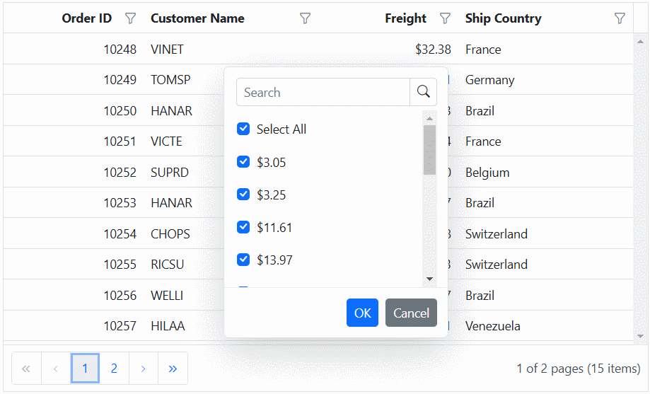
The following example demonstrates how to remove the context menu option in the excel filter dialog using above mentioned CSS
<ejs-grid id="grid" dataSource="@ViewBag.dataSource" allowFiltering="true" allowPaging="true" height="352px">
    <e-grid-filterSettings type="Excel"></e-grid-filterSettings>
    <e-grid-pageSettings pageSize=10></e-grid-pageSettings>
    <e-grid-columns>
        <e-grid-column field="OrderID" headerText="Order ID" textAlign="Right" width="100"></e-grid-column>
        <e-grid-column field="CustomerID" headerText="Customer Name" width="120"></e-grid-column>
        <e-grid-column field="Freight" headerText="Freight" format="C2" textAlign="Right" width="100"></e-grid-column>
        <e-grid-column field="ShipCountry" headerText="Ship Country" width="100"></e-grid-column>
    </e-grid-columns>
</ejs-grid>
<style>
    .e-grid-popup .e-excelfilter .e-contextmenu-wrapper {
        display: none;
    }
</style>
public IActionResult Index()
{
ViewBag.dataSource = OrderDetails.GetAllRecords();
return View();
}
Bind custom remote datasource for excel/checkbox filtering
The Syncfusion ASP.NET Core Grid allows you to dynamically change the filter data source for the Excel or checkbox filter module using custom remote data as well. This can be done by either assigning a custom remote DataManager as the dataSource or by fetching the data initially and storing it in a global variable. This data can then be bound directly to the filter module’s dataSource in the actionBegin event for the filterBeforeOpen requestType, as detailed in our knowledge base.
The following example demonstrates how to dynamically change the remote custom data source for all columns in the Excel or checkbox filter dialog using a DataManager with WebApiAdaptor.
<ejs-grid id="grid" dataSource="@ViewBag.dataSource" allowPaging="true" allowFiltering="true" allowSorting="true" actionBegin="actionBegin">
    <e-grid-filterSettings type="Excel"></e-grid-filterSettings>
    <e-grid-pageSettings pageSize="12"></e-grid-pageSettings>
    <e-grid-columns>
       <e-grid-column field="OrderID" headerText="Order ID" textAlign="Right" width="100"></e-grid-column>
        <e-grid-column field="CustomerID" headerText="Customer ID" width="100"></e-grid-column>
        <e-grid-column field="Freight" headerText="Freight" width="100" format="C2"></e-grid-column>
        <e-grid-column field="OrderDate" headerText="Order Date" width="100" format="yMd"></e-grid-column>
    </e-grid-columns>
</ejs-grid>

<script>
    function actionBegin(args) {
        var hostUrl = 'https://services.syncfusion.com/aspnet/production/';
        if (args.requestType === "filterBeforeOpen") {
            console.log("Filter popup opening - Binding remote data source...");
            args.filterModel.options.dataSource = new ej.data.DataManager({
                url: hostUrl + 'api/Orders',
                adaptor: new ej.data.WebApiAdaptor(),
            });
        }
    }
</script>
public IActionResult Index()
{
ViewBag.dataSource = OrderDetails.GetAllRecords();
return View();
}
Hide sorting option in filter dialog
The Excel-like filter dialog in the Syncfusion® ASP.NET Core Grid includes built-in sorting options (ascending and descending) by default. To hide these options, set the display property of the following CSS classes to none, which will prevent the sorting options from appearing in the filter dialog:
.e-excel-ascending,
.e-excel-descending,
.e-separator.e-excel-separator {
 display: none;
}
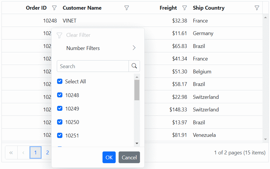
Here is a simple example demonstrating how to hide the sorting options in the Excel filter dialog:
<ejs-grid id="grid" dataSource="@ViewBag.dataSource" allowFiltering="true" allowSorting="true" allowPaging="true" height="352px">
    <e-grid-filterSettings type="Excel"></e-grid-filterSettings>
    <e-grid-pageSettings pageSize=10></e-grid-pageSettings>
    <e-grid-columns>
        <e-grid-column field="OrderID" headerText="Order ID" textAlign="Right" width="100"></e-grid-column>
        <e-grid-column field="CustomerID" headerText="Customer Name" width="120"></e-grid-column>
        <e-grid-column field="Freight" headerText="Freight" format="C2" textAlign="Right" width="100"></e-grid-column>
        <e-grid-column field="ShipCountry" headerText="Ship Country" width="100"></e-grid-column>
    </e-grid-columns>
</ejs-grid>
<style>
    .e-excel-ascending,
    .e-excel-descending,
    .e-separator.e-excel-separator {
      display: none;
    }
</style>
public IActionResult Index()
{
ViewBag.dataSource =OrderDetails.GetAllRecords();
return View();
}
Render checkbox list data in on-demand for excel/checkbox filtering
The Excel/Checkbox filter type of Grid has a restriction where only the first 1000 unique sorted items are accessible to view in the filter dialog checkbox list content by scrolling. This limitation is in place to avoid any rendering delays when opening the filter dialog. However, the searching and filtering processes consider all unique items in that particular column.
The Excel/Checkbox filter in the Grid provides an option to load large data sets on-demand during scrolling to improve scrolling limitation functionality. This is achieved by setting the filterSettings.enableInfiniteScrolling property to true. This feature proves especially beneficial for managing extensive datasets, enhancing data loading performance in the checkbox list, and allowing interactive checkbox selection with persistence for the selection based on filtering criteria.
The Excel/Checkbox filter retrieves distinct data in ascending order, governed by its filterSettings.itemsCount property, with a default value of 50. As the checkbox list data scroller reaches its end, the next dataset is fetched and displayed, with the notable advantage that this process only requests new checkbox list data without redundantly fetching the existing loaded dataset.
Customize the items count for initial rendering
Based on the items count value, the Excel/Checkbox filter gets unique data and displayed in Excel/Checkbox filter content dialog. You can customize the count of on-demand data rendering for Excel/Checkbox filter by adjusting the filterSettings.itemsCount property. The default value is 50
<e-grid-filterSettings type="Excel" enableInfiniteScrolling="true" itemsCount="40"></e-grid-filterSettings>It is recommended to keep the itemsCount below 300. Higher values will result in unwanted whitespace because of DOM maintenance performance degradation.
Customize the loading animation effect
A loading effect is presented to signify that loading is in progress when the checkbox list data scroller reaches the end, and there is a delay in receiving the data response from the server. The loading effect during on-demand data retrieval for Excel/Checkbox filter can be customized using the filterSettings.loadingIndicator property. The default value is Shimmer.
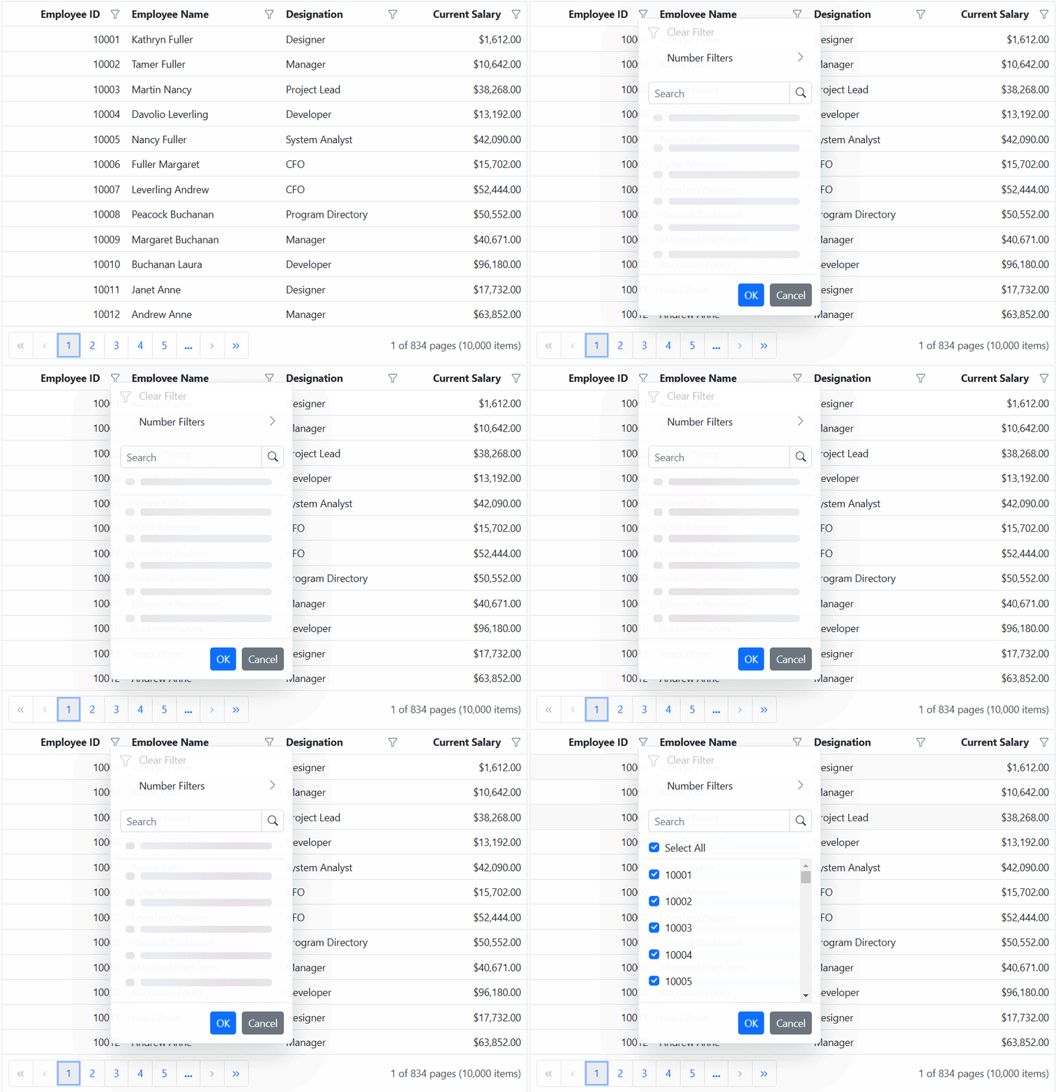
<e-grid-filterSettings type="Excel" enableInfiniteScrolling="true" loadingIndicator="Spinner"></e-grid-filterSettings>In the provided example, On-Demand Excel filter has been enabled for the ASP.NET Core Grid
<ejs-grid id="grid" allowFiltering="true" allowPaging="true" query="new ej.data.Query().addParams('dataCount', '10000')">
    <e-data-manager url="https://services.syncfusion.com/aspnet/production/api/UrlDataSource" adaptor="UrlAdaptor" crossdomain="true"></e-data-manager>
    <e-grid-filterSettings type="Excel" enableInfiniteScrolling="true"></e-grid-filterSettings>
    <e-grid-pageSettings pageCount=5></e-grid-pageSettings>
    <e-grid-columns>
        <e-grid-column field="EmployeeID" headerText="Employee ID" textAlign="Right" width="100"></e-grid-column>
        <e-grid-column field="Employees" headerText="Employee Name" width="120"></e-grid-column>
        <e-grid-column field="Designation" headerText="Designation" width="100"></e-grid-column>
        <e-grid-column field="CurrentSalary" headerText="Current Salary" width="100" format="C2"></e-grid-column>
    </e-grid-columns>
</ejs-grid>
public IActionResult Index()
{
return View();
}