How can I help you?
Populating Items in ASP.NET CORE Carousel control
19 Jun 202417 minutes to read
In the Carousel, slides can be rendered in two ways as follows,
- Populating items using carousel item
- Populating items using data source
Populating items using carousel item
When rendering the Carousel component using items binding, you can assign templates for each item separately or assign a common template to each item. You can also customize the slide transition interval for each item separately. The following example code depicts the functionality as item property binding.
<div class="container">
    <div class="control-container">
        <ejs-carousel id="defaultCarousel">
            <e-carousel-items>
                <e-carousel-item template='<div class="slide-content">Slide 1</div>'></e-carousel-item>
                <e-carousel-item template='<div class="slide-content">Slide 2</div>'></e-carousel-item>
                <e-carousel-item template='<div class="slide-content">Slide 3</div>'></e-carousel-item>
                <e-carousel-item template='<div class="slide-content">Slide 4</div>'></e-carousel-item>
                <e-carousel-item template='<div class="slide-content">Slide 5</div>'></e-carousel-item>
            </e-carousel-items>
        </ejs-carousel>
    </div>
</div>
<style>
    .control-container {
        background-color: #adb5bd;
        height: 300px;
        margin: 0 auto;
        width: 500px;
    }

    .e-carousel .slide-content {
        align-items: center;
        display: flex;
        font-size: 1.25rem;
        height: 100%;
        justify-content: center;
    }
</style>
Populating items using data source
When rendering the Carousel component using data binding, you can assign a common template only for all items using the itemTemplate property. You cannot set the interval for each item. The following example code depicts the functionality as data binding.
@{
    List<CarouselDataBinding> datasrc = new List<CarouselDataBinding>();
    datasrc.Add(new CarouselDataBinding
    {
        Id = 1,
        Title = "Slide 1",
    });
    datasrc.Add(new CarouselDataBinding
    {
        Id = 2,
        Title = "Slide 2",
    });
    datasrc.Add(new CarouselDataBinding
    {
        Id = 3,
        Title = "Slide 3",
    });
    datasrc.Add(new CarouselDataBinding
    {
        Id = 4,
        Title = "Slide 4",
    });
    datasrc.Add(new CarouselDataBinding
    {
        Id = 5,
        Title = "Slide 5",
    });
}

<div class="container">
    <div class="control-container">
        <ejs-carousel id="defaultCarousel" dataSource="@datasrc" itemTemplate='<div class="slide-content">${Title}</div>'>
        </ejs-carousel>
    </div>
</div>
<style>
    .control-container {
        background-color: #adb5bd;
        height: 300px;
        margin: 0 auto;
        width: 500px;
    }

    .e-carousel .slide-content {
        align-items: center;
        display: flex;
        font-size: 1.25rem;
        height: 100%;
        justify-content: center;
    }
</style>
public class CarouselDataBinding
{
public int Id { get; set; }
public string Title { get; set; }
}Selection
The Carousel items will be populated from the first index of the Carousel items and can be customized using the following ways,
- Select an item using the property.
- Select an item using the method.
Select an item using the property
Using the selectedIndex property of the Carousel component, you can set the slide to be populated at the time of initial rendering else you can switch to the particular slide item.
<div class="container">
    <div class="control-container">
        <ejs-carousel id="defaultCarousel" selectedIndex="2">
            <e-carousel-items>
                <e-carousel-item template='<div class="slide-content">Slide 1</div>'></e-carousel-item>
                <e-carousel-item template='<div class="slide-content">Slide 2</div>'></e-carousel-item>
                <e-carousel-item template='<div class="slide-content">Slide 3</div>'></e-carousel-item>
                <e-carousel-item template='<div class="slide-content">Slide 4</div>'></e-carousel-item>
                <e-carousel-item template='<div class="slide-content">Slide 5</div>'></e-carousel-item>
            </e-carousel-items>
        </ejs-carousel>
    </div>
</div>
<style>
    .control-container {
        background-color: #adb5bd;
        height: 300px;
        margin: 0 auto;
        width: 500px;
    }

    .e-carousel .slide-content {
        align-items: center;
        display: flex;
        font-size: 1.25rem;
        height: 100%;
        justify-content: center;
    }
</style>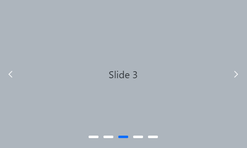
Select an item using the method
Using the prev or next public method of the Carousel component, you can switch the current populating slide to a previous or next slide.
<ejs-button id="prev" cssClass="e-info" content="Prev"></ejs-button>
<ejs-button id="next" cssClass="e-info" content="Next"></ejs-button>

<div class="container">
    <div class="control-container">
        <ejs-carousel id="defaultCarousel">
            <e-carousel-items>
                <e-carousel-item template='<div class="slide-content">Slide 1</div>'></e-carousel-item>
                <e-carousel-item template='<div class="slide-content">Slide 2</div>'></e-carousel-item>
                <e-carousel-item template='<div class="slide-content">Slide 3</div>'></e-carousel-item>
                <e-carousel-item template='<div class="slide-content">Slide 4</div>'></e-carousel-item>
                <e-carousel-item template='<div class="slide-content">Slide 5</div>'></e-carousel-item>
            </e-carousel-items>
        </ejs-carousel>
    </div>
</div>
<script>
    document.getElementById('prev').onclick = function () {
        var carouselObj = document.querySelector(".e-carousel").ej2_instances[0];
        carouselObj.prev();
    }
    document.getElementById('next').onclick = function () {
        var carouselObj = document.querySelector(".e-carousel").ej2_instances[0];
        carouselObj.next();
    }
</script>
<style>
    .control-container {
        background-color: #adb5bd;
        height: 300px;
        margin: 0 auto;
        width: 500px;
    }

    .e-carousel .slide-content {
        align-items: center;
        display: flex;
        font-size: 1.25rem;
        height: 100%;
        justify-content: center;
    }
</style>
Partial visible slides
The Carousel component supports to show one complete slide and a partial view of adjacent (previous and next) slides at the same time. You can enable or disable the partial slides using the partialVisible property.
<div class="container">
    <div class="control-container">
        <ejs-carousel id="defaultCarousel" partialVisible=true>
            <e-carousel-items>
                <e-carousel-item template="#templateItem1"></e-carousel-item>
                    <e-carousel-item template="#templateItem2"></e-carousel-item>
                    <e-carousel-item template="#templateItem3"></e-carousel-item>
                    <e-carousel-item template="#templateItem4"></e-carousel-item>
                    <e-carousel-item template="#templateItem5"></e-carousel-item>
            </e-carousel-items>
        </ejs-carousel>
    </div>
</div>
<script id="templateItem1" type="text/x-template">
    <figure class="img-container">
        <img src="https://ej2.syncfusion.com/aspnetcore/css/carousel/images/bridge.jpg" alt="bridge" style="height:100%; width: 100%" />
        <figcaption class="img-caption">Golden Gate Bridge, San Francisco</figcaption>
    </figure>
</script>

<script id="templateItem2" type="text/x-template">
    <figure class="img-container">
        <img src="https://ej2.syncfusion.com/aspnetcore/css/carousel/images/trees.jpg" alt="spring_trees" style="height:100%; width: 100%" />
        <figcaption class="img-caption">Spring Flower Trees</figcaption>
    </figure>
</script>

<script id="templateItem3" type="text/x-template">
    <figure class="img-container">
        <img src="https://ej2.syncfusion.com/aspnetcore/css/carousel/images/waterfall.jpg" alt="waterfall" style="height:100%; width: 100%" />
        <figcaption class="img-caption">Oddadalen Waterfalls, Norway</figcaption>
    </figure>
</script>

<script id="templateItem4" type="text/x-template">
    <figure class="img-container">
        <img src="https://ej2.syncfusion.com/aspnetcore/css/carousel/images/sea.jpg" alt="sea" style="height:100%; width: 100%" />
        <figcaption class="img-caption">Anse Source d'Argent, Seychelles</figcaption>
    </figure>
</script>

<script id="templateItem5" type="text/x-template">
    <figure class="img-container">
        <img src="https://ej2.syncfusion.com/aspnetcore/css/carousel/images/rocks.jpeg" alt="rocks" style="height:100%; width: 100%" />
        <figcaption class="img-caption">Stonehenge, England</figcaption>
    </figure>
</script>
<style>
    .control-container {
        background-color: #e5e5e5;
        height: 360px;
        margin: 0 auto;
        width: 600px;
    }

    .img-container {
        height: 100%;
        margin: 0;
    }

    .img-caption {
        color: #fff;
        font-size: 1rem;
        position: absolute;
        bottom: 3rem;
        width: 100%;
        text-align: center;
    }

</style>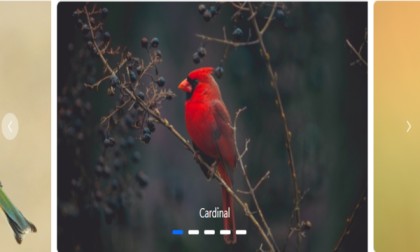
NOTE
Slide animation only applicable if the
partialVisibleis enabled.
The last slide will be displayed as a partial slide at the initial rendering when the loop and partialVisible properties are enabled.
The previous slide is not displayed at the initial rendering when the loop is disabled.
The following example code depicts the functionality of partialVisible and without loop functionalities.
<div class="container">
    <div class="control-container">
        <ejs-carousel id="defaultCarousel" partialVisible=true loop=false>
            <e-carousel-items>
                <e-carousel-item template="#templateItem1"></e-carousel-item>
                    <e-carousel-item template="#templateItem2"></e-carousel-item>
                    <e-carousel-item template="#templateItem3"></e-carousel-item>
                    <e-carousel-item template="#templateItem4"></e-carousel-item>
                    <e-carousel-item template="#templateItem5"></e-carousel-item>
            </e-carousel-items>
        </ejs-carousel>
    </div>
</div>
<script id="templateItem1" type="text/x-template">
    <figure class="img-container">
        <img src="https://ej2.syncfusion.com/aspnetcore/css/carousel/images/bridge.jpg" alt="bridge" style="height:100%; width: 100%" />
        <figcaption class="img-caption">Golden Gate Bridge, San Francisco</figcaption>
    </figure>
</script>

<script id="templateItem2" type="text/x-template">
    <figure class="img-container">
        <img src="https://ej2.syncfusion.com/aspnetcore/css/carousel/images/trees.jpg" alt="spring_trees" style="height:100%; width: 100%" />
        <figcaption class="img-caption">Spring Flower Trees</figcaption>
    </figure>
</script>

<script id="templateItem3" type="text/x-template">
    <figure class="img-container">
        <img src="https://ej2.syncfusion.com/aspnetcore/css/carousel/images/waterfall.jpg" alt="waterfall" style="height:100%; width: 100%" />
        <figcaption class="img-caption">Oddadalen Waterfalls, Norway</figcaption>
    </figure>
</script>

<script id="templateItem4" type="text/x-template">
    <figure class="img-container">
        <img src="https://ej2.syncfusion.com/aspnetcore/css/carousel/images/sea.jpg" alt="sea" style="height:100%; width: 100%" />
        <figcaption class="img-caption">Anse Source d'Argent, Seychelles</figcaption>
    </figure>
</script>

<script id="templateItem5" type="text/x-template">
    <figure class="img-container">
        <img src="https://ej2.syncfusion.com/aspnetcore/css/carousel/images/rocks.jpeg" alt="rocks" style="height:100%; width: 100%" />
        <figcaption class="img-caption">Stonehenge, England</figcaption>
    </figure>
</script>
<style>
    .control-container {
        background-color: #e5e5e5;
        height: 360px;
        margin: 0 auto;
        width: 600px;
    }

    .img-container {
        height: 100%;
        margin: 0;
    }

    .img-caption {
        color: #fff;
        font-size: 1rem;
        position: absolute;
        bottom: 3rem;
        width: 100%;
        text-align: center;
    }

</style>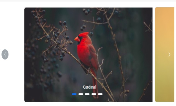
See also
NOTE