Getting started with Angular Uploader component
10 Mar 202614 minutes to read
This guide demonstrates how to set up and configure the Syncfusion Angular Uploader component, from initial installation through enabling core features like asynchronous file uploads and drag-and-drop functionality. The Uploader component allows users to upload files to a server with support for multiple file formats, drag-and-drop, progress tracking, and event handling.
Note: This guide supports Angular 21 and other recent Angular versions. For detailed compatibility with other Angular versions, please refer to the Angular version support matrix. Starting from Angular 19, standalone components are the default, and this guide reflects that architecture.
Ready to streamline your Syncfusion® Angular development? Discover the full potential of Syncfusion® Angular components with Syncfusion® AI Coding Assistant. Effortlessly integrate, configure, and enhance your projects with intelligent, context-aware code suggestions, streamlined setups, and real-time insights—all seamlessly integrated into your preferred AI-powered IDEs like VS Code, Cursor, Syncfusion® CodeStudio and more. Explore Syncfusion® AI Coding Assistant
Prerequisites
Ensure your development environment meets the System Requirements for Syncfusion Angular UI Components.
Dependencies
The following packages are required to render the uploader component in your Angular application.
|-- @syncfusion/ej2-angular-inputs
    |-- @syncfusion/ej2-angular-base
    |-- @syncfusion/ej2-angular-popups
    |-- @syncfusion/ej2-angular-buttons
    |-- @syncfusion/ej2-inputs
        |-- @syncfusion/ej2-base
        |-- @syncfusion/ej2-popups
        |-- @syncfusion/ej2-buttons
        |-- @syncfusion/ej2-splitbuttons
SetUp the Angular application
A straightforward approach to beginning with Angular is to create a new application using the Angular CLI. Install Angular CLI globally with the following command:
npm install -g @angular/cliAngular 21 Standalone Architecture: Standalone components are the default in Angular 21. This guide uses the modern standalone architecture. If you need more information about the standalone architecture, refer to the Standalone Guide.
Installing a specific version
To install a particular version of Angular CLI, use:
npm install -g @angular/[email protected]Create a new application
With Angular CLI installed, execute this command to generate a new application:
ng new syncfusion-angular-app- This command will prompt you to configure settings like enabling Angular routing and choosing a stylesheet format.
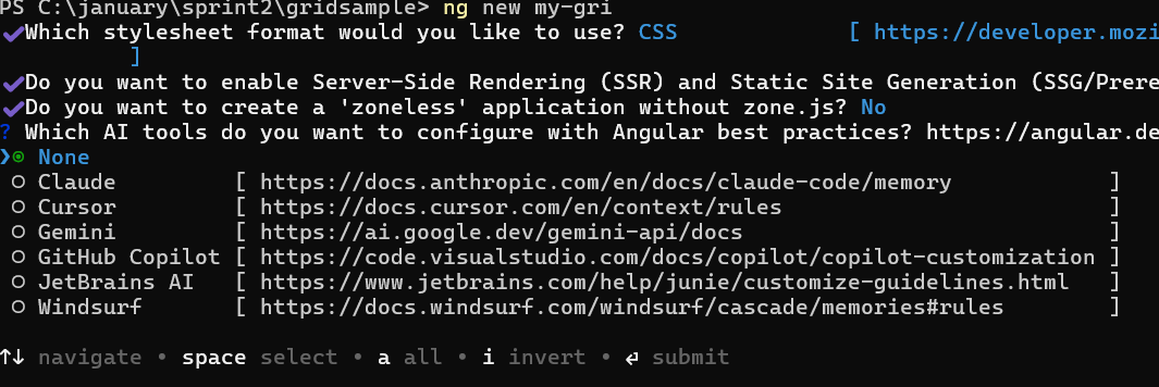
? Which stylesheet format would you like to use? (Use arrow keys)
> CSS             [ https://developer.mozilla.org/docs/Web/CSS                     ]
  Sass (SCSS)     [ https://sass-lang.com/documentation/syntax#scss                ]
  Sass (Indented) [ https://sass-lang.com/documentation/syntax#the-indented-syntax ]
Less [ http://lesscss.org ]- By default, a CSS-based application is created. Use SCSS if required:
ng new syncfusion-angular-app --style=scss- During project setup, when prompted for the Server-side rendering (SSR) option, choose the appropriate configuration.

- Select the required AI tool or ‘none’ if you do not need any AI tool.
- Navigate to your newly created application directory:
cd syncfusion-angular-appNote: In Angular 19 and below, it uses
app.component.ts,app.component.html,app.component.cssetc. In Angular 20+, the CLI generates a simpler structure withsrc/app/app.ts,app.html, andapp.css(no.component.suffixes).
Adding Syncfusion® Angular packages
Syncfusion®’s Angular component packages are available on npmjs.com. To use Syncfusion® Angular components, install the necessary package.
This guide uses the Angular Uploader component for demonstration. Add the Angular Uploader component component with:
ng add @syncfusion/ej2-angular-inputsThis command will perform the following configurations:
- Add the
@syncfusion/ej2-angular-inputspackage and peer dependencies to yourpackage.json. - Import the Uploader component component in your application.
- Register the default Syncfusion® material theme in
angular.json.
For more details on version compatibility, refer to the Version Compatibility section.
Syncfusion® offers two package structures for Angular components:
- Ivy library distribution package format
- Angular compatibility compiler (ngcc), which is Angular’s legacy compilation pipeline.
Syncfusion®’s latest Angular packages are provided as Ivy-compatible and suited for Angular 12 and above. To install the package, execute:ng add @syncfusion/ej2-angular-inputsFor applications not compiled with Ivy, use the
ngcctagged packages:The ngcc packages are still compatible with Angular CLI versions 15 and below. However, they may generate warnings suggesting the use of IVY compiled packages. Starting from Angular 16, support for the ngcc package has been completely removed. If you have further questions regarding ngcc compatibility, please refer to the following FAQ.
npm add @syncfusion/[email protected]
Import Syncfusion® CSS styles
Syncfusion® Angular component themes can be added in various ways: via CSS or SCSS styles from npm packages, CDN, CRG, or Theme Studio.
The Material theme is added to your styles.css when you run ng add (this happens automatically by default).
To stylize only specific Syncfusion® components, import the necessary styles. For example, to style only the Uploader component:
@import '../node_modules/@syncfusion/ej2-base/styles/material3.css';
@import '../node_modules/@syncfusion/ej2-buttons/styles/material3.css';
@import '../node_modules/@syncfusion/ej2-inputs/styles/material3.css';
@import '../node_modules/@syncfusion/ej2-popups/styles/material3.css';
@import '../node_modules/@syncfusion/ej2-angular-inputs/styles/material3.css';
Ensure that the import order aligns with the component’s dependency sequence.
For using SCSS styles, refer to this guide.
Add Uploader component
Modify the template in [src/app/app.ts] file to render the Uploader component.
Add the Angular Uploader by using <ejs-uploader> selector in template section of the app.ts file.
import { Component, OnInit } from '@angular/core';
import { UploaderModule } from '@syncfusion/ej2-angular-inputs'

@Component({
    imports: [
      UploaderModule
    ],
    standalone: true,
    selector: 'app-root',
    // specifies the template string for the Uploader component
    template: `<ejs-uploader [autoUpload]='false'></ejs-uploader>`
})
export class AppComponent implements OnInit {

    ngOnInit(): void {
    }
}
Running the application
After completing the configuration required to render the uploader, run the application using the following command to display the output in your default browser.
ng serve
The output will appear as follows.
import { NgModule } from '@angular/core'
import { BrowserModule } from '@angular/platform-browser'
import { UploaderModule } from '@syncfusion/ej2-angular-inputs'


import { Component } from '@angular/core';

@Component({
imports: [
         UploaderModule
    ],


standalone: true,
    selector: 'app-root',
    template: `
               <ejs-uploader #defaultupload  [autoUpload]='false'></ejs-uploader>
              `
})
export class AppComponent {
    constructor() {
    }
}
import { bootstrapApplication } from '@angular/platform-browser';
import { AppComponent } from './app.component';
import 'zone.js';
bootstrapApplication(AppComponent).catch((err) => console.error(err));From v16.2.41 version, the Essential® JS2 AJAX library has been integrated for uploader server requests.
Hence, use the third partypromiselibrary like blue-bird to use the uploader in Internet Explorer.
Adding drop area
By default, the Uploader component allows uploading files by dragging files from file explorer and dropping them into the drop area.
You can configure any other external element as a drop target using the dropArea property.
In the following sample, an external element is configured as a drop target for the Uploader component.
import { NgModule } from '@angular/core'
import { BrowserModule } from '@angular/platform-browser'
import { UploaderModule } from '@syncfusion/ej2-angular-inputs'


import { Component } from '@angular/core';

@Component({
imports: [
         UploaderModule
    ],


standalone: true,
    selector: 'app-root',
    template: `
               <div id='droparea'>
            Drop files here to upload
        </div>
        <div id='uploadfile' >
               <ejs-uploader #defaultupload  [autoUpload]='false' [dropArea]='dropEle'></ejs-uploader>
               </div>
              `
})
export class AppComponent {
    public dropEle?: HTMLElement ;
    ngOnInit() {
          this.dropEle = document.getElementById('droparea');
    }
    constructor() {
    }
}
import { bootstrapApplication } from '@angular/platform-browser';
import { AppComponent } from './app.component';
import 'zone.js';
bootstrapApplication(AppComponent).catch((err) => console.error(err));Configure asynchronous settings
By default, the Uploader component processes files in asynchronous mode.
Define the properties saveUrl and removeUrl to handle the save and remove actions as follows.
import { NgModule } from '@angular/core'
import { BrowserModule } from '@angular/platform-browser'
import { UploaderModule } from '@syncfusion/ej2-angular-inputs'


import { Component } from '@angular/core';

@Component({
imports: [
         UploaderModule
    ],


standalone: true,
    selector: 'app-root',
    template: `
               <div id='droparea'>
            Drop files here to upload
        </div>
        <div id='uploadfile' >
               <ejs-uploader #defaultupload  [autoUpload]='false' [dropArea]='dropEle' [asyncSettings]='path'></ejs-uploader>
               </div>
              `
})
export class AppComponent {
    public dropEle?: any;
     public path: Object = {
      saveUrl: 'https://services.syncfusion.com/angular/production/api/FileUploader/Save',
      removeUrl: 'https://services.syncfusion.com/angular/production/api/FileUploader/Remove' };
    constructor() {
    }
}
import { bootstrapApplication } from '@angular/platform-browser';
import { AppComponent } from './app.component';
import 'zone.js';
bootstrapApplication(AppComponent).catch((err) => console.error(err));Handle success and failed upload
You can handle the success and failure actions using the success and failure events.
To handle these events, define the function and assign it to the corresponding event as follows.
import { NgModule } from '@angular/core'
import { BrowserModule } from '@angular/platform-browser'
import { UploaderModule } from '@syncfusion/ej2-angular-inputs'


import { Component } from '@angular/core';

@Component({
imports: [
         UploaderModule
    ],


standalone: true,
    selector: 'app-root',
    template: `
               <ejs-uploader #defaultupload [autoUpload]='false' [dropArea]='dropEle' [asyncSettings]='path' (success)="onUploadSuccess($event)" (failure)="onUploadFailure($event)"></ejs-uploader>
              `
})
export class AppComponent {

    public path: Object = {
      saveUrl: 'https://services.syncfusion.com/angular/production/api/FileUploader/Save',
      removeUrl: 'https://services.syncfusion.com/angular/production/api/FileUploader/Remove' };
      public onUploadSuccess(args: any): void  {
        if (args.operation === 'upload') {
            console.log('File uploaded successfully');
        }
    }

    public onUploadFailure(args: any): void  {
    console.log('File failed to upload');
    }

    public dropEle?: HTMLElement ;
    ngOnInit() {
        this.dropEle = document.getElementById('droparea') as HTMLElement;
    }

    constructor() {
    }
}
import { bootstrapApplication } from '@angular/platform-browser';
import { AppComponent } from './app.component';
import 'zone.js';
bootstrapApplication(AppComponent).catch((err) => console.error(err));You can also explore Angular File Upload feature tour page for its groundbreaking features. You can also explore our Angular File Upload example to understand how to browse the files which you want to upload to the server.
See Also
NOTE
You can also explore Angular File Upload feature tour page for its groundbreaking features. You can also explore our Angular File Upload example to understand how to browse the files which you want to upload to the server.