Getting started with the Angular Tooltip component
26 Feb 202613 minutes to read
This section explains how to create a simple Tooltip and configure its functionality in Angular.
Note: This guide supports Angular 21 and other recent Angular versions. For detailed compatibility with other Angular versions, please refer to the Angular version support matrix. Starting from Angular 19, standalone components are the default, and this guide reflects that architecture.
Ready to streamline your Syncfusion® Angular development? Discover the full potential of Syncfusion® Angular components with Syncfusion® AI Coding Assistant. Effortlessly integrate, configure, and enhance your projects with intelligent, context-aware code suggestions, streamlined setups, and real-time insights—all seamlessly integrated into your preferred AI-powered IDEs like VS Code, Cursor, Syncfusion® CodeStudio and more. Explore Syncfusion® AI Coding Assistant
Prerequisites
Ensure your development environment meets the System Requirements for Syncfusion Angular UI Components.
Dependencies
The following dependencies are required to use the Tooltip component in an application.
|-- @syncfusion/ej2-angular-popups
    |-- @syncfusion/ej2-angular-base
    |-- @syncfusion/ej2-popups
      |-- @syncfusion/ej2-base
      |-- @syncfusion/ej2-buttons
SetUp the Angular application
A straightforward approach to beginning with Angular is to create a new application using the Angular CLI. Install Angular CLI globally with the following command:
npm install -g @angular/cliAngular 21 Standalone Architecture: Standalone components are the default in Angular 21. This guide uses the modern standalone architecture. If you need more information about the standalone architecture, refer to the Standalone Guide.
Installing a specific version
To install a particular version of Angular CLI, use:
npm install -g @angular/[email protected]Create a new application
With Angular CLI installed, execute this command to generate a new application:
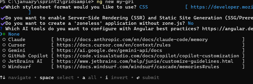
ng new syncfusion-angular-app- This command will prompt you to configure settings like enabling Angular routing and choosing a stylesheet format.
? Which stylesheet format would you like to use? (Use arrow keys)
> CSS             [ https://developer.mozilla.org/docs/Web/CSS                     ]
  Sass (SCSS)     [ https://sass-lang.com/documentation/syntax#scss                ]
  Sass (Indented) [ https://sass-lang.com/documentation/syntax#the-indented-syntax ]
Less [ http://lesscss.org ]- By default, a CSS-based application is created. Use SCSS if required:
ng new syncfusion-angular-app --style=scss- During project setup, when prompted for the Server-side rendering (SSR) option, choose the appropriate configuration.

- Select the required AI tool or ‘none’ if you do not need any AI tool.
- Navigate to your newly created application directory:
cd syncfusion-angular-appNote: In Angular 19 and below, it uses
app.component.ts,app.component.html,app.component.cssetc. In Angular 20+, the CLI generates a simpler structure withsrc/app/app.ts,app.html, andapp.css(no.component.suffixes).
Installing Syncfusion® Tooltip package
Syncfusion®’s Angular component packages are available on npmjs.com. To use Syncfusion® Angular components, install the necessary package.
This guide uses the Angular Tooltip component for demonstration. Add the Angular Tooltip component component with:
ng add @syncfusion/ej2-angular-popupsThis command will perform the following configurations:
- Add the
@syncfusion/ej2-angular-popupspackage and peer dependencies to yourpackage.json. - Import the Tooltip component component in your application.
- Register the default Syncfusion® material theme in
angular.json.
For more details on version compatibility, refer to the Version Compatibility section.
Syncfusion® offers two package structures for Angular components:
- Ivy library distribution package format
- Angular compatibility compiler (ngcc), which is Angular’s legacy compilation pipeline.
Syncfusion®’s latest Angular packages are provided as Ivy-compatible and suited for Angular 12 and above. To install the package, execute:ng add @syncfusion/ej2-angular-popupsFor applications not compiled with Ivy, use the
ngcctagged packages:The ngcc packages are still compatible with Angular CLI versions 15 and below. However, they may generate warnings suggesting the use of IVY compiled packages. Starting from Angular 16, support for the ngcc package has been completely removed. If you have further questions regarding ngcc compatibility, please refer to the following FAQ.
npm add @syncfusion/[email protected]
Adding CSS Reference
Syncfusion® Angular component themes can be added in various ways: via CSS or SCSS styles from npm packages, CDN, CRG, or Theme Studio.
The Material theme is added to your styles.css when you run ng add (this happens automatically by default).
To stylize only specific Syncfusion® components, import the necessary styles. For example, to style only the Tooltip component:
[style.css]
@import "../node_modules/@syncfusion/ej2-base/styles/material3.css";
@import "../node_modules/@syncfusion/ej2-angular-buttons/styles/material3.css";
@import "../node_modules/@syncfusion/ej2-angular-popups/styles/material3.css";
Alternatively, based on the location of your CSS file, you can import the styles as shown below:
@import "node_modules/@syncfusion/ej2-base/styles/material3.css";
@import "node_modules/@syncfusion/ej2-angular-buttons/styles/material3.css";
@import "node_modules/@syncfusion/ej2-angular-popups/styles/material3.css";
Ensure that the import order aligns with the component’s dependency sequence.
For using SCSS styles, refer to this guide.
Add Tooltip component
Use the following snippet in the src/app/app.ts file to import the Tooltip component.
import { Component, ViewEncapsulation } from '@angular/core';
import { TooltipModule } from '@syncfusion/ej2-angular-popups'

@Component({
  imports: [TooltipModule],
  standalone: true,
  selector: 'app-root',
  template: `
    <ejs-tooltip id='tooltip' content='Tooltip content'>
        Hover Me
    </ejs-tooltip>`,
  encapsulation: ViewEncapsulation.None
})
export class App { }
Run the application
- Run the application in the browser using the following command:
ng serve --openThe following example shows how to initialize a Tooltip on a single element.
import { NgModule } from '@angular/core'
import { BrowserModule } from '@angular/platform-browser'
import { TooltipModule } from '@syncfusion/ej2-angular-popups'
import { ButtonModule } from '@syncfusion/ej2-angular-buttons'
import { Component, ViewEncapsulation } from '@angular/core';

@Component({
  imports: [
    TooltipModule,
    ButtonModule
  ],
  standalone: true,
  selector: 'app-root',
  template: `
    <div id='container' style="display: inline-block; position: relative; left: 50%;top: 100px;transform: translateX(-50%);">
        <ejs-tooltip id='tooltip' content='Tooltip content' target="#target">
            <button ejs-button id="target">Show Tooltip</button>
        </ejs-tooltip>
    </div>`,
  encapsulation: ViewEncapsulation.None
})
export class AppComponent { }
import { bootstrapApplication } from '@angular/platform-browser';
import { AppComponent } from './app.component';
import 'zone.js';
bootstrapApplication(AppComponent).catch((err) => console.error(err));Initialize Tooltip within a container
Create a Tooltip on multiple targets within a container by defining the selector property with specific target elements, so the Tooltip initializes only on those matches. In this case, the Tooltip content is taken from the target element’s title attribute.
Use the following example to create a Tooltip on multiple targets within a container.
import { NgModule } from '@angular/core'
import { BrowserModule } from '@angular/platform-browser'
import { TooltipModule } from '@syncfusion/ej2-angular-popups'
import { ButtonModule } from '@syncfusion/ej2-angular-buttons'
import { Component } from '@angular/core';
@Component({
    imports: [

        TooltipModule,
        ButtonModule
    ],
    standalone: true,
    selector: 'app-root',
    template: `
        <div id="tool">
          <ejs-tooltip target='.e-info' position='RightCenter'>
            <form id="details" role="form">
              <table>
                <tr>
                    <td class="info">User Name</td>
                    <td>
                        <input type="text" class="e-info" name="firstname" title="Please enter your name"> </td>
                </tr>
                <tr>
                    <td class="info">Email Address</td>
                    <td>
                        <input type="text" class="e-info" name="email" title="Enter a valid email address">
                    </td>
                </tr>
                <tr>
                    <td class="info">Password</td>
                    <td>
                        <input type="password" class="e-info" name="password" title="Be at least 8 characters length">
                    </td>
                </tr>
                <tr>
                    <td class="info">Confirm Password</td>
                    <td>
                        <input type="password" class="e-info" name="Cpwd" title="Re-enter your password">
                    </td>
                </tr>
                <tr>
                    <td><input ejs-button id="sample" class="center" type="submit" value="Submit"></td>
                    <td><input ejs-button id="clear" class="center" type="reset" value="Reset"></td>
                </tr>
              </table>
            </form>
          </ejs-tooltip>
        </div>
        `,
})

export class AppComponent { }
@import 'node_modules/@syncfusion/ej2-base/styles/material3.css';
@import 'node_modules/@syncfusion/ej2-angular-popups/styles/material3.css';
@import 'node_modules/@syncfusion/ej2-angular-buttons/styles/material3.css';
@import 'node_modules/@syncfusion/ej2-angular-base/styles/material3.css';
#loader {
color: #008cff;
font-family: 'Helvetica Neue', 'calibiri';
font-size: 16px;
height: 40px;
left: 45%;
position: absolute;
top: 45%;
width: 30%;
}
#tool {
width: 500px;
margin: auto;
transform: translateX(10%);
}
#details table th,
#details table td {
padding: 20px 10px;
text-align: left;
}
#details .info {
font-size: 14px;
text-align: left;
font-weight: 500;
}
.center {
position: relative;
left: 50%;
transform: translateX(-50%);
}import { bootstrapApplication } from '@angular/platform-browser';
import { AppComponent } from './app.component';
import 'zone.js';
bootstrapApplication(AppComponent).catch((err) => console.error(err));In the above sample,
detailsrefers to the container’s ID, and the target.e-inforefers to the target elements available within that container.