Responsive mode in Angular Toolbar component
17 Sep 202515 minutes to read
The Angular Toolbar component automatically handles content overflow with responsive display modes when toolbar items exceed the available viewing area. The component supports two primary responsive modes:
- Scrollable
- Popup
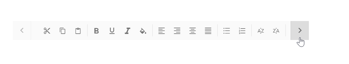
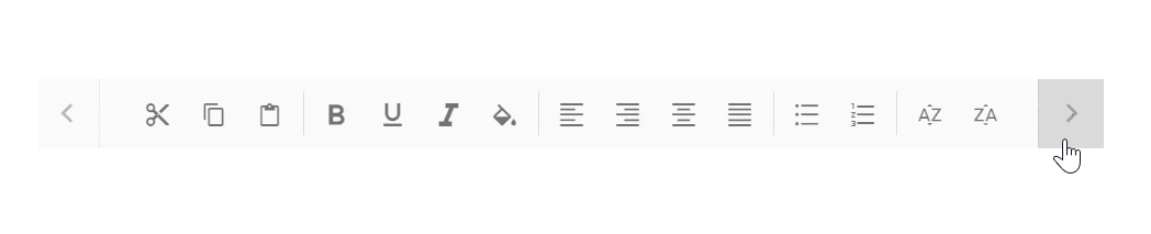
Scrollable
The default overflow mode of the Toolbar is Scrollable. This responsive mode displays all commands in a single horizontal line with scrolling navigation when content overflows the available container width.
- Navigation arrows appear at the start and end of the Toolbar to access hidden commands.
- You can also see the hidden commands using touch swipe action.
- When the left navigation icon is disabled, hidden commands are accessible by moving right.
- Clicking or holding navigation arrows continuously reveals hidden commands.
- On devices without navigation icons, touch swipe gestures provide access to hidden toolbar commands.
- When the Toolbar reaches the first or last command, the corresponding navigation icon becomes disabled, allowing movement in the opposite direction only.
- Continuous scrolling is possible by holding the navigation icon.
import { NgModule } from '@angular/core'
import { BrowserModule } from '@angular/platform-browser'
import { ToolbarModule } from '@syncfusion/ej2-angular-navigations'
import { TooltipModule } from '@syncfusion/ej2-angular-popups'


import { Component, ViewChild } from '@angular/core';
import { ToolbarComponent } from '@syncfusion/ej2-angular-navigations';

@Component({
imports: [
         ToolbarModule, TooltipModule
    ],


standalone: true,
    selector: 'app-container',
    template: `
        <ejs-toolbar width="300px">
          <e-items>
             <e-item text='Cut' prefixIcon = 'e-cut-icon tb-icons'></e-item>
             <e-item text='Copy' prefixIcon = 'e-copy-icon tb-icons'></e-item>
             <e-item text='Paste' prefixIcon = 'e-paste-icon tb-icons'></e-item>
             <e-item type='Separator'></e-item>
             <e-item text='bold' prefixIcon = 'e-bold-icon tb-icons'></e-item>
             <e-item text='underline' prefixIcon = 'e-underline-icon tb-icons'></e-item>
             <e-item text='italic' prefixIcon = 'e-italic-icon tb-icons'></e-item>
             <e-item type='Separator'></e-item>
             <e-item text='A-Z Sort' prefixIcon = 'e-ascending-icon tb-icons'></e-item>
             <e-item text='Z-A Sort' prefixIcon = 'e-descending-icon tb-icons'></e-item>
             <e-item text='Clear' prefixIcon = 'e-clear-icon tb-icons'></e-item>
          </e-items>
        </ejs-toolbar>
        `
})

export class AppComponent {

}
import { bootstrapApplication } from '@angular/platform-browser';
import { AppComponent } from './app.component';
import 'zone.js';
bootstrapApplication(AppComponent).catch((err) => console.error(err));Popup
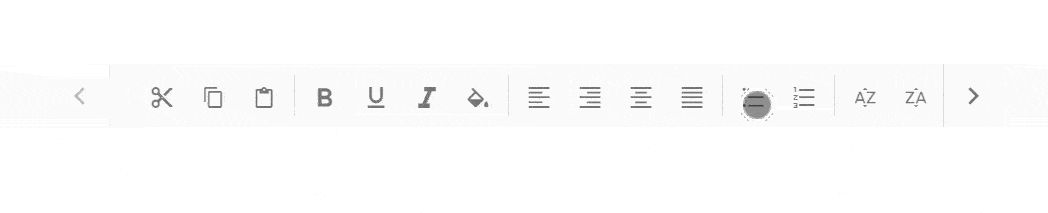
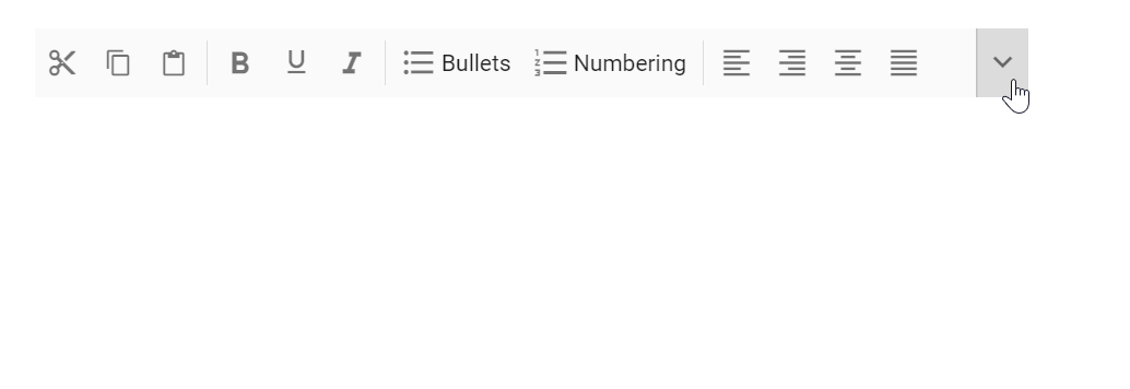
Popup is an alternative overflowMode where the Toolbar container displays commands that fit within the available space. Overflowing commands that exceed the viewing area automatically move to an overflow popup container.
Commands in the popup become accessible by opening the dropdown using the overflow icon at the end of the Toolbar.
If the popup content overflows the page height, the remaining commands will be hidden.
Priority of commands
Default popup priority is set as none, and when the commands of the Toolbar overflow, the ones listed last will be moved to the popup.
Command display priority can be customized using the overflow property to control which items appear in the Toolbar versus the popup.
| Property | Description |
|---|---|
| show | Always displays items on the Toolbar with primary priority |
| hide | Always displays items in the popup with secondary priority |
| none | No priority assigned - commands move to popup in normal order when content exceeds viewing area |
When primary priority commands exceed available space, they move to the popup container at the top position, placed before secondary priority commands.
You can maintain toolbar item on popup always by using the ‘showAlwaysInPopup’ property, and this behavior is not applicable for toolbar items with overflow property as ‘show’.
import { NgModule } from '@angular/core'
import { BrowserModule } from '@angular/platform-browser'
import { ToolbarModule } from '@syncfusion/ej2-angular-navigations'
import { TooltipModule } from '@syncfusion/ej2-angular-popups'


import { Component, ViewChild } from '@angular/core';
import { ToolbarComponent } from '@syncfusion/ej2-angular-navigations';

@Component({
imports: [
         ToolbarModule, TooltipModule
    ],


standalone: true,
    selector: 'app-container',
    template: `
        <ejs-toolbar overflowMode = 'Popup' width= 380>
          <e-items>
             <e-item text='Cut' prefixIcon = 'e-cut-icon tb-icons' overflow ='Show'></e-item>
             <e-item text='Copy' prefixIcon = 'e-copy-icon tb-icons' overflow ='Show'></e-item>
             <e-item text='Paste' prefixIcon = 'e-paste-icon' overflow ='Show'></e-item>
             <e-item type='Separator'></e-item>
             <e-item text='Bold' prefixIcon = 'e-bold-icon tb-icons' ></e-item>
             <e-item text='Italic' prefixIcon = 'e-italic-icon tb-icons' ></e-item>
             <e-item text='underline' prefixIcon = 'e-underline-icon tb-icons' ></e-item>
             <e-item type='Separator'></e-item>
             <e-item text='A-Z Sort' prefixIcon = 'e-ascending-icon tb-icons' overflow ='Show'></e-item>
             <e-item text='Z-A Sort' prefixIcon = 'e-descending-icon tb-icons' overflow ='Show'></e-item>
          </e-items>
        </ejs-toolbar>
        `
})

export class AppComponent {

}
import { bootstrapApplication } from '@angular/platform-browser';
import { AppComponent } from './app.component';
import 'zone.js';
bootstrapApplication(AppComponent).catch((err) => console.error(err));Text mode for buttons
The showTextOn property determines where button text displays within the Toolbar, popup, or both locations. This enables customization of text and image representations for different display contexts.
For example, icon-only buttons can display on the Toolbar while the popup container shows detailed information with both icons and text.
Available values:
| Property | Description |
|---|---|
| Both | Button text appears in both Toolbar and popup
|
| Overflow | Button text appears only in the popup
|
| Toolbar | Button text appears only on the Toolbar
|
The following example demonstrates text visibility limited to the popup container only.
import { NgModule } from '@angular/core'
import { BrowserModule } from '@angular/platform-browser'
import { ToolbarModule } from '@syncfusion/ej2-angular-navigations'
import { TooltipModule } from '@syncfusion/ej2-angular-popups'


import { Component, ViewChild } from '@angular/core';
import { ToolbarComponent } from '@syncfusion/ej2-angular-navigations';

@Component({
imports: [
         ToolbarModule, TooltipModule
    ],


standalone: true,
    selector: 'app-container',
    template: `
        <ejs-toolbar overflowMode = 'Popup' width= 330>
          <e-items>
             <e-item text='Cut' prefixIcon = 'e-cut-icon tb-icons' overflow ='Show' showTextOn = 'overflow'></e-item>
             <e-item text='Copy' prefixIcon = 'e-copy-icon tb-icons' overflow ='Show' showTextOn = 'overflow'></e-item>
             <e-item text='Paste' prefixIcon = 'e-paste-icon tb-icons' overflow ='Show' showTextOn = 'overflow'></e-item>
             <e-item type='Separator'></e-item>
             <e-item text='bold' prefixIcon = 'e-bold-icon tb-icons' overflow ='Show' showTextOn = 'overflow' ></e-item>
             <e-item text='underline' prefixIcon = 'e-underline-icon tb-icons' overflow ='Show' showTextOn = 'overflow' ></e-item>
             <e-item text='italic' prefixIcon = 'e-italic-icon tb-icons' overflow ='Show' showTextOn = 'overflow' ></e-item>
             <e-item text='Color-Picker' prefixIcon = 'e-color-icon tb-icons' overflow ='Hide' showTextOn = 'overflow' ></e-item>
             <e-item type='Separator'></e-item>
             <e-item text='A-Z Sort' prefixIcon = 'e-ascending-icon tb-icons' overflow ='Show' showTextOn = 'overflow'></e-item>
             <e-item text='Z-A Sort' prefixIcon = 'e-descending-icon tb-icons' overflow ='Show' showTextOn = 'overflow'></e-item>
             <e-item text='Clear' prefixIcon = 'e-clear-icon tb-icons' overflow ='Show' showTextOn = 'overflow'></e-item>
          </e-items>
        </ejs-toolbar>
        `
})

export class AppComponent {

}
import { bootstrapApplication } from '@angular/platform-browser';
import { AppComponent } from './app.component';
import 'zone.js';
bootstrapApplication(AppComponent).catch((err) => console.error(err));Render toolbar with a less than minimum height
By default, the Toolbar renders with a minimum height to accommodate items properly. A customized toolbar with height less than the minimum can be achieved by overriding default styles from the application level.
<div class="control-section e-tbar-section">
  <div class="e-sample-resize-container">
    <h3>Scrollable mode </h3>
    <!-- Render the Toolbar Component -->
    <ejs-toolbar height="20px" width="300px">
      <e-items>
        <e-item text='Cut' prefixIcon='e-icons e-cut'></e-item>
        <e-item text='Copy' prefixIcon='e-icons e-copy'></e-item>
        <e-item text='Paste' prefixIcon='e-icons e-paste'></e-item>
        <e-item type='Separator'></e-item>
        <e-item text='bold' prefixIcon='e-icons e-bold'></e-item>
        <e-item text='underline' prefixIcon='e-icons e-underline'></e-item>
        <e-item text='italic' prefixIcon='e-icons e-italic'></e-item>
        <e-item type='Separator'></e-item>
        <e-item text='Export' prefixIcon='e-icons e-export'></e-item>
        <e-item text='Reload' prefixIcon='e-icons e-refresh'></e-item>
        <e-item text='Clear' prefixIcon='e-icons e-erase'></e-item>
      </e-items>
    </ejs-toolbar>
    <br>

    <h3>Popup mode </h3>
    <!-- Render the Toolbar Component -->
    <ejs-toolbar height="20px" overflowMode='Popup' width='380px'>
      <e-items>
        <e-item text='Cut' prefixIcon='e-icons e-cut' overflow='Show' showTextOn='overflow'></e-item>
        <e-item text='Copy' prefixIcon='e-icons e-copy' overflow='Show' showTextOn='overflow'></e-item>
        <e-item text='Paste' prefixIcon='e-icons e-paste' overflow='Show' showTextOn='overflow'></e-item>
        <e-item type='Separator'></e-item>
        <e-item text='bold' prefixIcon='e-icons e-bold' overflow='Show' showTextOn='overflow'></e-item>
        <e-item text='underline' prefixIcon='e-icons e-underline' overflow='Show' showTextOn='overflow'></e-item>
        <e-item text='italic' prefixIcon='e-icons e-italic' overflow='Show' showTextOn='overflow'></e-item>
        <e-item text='Color-Picker' prefixIcon='e-icons e-paint-bucket' overflow='Hide' showTextOn='overflow'></e-item>
        <e-item type='Separator'></e-item>
        <e-item text='Export' prefixIcon='e-icons e-export' overflow='Show' showTextOn='overflow'></e-item>
        <e-item text='Reload' prefixIcon='e-icons e-refresh' overflow='Show' showTextOn='overflow'></e-item>
        <e-item text='Clear' prefixIcon='e-icons e-erase' overflow='Show' showTextOn='overflow'></e-item>
      </e-items>
    </ejs-toolbar>
  </div>
</div>
import { NgModule } from '@angular/core'
import { BrowserModule } from '@angular/platform-browser'
import { ToolbarModule } from '@syncfusion/ej2-angular-navigations'
import { Component, ViewEncapsulation } from '@angular/core';
import { ToolbarComponent } from '@syncfusion/ej2-angular-navigations';
@Component({
imports: [
ToolbarModule
],
standalone: true,
selector: 'app-container',
templateUrl: './app.component.html',
encapsulation: ViewEncapsulation.None
})
export class AppComponent {
}import { bootstrapApplication } from '@angular/platform-browser';
import { AppComponent } from './app.component';
import 'zone.js';
bootstrapApplication(AppComponent).catch((err) => console.error(err));