Timescale in Angular Schedule component
7 Jul 202612 minutes to read
Time slots are the cells displayed in the Day, Week, and Work Week views of the Scheduler (in vertical views on the leftmost position and in timeline views at the top). The timeScale property lets you control the duration of these slots. It includes these sub-options:
-
enable- When set totrue, allows the Scheduler to display the appointments accurately against the exact time duration. If set tofalse, all the appointments of a day will be displayed one below the other with no grid lines displayed. Its default value istrue. -
interval– Defines the time duration on which the time axis to be displayed either in 1 hour or 30 minutes interval and so on. It accepts the values in minutes and defaults to 60. -
slotCount– Decides the number of slot count to be split for the specified time interval duration. It defaults to 2, thus displaying two slots to represent an hour(each slot depicting 30 minutes duration).
Note: The upper limit for rendering slots within a single day, utilizing the interval and slotCount properties of the timeScale, stands at 1000. This constraint aligns with the maximum colspan value permissible for the table element, also capped at 1000. This particular restriction is relevant exclusively to the
TimelineDay,TimelineWeekandTimelineWorkWeekviews.
Setting different time slot duration
The interval and slotCount properties can be used together on the Scheduler to set different time slot duration which is depicted in the following code example. Here, six time slots together represents an hour.
import { NgModule } from '@angular/core'
import { BrowserModule } from '@angular/platform-browser'
import { ScheduleModule } from '@syncfusion/ej2-angular-schedule'
import { ButtonModule } from '@syncfusion/ej2-angular-buttons'
import { DayService, WeekService, WorkWeekService, MonthService, AgendaService, MonthAgendaService} from '@syncfusion/ej2-angular-schedule'


import { Component } from '@angular/core';
import { EventSettingsModel, TimeScaleModel} from '@syncfusion/ej2-angular-schedule';
import { scheduleData } from './datasource';

@Component({
imports: [

        ScheduleModule,
        ButtonModule
    ],

providers: [DayService,
                WeekService,
                WorkWeekService,
                MonthService,
                AgendaService,
                MonthAgendaService],
standalone: true,
  selector: 'app-root',
  // specifies the template string for the Schedule component
  template: `<ejs-schedule width='100%' height='550px' [selectedDate]="selectedDate" [eventSettings]="eventSettings"  [timeScale]="timeScale" > </ejs-schedule>`
})
export class AppComponent {
    public selectedDate: Date = new Date(2018, 1, 15);
    public timeScale: TimeScaleModel = { enable: true, interval: 60, slotCount: 6 };
    public eventSettings: EventSettingsModel = { dataSource: scheduleData };
 }
import { bootstrapApplication } from '@angular/platform-browser';
import { AppComponent } from './app.component';
import 'zone.js';
bootstrapApplication(AppComponent).catch((err) => console.error(err));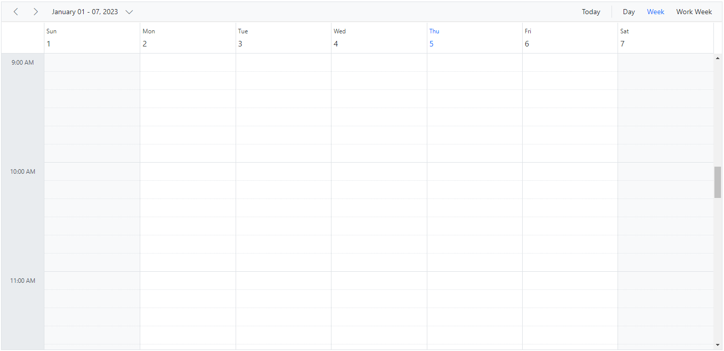
Customizing time cells using template
The timeScale property provides template options for custom rendering:
-
majorSlotTemplate- The template option to be applied for major time slots. Here, the template accepts either the string or HTMLElement as template design and then the parsed design is displayed onto the time cells. The time details can be accessed within this template. -
minorSlotTemplate- The template option to be applied for minor time slots. Here, the template accepts either the string or HTMLElement as template design and then the parsed design is displayed onto the time cells. The time details can be accessed within this template.
<ejs-schedule width='100%' height='550px' [selectedDate]="selectedDate" [eventSettings]="eventSettings" [timeScale]="timeScale">
    <ng-template #timeScaleMajorSlotTemplate let-data>
        <div class="majorTime"></div>
    </ng-template>
    <ng-template #timeScaleMinorSlotTemplate let-data>
        <div class="minorTime"></div>
    </ng-template>
</ejs-schedule>
import { NgModule } from '@angular/core'
import { BrowserModule } from '@angular/platform-browser'
import { ScheduleModule } from '@syncfusion/ej2-angular-schedule'
import { TimePickerModule } from '@syncfusion/ej2-angular-calendars'
import { Component } from '@angular/core';
import { EventSettingsModel, TimeScaleModel, DayService, WeekService, WorkWeekService, MonthService, AgendaService, MonthAgendaService } from '@syncfusion/ej2-angular-schedule';
import { scheduleData } from './datasource';
import { Internationalization } from '@syncfusion/ej2-base';
@Component({
imports: [
ScheduleModule,
TimePickerModule
],
standalone: true,
selector: 'app-root',
providers: [DayService, WeekService, WorkWeekService, MonthService, AgendaService, MonthAgendaService],
// specifies the template string for the Schedule component
templateUrl: './app.component.html'
})
export class AppComponent {
public selectedDate: Date = new Date(2018, 1, 15);
public timeScale: TimeScaleModel = {
enable: true,
interval: 60,
slotCount: 6,
majorSlotTemplate: '#majorSlotTemplate',
minorSlotTemplate: '#minorSlotTemplate'
};
public eventSettings: EventSettingsModel = { dataSource: scheduleData };
public instance: Internationalization = new Internationalization();
getMajorTime(date: Date): string {
return this.instance.formatDate(date, { skeleton: 'hm' });
}
getMinorTime(date: Date): string {
return this.instance.formatDate(date, { skeleton: 'ms' }).replace(':00', '');
}
}import { bootstrapApplication } from '@angular/platform-browser';
import { AppComponent } from './app.component';
import 'zone.js';
bootstrapApplication(AppComponent).catch((err) => console.error(err));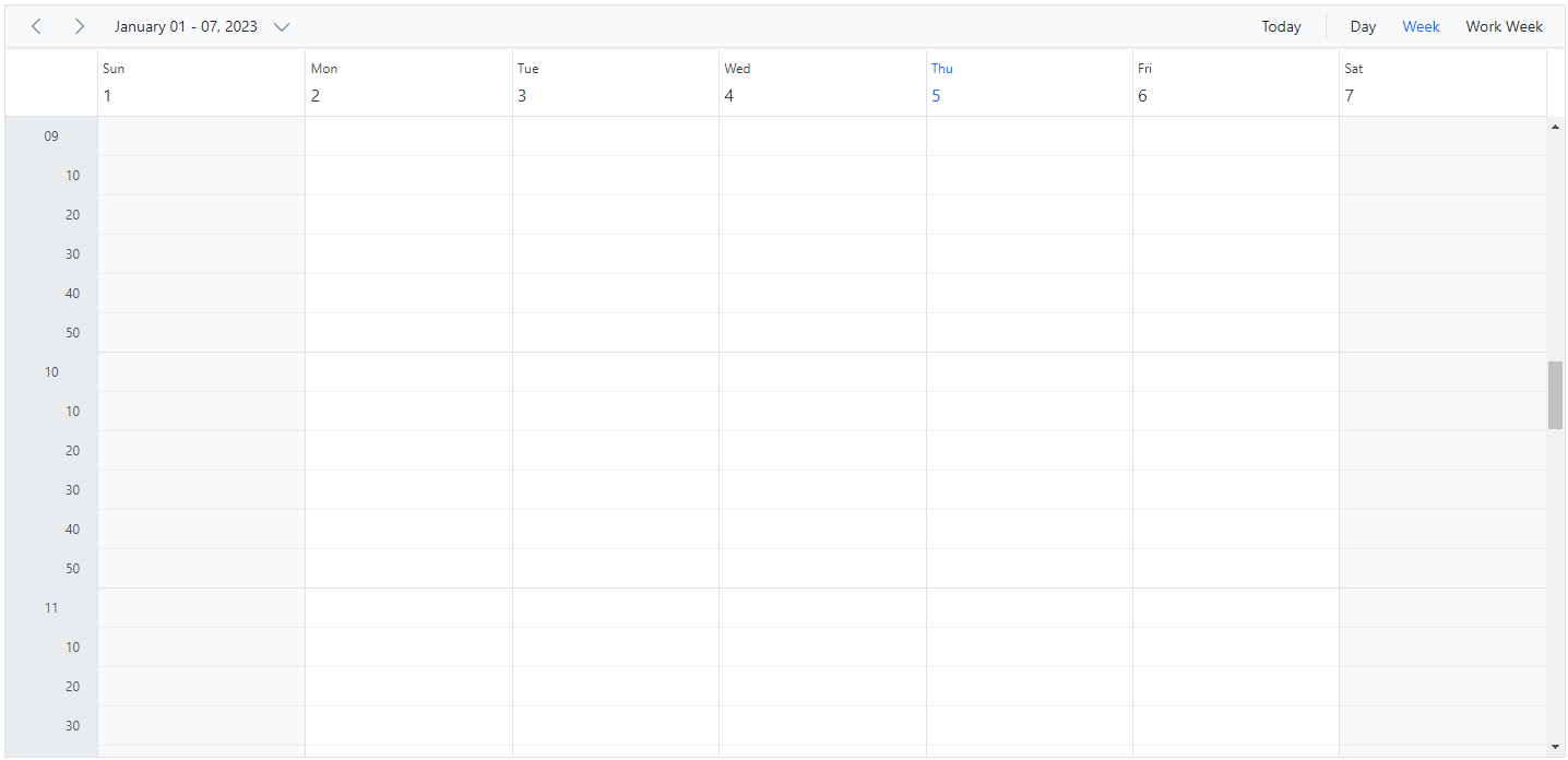
Hide the timescale
The grid lines which indicates the exact time duration can be enabled or disabled on the Scheduler, by setting true or false to the enable option within the timeScale property. It’s default value is true.
import { NgModule } from '@angular/core'
import { BrowserModule } from '@angular/platform-browser'
import { ScheduleModule } from '@syncfusion/ej2-angular-schedule'
import { ButtonModule } from '@syncfusion/ej2-angular-buttons'
import { DayService, WeekService, WorkWeekService, MonthService, AgendaService, MonthAgendaService} from '@syncfusion/ej2-angular-schedule'


import { Component } from '@angular/core';
import { EventSettingsModel, TimeScaleModel} from '@syncfusion/ej2-angular-schedule';
import { scheduleData } from './datasource';

@Component({
imports: [

        ScheduleModule,
        ButtonModule
    ],

providers: [DayService,
                WeekService,
                WorkWeekService,
                MonthService,
                AgendaService,
                MonthAgendaService],
standalone: true,
  selector: 'app-root',
  // specifies the template string for the Schedule component
  template: `<ejs-schedule width='100%' height='550px' [selectedDate]="selectedDate" [eventSettings]="eventSettings"  [timeScale]="timeScale" > </ejs-schedule>`
})
export class AppComponent {
    public selectedDate: Date = new Date(2018, 1, 15);
    public timeScale: TimeScaleModel = { enable: false };
    public eventSettings: EventSettingsModel = { dataSource: scheduleData };
 }
import { bootstrapApplication } from '@angular/platform-browser';
import { AppComponent } from './app.component';
import 'zone.js';
bootstrapApplication(AppComponent).catch((err) => console.error(err));
Highlighting current date and time
By default, Scheduler indicates current date with a highlighted date header on all views, as well as marks accurately the system’s current time on specific views such as Day, Week, Work Week, Timeline Day, Timeline Week and Timeline Work Week views. To stop highlighting the current time indicator on Scheduler views, set false to the showTimeIndicator property which defaults to true.
import { NgModule } from '@angular/core'
import { BrowserModule } from '@angular/platform-browser'
import { ScheduleModule } from '@syncfusion/ej2-angular-schedule'
import { ButtonModule } from '@syncfusion/ej2-angular-buttons'
import { DayService, WeekService, WorkWeekService, MonthService, AgendaService, MonthAgendaService} from '@syncfusion/ej2-angular-schedule'


import { Component } from '@angular/core';
import { EventSettingsModel, TimeScaleModel } from '@syncfusion/ej2-angular-schedule';
import { scheduleData } from './datasource';

@Component({
imports: [

        ScheduleModule,
        ButtonModule
    ],

providers: [DayService,
                WeekService,
                WorkWeekService,
                MonthService,
                AgendaService,
                MonthAgendaService],
standalone: true,
  selector: 'app-root',
  // specifies the template string for the Schedule component
  template: `<ejs-schedule width='100%' height='550px' [eventSettings]="eventSettings"  [showTimeIndicator]="showTimeIndicator" > </ejs-schedule>`
})
export class AppComponent {
    public showTimeIndicator: boolean = true;
    public eventSettings: EventSettingsModel = { dataSource: scheduleData };
 }
import { bootstrapApplication } from '@angular/platform-browser';
import { AppComponent } from './app.component';
import 'zone.js';
bootstrapApplication(AppComponent).catch((err) => console.error(err));
You can refer to our Angular Scheduler feature tour page for its groundbreaking feature representations. You can also explore our Angular Scheduler example to knows how to present and manipulate data.