Getting started with the Angular Predefined Dialogs component
26 Feb 202617 minutes to read
This section explains how to create a simple predefined dialog and demonstrates the basic usage of predefined dialogs in an Angular environment.
Note: This guide supports Angular 21 and other recent Angular versions. For detailed compatibility with other Angular versions, please refer to the Angular version support matrix. Starting from Angular 19, standalone components are the default, and this guide reflects that architecture.
Ready to streamline your Syncfusion® Angular development? Discover the full potential of Syncfusion® Angular components with Syncfusion® AI Coding Assistant. Effortlessly integrate, configure, and enhance your projects with intelligent, context-aware code suggestions, streamlined setups, and real-time insights—all seamlessly integrated into your preferred AI-powered IDEs like VS Code, Cursor, Syncfusion® CodeStudio and more. Explore Syncfusion® AI Coding Assistant
Prerequisites
Ensure your development environment meets the System Requirements for Syncfusion Angular UI Components.
Dependencies
|-- @syncfusion/ej2-popups
    |-- @syncfusion/ej2-base
    |-- @syncfusion/ej2-buttons
SetUp the Angular application
A straightforward approach to beginning with Angular is to create a new application using the Angular CLI. Install Angular CLI globally with the following command:
npm install -g @angular/cliAngular 21 Standalone Architecture: Standalone components are the default in Angular 21. This guide uses the modern standalone architecture. If you need more information about the standalone architecture, refer to the Standalone Guide.
Installing a specific version
To install a particular version of Angular CLI, use:
npm install -g @angular/[email protected]Create a new application
With Angular CLI installed, execute this command to generate a new application:
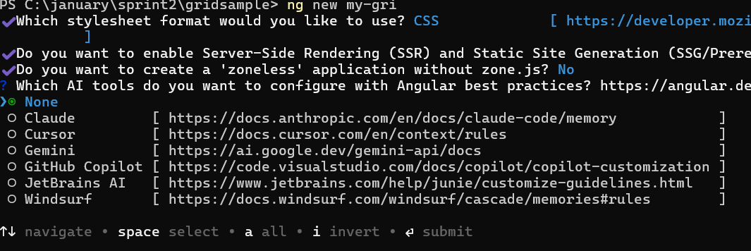
ng new syncfusion-angular-app- This command will prompt you to configure settings like enabling Angular routing and choosing a stylesheet format.
? Which stylesheet format would you like to use? (Use arrow keys)
> CSS             [ https://developer.mozilla.org/docs/Web/CSS                     ]
  Sass (SCSS)     [ https://sass-lang.com/documentation/syntax#scss                ]
  Sass (Indented) [ https://sass-lang.com/documentation/syntax#the-indented-syntax ]
Less [ http://lesscss.org ]- By default, a CSS-based application is created. Use SCSS if required:
ng new syncfusion-angular-app --style=scss- During project setup, when prompted for the Server-side rendering (SSR) option, choose the appropriate configuration.

- Select the required AI tool or ‘none’ if you do not need any AI tool.
- Navigate to your newly created application directory:
cd syncfusion-angular-appNote: In Angular 19 and below, it uses
app.component.ts,app.component.html,app.component.cssetc. In Angular 20+, the CLI generates a simpler structure withsrc/app/app.ts,app.html, andapp.css(no.component.suffixes).
Installing Syncfusion® Popups package
Syncfusion®’s Angular component packages are available on npmjs.com. To use Syncfusion® Angular components, install the necessary package.
This guide uses the Angular Dialog component for demonstration. Add the Angular Dialog component component with:
ng add @syncfusion/ej2-angular-popupsThis command will perform the following configurations:
- Add the
@syncfusion/ej2-angular-popupspackage and peer dependencies to yourpackage.json. - Import the Dialog component component in your application.
- Register the default Syncfusion® material theme in
angular.json.
For more details on version compatibility, refer to the Version Compatibility section.
Syncfusion® offers two package structures for Angular components:
- Ivy library distribution package format
- Angular compatibility compiler (ngcc), which is Angular’s legacy compilation pipeline.
Syncfusion®’s latest Angular packages are provided as Ivy-compatible and suited for Angular 12 and above. To install the package, execute:ng add @syncfusion/ej2-angular-popupsFor applications not compiled with Ivy, use the
ngcctagged packages:The ngcc packages are still compatible with Angular CLI versions 15 and below. However, they may generate warnings suggesting the use of IVY compiled packages. Starting from Angular 16, support for the ngcc package has been completely removed. If you have further questions regarding ngcc compatibility, please refer to the following FAQ.
npm add @syncfusion/[email protected]
Adding CSS reference
Syncfusion® Angular component themes can be added in various ways: via CSS or SCSS styles from npm packages, CDN, CRG, or Theme Studio.
The Material theme is added to your styles.css when you run ng add (this happens automatically by default).
To stylize only specific Syncfusion® components, import the necessary styles. For example, to style only the Dialog component:
@import '../node_modules/@syncfusion/ej2-base/styles/material3.css';
@import '../node_modules/@syncfusion/ej2-icons/styles/material3.css';
@import '../node_modules/@syncfusion/ej2-buttons/styles/material3.css';
@import '../node_modules/@syncfusion/ej2-angular-popups/styles/material3.css';
Ensure that the import order aligns with the component’s dependency sequence.
For using SCSS styles, refer to this guide.
Adding Dialog component
Use the following snippet in the src/app/app.ts file to import the Dialog component.
import { Component } from '@angular/core';
import { DialogModule } from '@syncfusion/ej2-angular-popups';
import { ButtonModule } from '@syncfusion/ej2-angular-buttons';
import { DialogUtility } from '@syncfusion/ej2-popups';

@Component({
  selector: 'app-root',
  standalone: true,
  imports: [DialogModule, ButtonModule],
  template: `
    <button ejs-button cssClass="e-primary" (click)="showAlert()">Show Alert</button>
    <button ejs-button cssClass="e-success" (click)="showConfirm()" style="margin-left:10px;">
      Show Confirm
    </button>
  `,
})

export class App {
  // ---- Predefined Alert ----
  showAlert(): void {
    DialogUtility.alert({
      title: 'Alert',
      content: 'This is a simple predefined Alert dialog.',
      width: '250px'
    });
  }

  // ---- Predefined Confirm ----
  showConfirm(): void {
    DialogUtility.confirm({
      title: 'Confirm',
      content: 'Are you sure you want to continue?',
      width: '280px'
    });
  }
}
Running the application
Run the ng serve command in a terminal to serve your application, then open it in a browser.
ng serveRender a dialog using utility functions
The dialog component provides built-in utility functions to render alert and confirm dialogs with minimal code.
The following options are used as arguments when calling the utility functions:
| Options | Description |
|---|---|
| title | Specifies the dialog title similar to the header property. |
| content | Specifies the value displayed in the dialog content area similar to the content property. |
| isModal | Specifies whether the dialog is displayed as modal or non-modal. For more details, refer to the isModal property. |
| position | Specifies where the alert or confirm dialog is positioned within the document. For more details, refer to the position property. Example: position: { X: 'center', Y: 'center' }. |
| okButton | Configures the OK button with button properties and click event. Example: okButton: { icon: 'prefix icon', cssClass: 'custom-class', click: /* OK action */, text: 'Yes' } (default text is OK). |
| cancelButton | Configures the Cancel button with button properties and click event. Example: cancelButton: { icon: 'prefix icon', cssClass: 'custom-class', click: /* Cancel action */, text: 'No' } (default text is Cancel). |
| isDraggable | Specifies whether the alert or confirm dialog can be dragged by the user. |
| showCloseIcon | When set to true, the close icon is shown in the dialog component. |
| closeOnEscape | When set to true, the dialog can be closed by pressing the ESC key. |
| animationSettings | Specifies the animation settings of the dialog component. |
| cssClass | Specifies the CSS class name appended to the dialog. |
| zIndex | Specifies the z-index of the dialog, controlling whether it appears in front of or behind other components. |
| open | Event that is triggered after the dialog is opened. |
| close | Event that is triggered after the dialog is closed. |
Alert dialog
An alert dialog box is used to display errors, warnings, and information that require user awareness. The alert dialog is displayed with an OK button. When the user clicks the OK button, the alert dialog closes. Use the following code to render a simple alert dialog in an application.
import { DialogModule } from '@syncfusion/ej2-angular-popups';
import { ButtonModule } from '@syncfusion/ej2-angular-buttons';
import { Component, OnInit } from '@angular/core';
import { DialogUtility } from '@syncfusion/ej2-popups';

@Component({
  imports: [DialogModule, ButtonModule],
  standalone: true,
  selector: 'app-root',
  template: `<button ejs-button cssClass="e-danger" #alertButton (click)="alertBtnClick()">Alert</button><span id="statusText"></span>`,
})

export class AppComponent implements OnInit {
  ngOnInit(): void {
    throw new Error('Method not implemented.');
  }
  public dialogObj: any;
  public alertBtnClick = (): void => {
    document.getElementById('statusText')!.style.display = 'none';
    this.dialogObj = DialogUtility.alert({
      title: 'Low Battery',
      content: '10% of battery remaining',
      width: '250px',
      okButton: { click: this.alertOkAction.bind(this) },
    });
  };
  private alertOkAction(): void {
    this.dialogObj.hide();
    document.getElementById('statusText')!.innerHTML =
      'The user closed the Alert dialog.';
    document.getElementById('statusText')!.style.display = 'block';
  }
}
import { bootstrapApplication } from '@angular/platform-browser';
import { AppComponent } from './app.component';
import 'zone.js';
bootstrapApplication(AppComponent).catch((err) => console.error(err));Confirm dialog
A confirm dialog box displays a specified message along with OK and Cancel buttons. It is used to get approval from the user and typically appears before a critical action. After the user responds, the dialog disappears automatically. Use the following code to render a simple confirm dialog in an application.
import { DialogModule } from '@syncfusion/ej2-angular-popups';
import { ButtonModule } from '@syncfusion/ej2-angular-buttons';
import { Component, OnInit } from '@angular/core';
import { DialogUtility } from '@syncfusion/ej2-popups';

@Component({
  imports: [DialogModule, ButtonModule],
  standalone: true,
  selector: 'app-root',
  template: `<button ejs-button cssClass="e-success" #confirmButton (click)="confirmBtnClick()">Confirm</button><span id="statusText"></span>`
})

export class AppComponent implements OnInit {
  ngOnInit(): void {
    throw new Error('Method not implemented.');
  }
  public dialogObj: any;
  public confirmBtnClick = (): void => {
    document.getElementById('statusText')!.style.display = 'none';
    this.dialogObj = DialogUtility.confirm({
      title: 'Delete Multiple Items',
      content: 'Are you sure you want to permanently delete these items?',
      width: '300px',
      okButton: { click: this.confirmOkAction.bind(this) },
      cancelButton: { click: this.confirmCancelAction.bind(this) }
    });
  };
  private confirmOkAction(): void {
    this.dialogObj.hide();
    document.getElementById('statusText')!.innerHTML =
      'The user confirmed the dialog box';
    document.getElementById('statusText')!.style.display = 'block';
  }
  private confirmCancelAction(): void {
    this.dialogObj.hide();
    document.getElementById('statusText')!.innerHTML =
      'The user canceled the dialog box.';
    document.getElementById('statusText')!.style.display = 'block';
  }
}
import { bootstrapApplication } from '@angular/platform-browser';
import { AppComponent } from './app.component';
import 'zone.js';
bootstrapApplication(AppComponent).catch((err) => console.error(err));Prompt dialog
A prompt dialog is used to get input from the user. When the user clicks the OK button, the input value from the dialog is returned. If the user clicks the Cancel button, a null value is returned. After receiving the input, the dialog disappears automatically.
import { DialogModule } from '@syncfusion/ej2-angular-popups';
import { ButtonModule } from '@syncfusion/ej2-angular-buttons';
import { Component, OnInit } from '@angular/core';
import { DialogUtility } from '@syncfusion/ej2-popups';

@Component({
  imports: [DialogModule, ButtonModule],
  standalone: true,
  selector: 'app-root',
  template: `<button ejs-button [isPrimary]="true" #promptButton (click)="promptBtnClick()">Prompt</button><span id="statusText"></span>`
})

export class AppComponent implements OnInit {
  ngOnInit(): void {
    throw new Error('Method not implemented.');
  }
  public dialogObj: any;
  public promptBtnClick = (): void => {
    document.getElementById('statusText')!.style.display = 'none';
    this.dialogObj = DialogUtility.confirm({
      title: 'Join Chat Group',
      width: '300px',
      content: '<p>Enter your name:</p> <input id= "inputEle" type="text" name="Required" class="e-input" placeholder="Type here.." />',
      okButton: { click: this.promptOkAction.bind(this) },
      cancelButton: { click: this.promptCancelAction.bind(this) },
    });
  };
  private promptOkAction(): void {
    let value: string;
    value = (document.getElementById('inputEle') as any).value;
    if (value == '') {
      this.dialogObj.hide();
      document.getElementById('statusText')!.innerHTML =
        'The user\'s input is returned as" " ';
      document.getElementById('statusText')!.style.display = 'block';
    } else {
      this.dialogObj.hide();
      document.getElementById('statusText')!.innerHTML =
        "The user's input is returned as" + ' ' + value;
      document.getElementById('statusText')!.style.display = 'block';
    }
  }
  private promptCancelAction(): void {
    this.dialogObj.hide();
    document.getElementById('statusText')!.innerHTML =
      'The user canceled the prompt dialog';
    document.getElementById('statusText')!.style.display = 'block';
  }
}
import { bootstrapApplication } from '@angular/platform-browser';
import { AppComponent } from './app.component';
import 'zone.js';
bootstrapApplication(AppComponent).catch((err) => console.error(err));