Headers in Angular Grid Component
11 Jun 202624 minutes to read
Column headers in the Angular Data Grid display the titles for each column, making it clear what data is shown. They provide context and make the grid easier to read and navigate. Headers can be customized by adjusting text alignment, applying templates, stacking multiple headers, or updating them dynamically, offering flexibility to design the grid as needed.
Header text
In the Angular Data Grid, the headerText property of the ColumnDirective defines the label shown in a column’s header; when this property is not set, the column automatically displays its field value, so assigning header text provides a more descriptive label in place of the field name.
To enable the headerText property, define it in the e-column element. The following example demonstrates enabling header text for a Grid column.
import { data } from './datasource';
import { Component, OnInit } from '@angular/core';
import { GridModule } from '@syncfusion/ej2-angular-grids';

@Component({
    imports: [ GridModule ],
    standalone: true,
    selector: 'app-root',
    template: `<ejs-grid [dataSource]='data' height='315px'>
                <e-columns>
                    <e-column field='OrderID' headerText='Order ID' textAlign='Right'
                    width=120></e-column>
                    <e-column field='CustomerID' headerText='Customer ID' width=140>
                    </e-column>
                    <e-column field='Freight' headerText='Freight' textAlign='Right'
                    format='C' width=120></e-column>
                    <e-column field='OrderDate' headerText='Order Date' textAlign='Right'
                    format='yMd' width=140></e-column>
                </e-columns>
               </ejs-grid>`
})
export class AppComponent implements OnInit {

    public data?: object[];

    ngOnInit(): void {
        this.data = data;
    }
}
import { bootstrapApplication } from '@angular/platform-browser';
import { AppComponent } from './app.component';
import 'zone.js';
bootstrapApplication(AppComponent).catch((err) => console.error(err));
- The
headerTextproperty is optional. If not defined, the corresponding column’s field value is set as header text for that column.- The headerTemplate property can be used to apply custom HTML content to the header cell.
- If both the
fieldandheaderTextare not defined in the column, the column renders with empty header text.
Header template
The headerTemplate property provides full control over customizing column header cells. Instead of plain text, the header can render custom HTML elements or Angular components, such as icons, styled labels, or interactive elements, to create a richer and more engaging design.
The following example demonstrates custom elements rendered for the “Customer ID”, “Freight”, and “Order Date” column headers.
import { GridModule } from '@syncfusion/ej2-angular-grids';
import { DropDownListAllModule } from '@syncfusion/ej2-angular-dropdowns';
import { ButtonModule, SwitchModule, ChangeEventArgs  } from '@syncfusion/ej2-angular-buttons';
import { Component, OnInit } from '@angular/core';
import { data } from './datasource';

@Component({
  imports: [ GridModule, DropDownListAllModule, ButtonModule,SwitchModule ],
  standalone: true,
  selector: 'app-root',
  template: `<ejs-grid [dataSource]="data" height="315px">
              <e-columns>
                <e-column field="OrderID" headerText="Order ID" textAlign="Right" width="120"></e-column>
                <e-column field="CustomerID" headerText="Customer ID" width="140">
                  <ng-template #headerTemplate let-data>
                    <div>
                      <span class="e-icon-userlogin e-icons employee"></span> Customer ID
                    </div>
                  </ng-template>
                </e-column>
                <e-column field="Freight" headerText="Freight" format="C" width="120">
                  <ng-template #headerTemplate let-data>
                    <div>
                      <ejs-dropdownlist index="0" width="130" [dataSource]="dropdownData">
                      </ejs-dropdownlist>
                    </div>
                  </ng-template>
                </e-column>
                <e-column field="OrderDate" textAlign="Right" format="yMd" width="140">
                  <ng-template #headerTemplate let-data>
                    <div>
                      <ejs-switch (change)="onSwitchToggle($event)"></ejs-switch>
                      <label style="padding: 0px 0px 0px 10px">{{ headerText }}</label>
                    </div>
                  </ng-template>
                </e-column>
              </e-columns>
           </ejs-grid>`
})
export class AppComponent implements OnInit {

  public data: Object[] = [];
  public dropdownData: string[] = [];
  public headerText: string = 'Order Date';

  ngOnInit() {
    this.data = data;
    this.dropdownData = ['Freight', 'Shipment', 'Cargo'];
  }
  onSwitchToggle(args:ChangeEventArgs) {
    this.headerText = args.checked ? 'Purchase Date' : 'Order Date';
  }

}
import { bootstrapApplication } from '@angular/platform-browser';
import { AppComponent } from './app.component';
import 'zone.js';
bootstrapApplication(AppComponent).catch((err) => console.error(err));
- The
headerTemplateproperty applies only to Grid columns that have a header element.- Any HTML or Angular component can be used in the header template to add functionality to the header element.
Stacked header
Stacked headers enable hierarchical organization of column headers by grouping related columns under parent headers. This feature is useful for complex data layouts where columns need logical grouping for better readability and organization. Stacked headers are implemented using the ColumnDirective property to define an array of column objects as sub-headers under a main header.
The headerText property of each sub-header column sets the display text. The appearance of stacked header elements can be customized using the headerTemplate property, which accepts a template reference enabling definition of custom HTML elements or Angular components.
import { GridModule,PageService,ColumnModel } from '@syncfusion/ej2-angular-grids';
import { DropDownListAllModule } from '@syncfusion/ej2-angular-dropdowns';
import { Component, OnInit } from '@angular/core';
import { orderDetails } from './datasource';

@Component({
  imports: [ GridModule,DropDownListAllModule],
  providers: [PageService],
  standalone: true,
  selector: 'app-root',
  template: `<div>
              <ejs-grid [dataSource]="data" allowPaging="true">
                <e-columns>
                  <e-column field="OrderID" width="120" textAlign="Center">
                    <ng-template #headerTemplate let-data>
                      <div>
                        <a href="#">OrderID</a>
                      </div>
                    </ng-template>
                  </e-column>
                  <e-column headerText="Order Details" [columns]="orderColumns">
                    <ng-template #headerTemplate let-data>
                      <div>
                        <ejs-dropdownlist index="0"
                        [dataSource]="dropdownData">
                        </ejs-dropdownlist>
                      </div>
                    </ng-template>
                  </e-column>
                  <e-column headerText="Ship Details" [columns]="shipColumns">
                    <ng-template #headerTemplate let-column>
                      <div>
                        <span>{{ column.headerText }}</span>
                        <span>(<i class="fa fa-truck"></i>)</span>
                      </div>
                    </ng-template>
                  </e-column>
                </e-columns>
              </ejs-grid>
            </div>`
})
export class AppComponent implements OnInit {

  public data?: Object[] = [];
  public orderColumns?: ColumnModel[];
  public shipColumns?: ColumnModel[];
  public dropdownData?: string[];

  public ngOnInit(): void {

    this.data = orderDetails;
    this.orderColumns = [
      {
        field: 'OrderDate',
        headerText: 'Order Date',
        format: 'yMd',
        width: 130,
        textAlign: 'Right',
        minWidth: 10,
      },
      {
        field: 'Freight',
        headerText: 'Freight ($)',
        width: 120,
        format: 'C1',
        textAlign: 'Right',
        minWidth: 10,
      },
    ];

    this.shipColumns = [
      {
        field: 'ShippedDate',
        headerText: 'Shipped Date',
        format: 'yMd',
        textAlign: 'Right',
        width: 150,
        minWidth: 10,
      },
      {
        field: 'ShipCountry',
        headerText: 'Ship Country',
        width: 150,
        minWidth: 10,
      },
    ];

    this.dropdownData = ['Order Details', 'Order Information'];
  }

}
import { bootstrapApplication } from '@angular/platform-browser';
import { AppComponent } from './app.component';
import 'zone.js';
bootstrapApplication(AppComponent).catch((err) => console.error(err));Header text alignment
Header text alignment improves readability and visual organization of the grid. The headerTextAlign property controls text positioning inside column headers. By default, header text is aligned to the left, but it can be changed to better match the data or design. Supported options are:
-
Left: Aligns text to the left (default). -
Center: Aligns text to the center. -
Right: Aligns text to the right. -
Justify: Justifies header text.
The following example demonstrates dynamically changing the alignment of the header text based on DropDown selection:
import { data } from './datasource';
import { Component, ViewChild } from '@angular/core';
import { DropDownListAllModule } from '@syncfusion/ej2-angular-dropdowns';
import { Column, GridComponent, GridModule, PageService, TextAlign } from '@syncfusion/ej2-angular-grids';
import { ChangeEventArgs } from '@syncfusion/ej2-dropdowns';

@Component({
  imports: [ GridModule, DropDownListAllModule],
  providers: [PageService],
  standalone: true,
  selector: 'app-root',
  template: `
      <div style="display: flex">
        <label style="padding: 5px 5px 0 0;">Align the text of header text :</label>
          <ejs-dropdownlist index="0" width="100"
          [dataSource]="alignmentData" (change)="changeAlignment($event)"></ejs-dropdownlist>
      </div>
            <div class="control-section" style="padding-top:5px">
              <ejs-grid #grid [dataSource]='data' height='295px' >
                <e-columns>
                  <e-column field='OrderID' headerText='Order ID' width=120 >
                  </e-column>
                  <e-column field='CustomerID' headerText='Customer ID' width=140 >
                  </e-column>
                  <e-column field='Freight' headerText='Freight'  format='C' width=120 >
                  </e-column>
                  <e-column field='OrderDate' headerText='Order Date' format='yMd' width=140>
                  </e-column>
                  </e-columns>
                </ejs-grid>
            </div>`
})
export class AppComponent {

  public data?: Object[] = data;
  @ViewChild('grid')
  public grid?: GridComponent;
  public alignmentData: Object[] = [
    { text: 'Left', value: 'Left' },
    { text: 'Right', value: 'Right' },
    { text: 'Center', value: 'Center' },
    { text: 'Justify', value: 'Justify' }
  ];

  public changeAlignment(args: ChangeEventArgs): void {
    (this.grid as GridComponent).columns.forEach((col) => {
      (col as Column).headerTextAlign = (args.value as TextAlign);
    });
    (this.grid as GridComponent).refreshHeader();
  }

}
import { bootstrapApplication } from '@angular/platform-browser';
import { AppComponent } from './app.component';
import 'zone.js';
bootstrapApplication(AppComponent).catch((err) => console.error(err));
- The
headerTextAlignproperty only changes the alignment of the text in the column header, not the content of the column. To align both the column header and content, use the textAlign property.- The
headerTextAlignproperty also works with the stacked header feature in Syncfusion® Grid, aligning the header text in sub-headers as well.
Autowrap the header text
Header text wrapping enables proper display of lengthy column names or descriptive labels within defined column widths. When content exceeds boundary limits, automatic wrapping to multiple lines maintains readability and prevents text overflow. The Angular Data Grid supports configurable text wrapping with options to wrap headers only, content only, or both, optimizing space usage without sacrificing information clarity.
To enable autowrap, set the allowTextWrap property to true. The auto wrap mode can be configured using the textWrapSettings.wrapMode property.
Grid provides the below three options for configuring:
-
Both: This is the default value for wrapMode. With this option, both the grid header text and content is wrapped. -
Header: With this option, only the grid header text is wrapped. -
Content: With this option, only the grid content is wrapped.
- If a
ColumnDirectivewidth is not specified, then the Autowrap of columns will be adjusted with respect to the grid’s width.- If a
ColumnDirectiveheader text contains no white space, the text may not be wrapped.- If the content of a cell contains HTML tags, the Autowrap functionality may not work as expected. In such cases, use the headerTemplate and template properties of the column to customize the appearance of the header and cell content.
In the following example, the textWrapSettings.wrapMode property is set to Header to wrap only the grid header text to the next line.
import { inventoryData } from './datasource';
import { Component, ViewChild } from '@angular/core';
import { ButtonModule } from '@syncfusion/ej2-angular-buttons';
import { ChangeEventArgs, DropDownListAllModule } from '@syncfusion/ej2-angular-dropdowns';
import { GridComponent, GridModule, PageService, TextWrapSettingsModel, WrapMode } from '@syncfusion/ej2-angular-grids';

@Component({
  imports: [ GridModule, ButtonModule, DropDownListAllModule],
  providers: [PageService],
  standalone: true,
  selector: 'app-root',
  template: `
    <div style="display: flex">
        <label style="padding: 5px 5px 0 0" >Autowrap for header column :</label>
        <ejs-dropdownlist index="0" width="100" [dataSource]=" dropdownData" (change)="valueChange($event)"></ejs-dropdownlist>
    </div>
    <div style="padding-top:5px">
      <ejs-grid #grid [dataSource]='data' allowPaging='true' allowTextWrap='true' [textWrapSettings]='wrapSettings' height='240'>
        <e-columns>
          <e-column field='Inventor' headerText='Inventor Name' width='180' textAlign="Right"></e-column>
          <e-column field='NumberofPatentFamilies' headerText="Number of Patent Families" width='180' textAlign="Right"></e-column>
          <e-column field='Country' headerText='Country' width='140'></e-column>
          <e-column field='Active' width='120'></e-column>
          <e-column field='Mainfieldsofinvention' headerText='Main Fields Of Invention' width='200'></e-column>
        </e-columns>
      </ejs-grid>
    </div>`
})
export class AppComponent {

  public data?: Object[] = inventoryData;

  @ViewChild('grid')
  public grid?: GridComponent;

  public wrapSettings: TextWrapSettingsModel = { wrapMode: 'Header' };
  public dropdownData: Object[] = [
    { text: 'Header', value: 'Header' },
    { text: 'Both', value: 'Both' },
  ];

  valueChange(args: ChangeEventArgs): void {
    (this.grid as GridComponent).textWrapSettings.wrapMode = (args.value as WrapMode);
  }

}
import { bootstrapApplication } from '@angular/platform-browser';
import { AppComponent } from './app.component';
import 'zone.js';
bootstrapApplication(AppComponent).catch((err) => console.error(err));Change the height of header
When the default header height is not sufficient to display content, it can be adjusted to fit the design requirements. This is especially useful when headers are customized with a header template that includes icons, images, or multi‑line text. Header height can be modified using CSS styles or dynamic methods, ensuring that all content is visible and the grid remains well‑organized.
Using CSS
Use CSS to override the default height of the .e-grid .e-headercell class to change the height of the header.
.e-grid .e-headercell {
  height: 130px;
}
Using methods
To dynamically adjust the header height, use the getHeaderContent method to retrieve the header content element. Then use querySelectorAll to access all header cell elements with the class e-headercell and adjust their height via the style property.
import { data } from './datasource';
import { Component, OnInit, ViewChild } from '@angular/core';
import { ButtonModule } from '@syncfusion/ej2-angular-buttons';
import { GridComponent, GridModule } from '@syncfusion/ej2-angular-grids';

@Component({
  imports: [ GridModule,ButtonModule],
  standalone: true,
  selector: 'app-root',
  template: `<div >
              <button ejs-button id="small" cssClass="e-small"
              (click)="changeHeaderHeight($event)">
              Change height 20px</button>
              <button ejs-button id="medium" cssClass="e-small"
              (click)="changeHeaderHeight($event)">
              Default height 42px</button>
              <button ejs-button  id="big" cssClass="e-small"
              (click)="changeHeaderHeight($event)">
              Change height 60px</button>
            </div>
            <div class="control-section" style="padding-top:20px">
              <ejs-grid #grid [dataSource]="data">
                <e-columns>
                  <e-column field='OrderID' headerText='Order ID' width=120></e-column>
                  <e-column field='CustomerID' headerText='Customer ID' width=140></e-column>
                  <e-column field='Freight' headerText='Freight' format='C' width=120>
                  </e-column>
                  <e-column field='OrderDate' headerText='Order Date' format='yMd' width=140>
                  </e-column>
                </e-columns>
              </ejs-grid>
            <div>`
})
export class AppComponent implements OnInit {

  public data?: Object[];
  @ViewChild('grid')
  public grid?: GridComponent;

  ngOnInit(): void {
    this.data = data;
  }
  changeHeaderHeight(event: MouseEvent): void {
    const heightMap: { [key: string]: string } = {
      small: '20px',
      medium: '42px',
      big: '60px'
    };    const headerCells = (this.grid as GridComponent).getHeaderContent().querySelectorAll('.e-headercell');
    headerCells.forEach((headerCell:Element) => {
      (headerCell as HTMLElement).style.height = (heightMap)[
        (event.target as HTMLButtonElement).id
      ];
    });
  }

}
import { bootstrapApplication } from '@angular/platform-browser';
import { AppComponent } from './app.component';
import 'zone.js';
bootstrapApplication(AppComponent).catch((err) => console.error(err));
- The getHeaderTable method can also be used to access the header table element for adjustment.
- The header row height cannot be reduced below the default height of “42px” using the
e-columnheaderclass.
Change header text dynamically
Dynamic header modification is essential for interactive grids where header content needs to change based on input, runtime conditions, or business logic. The Angular Data Grid component enables real-time modification of column header text through events or property accessors. This feature is particularly useful in scenarios such as localization, conditional labeling, or updating headers based on applied filters or grouping.
Using Event:
The headerCellInfo event of the Angular Data Grid enables modification of header text dynamically. This event triggers for each header cell element rendered in the Grid. When the headerCellInfo event triggers, it provides a HeaderCellInfoEventArgs object containing the following properties:
-
cell: Defines the header cell that is being modified. -
node: Defines the DOM element of the header cell that is being modified.
These properties can be used to access and modify the header text of the corresponding column. Once the header text is modified, refresh the Grid to reflect the changes by calling the refreshHeader method of the Grid.
Using method:
The Grid component provides several methods to change column header text dynamically:
| # | Method | Description |
|---|---|---|
| 1 | getColumnByField | Returns the entire column object corresponding to a field name, including properties such as header text, width, and alignment. |
| 2 | getColumnHeaderByField | Retrieves the header element of a column by its field name. Modify the textContent property to change header text. This method returns only the header element reference, not the column object. |
| 3 | getColumnIndexByField | Retrieves the column index by field name. Use with getColumnByIndex to retrieve the column object and modify its headerText property. |
| 4 | getColumnByUid | Retrieves the column object by its unique identifier (UID). Modify the headerText property to change header text. |
| 5 | getColumnHeaderByIndex | Retrieves the header element by its zero-based index. Modify the textContent property to change header text. |
| 6 | getColumnIndexByUid | Retrieves the column index by unique identifier. Use with getColumnByIndex to modify the headerText property. |
| 7 | getColumnHeaderByUid | Retrieves the header element by its unique identifier. Modify the textContent property to change header text. If the column has only a template without a defined field, this method provides access to the header element. |
- When header text is changed dynamically, the Grid must be refreshed by calling the refreshHeader method to reflect the changes.
- UIDs are automatically generated by the Grid component and may change when the grid is refreshed or updated.
Here is an example of changing the header text of a column using the getColumnByField method:
import { data } from './datasource';
import { Component, ViewChild } from '@angular/core';
import { ButtonModule } from '@syncfusion/ej2-angular-buttons';
import { DropDownListAllModule, DropDownListComponent } from '@syncfusion/ej2-angular-dropdowns';
import { GridComponent, GridModule, PageService } from '@syncfusion/ej2-angular-grids';
import { TextBoxComponent, TextBoxModule } from '@syncfusion/ej2-angular-inputs';

@Component({
  imports: [ GridModule,ButtonModule,DropDownListAllModule,TextBoxModule],
  providers: [PageService],
  standalone: true,
  selector: 'app-root',
  template: `<div style="display: flex">
             <label style="padding: 30px 20px 0 0" > Select column name  :</label>
              <ejs-dropdownlist  #dropdown style="padding: 26px 0 0 0" index='0' width="220"
              [dataSource]="columns"  [fields]="field"></ejs-dropdownlist>
            </div>
            <div>
              <label style="padding: 30px 17px 0 0" >Enter new header text :</label>
              <ejs-textbox #textbox required placeholder="Enter new header text" width="220">
              </ejs-textbox>
              <button ejs-button style="margin-left: 10px" id="buttons" (click)="ChangeHeaderText()">Change</button>
            </div>
            <div style="padding: 20px 17px 0 0">
              <ejs-grid #grid [dataSource]="data" allowPaging='true'>
                <e-columns>
                  <e-column field="OrderID" headerText="Order ID" width="120"></e-column>
                  <e-column field="CustomerID" headerText="Customer ID" width="140">
                  </e-column>
                  <e-column field="Freight" headerText="Freight" format="C" width="120">
                  </e-column>
                  <e-column field="OrderDate" headerText="Order Date" format="yMd"
                   width="140"></e-column>
                </e-columns>
              </ejs-grid>
            </div>`
})
export class AppComponent {

  public data?: Object[] = data;
  public columns: Object[] = [
    { text: 'Order ID', value: 'OrderID' },
    { text: 'Customer ID', value: 'CustomerID' },
    { text: 'Freight', value: 'Freight' },
    { text: 'Order Date', value: 'OrderDate' },
  ];
  public field?: Object = { text: 'text', value: 'value' };
  @ViewChild('dropdown') public dropdown?: DropDownListComponent;
  @ViewChild('textbox') public textbox?: TextBoxComponent;
  @ViewChild('grid')
  public grid?: GridComponent;

  public ChangeHeaderText(): void {
    if ((this.textbox as TextBoxComponent).element.value.trim() !== '') {
      const column = (this.grid as GridComponent).getColumnByField(
        (((this.dropdown as DropDownListComponent).value as string))
      );
      column.headerText = (this.textbox as TextBoxComponent).element.value;
      (this.grid as GridComponent).refreshHeader();
    }
  }

}
import { bootstrapApplication } from '@angular/platform-browser';
import { AppComponent } from './app.component';
import 'zone.js';
bootstrapApplication(AppComponent).catch((err) => console.error(err));Conditional header text customization
The column headerValueAccessor property in Angular Data Grid enables customization of column header cell text. This is useful in scenarios requiring alternate language display, specific formatting, or additional header information. This property triggers every time the header cell renders. This property accepts a callback function with two arguments:
-
field: Represents the current field of the column. -
column: Represents the current column object.
- Use
headerValueAccessoronly to modify header text; avoid DOM operations such as adding or manipulating elements. Use the headerCellInfo event for DOM-related customizations.- The callback function should return a string representing the new header text.
- The refreshHeader method can be used to refresh only the column header after dynamically changing the header content.
- This property can be applied to individual columns or for all columns by adding it to the grid’s properties.
Here’s an example of using the headerValueAccessor property to change the header text of a column:
import { data } from './datasource';
import { Component, ViewChild } from '@angular/core';
import { ButtonModule } from '@syncfusion/ej2-angular-buttons';
import { DropDownListAllModule, DropDownListComponent } from '@syncfusion/ej2-angular-dropdowns';
import { ColumnModel, GridComponent, GridModule, PageService } from '@syncfusion/ej2-angular-grids';
import { TextBoxComponent, TextBoxModule } from '@syncfusion/ej2-angular-inputs';

@Component({
  imports: [ GridModule, ButtonModule, DropDownListAllModule,TextBoxModule],
  providers: [PageService],
  standalone: true,
  selector: 'app-root',
  template: `<div style="display: flex">
              <label style="padding: 30px 20px 0 0">Select column name:</label>
              <ejs-dropdownlist #dropdown style="padding: 26px 0 0 0" index='0' width="220"
              [dataSource]="columns" [fields]="field"></ejs-dropdownlist>
            </div>
            <div>
              <label style="padding: 30px 17px 0 0">Enter new header text:</label>
              <ejs-textbox #textbox required placeholder="Enter new header text" width="220">
              </ejs-textbox>
              <button ejs-button style="margin-left: 10px" id="buttons" (click)="changeHeaderText()">Change</button>
            </div>
            <div style="padding: 20px 17px 0 0">
              <ejs-grid #grid [dataSource]="data" allowPaging='true'>
                <e-columns>
                  <e-column field="OrderID" headerText="Order ID"
                  [headerValueAccessor]="headerValueAccessor" width="120"></e-column>
                  <e-column field="CustomerID" headerText="Customer ID"
                   [headerValueAccessor]="headerValueAccessor" width="140"></e-column>
                  <e-column field="Freight" headerText="Freight"
                  [headerValueAccessor]="headerValueAccessor" format="C" width="120">
                  </e-column>
                  <e-column field="OrderDate" headerText="Order Date"
                  [headerValueAccessor]="headerValueAccessor" format="yMd" width="140">
                  </e-column>
                </e-columns>
              </ejs-grid>
            </div>`
})
export class AppComponent {

  public data?: Object[] = data;
  public columns: Object[] = [
    { text: 'Order ID', value: 'OrderID' },
    { text: 'Customer ID', value: 'CustomerID' },
    { text: 'Freight', value: 'Freight' },
    { text: 'Order Date', value: 'OrderDate' },
  ];
  public field?: Object = { text: 'text', value: 'value' };

  @ViewChild('dropdown') public dropdown?: DropDownListComponent;
  @ViewChild('textbox') public textbox?: TextBoxComponent;
  @ViewChild('grid')
  public grid?: GridComponent;

  public headerValueAccessor = (field: string, columns: ColumnModel): void => {
    if (this.textbox && this.textbox.value && this.textbox.value.trim() !== ''
      && columns.field === (this.dropdown as DropDownListComponent).value) {
      columns.headerText = this.textbox.value;
    }
  };
  public changeHeaderText(): void {
    (this.grid as GridComponent).refreshHeader();
  }

}
import { bootstrapApplication } from '@angular/platform-browser';
import { AppComponent } from './app.component';
import 'zone.js';
bootstrapApplication(AppComponent).catch((err) => console.error(err));Changing the header text of all columns
To change header text for all columns, loop through the columns collection and set the headerText property for each column.
import { data } from './datasource';
import { Component, OnInit, ViewChild } from '@angular/core';
import { ButtonModule } from '@syncfusion/ej2-angular-buttons';
import { ColumnModel, GridComponent, GridModule } from '@syncfusion/ej2-angular-grids';

@Component({
    imports: [ GridModule,ButtonModule],
    standalone: true,
    selector: 'app-root',
    template: ` <button ejs-button cssClass="e-success" (click)='changeHeaderText()'>
                Change Header Text</button>
                <div style="padding: 20px 17px 0 0">
                    <ejs-grid #grid [dataSource]='data' [height]='280'>
                        <e-columns>
                            <e-column field='OrderID' textAlign='Right' width=90></e-column>
                            <e-column field='CustomerID' width=120></e-column>
                            <e-column field='Freight' textAlign='Right' format='C2' width=90>
                            </e-column>
                            <e-column field='ShipCity' width=120></e-column>
                        </e-columns>
                    </ejs-grid>
                </div>`
})
export class AppComponent implements OnInit {

    public data?: object[] = [];
    @ViewChild('grid')
    public grid?: GridComponent;
    public headerTextMap: { [key: string]: string } = {
        'OrderID': 'Order ID',
        'CustomerID': 'Customer ID',
        'Freight': 'Freight Charge',
        'ShipCity': 'Ship To City'
    };

    ngOnInit(): void {
        this.data = data;
    }
    changeHeaderText(): void {
        this.grid?.columns.forEach((column: ColumnModel | any) => {
            column.headerText = this.headerTextMap[column.field as string];
        });
        this.grid?.refreshHeader();
    }

}
import { bootstrapApplication } from '@angular/platform-browser';
import { AppComponent } from './app.component';
import 'zone.js';
bootstrapApplication(AppComponent).catch((err) => console.error(err));Change the orientation of header text
By default, column header text in the Grid is oriented horizontally. In data visualization scenarios especially grids with many columns where horizontal headers consume excessive space rotating the header text vertically, diagonally, or at a custom angle optimizes layout and enhances visual hierarchy and readability. This can be achieved by applying a custom CSS class to the header cell using the customAttributes property, then defining CSS transformations.
Follow these steps to change header text orientation in Grid:
Step 1: Create a CSS class with orientation style for grid header cell
Create a CSS class with the transform property to rotate header text “90” degrees. This class will be applied to the header cell using the customAttributes property.
.orientation .e-headercelldiv {
    transform: rotate(90deg);
}
Step 2: Add the custom CSS class to the grid column
Add the custom CSS class to a column using the customAttributes property.
For example, to add the “orientationcss” class to the “Freight” column:
<e-column field='Freight' headerText='Freight' textAlign='Center' format='C2' [customAttributes]='customAttributes' width=80></e-column>Step 3: Resize the header cell height
After adding the custom CSS class to a column, resize the header cell height to ensure the rotated header text displays fully using the following code:
setHeaderHeight(args) {
    let textWidth: number = document.querySelector('.orientation > div').scrollWidth;//Obtain the width of the headerText content.
    let headerCell: NodeList = document.querySelectorAll('.e-headercell');
    for(let i: number = 0; i < headerCell.length; i++) {
        (<HTMLElement>headerCell.item(i)).style.height = textWidth + 'px'; //Assign the obtained textWidth as the height of the headerCell.
    }
}
The following example demonstrates changing the orientation of the “Freight” column header text to “90” degrees:
import { data } from './datasource';
import { Component, OnInit } from '@angular/core';
import { GridModule } from '@syncfusion/ej2-angular-grids';

@Component({
    imports: [ GridModule ],
    standalone: true,
    selector: 'app-root',
    template: `<ejs-grid #grid [dataSource]='data' [height]='240'
                (created)='setHeaderHeight()'>
                    <e-columns>
                        <e-column field='OrderID' headerText='Order ID' textAlign='Right'
                         width=100>
                        </e-column>
                        <e-column field='CustomerID' headerText='Customer ID' width=120>
                        </e-column>
                        <e-column field='Freight' headerText='Freight' textAlign='Center'
                        format='C2' [customAttributes]='customAttributes' width=80>
                        </e-column>
                        <e-column field='ShipCity' headerText='Ship City' width=100 >
                        </e-column>
                    </e-columns>
                </ejs-grid>`
})
export class AppComponent implements OnInit {

    public data?: object[];
    public customAttributes?: object;

    ngOnInit(): void {
        this.data = data;
        this.customAttributes = { class: 'orientation' };
    }
    setHeaderHeight() {
        // Obtain the width of the headerText content.
        const textWidth = (document.querySelector('.orientation > div') as Element).scrollWidth;
        const headerCell: NodeList = document.querySelectorAll('.e-headercell');
        for (let i = 0; i < headerCell.length; i++) {
            // Assign the obtained textWidth as the height of the headerCell.
            (headerCell.item(i) as HTMLElement).style.height = textWidth + 'px';
        }
    }
}
import { bootstrapApplication } from '@angular/platform-browser';
import { AppComponent } from './app.component';
import 'zone.js';
bootstrapApplication(AppComponent).catch((err) => console.error(err));Translate header text using ngx-translate
The ngx-translate library provides internationalization (i18n) and localization (l10n) support for Angular applications. With ngx-translate, Angular applications can be easily translated into multiple languages.
In the context of the Angular Data Grid component, ngx-translate can be used to translate the header text of the Grid’s columns. There are two ways to achieve this: through header text and through header template.
Through header text
To translate the header text of the Grid’s columns using ngx-translate through header text, use the translate pipe for the headerText property.
Step 1: Create and Configure the TranslateService
import { Component, ViewChild } from '@angular/core';
import { TranslateService } from '@ngx-translate/core';
import { GridComponent } from '@syncfusion/ej2-angular-grids';
@Component({
  selector: 'app-root',
  templateUrl: './app.component.html',
  styleUrls: ['./app.component.css'],
})
export class AppComponent {
  constructor(public translate: TranslateService) {
  }

  @ViewChild('grid', { static: true })
  public grid!: GridComponent;
  public flag: boolean = true;
  public data: Object[] = [];

  changeLanguage(lang: string) {
    this.translate.use(lang);

    setTimeout(() => {
      this.grid.refreshHeader();
    }, 500);
  }

  ngOnInit(): void {
    this.data = [
      {
        OrderID: 10248,
        CustomerID: 'VINET',
        lineId: 5,
        start: 'Reims',
        destination: 'France',
      },
      {
        OrderID: 10249,
        CustomerID: 'TOMSP',
        lineId: 6,
        start: 'Münster',
        destination: 'Germany',
      },
      {
        OrderID: 10250,
        CustomerID: 'HANAR',
        lineId: 2,
        start: 'Rio de Janeiro',
        destination: 'Brazil',
      },
    ];
  }
}
Step 2: Use the translate pipe in HTML code to translate the headerText of the column.
<h1> Ngx translate pipe for header text in Angular Grid component</h1>
<h1></h1>
<div class="container-fluid py-3">
  <div class="btn-group btn-group-sm py-5">
    <button  ejs-button type="button" class="btn btn-sm btn-info"
     (click)="changeLanguage('en')">en</button>
    <button  ejs-button type="button" class="btn btn-sm btn-success"
    (click)="changeLanguage('de')">de</button>
    <button  ejs-button ejs-button type="button" ejs-button class="btn btn-sm btn-warning"
    (click)="changeLanguage('es-ES')">es</button>
  </div>
</div>
<div style="padding:20px 0px 0px 0px">
  <ejs-grid #grid [dataSource]="data" height="350">
    <e-columns>
      <e-column field="OrderID" headerText="Order ID" width="120" textAlign="Right"></e-column>
      <e-column field="lineId" headerText="{{ 'Line' | translate }}" width="120" textAlign="Right">
      </e-column>
      <e-column field="start" headerText="{{ 'Start' | translate }}" width="140">
      </e-column>
      <e-column field="destination" headerText="{{ 'Destination' | translate }}" width="170">
      </e-column>
    </e-columns>
  </ejs-grid>
<div>
Step 3: Import the TranslateModule and TranslateLoader in the app.module.ts file. Also import the HttpClientModule to enable HTTP requests for loading translation files.
import { NgModule } from '@angular/core';
import { BrowserModule } from '@angular/platform-browser';
import { HttpClient, HttpClientModule } from '@angular/common/http';
import { TranslateModule, TranslateLoader } from '@ngx-translate/core';
import { TranslateHttpLoader } from '@ngx-translate/http-loader';
import { AppComponent } from './app.component';
import { GridAllModule } from '@syncfusion/ej2-angular-grids';
import { CommonModule } from '@angular/common';
import { ButtonModule } from '@syncfusion/ej2-angular-buttons';

export function createTranslateLoader(http: HttpClient) {
  return new TranslateHttpLoader(http, './assets/i18n/', '.json');
}

@NgModule({
  imports: [
    BrowserModule,
    HttpClientModule,
    TranslateModule.forRoot({
      loader: {
        provide: TranslateLoader,
        useFactory: createTranslateLoader,
        deps: [HttpClient],
      },
      defaultLanguage: '',
    }),
    CommonModule,
    GridAllModule,
    BrowserModule,
    ButtonModule
  ],
  declarations: [AppComponent],
  bootstrap: [AppComponent],
})
export class AppModule {}
In the above code, the required modules are imported and a function called HttpLoaderFactory is defined that returns an instance of TranslateHttpLoader, which is used to load translation files.
Step 4: Add the json file with the translation text in the required languages:
en.json {

    "Line": "Line",
    "Start": "Start",
    "Destination": "Destination"

}de.json {
"changeLanguage": "Ändere Sprache",
"Line": "Linie",
"Start": "Startpunkt",
"Destination": "Zielpunkt"
}es-ES.json {
"changeLanguage": "cambiar idioma",
"Line": "Línea",
"Start": "Comenzar",
"Destination": "Destino"
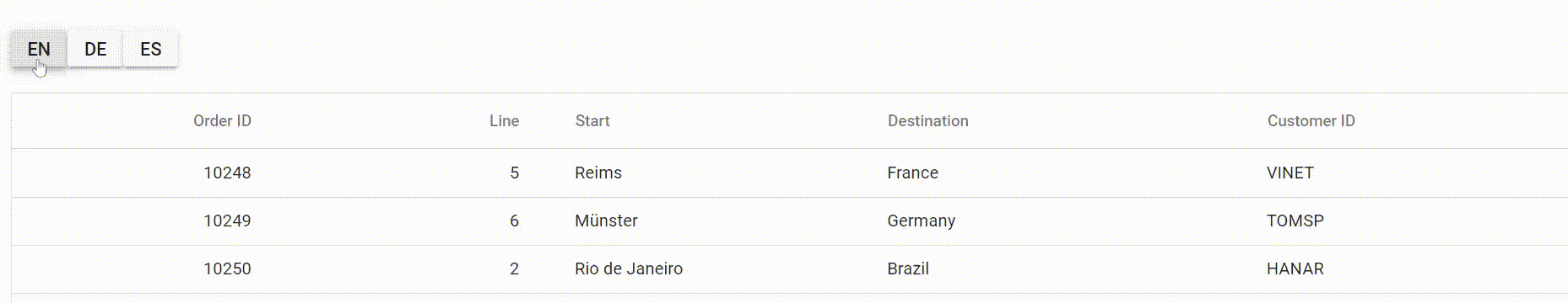
}The following screenshot represents the translation of the header text of a Syncfusion Angular Grid component to multiple languages using ngx-translate:
Through header template
To translate the header text of the Grid’s columns using ngx-translate through header template, use the translate pipe in the header templates of the Grid component.
Here are the steps to use ngx-translate pipe for Grid’s header template in Angular Grid component:
Step 1: Create and Configure the TranslateService
import { Component, ViewChild } from '@angular/core';
import { TranslateService } from '@ngx-translate/core';
import { GridComponent } from '@syncfusion/ej2-angular-grids';
@Component({
  selector: 'app-root',
  templateUrl: './app.component.html',
  styleUrls: ['./app.component.css'],
})
export class AppComponent {
  constructor(public translate: TranslateService) {
  }

  @ViewChild('grid', { static: true })
  public grid!: GridComponent;
  public flag: boolean = true;
  public data: Object[] = [];

  changeLanguage(lang: string) {
    this.translate.use(lang);
  }

  ngOnInit(): void {
    this.data = [
      {
        OrderID: 10248,
        CustomerID: 'VINET',
        lineId: 5,
        start: 'Reims',
        destination: 'France',
      },
      {
        OrderID: 10249,
        CustomerID: 'TOMSP',
        lineId: 6,
        start: 'Münster',
        destination: 'Germany',
      },
      {
        OrderID: 10250,
        CustomerID: 'HANAR',
        lineId: 2,
        start: 'Rio de Janeiro',
        destination: 'Brazil',
      },
    ];
  }
}
Step 2: Use the ngx-translate pipe in Angular Grid component header templates to translate the headers dynamically.
<h1> Ngx translate pipe for header template in Angular Grid component</h1>
<h1></h1><div class="container-fluid py-3">
  <div class="btn-group btn-group-sm py-5">
    <button ejs-button type="button" class="btn btn-sm btn-info"
    (click)="changeLanguage('en-US')"> en-US</button>
    <button ejs-button type="button" class="btn btn-sm btn-success"
    (click)="changeLanguage('de-DE')"> de-DE</button>
  </div>
</div>
<div style="padding:20px 0px 0px 0px">
  <ejs-grid [dataSource]="data" height="350">
    <e-columns>
      <e-column
        field="OrderID"
        headerText="Order ID"
        width="120"
        textAlign="Right"
      ></e-column>
      <e-column field="lineId" width="120" textAlign="Right"
        ><ng-template #headerTemplate let-data>
          <div>
            {{ 'Line' | translate }}
          </div>
        </ng-template></e-column
      >
      <e-column field="start" width="140"
        ><ng-template #headerTemplate let-data>
          <div>
            {{ 'Start' | translate }}
          </div>
        </ng-template></e-column
      >
      <e-column field="destination" width="170"
        ><ng-template #headerTemplate let-data>
          <div>
            {{ 'Destination' | translate }}
          </div>
        </ng-template></e-column>
    </e-columns>
  </ejs-grid>
</div>
Step 3: Import the required modules in app.module.ts file along with translate loader function:
import { NgModule } from '@angular/core';
import { BrowserModule } from '@angular/platform-browser';
import { HttpClient, HttpClientModule } from '@angular/common/http';
import { TranslateModule, TranslateLoader } from '@ngx-translate/core';
import { TranslateHttpLoader } from '@ngx-translate/http-loader';
import { AppComponent } from './app.component';
import { GridAllModule } from '@syncfusion/ej2-angular-grids';
import { CommonModule } from '@angular/common';
import { ButtonModule } from '@syncfusion/ej2-angular-buttons';

export function createTranslateLoader(http: HttpClient) {
  return new TranslateHttpLoader(http, './assets/i18n/', '.json');
}

@NgModule({
  imports: [
    BrowserModule,
    HttpClientModule,
    TranslateModule.forRoot({
      loader: {
        provide: TranslateLoader,
        useFactory: createTranslateLoader,
        deps: [HttpClient],
      },
      defaultLanguage: 'en-US',
    }),
    CommonModule,
    GridAllModule,
    BrowserModule,
    ButtonModule
  ],
  declarations: [AppComponent],
  bootstrap: [AppComponent],
})
export class AppModule {}
Step 4: Add the json file with the translation text in the required languages:
en.json {

    "Line": "Line",
    "Start": "Start",
    "Destination": "Destination"
}de.json {
"changeLanguage": "Ändere Sprache",
"Line": "Linie",
"Start": "Startpunkt",
"Destination": "Zielpunkt"
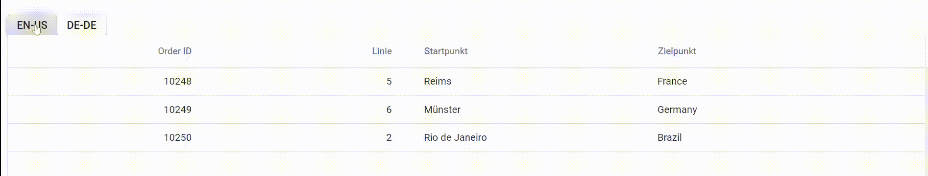
}The following screenshot represents the translation of the header text of a Angular Data Grid component to multiple languages using ngx-translate:
Custom tooltip for header
Tooltips in headers provide contextual information that helps understand the purpose or content of each column without cluttering the UI. Custom tooltips for headers display additional information when hovering over column headers in the Angular Data Grid, particularly useful when space limitations prevent full descriptions in headers or when additional column metadata needs to be communicated.
Custom tooltips can be enabled using the beforeRender event of the Grid component. This event triggers before each header cell renders, enabling addition of a custom tooltip using the tooltip component.
Here’s an example of using the beforeRender event to add a custom tooltip to a header cell:
import { data } from './datasource';
import { Component, OnInit, ViewChild } from '@angular/core';
import { GridModule, PageService } from '@syncfusion/ej2-angular-grids';
import { TooltipAllModule, TooltipComponent, TooltipEventArgs } from '@syncfusion/ej2-angular-popups';

@Component({
  imports: [TooltipAllModule, GridModule],
  standalone: true,
  providers: [PageService],
  selector: "app-root",
  template: `
    <div class="control-section" >
      <ejs-tooltip #tooltip (beforeRender)="beforeRender($event)" target=".e-headertext">
        <ejs-grid [dataSource]="data" allowPaging='true'>
          <e-columns>
            <e-column field="OrderID" headerText="Order ID" width="120">
            </e-column>
            <e-column field="Freight" headerText="Freight" width="120"
            format="C2">
            </e-column>
            <e-column field="ShipName" headerText="Ship Name" width="150">
            </e-column>
            <e-column field="ShipCountry" headerText="Ship Country" width="120">
            </e-column>
            <e-column field="OrderDate" headerText="Order Date" type="date" format="yMd"
            width="120">
            </e-column>
          </e-columns>
        </ejs-grid>
      </ejs-tooltip>
    </div>`
})
export class AppComponent implements OnInit {

  public data?: object[] = data;
  @ViewChild('tooltip')
  public toolTip?: TooltipComponent;
  public columnDescriptions: { [key: string]: string } = {
    "Order ID": "A unique number assigned to each order.",
    "Freight": "The cost of shipping the order.",
    "Ship Name": "The name of the person or company who will receive the shipment.",
    "Ship Country": "The country to which the shipment will be sent.",
    "Order Date": "The date when the order was placed.",
  };

  ngOnInit(): void {
    this.data = data;
  }
  beforeRender(args: TooltipEventArgs) {
    const description = this.columnDescriptions[args.target.innerText];
    if (description) {
      (this.toolTip as TooltipComponent).content = args.target.innerText + ": " + description;
    }
  }

}
import { bootstrapApplication } from '@angular/platform-browser';
import { AppComponent } from './app.component';
import 'zone.js';
bootstrapApplication(AppComponent).catch((err) => console.error(err));The headerCellInfo event can also be used to customize the header tooltip. This event is triggered for each header cell after it is rendered.
Customize header text styles
Header styling enables visual distinction and emphasizes important columns or data categories within the grid. Customizing header appearance through font, background color, and other styles meets specific design requirements and improves information hierarchy. The Angular Data Grid component provides multiple approaches for header customization through CSS, properties, methods, or event-based styling.
Using CSS
Styles can be applied to header cells using CSS selectors. The Grid assigns the .e-headercell class to each header cell element, which can be used to change the background color and text color of column headers.
  .e-grid .e-headercell {
    background-color: #a2d6f4;
    color:rgb(3, 2, 2);
  }
Here’s an example that demonstrates customizing the appearance of a column header in the Grid using className:
import { data } from './datasource';
import { Component, OnInit } from '@angular/core';
import { GridModule, PageService } from '@syncfusion/ej2-angular-grids';

@Component({
  imports: [ GridModule],
  providers: [PageService],
  standalone: true,
  selector: 'app-root',
  template: `<div class="control-section" >
              <ejs-grid [dataSource]="data" allowPaging="true">
                <e-columns>
                  <e-column field="OrderID" headerText="Order ID" width="120"
                  textAlign="Right"></e-column>
                  <e-column field="CustomerID" headerText="Customer ID" width="150" >
                  </e-column>
                  <e-column field="OrderDate" headerText="Order Date" width="130"
                  format="yMd" textAlign="Right">
                  </e-column>
                  <e-column field="Freight" headerText="Freight" width="120" format="C2"
                  textAlign="Right"></e-column>
                  <e-column field="ShipCountry" headerText="Ship Country" width="130"
                   format="yMd" textAlign="Right"></e-column>
                </e-columns>
              </ejs-grid>
            </div>`,
  styleUrls: ['./app.component.css']

})
export class AppComponent implements OnInit {

  public data?: object[];

  ngOnInit() {
    this.data = data;
  }
}
import { bootstrapApplication } from '@angular/platform-browser';
import { AppComponent } from './app.component';
import 'zone.js';
bootstrapApplication(AppComponent).catch((err) => console.error(err));Using property
Column header appearance in Grid can be customized using the customAttributes property. This property accepts an object with name-value pairs to customize CSS properties for grid header cells. Multiple CSS properties can be set to the custom class using the customAttributes property.
To customize column headers, follow these steps:
Step 1: Define a CSS class specifying the desired styles for header cells.
    .e-grid .e-headercell.custom {
       background-color: rgb(43, 205, 226);
       color: black;
    }
Step 2: Set the customAttributes property of the column to an object containing the CSS class “customcss”. This class will be applied to the column’s header cell.
{field="Freight" headerText="Freight" [customAttributes]="{class: '.custom'} }The following example demonstrates customizing the appearance of the “OrderID” and “OrderDate” columns using custom attributes:
import { data } from './datasource';
import { Component, OnInit } from '@angular/core';
import { GridModule, PageService } from '@syncfusion/ej2-angular-grids';

@Component({
  imports: [GridModule],
  providers: [PageService],
  standalone: true,
  selector: 'app-root',
  template: `<ejs-grid #grid [dataSource]="data" allowPaging="true">
                <e-columns>
                  <e-column field="OrderID" headerText="Order ID"
                  [customAttributes]="{class:'custom'}" textAlign="Center">
                  </e-column>
                  <e-column field="CustomerName" headerText="Customer Name" textAlign="Center">
                  </e-column>
                  <e-column field="OrderDate" headerText="Order Date" format="yMd"
                  [customAttributes]="{class:'custom'}" textAlign="Center">
                  </e-column>
                  <e-column field="ShippedDate" headerText="Shipped Date" textAlign="Center" format="yMd">
                  </e-column>
                </e-columns>
              </ejs-grid>`
})
export class AppComponent implements OnInit {

  public data?: object[];

  ngOnInit() {
    this.data = data;
  }
}
import { bootstrapApplication } from '@angular/platform-browser';
import { AppComponent } from './app.component';
import 'zone.js';
bootstrapApplication(AppComponent).catch((err) => console.error(err));Using method
Angular Data Grid provides methods to customize column header appearance:
| # | Method | Description |
|---|---|---|
| 1 | getColumnHeaderByIndex | Customizes a specific column header by specifying the column index. |
| 2 | getColumnHeaderByField | Retrieves the header element by field name to customize its appearance. |
| 3 | getColumnHeaderByUid | Retrieves the header element by unique ID to customize its appearance. |
| 4 | getColumnIndexByField | Retrieves the column index by field name to access and customize the header element. |
| 5 | getColumnIndexByUid | Retrieves the column index by unique ID to access and customize the header element. |
Here’s an example of using these methods to change the style of a specific column header:
import { orderDetails } from './datasource';
import { Component, OnInit, ViewChild } from '@angular/core';
import { GridComponent, GridModule, PageService } from '@syncfusion/ej2-angular-grids';

@Component({
  imports: [ GridModule],
  providers: [PageService],
  standalone: true,
  selector: 'app-root',
  template: `<div class="control-section">
              <ejs-grid #grid [dataSource]="data" allowPaging="true"
              (dataBound)="dataBound()" height="290">
                <e-columns>
                  <e-column field="OrderID" headerText="Order ID" width="120"
                  textAlign="Right"></e-column>
                  <e-column field="CustomerName" headerText="Customer Name" width="150">
                  </e-column>
                  <e-column field="Freight" headerText="Freight" width="120" format="C2"
                  textAlign="Right"></e-column>
                  <e-column field="ShipCountry" headerText="Ship Country" width="150">
                  </e-column>
                </e-columns>
              </ejs-grid>
            </div>`
})
export class AppComponent implements OnInit {

  public data?: Object[];
  @ViewChild('grid')
  public grid?: GridComponent;

  ngOnInit() {
    this.data = orderDetails;
  }
  dataBound() {
    ((this.grid as GridComponent).getColumnHeaderByIndex(0) as HTMLElement).style.color = 'green';
    ((this.grid as GridComponent).getColumnHeaderByField('CustomerName') as HTMLElement).style.background = 'rgb(217, 244, 235)';
    ((this.grid as GridComponent).getColumnHeaderByField('OrderID') as HTMLElement).style.background = 'rgb(217, 244, 235)';
    ((this.grid as GridComponent).getColumnHeaderByField('ShipCountry') as HTMLElement).style.background = 'rgb(217, 244, 235)';
    ((this.grid as GridComponent).getColumnHeaderByField('CustomerName') as HTMLElement).style.color = '#0d0b0b';
    ((this.grid as GridComponent).getColumnHeaderByUid('grid-column2') as HTMLElement).style.background = 'rgb(217, 244, 235)';
    const columnIndex = (this.grid as GridComponent).getColumnIndexByField('ShipCountry');
    ((this.grid as GridComponent).getColumnHeaderByIndex(columnIndex) as HTMLElement).style.color = 'green';
    const index = (this.grid as GridComponent).getColumnIndexByUid('grid-column2');
    ((this.grid as GridComponent).getColumnHeaderByIndex(index) as HTMLElement).style.color = 'green';
  }
}
import { bootstrapApplication } from '@angular/platform-browser';
import { AppComponent } from './app.component';
import 'zone.js';
bootstrapApplication(AppComponent).catch((err) => console.error(err));The UID is automatically generated by the Grid component and may change whenever the grid is refreshed or updated.
Using event
To customize the appearance of the grid header, handle the headerCellInfo event of the grid. This event is triggered when each header cell is rendered in the grid, and provides an object that contains information about the header cell. This object can be used to modify the styles of the header column.
The following example demonstrates adding a headerCellInfo event handler to the grid. In the event handler, it checks whether the current header column is the “Order Date” field and then applies the appropriate CSS class to the cell based on its value:
import { data } from './datasource';
import { Component, OnInit } from '@angular/core';
import { GridModule, PageService } from '@syncfusion/ej2-angular-grids';
import { Cell, Column, HeaderCellInfoEventArgs } from '@syncfusion/ej2-grids';

@Component({
  imports: [GridModule],
  providers: [PageService],
  standalone: true,
  selector: 'app-root',
  template: `<div class="control-section" >
              <ejs-grid [dataSource]="data" allowPaging="true"
              (headerCellInfo)="onHeaderCellInfo($event)" >
                <e-columns>
                  <e-column field="OrderID" headerText="Order ID" width="120"
                  textAlign="Center"></e-column>
                  <e-column field="CustomerID" headerText="Customer ID" width="150">
                  </e-column>
                  <e-column field="OrderDate" headerText="Order Date" width="130"
                  format="yMd" textAlign="Center" >
                  </e-column>
                  <e-column field="Freight" headerText="Freight" width="120" format="C2"
                  textAlign="Center"></e-column>
                  <e-column field="ShippedDate" headerText="Shipped Date" width="130"
                  format="yMd" textAlign="Center">
                  </e-column>
                </e-columns>
              </ejs-grid>
            </div>`
})
export class AppComponent implements OnInit {

  public data?: object[];

  ngOnInit() {
    this.data = data;
  }
  public onHeaderCellInfo(args:HeaderCellInfoEventArgs  ) {
    if ((args.cell as Cell<Column> ).column.field == 'OrderDate') {
      (args.node as Element).classList.add('customcss');
    }
  }
}
import { bootstrapApplication } from '@angular/platform-browser';
import { AppComponent } from './app.component';
import 'zone.js';
bootstrapApplication(AppComponent).catch((err) => console.error(err));Refresh header
Header refresh functionality enables synchronization between the visual display and underlying column definitions. Whenever column properties are programmatically modified (such as header text, width, or alignment), refreshing the header ensures the UI reflects all changes immediately. The refreshHeader method provides a lightweight approach to update only the header section without reloading the entire grid.
The following example demonstrates using the refreshHeader method to update the grid header:
import { data } from './datasource';
import { Component, OnInit, ViewChild } from '@angular/core';
import { ButtonModule } from '@syncfusion/ej2-angular-buttons';
import { GridComponent, GridModule } from '@syncfusion/ej2-angular-grids';

@Component({
  imports: [GridModule, ButtonModule],
  standalone: true,
  selector: 'app-root',
  template: `<button ejs-button (click)="refreshHeader()">Refresh Header</button>
            <div class="control-section" style='padding:20px 0px 0px 0px'>
              <ejs-grid #grid [dataSource]="data">
                <e-columns>
                  <e-column field="OrderID" headerText="Order ID"></e-column>
                  <e-column field="CustomerID" headerText="Customer ID"></e-column>
                  <e-column field="OrderDate" headerText="Order Date" format="yMd">
                  </e-column>
                  <e-column field="Freight" headerText="Freight"></e-column>
                </e-columns>
              </ejs-grid>
            </div>`
})
export class AppComponent implements OnInit {

  @ViewChild('grid')
  public grid?: GridComponent;
  public data?: Object[];

  ngOnInit(): void {
    this.data = data;
  }
  public refreshHeader(): void {
    const column = (this.grid as GridComponent).getColumnByIndex(1);
    column.headerText = 'New Header Text'; // update the header text of the column object
    (this.grid as GridComponent).refreshHeader(); // refresh the grid header
  }
}
import { bootstrapApplication } from '@angular/platform-browser';
import { AppComponent } from './app.component';
import 'zone.js';
bootstrapApplication(AppComponent).catch((err) => console.error(err));
- The
refreshHeadermethod updates only the grid header and not the entire grid.- To refresh the entire grid, use the
refreshmethod instead.
Get header element
Accessing header elements programmatically is necessary for advanced customizations, styling, or interaction handling that go beyond built-in configuration options. The Angular Data Grid provides multiple methods to retrieve specific header elements by various identifiers, enabling direct DOM manipulation or reading header metadata.
| # | Method | Description | Example |
|---|---|---|---|
| 1 | getHeaderContent | Returns the header div element of the Grid, providing access to the entire header content. | const headerElement = grid.getHeaderContent(); |
| 2 | getHeaderTable | Returns the header table element of the Grid, providing access only to the header table. | const headerTableElement = grid.getHeaderTable(); |
| 3 | getColumnHeaderByUid | Returns the column header element by its unique identifier. | const columnHeaderElement = grid.getColumnHeaderByUid("e-grid2"); |
| 4 | getColumnHeaderByIndex | Returns the column header element by its index. | const columnHeaderElement = grid.getColumnHeaderByIndex(0); |
| 5 | getColumnHeaderByField | Returns the column header element by its field name. | const columnHeaderElement = grid.getColumnHeaderByField("OrderID"); |
The UID is automatically generated by the Grid component and may change whenever the grid is refreshed or updated.