How can I help you?
Getting started with Angular Dropdown Tree component
6 Feb 202613 minutes to read
This section explains how to create a simple Dropdown Tree component and configure its available functionalities in Angular.
Dependencies
The following list of dependencies are required to use the Dropdown Tree component in your application.
|-- @syncfusion/ej2-angular-dropdowns
    |-- @syncfusion/ej2-base
    |-- @syncfusion/ej2-data
    |-- @syncfusion/ej2-ng-base
    |-- @syncfusion/ej2-dropdowns
        |-- @syncfusion/ej2-lists
        |-- @syncfusion/ej2-inputs
        |-- @syncfusion/ej2-navigations
        |-- @syncfusion/ej2-popups
            |-- @syncfusion/ej2-buttons
Setup Angular Environment
You can use Angular CLI to setup your Angular applications.
To install Angular CLI use the following command.
npm install -g @angular/cliAngular 21 Standalone Architecture: Standalone components are the default in Angular 21. This guide uses the modern standalone architecture. If you need more information about the standalone architecture, refer to the Standalone Guide.
Installing a specific version
To install a particular version of Angular CLI, use:
npm install -g @angular/[email protected]Create a new application
With Angular CLI installed, execute this command to generate a new application:
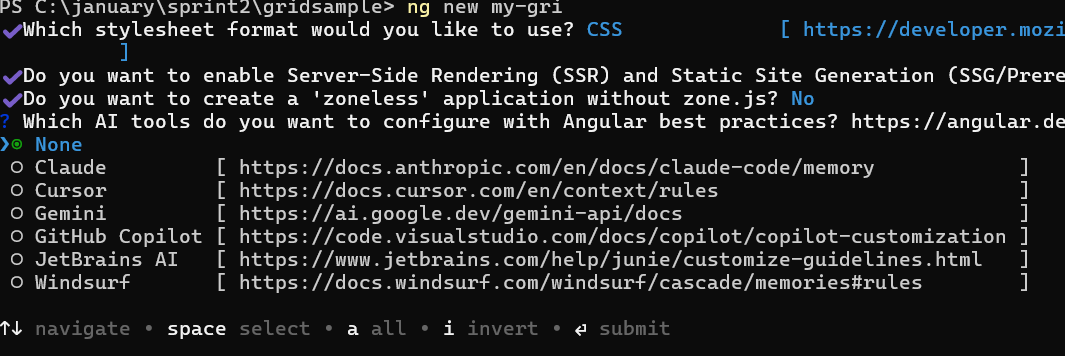
ng new syncfusion-angular-app- This command will prompt you to configure settings like enabling Angular routing and choosing a stylesheet format.
? Which stylesheet format would you like to use? (Use arrow keys)
> CSS             [ https://developer.mozilla.org/docs/Web/CSS                     ]
  Sass (SCSS)     [ https://sass-lang.com/documentation/syntax#scss                ]
  Sass (Indented) [ https://sass-lang.com/documentation/syntax#the-indented-syntax ]
Less [ http://lesscss.org ]- By default, a CSS-based application is created. Use SCSS if required:
ng new syncfusion-angular-app --style=scss- During project setup, when prompted for the Server-side rendering (SSR) option, choose the appropriate configuration.

- Select the required AI tool or ‘none’ if you do not need any AI tool.
- Navigate to your newly created application directory:
cd syncfusion-angular-appNote: In Angular 19 and below, it uses
app.component.ts,app.component.html,app.component.cssetc. In Angular 20+, the CLI generates a simpler structure withsrc/app/app.ts,app.html, andapp.css(no.component.suffixes).
Installing Syncfusion® DropDownTree package
Syncfusion® packages are distributed in npm as @syncfusion scoped packages. You can get all the Angular Syncfusion® package from npm link.
Currently, Syncfusion® provides two types of package structures for Angular components,
- Ivy library distribution package format
- Angular compatibility compiler(Angular’s legacy compilation and rendering pipeline) package.
Ivy library distribution package
Syncfusion® Angular packages(>=20.2.36) has been moved to the Ivy distribution to support the Angular Ivy rendering engine and the package are compatible with Angular version 12 and above. To download the package use the below command.
Add @syncfusion/ej2-angular-dropdowns package to the application.
npm install @syncfusion/ej2-angular-dropdowns --saveAngular compatibility compiled package(ngcc)
For Angular version below 12, you can use the legacy (ngcc) package of the Syncfusion® Angular components. To download the ngcc package use the below.
Add @syncfusion/ej2-angular-dropdowns@ngcc package to the application.
npm install @syncfusion/ej2-angular-dropdowns@ngcc --saveTo mention the ngcc package in the package.json file, add the suffix -ngcc with the package version as below.
@syncfusion/ej2-angular-dropdowns:"20.2.38-ngcc"Note: If the ngcc tag is not specified while installing the package, the Ivy Library Package will be installed and this package will throw a warning.
Registering Dropdown Tree Module
Import Dropdown Tree module into Angular application app.module.ts from the package @syncfusion/ej2-angular-dropdowns.
import { NgModule }      from '@angular/core';
import { BrowserModule } from '@angular/platform-browser';
// import the DropDownTreeModule for the DropDownTree component
import { DropDownTreeModule } from '@syncfusion/ej2-angular-dropdowns';
import { AppComponent }  from './app.component';

@NgModule({
  //declaration of ej2-angular-dropdowns module into NgModule
  imports:      [ BrowserModule, DropDownTreeModule ],
  declarations: [ AppComponent ],
  bootstrap:    [ AppComponent ]
})
export class AppModule { }
Adding CSS Reference
Add Dropdown Tree component’s styles as given below in styles.css.
@import '../node_modules/@syncfusion/ej2-base/styles/material3.css';
@import '../node_modules/@syncfusion/ej2-buttons/styles/material3.css';
@import '../node_modules/@syncfusion/ej2-dropdowns/styles/material3.css';
@import '../node_modules/@syncfusion/ej2-navigations/styles/material3.css';
@import '../node_modules/@syncfusion/ej2-inputs/styles/material3.css';
@import '../node_modules/@syncfusion/ej2-popups/styles/material3.css';
@import '../node_modules/@syncfusion/ej2-lists/styles/material3.css';
@import '../node_modules/@syncfusion/ej2-angular-dropdowns/styles/material3.css';
Alternatively, based on the location of your CSS file, you can import the styles as shown below:
@import 'node_modules/@syncfusion/ej2-base/styles/material3.css';
@import 'node_modules/@syncfusion/ej2-buttons/styles/material3.css';
@import 'node_modules/@syncfusion/ej2-dropdowns/styles/material3.css';
@import 'node_modules/@syncfusion/ej2-navigations/styles/material3.css';
@import 'node_modules/@syncfusion/ej2-inputs/styles/material3.css';
@import 'node_modules/@syncfusion/ej2-popups/styles/material3.css';
@import 'node_modules/@syncfusion/ej2-lists/styles/material3.css';
@import 'node_modules/@syncfusion/ej2-angular-dropdowns/styles/material3.css';
Note: If you want to refer the combined component styles, please make use of our
CRG(Custom Resource Generator) in your application.
Add Dropdown Tree component
Modify the template in src/app/app.component.ts file to render the Dropdown Tree component. Add the Angular Dropdown Tree selector in template section of the app.component.ts file.
import { Component } from '@angular/core';

@Component({
  selector: 'app-root',
  template: `<ejs-dropdowntree id='dropdowntree'></ejs-dropdowntree>`
})
export class AppComponent {}
Binding data source
The Dropdown Tree component can load the data either from local data sources or remote data services. This can be done using the dataSource property that is a member of the fields property. The dataSource property supports array of JavaScript objects and DataManager. Here, an array of JSON values is passed to the Dropdown Tree component.
import { Component } from '@angular/core';

@Component({
    selector: 'app-root',
    // specifies the template string for the DropDownTree component
    template: `<ejs-dropdowntree id='dropdowntree' [fields]='fields' placeholder='Select a Item'></ejs-dropdowntree>`
})
export class AppComponent {
    constructor() {
    }
    // defined the array of data
    public data: { [key: string]: Object }[] = [
     {
        nodeId: '01', nodeText: 'Music',
        nodeChild: [
            { nodeId: '01-01', nodeText: 'Gouttes.mp3' }
        ]
     },
     {
        nodeId: '02', nodeText: 'Videos', expanded: true,
        nodeChild: [
            { nodeId: '02-01', nodeText: 'Naturals.mp4' },
            { nodeId: '02-02', nodeText: 'Wild.mpeg' },
        ]
     },
     {
        nodeId: '03', nodeText: 'Documents',
        nodeChild: [
            { nodeId: '03-01', nodeText: 'Environment Pollution.docx' },
            { nodeId: '03-02', nodeText: 'Global Water, Sanitation, & Hygiene.docx' },
            { nodeId: '03-03', nodeText: 'Global Warming.ppt' },
            { nodeId: '03-04', nodeText: 'Social Network.pdf' },
            { nodeId: '03-05', nodeText: 'Youth Empowerment.pdf' },
        ]
     },
    ];
    // Map the appropriate fields to the data properties using the fields property
    // value: field that contains the actual value, text: field for display text, child: field containing child nodes
    public fields: Object = { dataSource: this.data, value: 'nodeId', text: 'nodeText', child: 'nodeChild' };
}
Run the application
After completing the configuration required to render a basic Dropdown Tree, run the following command to display the output in your default browser.
ng serve --openThe following example illustrates the output in your browser.
import { NgModule } from '@angular/core'
import { BrowserModule } from '@angular/platform-browser'
import { FormsModule, ReactiveFormsModule } from '@angular/forms'
import { DropDownTreeModule } from '@syncfusion/ej2-angular-dropdowns'
import { ButtonModule } from '@syncfusion/ej2-angular-buttons'
import { Component } from '@angular/core';

@Component({
    imports: [
        FormsModule, ReactiveFormsModule, ButtonModule, DropDownTreeModule
    ],
    standalone: true,
    selector: 'app-container',
    // specifies the template string for the DropDownTree component
    template: `<ejs-dropdowntree id='dropdowntree' [fields]='fields' placeholder='Select a Item'></ejs-dropdowntree>`
})
export class AppComponent {
    constructor() {
    }
    // defined the array of data
    public data: { [key: string]: Object }[] = [
        {
            nodeId: '01', nodeText: 'Music',
            nodeChild: [
                { nodeId: '01-01', nodeText: 'Gouttes.mp3' }
            ]
        },
        {
            nodeId: '02', nodeText: 'Videos', expanded: true,
            nodeChild: [
                { nodeId: '02-01', nodeText: 'Naturals.mp4' },
                { nodeId: '02-02', nodeText: 'Wild.mpeg' },
            ]
        },
        {
            nodeId: '03', nodeText: 'Documents',
            nodeChild: [
                { nodeId: '03-01', nodeText: 'Environment Pollution.docx' },
                { nodeId: '03-02', nodeText: 'Global Water, Sanitation, & Hygiene.docx' },
                { nodeId: '03-03', nodeText: 'Global Warming.ppt' },
                { nodeId: '03-04', nodeText: 'Social Network.pdf' },
                { nodeId: '03-05', nodeText: 'Youth Empowerment.pdf' },
            ]
        },
    ];
    //binding data source through fields property
    public fields: Object = { dataSource: this.data, value: 'nodeId', text: 'nodeText', child: 'nodeChild' };
}
@import 'node_modules/@syncfusion/ej2-base/styles/material3.css';
@import 'node_modules/@syncfusion/ej2-buttons/styles/material3.css';
@import 'node_modules/@syncfusion/ej2-dropdowns/styles/material3.css';
@import 'node_modules/@syncfusion/ej2-navigations/styles/material3.css';
@import 'node_modules/@syncfusion/ej2-inputs/styles/material3.css';
@import 'node_modules/@syncfusion/ej2-popups/styles/material3.css';
@import 'node_modules/@syncfusion/ej2-lists/styles/material3.css';
@import 'node_modules/@syncfusion/ej2-angular-base/styles/material3.css';
@import 'node_modules/@syncfusion/ej2-angular-popups/styles/material3.css';
@import 'node_modules/@syncfusion/ej2-angular-buttons/styles/material3.css';
@import 'node_modules/@syncfusion/ej2-angular-dropdowns/styles/material3.css';
#container {
visibility: hidden;
}
#loader {
color: #008cff;
height: 40px;
width: 30%;
position: absolute;
top: 45%;
left: 45%;
}
#wrapper {
width: 250px;
margin: 0 auto;
}import { bootstrapApplication } from '@angular/platform-browser';
import { AppComponent } from './app.component';
import 'zone.js';
bootstrapApplication(AppComponent).catch((err) => console.error(err));