Swimlane in Symbol Palette
29 Aug 202511 minutes to read
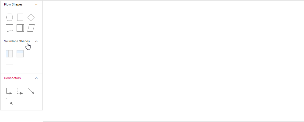
The Angular Diagram component provides comprehensive support for adding swimlane shapes and phases to the symbol palette. Swimlanes help organize process flows by grouping related activities into lanes, making complex diagrams more readable and structured.
Add Swimlane to Palette
The diagram component supports adding both swimlane containers and individual phases to the symbol palette. This enables users to drag and drop pre-configured swimlane elements into their diagrams.
import { Component, ViewEncapsulation } from '@angular/core';
import { SymbolPreviewModel,  DiagramModule, SymbolPaletteModule, NodeModel, PaletteModel, MarginModel, ExpandTool, ShapeStyleModel } from '@syncfusion/ej2-angular-diagrams';

@Component({
imports: [
         DiagramModule, SymbolPaletteModule
    ],

providers: [ ],
standalone: true,
    selector: "app-container",
    template: `<ejs-symbolpalette id="symbolpalette"width="100%" height="700px" [symbolHeight]=80 [symbolWidth]=80 [expandMode]="expandMode" [palettes]="palettes" [getSymbolInfo]="getSymbolInfo" [symbolMargin]="symbolMargin" [symbolPreview]="symbolPreview" [getNodeDefaults]="">
    </ejs-symbolpalette>`,
    encapsulation: ViewEncapsulation.None
})
export class AppComponent {
    public expandMode?: ExpandTool;
    public palettes?: PaletteModel[];
    public symbolMargin?: MarginModel;
    public symbolPreview?: SymbolPreviewModel;
    public getswimlaneShapes(): NodeModel[] {
       let swimlaneShapes : NodeModel[]= [
            {
                id: 'stackCanvas1',
                shape: {
                    type: 'SwimLane', lanes: [
                        {
                            id: 'lane1',
                            style: { strokeColor: 'black' }, height: 60, width: 150,
                            header: { width: 50, height: 50, style: { strokeColor: 'black', fontSize: 11 } },
                        }
                    ],
                    orientation: 'Horizontal', isLane: true
                },
                height: 60,
                width: 140,
                offsetX: 70,
                offsetY: 30,
            }, {
                id: 'stackCanvas2',
                shape: {
                    type: 'SwimLane',
                    lanes: [
                        {
                            id: 'lane1',
                            style: { strokeColor: 'black' }, height: 150, width: 60,
                            header: { width: 50, height: 50, style: { strokeColor: 'black', fontSize: 11 } },
                        }
                    ],
                    orientation: 'Vertical', isLane: true
                },
                height: 140,
                width: 60,
                // style: { fill: '#f5f5f5' },
                offsetX: 70,
                offsetY: 30,
            }, {
                id: 'verticalPhase',
                shape: {
                    type: 'SwimLane',
                    phases: [{ style: { strokeWidth: 1, strokeDashArray: '3,3', strokeColor: '#A9A9A9' }, }],
                    annotations: [{ text: '' }],
                    orientation: 'Vertical', isPhase: true
                },
                height: 60,
                width: 140
            }, {
                id: 'horizontalPhase',
                shape: {
                    type: 'SwimLane',
                    phases: [{ style: { strokeWidth: 1, strokeDashArray: '3,3', strokeColor: '#A9A9A9' }, }],
                    annotations: [{ text: '' }],
                    orientation: 'Horizontal', isPhase: true
                },
                height: 60,
                width: 140
            }
    ];

    return swimlaneShapes;
    };
    public getPaletteNodeDefaults(node: NodeModel): void {
        node.width = 100;
        node.height = 100;
        ((node as NodeModel).style as ShapeStyleModel).strokeColor = '#3A3A3A';
    }
    public getSymbolInfo() {
        // Enables to fit the content into the specified palette item size
        return {
            fit: true
        };
        // When it is set as false, the element is rendered with actual node size
    }
    ngOnInit(): void {
        this.expandMode = 'Multiple' as any
        this.palettes = [{
            id: 'swimlane',
            expanded: true,
            symbols: this.getswimlaneShapes(),
            title: 'Swimlane Shapes',
            iconCss: 'e-ddb-icons e-basic'
        } as any] ,
        this.symbolMargin = {
            left: 15,
            right: 15,
            top: 15,
            bottom: 15
        },
        //Specifies the preview size and position to symbol palette items.
        this.symbolPreview = {
            height: 100,
            width: 100,
            offset: {
                x: 0.5,
                y: 0.5
            }
        }
    }
}
import { bootstrapApplication } from '@angular/platform-browser';
import { AppComponent } from './app.component';
import 'zone.js';
bootstrapApplication(AppComponent).catch((err) => console.error(err));Drag and drop swimlane to palette
- The drag and drop support for swimlane shapes has been provided.
- Horizontal lanes can be added to vertical swimlanes, and vice versa.
- The phase will only drop on swimlane shape with same orientation. The following image illustrates how to drag symbol from palette.