Customizing Label Appearance in Angular Diagram Component
29 Aug 202524 minutes to read
Overview
The Angular Diagram component provides comprehensive styling options to customize label appearance. Labels can be enhanced with various font properties, colors, decorations, and visual effects to match application requirements.
Font styling properties such as fontSize, fontFamily, and color control the basic text appearance. Additional text formatting is available through bold, italic, and textDecoration properties.
Background and border styling can be applied using fill, strokeColor, and strokeWidth properties. The opacity property controls label transparency.
Control label visibility using the visible property, which enables or disables label display.
The following code demonstrates comprehensive label appearance customization:
import { Component, ViewEncapsulation, ViewChild } from '@angular/core';
import { DiagramModule, DiagramComponent, TextStyleModel, PointModel } from '@syncfusion/ej2-angular-diagrams';

@Component({
imports: [
         DiagramModule
    ],

providers: [ ],
standalone: true,
    selector: "app-container",
    template: `<ejs-diagram #diagram id="diagram" width="100%" height="580px" >
        <e-nodes>
            <e-node id='node1' [offsetX]=150 [offsetY]=150 [width]=100 [height]=100>
                <e-node-annotations>
                    <e-node-annotation id="label1" content="Annotation visibility true" [style]="style" [visibility]=true>
                    </e-node-annotation>
                    <e-node-annotation id="label2" content="Annotation visibility false" [offset]="offset" [style]="style" [visibility]=false>
                    </e-node-annotation>
                </e-node-annotations>
            </e-node>
        </e-nodes>
    </ejs-diagram>`,
    encapsulation: ViewEncapsulation.None
})
export class AppComponent {
    @ViewChild("diagram")
    public diagram?: DiagramComponent;
    public style?: TextStyleModel;
    public offset?: PointModel;
    ngOnInit(): void {
        this.style= {
            color: 'blue',
            bold: true,
            italic: true,
            fontSize: 15,
            fontFamily: 'TimesNewRoman',
            fill: 'orange',
            opacity: 0.6,
        }
        this.offset = { x: 0.5, y: 1 }
    }
}
import { bootstrapApplication } from '@angular/platform-browser';
import { AppComponent } from './app.component';
import 'zone.js';
bootstrapApplication(AppComponent).catch((err) => console.error(err));Horizontal and vertical alignment
Label positioning within nodes and connectors can be precisely controlled through horizontal and vertical alignment properties. The following table illustrates all possible alignment combinations with offset (0, 0):
| Horizontal Alignment | Vertical Alignment | Output with Offset(0,0) |
|---|---|---|
| Left | Top | 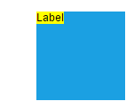 |
| Center | Top | 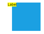 |
| Right | Top | 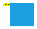 |
| Left | Center |  |
| Center | Center |  |
| Right | Center |  |
| Left | Bottom |  |
| Center | Bottom |  |
| Right | Bottom |  |
The following code example shows how to configure label alignment:
import { Component, ViewEncapsulation, ViewChild } from '@angular/core';
import { DiagramModule, DiagramComponent, VerticalAlignment, HorizontalAlignment } from '@syncfusion/ej2-angular-diagrams';

@Component({
imports: [
         DiagramModule
    ],

providers: [ ],
standalone: true,
    selector: "app-container",
    template: `<ejs-diagram #diagram id="diagram" width="100%" height="580px">
        <e-nodes>
            <e-node id='node1' [offsetX]=150 [offsetY]=150 [width]=100 [height]=100>
                <e-node-annotations>
                    <e-node-annotation id="label1" content="Annotation" [horizontalAlignment]="horizontalAlignment" [verticalAlignment]="verticalAlignment">
                    </e-node-annotation>
                </e-node-annotations>
            </e-node>
        </e-nodes>
    </ejs-diagram>`,
    encapsulation: ViewEncapsulation.None
})
export class AppComponent {
    @ViewChild("diagram")
    public diagram?: DiagramComponent;
    public verticalAlignment?: VerticalAlignment;
    public horizontalAlignment?: HorizontalAlignment;
    ngOnInit(): void {
        // Sets the horizontal alignment as left
        this.horizontalAlignment = 'Left';
        // Sets the vertical alignment as Center
        this.verticalAlignment = 'Center';
    }
}
import { bootstrapApplication } from '@angular/platform-browser';
import { AppComponent } from './app.component';
import 'zone.js';
bootstrapApplication(AppComponent).catch((err) => console.error(err));Label Margin
The Margin property adds spacing around labels by specifying absolute values for any or all four sides. This property works in conjunction with offset, horizontal alignment, and vertical alignment to achieve precise label positioning.
The following example demonstrates label positioning using margin combined with alignment properties:
import { Component, ViewEncapsulation, ViewChild } from '@angular/core';
import { DiagramModule, DiagramComponent, VerticalAlignment, HorizontalAlignment, MarginModel, PointModel } from '@syncfusion/ej2-angular-diagrams';

@Component({
imports: [
         DiagramModule
    ],

providers: [ ],
standalone: true,
    selector: "app-container",
    template: `<ejs-diagram #diagram id="diagram" width="100%" height="580px">
        <e-nodes>
            <e-node id='node1' [offsetX]=150 [offsetY]=150 [width]=100 [height]=100>
                <e-node-annotations>
                    <e-node-annotation id="label1" content="Annotation" [offset]="offset" [horizontalAlignment]="horizontalAlignment" [verticalAlignment]="verticalAlignment" [margin]="margin">
                    </e-node-annotation>
                </e-node-annotations>
            </e-node>
        </e-nodes>
        <e-connectors>
            <e-connector id='connector' type='Orthogonal' [sourcePoint]='sourcePoint' [targetPoint]='targetPoint'>
                <e-connector-annotations>
                    <e-connector-annotation content='annotation' [offset]=0.2 [margin]="marginConnector">
                    </e-connector-annotation>
                </e-connector-annotations>
            </e-connector>
        </e-connectors>
    </ejs-diagram>`,
    encapsulation: ViewEncapsulation.None
})
export class AppComponent {
    @ViewChild("diagram")
    public diagram?: DiagramComponent;
    public margin?: MarginModel;
    public offset?: PointModel;
    public verticalAlignment?: VerticalAlignment;
    public horizontalAlignment?: HorizontalAlignment;
    public sourcePoint?: PointModel;
    public targetPoint?: PointModel;
    public marginConnector?: MarginModel;
    ngOnInit(): void {
        // Sets the margin for the content
        this.margin = { top: 10 }
        this.horizontalAlignment = 'Center'
        this.verticalAlignment = 'Top'
        this.offset = { x: 0.5, y: 1}
        this.sourcePoint = { x: 300, y: 150 };
        this.targetPoint = { x: 500, y: 300 };
        this.marginConnector = { left:40 }
    }
}
import { bootstrapApplication } from '@angular/platform-browser';
import { AppComponent } from './app.component';
import 'zone.js';
bootstrapApplication(AppComponent).catch((err) => console.error(err));Hyperlink
Labels can include interactive hyperlinks for both nodes and connectors. Hyperlink behavior and appearance can be customized with several properties.
The hyperlinkOpenState property controls how the hyperlink opens - in a new window, the same tab, or a new tab.
Hyperlink appearance is controlled through the content property for display text, color for text color, and textDecoration for styling effects like Underline, LineThrough, or Overline.
The following example shows hyperlink implementation and customization:
import { Component, ViewEncapsulation, ViewChild } from '@angular/core';
import { DiagramModule, DiagramComponent, PointModel, HyperlinkModel } from '@syncfusion/ej2-angular-diagrams';

@Component({
imports: [
         DiagramModule
    ],

providers: [ ],
standalone: true,
    selector: "app-container",
    template: `<ejs-diagram #diagram id="diagram" width="100%" height="580px">
        <e-nodes>
            <e-node id='node1' [height]=100 [width]=100 [offsetX]=150 [offsetY]=150 >
                <e-node-annotations>
                    <e-node-annotation [hyperlink]="hyperlink">
                    </e-node-annotation>
                </e-node-annotations>
            </e-node>
        </e-nodes>
        <e-connectors>
            <e-connector id='connector' type='Orthogonal' [sourcePoint]='sourcePoint' [targetPoint]='targetPoint'>
                <e-connector-annotations>
                    <e-connector-annotation [hyperlink]="connectorHyperlink">
                    </e-connector-annotation>
                </e-connector-annotations>
            </e-connector>
        </e-connectors>
    </ejs-diagram>`,
    encapsulation: ViewEncapsulation.None
})
export class AppComponent {
    @ViewChild("diagram")
    public diagram?: DiagramComponent;
    public sourcePoint?: PointModel;
    public targetPoint?: PointModel;
    public hyperlink: HyperlinkModel = {
      content: 'Google', link: 'https://google.com',
      //Set the link to open in the new tab
      hyperlinkOpenState:'NewWindow'
    }
    public connectorHyperlink: HyperlinkModel = {
        link: 'https://google.com',
        //Set the link to open in the new tab
        hyperlinkOpenState:'NewWindow'
      }
    ngOnInit(): void {
        this.sourcePoint = { x: 300, y: 150 };
        this.targetPoint = { x: 500, y: 300 };
    }
}
import { bootstrapApplication } from '@angular/platform-browser';
import { AppComponent } from './app.component';
import 'zone.js';
bootstrapApplication(AppComponent).catch((err) => console.error(err));Rotate Label
Labels can be rotated to any angle using the rotateAngle property. This feature is useful for creating dynamic label orientations that match specific design requirements.
The following example demonstrates label rotation:
import { Component, ViewEncapsulation, ViewChild } from '@angular/core';
import { DiagramModule, DiagramComponent } from '@syncfusion/ej2-angular-diagrams';

@Component({
imports: [
         DiagramModule
    ],

providers: [ ],
standalone: true,
    selector: "app-container",
    template: `<ejs-diagram #diagram id="diagram" width="100%" height="580px">
        <e-nodes>
            <e-node id='node1' [offsetX]=150 [offsetY]=150 [width]=100 [height]=100>
                <e-node-annotations>
                    <e-node-annotation id="label1" content="Annotation" [rotateAngle]=45>
                    </e-node-annotation>
                </e-node-annotations>
            </e-node>
        </e-nodes>
    </ejs-diagram>`,
    encapsulation: ViewEncapsulation.None
})
export class AppComponent {
    @ViewChild("diagram")
    public diagram?: DiagramComponent;
}
import { bootstrapApplication } from '@angular/platform-browser';
import { AppComponent } from './app.component';
import 'zone.js';
bootstrapApplication(AppComponent).catch((err) => console.error(err));Template support for labels
The Diagram component provides flexible template support for creating custom label layouts. Templates can be defined as either string templates or HTML-based templates, enabling rich content presentation beyond simple text.
String template
String templates allow defining SVG or HTML content directly within the label’s template property. This approach is suitable for inline content definition.
The following code shows string template implementation:
import { Component, ViewEncapsulation, ViewChild } from '@angular/core';
import { DiagramModule, DiagramComponent, NodeModel, ConnectorModel } from '@syncfusion/ej2-angular-diagrams';

@Component({
imports: [
         DiagramModule
    ],

providers: [ ],
standalone: true,
    selector: "app-container",
    template: `<ejs-diagram #diagram id="diagram" width="100%" height="580px" [nodes]="nodes" [connectors]="connectors">
    </ejs-diagram>`,
    encapsulation: ViewEncapsulation.None
})
export class AppComponent {
    @ViewChild("diagram")
    public diagram?: DiagramComponent;
    public nodes: NodeModel[] = [
        {
            id: 'node1', offsetX: 150, offsetY: 150, width:100, height:100,
            annotations: [{ id:"label1", template:'<div><input type="button" value="Submit"></div>' }],
        }
    ]
    public connectors: ConnectorModel[] = [
        {
            id: 'connector', sourcePoint: { x: 300, y: 100 }, targetPoint: { x: 400, y: 300 },
            annotations: [{ id:"label1", height: 60, width: 100, offset: 0.5, template:'<div><input type="button" value="Submit"></div>' }],
        }
    ]
    ngOnInit(): void {

    }
}
import { bootstrapApplication } from '@angular/platform-browser';
import { AppComponent } from './app.component';
import 'zone.js';
bootstrapApplication(AppComponent).catch((err) => console.error(err));NOTE
Specify width and height for labels when using templates to ensure proper alignment and rendering.
Label template
HTML-based templates provide more complex content structures by defining templates in separate HTML files. Assign the template to the annotationTemplate property of the diagram. This template system works with both nodes and connectors.
The following code demonstrates HTML template usage for labels:
import { Component, ViewEncapsulation, ViewChild } from '@angular/core';
import { DiagramModule, DiagramComponent,  PointModel } from '@syncfusion/ej2-angular-diagrams';

@Component({
imports: [
         DiagramModule
    ],

providers: [ ],
standalone: true,
    selector: "app-container",
    template: `<ejs-diagram #diagram id="diagram" width="100%" height="580px" >
        <ng-template #annotationTemplate let-data>
            <input width="100%" style="width: 100px" type = "button" [value]= "data.id" >
        </ng-template>
        <e-nodes>
            <e-node id='node1' [offsetX]=150 [offsetY]=150 [height]=100 [width]=100>
                <e-node-annotations>
                    <e-node-annotation id="Node" >
                    </e-node-annotation>
                </e-node-annotations>
            </e-node>
        </e-nodes>
        <e-connectors>
            <e-connector id='connector' [sourcePoint]='sourcePoint' [targetPoint]='targetPoint'>
                <e-connector-annotations>
                    <e-connector-annotation id="Connector">
                    </e-connector-annotation>
                </e-connector-annotations>
            </e-connector>
        </e-connectors>
    </ejs-diagram>`,
    encapsulation: ViewEncapsulation.None
})
export class AppComponent {
    @ViewChild("diagram")
    public diagram?: DiagramComponent;
    public sourcePoint?: PointModel;
    public targetPoint?: PointModel;
    ngOnInit(): void {
        this.sourcePoint = { x: 300, y: 150 };
        this.targetPoint = { x: 500, y: 300 };
    }
}
import { bootstrapApplication } from '@angular/platform-browser';
import { AppComponent } from './app.component';
import 'zone.js';
bootstrapApplication(AppComponent).catch((err) => console.error(err));Text align
The textAlign property controls text alignment within the label boundaries. Available alignment options include left, right, center, and justify, providing flexibility for various content layouts.
The following code demonstrates text alignment configuration:
import { Component, ViewEncapsulation, ViewChild } from '@angular/core';
import { DiagramModule, DiagramComponent, NodeModel, PointModel, TextStyleModel } from '@syncfusion/ej2-angular-diagrams';

@Component({
imports: [
         DiagramModule
    ],

providers: [ ],
standalone: true,
    selector: "app-container",
    template: `<ejs-diagram #diagram id="diagram" width="100%" height="580px" [getNodeDefaults] ='getNodeDefaults'>
        <e-nodes>
            <e-node id='node1' [offsetX]=100 [offsetY]=150>
                <e-node-annotations>
                    <e-node-annotation id="label1" content="Text align is set as Right" [style]="node1Style">
                    </e-node-annotation>
                </e-node-annotations>
            </e-node>
            <e-node id='node2' [offsetX]=300 [offsetY]=150>
                <e-node-annotations>
                    <e-node-annotation id="label2" content="Text align is set as Center" [style]="node2Style">
                    </e-node-annotation>
                </e-node-annotations>
            </e-node>
            <e-node id='node3' [offsetX]=500 [offsetY]=150>
                <e-node-annotations>
                    <e-node-annotation id="label3" content="Text align is set as Left" [style]="node3Style">
                    </e-node-annotation>
                </e-node-annotations>
            </e-node>
            <e-node id='node4' [offsetX]=700 [offsetY]=150>
                <e-node-annotations>
                    <e-node-annotation id="label4" content="Text align is set as Justify" [style]="node4Style">
                    </e-node-annotation>
                </e-node-annotations>
            </e-node>
        </e-nodes>
        <e-connectors>
            <e-connector id='connector1' type='Orthogonal' [sourcePoint]='{ x: 100, y: 250 }' [targetPoint]='{ x: 200, y: 400 }'>
                <e-connector-annotations>
                    <e-connector-annotation content='Text align is set as Right' [style]="connector1Style" >
                    </e-connector-annotation>
                </e-connector-annotations>
            </e-connector>
            <e-connector id='connector2' type='Orthogonal' [sourcePoint]='{ x: 300, y: 250 }' [targetPoint]='{ x: 400, y: 400 }'>
                <e-connector-annotations>
                    <e-connector-annotation content='Text align is set as Center' [style]="connector2Style" >
                    </e-connector-annotation>
                </e-connector-annotations>
            </e-connector>
            <e-connector id='connector3' type='Orthogonal' [sourcePoint]='{ x: 500, y: 250 }' [targetPoint]='{ x: 600, y: 400 }'>
                <e-connector-annotations>
                    <e-connector-annotation content='Text align is set as Left' [style]="connector3Style" >
                    </e-connector-annotation>
                </e-connector-annotations>
            </e-connector>
            <e-connector id='connector4' type='Orthogonal' [sourcePoint]='{ x: 700, y: 250 }' [targetPoint]='{ x: 800, y: 400 }'>
                <e-connector-annotations>
                    <e-connector-annotation content='Text align is set as Justify' [style]="connector4Style" >
                    </e-connector-annotation>
                </e-connector-annotations>
            </e-connector>
        </e-connectors>
    </ejs-diagram>`,
    encapsulation: ViewEncapsulation.None
})
export class AppComponent {
    @ViewChild("diagram")
    public diagram?: DiagramComponent;
    public node1Style?: TextStyleModel;
    public node2Style?: TextStyleModel;
    public node3Style?: TextStyleModel;
    public node4Style?: TextStyleModel;
    public connector1Style?: TextStyleModel;
    public connector2Style?: TextStyleModel;
    public connector3Style?: TextStyleModel;
    public connector4Style?: TextStyleModel;
    ngOnInit(): void {
        // Sets the textAlign as left for the content
        this.node1Style = {
            textAlign: 'Right'
        }
        this.node2Style = {
            textAlign: 'Center'
        }
        this.node3Style = {
            textAlign: 'Left'
        }
        this.node4Style = {
            textAlign: 'Justify'
        }
        this.connector1Style = {
            textAlign: 'Right'
        }
        this.connector2Style = {
            textAlign: 'Center'
        }
        this.connector3Style = {
            textAlign: 'Left'
        }
        this.connector4Style = {
            textAlign: 'Justify'
        }
    }
    public getNodeDefaults(node: NodeModel): NodeModel {
        node.height = 100;
        node.width = 100;
        return node;
    }
}
import { bootstrapApplication } from '@angular/platform-browser';
import { AppComponent } from './app.component';
import 'zone.js';
bootstrapApplication(AppComponent).catch((err) => console.error(err));The following table shows different text alignment options:
| Text Align | Output image |
|---|---|
| Right | 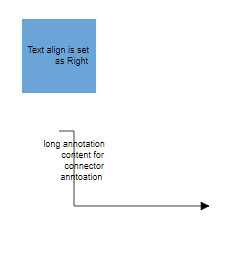 |
| Left | 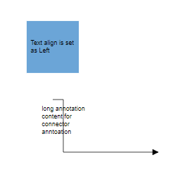 |
| Center | 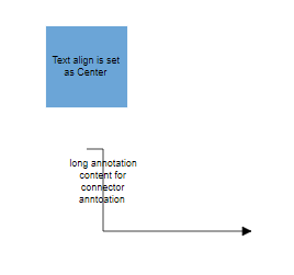 |
| Justify | 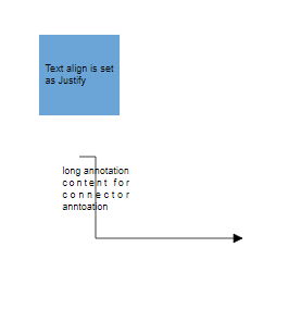 |
Text Wrapping
When label text exceeds node or connector boundaries, the text wrapping property controls how content is handled. Text can be wrapped into multiple lines based on the specified wrapping behavior.
The following code shows text wrapping implementation:
import { Component, ViewEncapsulation, ViewChild } from '@angular/core';
import { DiagramModule, DiagramComponent, NodeModel, TextStyleModel } from '@syncfusion/ej2-angular-diagrams';

@Component({
imports: [
         DiagramModule
    ],

providers: [ ],
standalone: true,
    selector: "app-container",
    template: `<ejs-diagram #diagram id="diagram" width="100%" height="580px" [getNodeDefaults] ='getNodeDefaults'>
        <e-nodes>
            <e-node id='node1' [offsetX]=150 [offsetY]=150>
                <e-node-annotations>
                    <e-node-annotation id="label1" content="Annotation Text WrapWithOverflow" [style]="node1Style">
                    </e-node-annotation>
                </e-node-annotations>
            </e-node>
            <e-node id='node2' [offsetX]=350 [offsetY]=150>
                <e-node-annotations>
                    <e-node-annotation id="label1" content="Annotation Text Wrapp" [style]="node2Style">
                    </e-node-annotation>
                </e-node-annotations>
            </e-node>
            <e-node id='node3' [offsetX]=550 [offsetY]=150>
                <e-node-annotations>
                    <e-node-annotation id="label1" content="Annotation Text NoWrap" [style]="node3Style">
                    </e-node-annotation>
                </e-node-annotations>
            </e-node>
        </e-nodes>
    </ejs-diagram>`,
    encapsulation: ViewEncapsulation.None
})
export class AppComponent {
    @ViewChild("diagram")
    public diagram?: DiagramComponent;
    public node1Style?: TextStyleModel;
    public node2Style?: TextStyleModel;
    public node3Style?: TextStyleModel;
    ngOnInit(): void {
        this.node1Style = {
            textWrapping: 'WrapWithOverflow'
        }
        this.node2Style = {
            textWrapping: 'Wrap'
        }
        this.node3Style = {
            textWrapping: 'NoWrap'
        }
    }
    public getNodeDefaults(node: NodeModel): NodeModel {
        node.height = 100;
        node.width = 100;
        return node;
    }
}
import { bootstrapApplication } from '@angular/platform-browser';
import { AppComponent } from './app.component';
import 'zone.js';
bootstrapApplication(AppComponent).catch((err) => console.error(err));| Value | Description | Image |
|---|---|---|
| No Wrap | Text will not be wrapped and may extend beyond boundaries. | 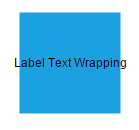 |
| Wrap | Text wrapping occurs when content overflows beyond available width. | 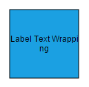 |
| WrapWithOverflow (Default) | Text wrapping occurs with overflow allowed for very long words that cannot be broken. | 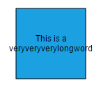 |
Text overflow
The TextOverflow property manages content display when text exceeds the available label space. This property works in conjunction with text wrapping to provide comprehensive text handling.
Available overflow options include:
-
Clip- Overflowing content beyond node boundaries is removed -
Ellipsis- Overflowing content is replaced with three dots (…) -
Wrap- Content renders with vertical overflow and horizontal wrapping
| TextOverflow | Output image |
|---|---|
| Clip | 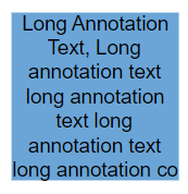 |
| Ellipsis | 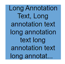 |
| Wrap (Default) | 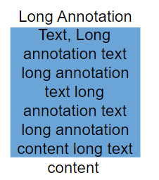 |
import { Component, ViewEncapsulation, ViewChild } from '@angular/core';
import { DiagramModule, DiagramComponent, NodeModel, PointModel, TextStyleModel } from '@syncfusion/ej2-angular-diagrams';

@Component({
imports: [
         DiagramModule
    ],

providers: [ ],
standalone: true,
    selector: "app-container",
    template: `<ejs-diagram #diagram id="diagram" width="100%" height="900px" [getNodeDefaults] ='getNodeDefaults'>
        <e-nodes>
            <e-node id='node1' [offsetX]=150 [offsetY]=150>
                <e-node-annotations>
                    <e-node-annotation id="label1" content="Clip Wrap" [offset]='offset'>
                    </e-node-annotation>
                    <e-node-annotation id="label2" content="Long Annotation Text, Long annotation text long annotation text long annotation text long annotation text long annotation text long annotation text" [style]="node1Style">
                    </e-node-annotation>
                </e-node-annotations>
            </e-node>
            <e-node id='node2' [offsetX]=350 [offsetY]=150>
                <e-node-annotations>
                    <e-node-annotation id="label1" content="Clip NoWrap" [offset]='offset'>
                    </e-node-annotation>
                    <e-node-annotation id="label2" content="Long Annotation Text, Long annotation text long annotation text long annotation text long annotation text" [style]="node2Style">
                    </e-node-annotation>
                </e-node-annotations>
            </e-node>
            <e-node id='node3' [offsetX]=550 [offsetY]=150>
                <e-node-annotations>
                    <e-node-annotation id="label1" content="Clip WrapWithOverflow" [offset]='offset'>
                    </e-node-annotation>
                    <e-node-annotation id="label2" content="Long Annotation Text, Long annotation text long annotation text long annotation text long annotation text" [style]="node3Style">
                    </e-node-annotation>
                </e-node-annotations>
            </e-node>
            <e-node id='node4' [offsetX]=150 [offsetY]=350>
                <e-node-annotations>
                    <e-node-annotation id="label1" content="Ellipsis Wrap" [offset]='offset'>
                    </e-node-annotation>
                    <e-node-annotation id="label2" content="Long Annotation Text, Long annotation text long annotation text long annotation text long annotation text" [style]="node4Style">
                    </e-node-annotation>
                </e-node-annotations>
            </e-node>
            <e-node id='node5' [offsetX]=350 [offsetY]=350>
                <e-node-annotations>
                    <e-node-annotation id="label1" content="Ellipsis NoWrap" [offset]='offset'>
                    </e-node-annotation>
                    <e-node-annotation id="label2" content="Long Annotation Text, Long annotation text long annotation text long annotation text long annotation text" [style]="node5Style">
                    </e-node-annotation>
                </e-node-annotations>
            </e-node>
            <e-node id='node6' [offsetX]=550 [offsetY]=350>
                <e-node-annotations>
                    <e-node-annotation id="label1" content="Ellipsis WrapWithOverflow" [offset]='offset'>
                    </e-node-annotation>
                    <e-node-annotation id="label2" content="Long Annotation Text, Long annotation text long annotation text long annotation text long annotation text" [style]="node6Style">
                    </e-node-annotation>
                </e-node-annotations>
            </e-node>
            <e-node id='node7' [offsetX]=350 [offsetY]=550>
                <e-node-annotations>
                    <e-node-annotation id="label1" content="Wrap NoWrap" [offset]='offset'>
                    </e-node-annotation>
                    <e-node-annotation id="label2" content="Long Annotation Text, Long annotation text long annotation text long annotation text long annotation text" [style]="node7Style">
                    </e-node-annotation>
                </e-node-annotations>
            </e-node>
            <e-node id='node8' [offsetX]=150 [offsetY]=750>
                <e-node-annotations>
                    <e-node-annotation id="label1" content="Wrap Wrap" [offset]='offset'>
                    </e-node-annotation>
                    <e-node-annotation id="label2" content="Long Annotation Text, Long annotation text long annotation text long annotation text long annotation text" [style]="node8Style">
                    </e-node-annotation>
                </e-node-annotations>
            </e-node>
            <e-node id='node9' [offsetX]=550 [offsetY]=750>
                <e-node-annotations>
                    <e-node-annotation id="label1" content="Wrap WrapWithOverflow" [offset]='offset'>
                    </e-node-annotation>
                    <e-node-annotation id="label2" content="Long Annotation Text, Long annotation text long annotation text long annotation text long annotation text" [style]="node9Style">
                    </e-node-annotation>
                </e-node-annotations>
            </e-node>
        </e-nodes>
    </ejs-diagram>`,
    encapsulation: ViewEncapsulation.None
})
export class AppComponent {
    @ViewChild("diagram")
    public diagram?: DiagramComponent;
    public node1Style?: TextStyleModel;
    public node2Style?: TextStyleModel;
    public node3Style?: TextStyleModel;
    public node4Style?: TextStyleModel;
    public node5Style?: TextStyleModel;
    public node6Style?: TextStyleModel;
    public node7Style?: TextStyleModel;
    public node8Style?: TextStyleModel;
    public node9Style?: TextStyleModel;
    public offset?: PointModel;
    ngOnInit(): void {
        this.node1Style = {
            textOverflow: 'Clip', textWrapping: 'Wrap'
        }
        this.node2Style = {
            textOverflow: 'Clip', textWrapping: 'NoWrap'
        }
        this.node3Style = {
            textOverflow: 'Clip', textWrapping: 'WrapWithOverflow'
        }
        this.node4Style = {
            textOverflow: 'Ellipsis', textWrapping: 'Wrap'
        }
        this.node5Style = {
            textOverflow: 'Ellipsis', textWrapping: 'NoWrap'
        }
        this.node6Style = {
            textOverflow: 'Ellipsis', textWrapping: 'WrapWithOverflow'
        }
        this.node7Style = {
            textOverflow: 'Wrap', textWrapping: 'NoWrap'
        }
        this.node8Style = {
            textOverflow: 'Wrap', textWrapping: 'Wrap'
        }
        this.node9Style = {
            textOverflow: 'Wrap', textWrapping: 'WrapWithOverflow'
        }
        this.offset = { x: 0.5, y: 1.4 }
    }
    public getNodeDefaults(node: NodeModel): NodeModel {
        node.height = 100;
        node.width = 100;
        return node;
    }
}
import { bootstrapApplication } from '@angular/platform-browser';
import { AppComponent } from './app.component';
import 'zone.js';
bootstrapApplication(AppComponent).catch((err) => console.error(err));