How can I help you?
Orthogonal Connectors in Angular Diagram Component
26 Aug 202524 minutes to read
Orthogonal connectors use segments that are always perpendicular to each other, which is ideal for creating structured layouts in flowcharts or organizational charts.
To create an orthogonal connector, set the connector’s type property to Orthogonal. The following code example illustrates how to create a default orthogonal connector.
For more fine-grained control, you can define individual segments within the segments collection. The length property specifies the length of a segment, while the direction property determines its orientation (e.g., ‘Right’, ‘Bottom’). The following code example shows how to create a connector with customized orthogonal segments.
import { Component, ViewEncapsulation, ViewChild } from '@angular/core';
import { DiagramComponent, DiagramModule, OrthogonalSegmentModel, PointModel, ConnectorConstraints } from '@syncfusion/ej2-angular-diagrams';
@Component({
imports: [
         DiagramModule
    ],

providers: [ ],
standalone: true,
    selector: "app-container",
    template: `<ejs-diagram #diagram id="diagram" width="100%" height="580px" >
        <e-connectors>
            <e-connector id='connector' type='Orthogonal' [sourcePoint]='sourcePoint' [targetPoint]='targetPoint' [segments]='segments' [constraints]= "constraints" >
            </e-connector>
        </e-connectors>
    </ejs-diagram>`,
    encapsulation: ViewEncapsulation.None
})
export class AppComponent {
    @ViewChild("diagram")
    public diagram?: DiagramComponent;
    public sourcePoint?: PointModel;
    public targetPoint?: PointModel;
    public segments?: OrthogonalSegmentModel;
    public constraints ?: ConnectorConstraints ;
    ngOnInit(): void {
        this.constraints =ConnectorConstraints.Default | ConnectorConstraints.DragSegmentThumb;
        this.sourcePoint = { x: 300, y: 100 };
        this.targetPoint = { x: 350, y: 150 };
        this.segments = [
            {
                type: 'Orthogonal',
                direction: 'Bottom',
                length: 150
            },
            {
                type: 'Orthogonal',
                direction: 'Right',
                length: 150
            },
            {
              type: 'Orthogonal',
              direction: 'Top',
              length: 100,
            },
            {
              type: 'Orthogonal',
              direction: 'Left',
              length: 100,
            },
        ]
    }

}
import { bootstrapApplication } from '@angular/platform-browser';
import { AppComponent } from './app.component';
import 'zone.js';
bootstrapApplication(AppComponent).catch((err) => console.error(err));NOTE
When defining custom segments for an orthogonal connector, ensure that each segment’s
typeis also set toOrthogonal.
Orthogonal Segment Editing
The interactive thumbs on an orthogonal connector allow you to adjust the length of adjacent segments by clicking and dragging them. While dragging a thumb, segments may be added or removed automatically to maintain the connector’s orthogonal path.
import { Component, ViewEncapsulation, ViewChild } from '@angular/core';
import { DiagramComponent, Diagram, OrthogonalSegmentModel,  ConnectorEditing, PointModel,ConnectorConstraints,DiagramModule } from '@syncfusion/ej2-angular-diagrams';
Diagram.Inject(ConnectorEditing);

@Component({
imports: [
         DiagramModule
    ],

providers: [ ],
standalone: true,
    selector: "app-container",
    template: `<ejs-diagram #diagram id="diagram" width="100%" height="580px" >
        <e-connectors>
            <e-connector id='connector' type='Orthogonal' [sourcePoint]='sourcePoint' [targetPoint]='targetPoint' [segments]='segments' [constraints]= "constraints">
            </e-connector>
        </e-connectors>
    </ejs-diagram>`,
    encapsulation: ViewEncapsulation.None
})
export class AppComponent {
    @ViewChild("diagram")
    public diagram?: DiagramComponent;
    public sourcePoint?: PointModel;
    public targetPoint?: PointModel;
    public segments?: OrthogonalSegmentModel;
    public constraints ?: ConnectorConstraints ;
    ngOnInit(): void {
        this.constraints =ConnectorConstraints.Default | ConnectorConstraints.DragSegmentThumb;
        this.sourcePoint = { x: 300, y: 100 };
        this.targetPoint = { x: 350, y: 150 };
        this.segments = [
            {
                type: 'Orthogonal',
                direction: 'Bottom',
                length: 150
            },
            {
                type: 'Orthogonal',
                direction: 'Right',
                length: 150
            },
            {
                type: 'Orthogonal',
                direction: 'Top',
                length: 100,
              },
              {
                type: 'Orthogonal',
                direction: 'Left',
                length: 100,
              },
        ]
    }
}
import { bootstrapApplication } from '@angular/platform-browser';
import { AppComponent } from './app.component';
import 'zone.js';
bootstrapApplication(AppComponent).catch((err) => console.error(err));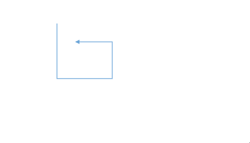
Avoid Overlapping
Orthogonal segments automatically reroute themselves to avoid overlapping with their connected source and target nodes. The following example illustrates how an orthogonal connector adjusts its path when a connected node is moved.
import { Component, ViewEncapsulation, ViewChild } from '@angular/core';
import { DiagramComponent, DiagramModule, NodeModel,PortVisibility, PointPortModel, ShapeStyleModel } from '@syncfusion/ej2-angular-diagrams';

@Component({
imports: [
         DiagramModule
    ],

providers: [ ],
standalone: true,
    selector: "app-container",
    template: `<ejs-diagram #diagram id="diagram" width="100%" height="580px" [getNodeDefaults] ='getNodeDefaults' >
        <e-nodes>
            <e-node id='node1' [offsetX]=150 [offsetY]=150  [ports]='port1'>
                <e-node-annotations>
                    <e-node-annotation content="Node1">
                    </e-node-annotation>
                </e-node-annotations>
            </e-node>
           <e-node id='node2' [offsetX]=350 [offsetY]=150 [ports]='port2'>
                <e-node-annotations>
                    <e-node-annotation content="Custom Template">
                    </e-node-annotation>
                </e-node-annotations>
            </e-node>
        </e-nodes>
        <e-connectors>
            < <e-connector id='connector' type='Orthogonal' sourceID='node1' sourcePortID='port1' targetID='node2' targetPortID='port2'>
            </e-connector>
        </e-connectors>
    </ejs-diagram>`,
    encapsulation: ViewEncapsulation.None
})
export class AppComponent {
    @ViewChild("diagram")
    public diagram?: DiagramComponent;
    public port1: PointPortModel[] = [{
        id: 'port1',
        offset: {
            x: 0,
            y: 0.5
        },
        shape: 'Circle',
        visibility: PortVisibility.Visible
    }]
    public port2: PointPortModel[] = [
        {
            id: 'port2',
            offset: {
                x: 1,
                y: 0.5
            },
            shape: 'Circle',
            visibility: PortVisibility.Visible
        },
        {
            id: 'port3',
            offset: {
                x: 0.5,
                y: 0
            },
            visibility: PortVisibility.Visible
        }

    ]
    public getNodeDefaults(node: NodeModel | any): NodeModel {
        node.height = 100;
        node.width = 100;
        ((node as NodeModel).style as ShapeStyleModel).fill = "#6BA5D7";
        ((node as NodeModel).style as ShapeStyleModel).strokeColor = "White";
        return node;
    }
}
import { bootstrapApplication } from '@angular/platform-browser';
import { AppComponent } from './app.component';
import 'zone.js';
bootstrapApplication(AppComponent).catch((err) => console.error(err));How to Customize Orthogonal Segment Thumb Shape
The thumbs used to edit orthogonal segments are rendered as a Circle by default. You can change this shape using the diagram’s segmentThumbShape property. The following predefined shapes are available:
| Shape Name | Preview |
|---|---|
| Rhombus | 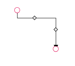 |
| Square | 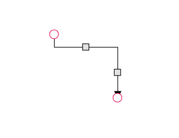 |
| Rectangle | 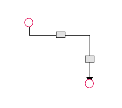 |
| Ellipse | 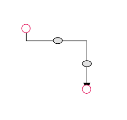 |
| Arrow | 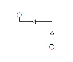 |
| OpenArrow | 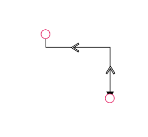 |
| Circle | 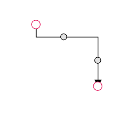 |
| Fletch | 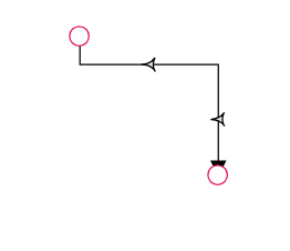 |
| OpenFetch | 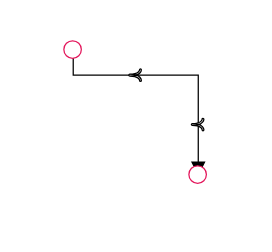 |
| IndentedArrow | 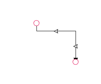 |
| OutdentedArrow | 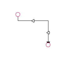 |
| DoubleArrow | 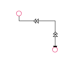 |
You can also customize the style of the thumb shape by overriding the e-orthogonal-thumb CSS class.
import { Component, ViewEncapsulation, ViewChild } from '@angular/core';
import { DiagramComponent, Diagram, DiagramModule,ConnectorEditing,ConnectorConstraints, OrthogonalSegmentModel, PointModel } from '@syncfusion/ej2-angular-diagrams';
Diagram.Inject(ConnectorEditing);

@Component({
imports: [
         DiagramModule
    ],

providers: [ ],
standalone: true,
    selector: "app-container",
    template: `<ejs-diagram #diagram id="diagram" width="900px" height="500px" [segmentThumbShape] = 'segmentThumbShape'>
        <e-connectors>
            <e-connector id='connector2' type='Orthogonal' [sourcePoint]='sourcePoint' [targetPoint]='targetPoint' [segments]='segments' [constraints]='constraints' >
            </e-connector>
        </e-connectors>
    </ejs-diagram>`,
    encapsulation: ViewEncapsulation.None
})
export class AppComponent {
    @ViewChild("diagram")
    public diagram?: DiagramComponent;
    public sourcePoint?: PointModel;
    public targetPoint?: PointModel;
    public segments?: OrthogonalSegmentModel;
    ngOnInit(): void {
        this.sourcePoint = { x: 250, y: 250 };
        this.targetPoint = { x: 350, y: 350 };
        this.segments = [
            {
            type: 'Orthogonal',
            // Defines the direction for the segment lines
            direction: "Right",
            // Defines the length for the segment lines
            length: 70
            },
            {
            type: 'Orthogonal',
            direction: "Bottom",
            length: 20
            }
        ]
    }
    constraints = ConnectorConstraints.Default | ConnectorConstraints.DragSegmentThumb;
    //Sets segmentThumbShape as arrow
    segmentThumbShape ="Arrow";
}
import { bootstrapApplication } from '@angular/platform-browser';
import { AppComponent } from './app.component';
import 'zone.js';
bootstrapApplication(AppComponent).catch((err) => console.error(err));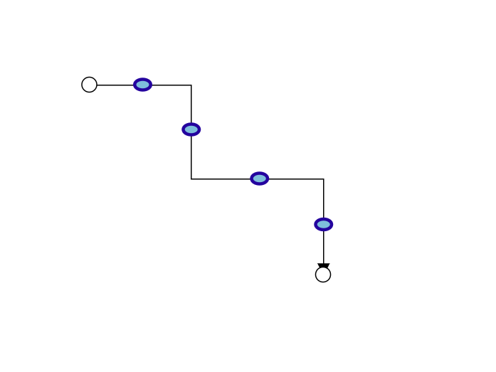
Use the following CSS to customize the segment thumb’s appearance.
.e-orthogonal-thumb {
    fill: rgb(126, 190, 219);
    stroke: #24039e;
    stroke-width: 3px;
}
How to Customize Orthogonal Segment Thumb Size
By default, orthogonal segment thumbs have a width and height of 10px. This can be customized for all connectors or for individual ones using the segmentThumbSize property.
To change the thumb size for all orthogonal connectors in a diagram, set the segmentThumbSize property in the diagram model.
To customize the thumb size for a specific connector, you must first disable its InheritSegmentThumbSize flag in the constraints property. Then, set the connector’s segmentThumbSize value as needed.
import { Component, ViewEncapsulation, ViewChild } from '@angular/core';
import { DiagramComponent, Diagram, NodeModel,ConnectorEditing,ConnectorConstraints, OrthogonalSegmentModel, PointModel ,DiagramModule} from '@syncfusion/ej2-angular-diagrams';
Diagram.Inject(ConnectorEditing);

@Component({
imports: [
         DiagramModule
    ],

providers: [ ],
standalone: true,
    selector: "app-container",
    template: `<ejs-diagram #diagram id="diagram" width="900px" height="500px" [getNodeDefaults]  ='getNodeDefaults'  [segmentThumbSize]= 15>
          <e-nodes>
            <e-node id='node1' [offsetX]=200 [offsetY]=200 > </e-node>
            <e-node id='node2' [offsetX]=400 [offsetY]=400 > </e-node>
            <e-node id='node3' [offsetX]=600 [offsetY]=200 > </e-node>
            <e-node id='node4' [offsetX]=800 [offsetY]=400 > </e-node>
        </e-nodes>
        <e-connectors>
            <e-connector id='connector1' type='Orthogonal' sourceID='node1'  targetID='node2' [segments]='segments1' [constraints]='Constraints1'>
            </e-connector>
            <e-connector id='connector2' type='Orthogonal' sourceID='node3'  targetID='node4' [segments]='segments2' [constraints]='Constraints2' [segmentThumbSize] = 20 >
            </e-connector>
        </e-connectors>
    </ejs-diagram>`,
    encapsulation: ViewEncapsulation.None
})
export class AppComponent {
    @ViewChild("diagram")
    public diagram?: DiagramComponent;
    public sourcePoint?: PointModel;
    public targetPoint?: PointModel;
    public segments?: OrthogonalSegmentModel;
    ngOnInit(): void {

    }
    public getNodeDefaults(node: NodeModel): NodeModel {
        node.height = 100;
        node.width = 100;
        return node;
    }
    public segments1 = [
        {
            type: 'Orthogonal',
            direction: "Right",
            length: 70
        },
        {
            type: 'Orthogonal',
            direction: "Bottom",
            length: 50
        }
    ]

    public segments2 = [
        {
            type: 'Orthogonal',
            direction: "Right",
            length: 70
        },
        {
            type: 'Orthogonal',
            direction: "Bottom",
            length: 50
        }
    ]

    public Constraints1 =  ConnectorConstraints.Default | ConnectorConstraints.DragSegmentThumb

    public Constraints2 =  ConnectorConstraints.Default & ~(ConnectorConstraints.InheritSegmentThumbSize) | ConnectorConstraints.DragSegmentThumb
}
import { bootstrapApplication } from '@angular/platform-browser';
import { AppComponent } from './app.component';
import 'zone.js';
bootstrapApplication(AppComponent).catch((err) => console.error(err));