Flowchart layout in Angular Diagram control
4 Jun 202624 minutes to read
The flowchart layout provides a visual representation of processes, workflows, systems, or algorithms in a diagrammatic format. It uses various symbols to depict different actions, with arrows connecting these symbols to indicate the flow or direction of the process. Flowcharts are powerful tools for illustrating step-by-step sequences, making complex processes easier to understand and communicate.
Common flowchart symbols
Different flowchart symbols have specific meanings used to represent various states and actions in flowcharts. The following table describes the most common flowchart symbols used when creating flowcharts.
| Symbol | Shape name | Description |
|---|---|---|
 |
Terminator | Indicates the beginning and ending of the process. |
 |
Data | Indicates data input or output for a process. |
 |
Process | Represents an operation or set of operations and data manipulations. |
 |
Decision | Shows a branching point where a decision is made to choose one of two paths. |
 |
Document | Represents a single document or report in the process. |
 |
PreDefinedProcess | Represents a sequence of actions that combine to perform a specific task defined elsewhere. |
 |
StoredData | Represents a step where data is stored within a process. |
 |
InternalStorage | Represents internal storage operations. |
 |
DirectData | Represents a collection of information that allows searching, sorting, and filtering. |
 |
SequentialData | Represents data that must be accessed sequentially. |
 |
Sort | Represents a step that organizes items in a list sequentially. |
 |
PaperTap | Represents a step where data is stored within a process. |
 |
ManualInput | Represents the manual input of data into a field or step in a process. |
 |
ManualOperation | Represents an operation in a process that must be performed manually, not automatically. |
 |
Preparation | Represents a setup or initialization process before another step in the process. |
 |
OffPageReference | Represents a labeled connector used to link two flowcharts on different pages. |
 |
MultiDocument | Represents multiple documents or reports in the process. |
 |
Card | Represents a data card or punched card used for data entry or storage. |
 |
SummingJunction | Represents the logical AND operation, merging multiple inputs into a single output. |
 |
Or | Represents the logical OR operation. |
 |
Merge | Represents a step where two or more sub-lists or sub-processes become one. |
 |
Extract | Represents retrieving or obtaining data from a source for further processing or analysis. |
 |
Delay | Represents a period of delay in a process. |
 |
Collate | Represents the process of gathering and arranging data or documents from multiple sources into a structured format. |
 |
Annotation | Represents additional information or clarifications about a process or decision point in the flowchart. |
 |
Annotation2 | Represents additional information or comments about a process in the flowchart. |
 |
SequentialAccessStorage | Represents information that is stored in a sequence. |
 |
Display | Represents information, data, or output being shown on a screen or printed for user review. |
 |
LoopLimit | Represents the maximum number of times a particular process or operation can be repeated within a loop. |
 |
Connector | Represents the direction of flow from one step to another. This connector is created automatically based on the relationship between parent and child nodes. |
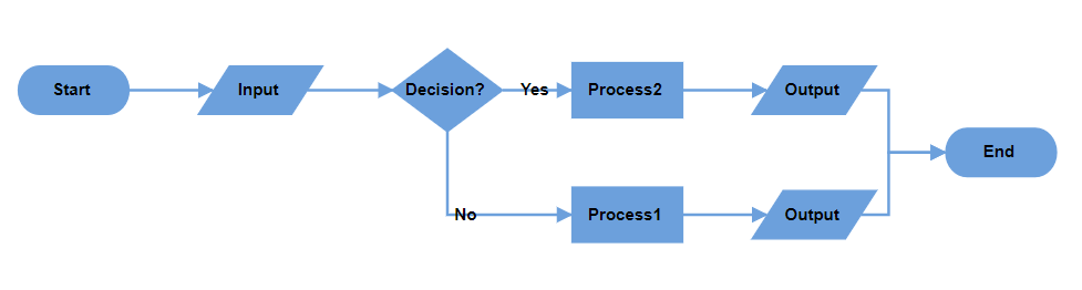
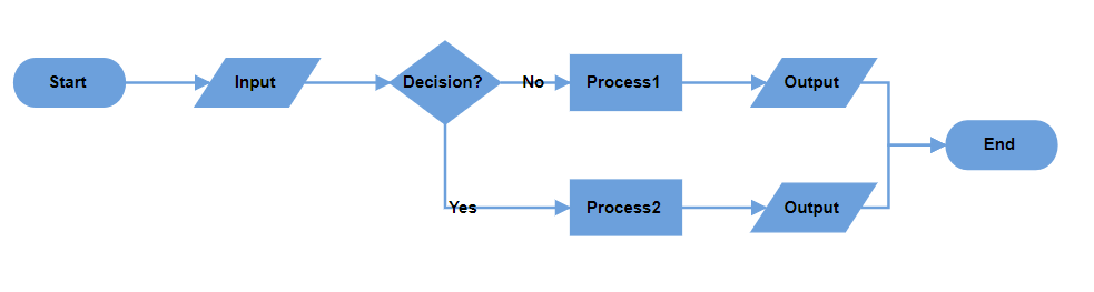
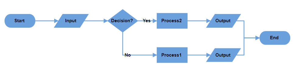
Render flowchart layout with data source
To render a flowchart layout, set the layoutType property to Flowchart. The following code example demonstrates how to render a flowchart layout using a data source.
import { Component, ViewEncapsulation, ViewChild } from '@angular/core';
import { DiagramComponent, DiagramModule, DataBindingService, FlowchartLayoutService, NodeModel,
  ConnectorModel, Diagram, DataBinding, LayoutModel, FlowchartLayout } from '@syncfusion/ej2-angular-diagrams';
import { DataManager, Query } from '@syncfusion/ej2-data';

Diagram.Inject(DataBinding, FlowchartLayout);

@Component({
  imports: [DiagramModule],

  providers: [FlowchartLayoutService, DataBindingService],
  standalone: true,
  selector: 'app-container',
  template: `<ejs-diagram #diagram id="diagram" width="100%" height="650px" [getNodeDefaults]='nodeDefaults'
  [getConnectorDefaults]='connectorDefaults' [layout]='layout' [dataSourceSettings]='dataSource' ></ejs-diagram>`,
  encapsulation: ViewEncapsulation.None
})

export class AppComponent {
  @ViewChild('diagram')
  public diagram!: DiagramComponent;

  //Initializes data source
  public data: Object[] =
    [
      {
        "id": "1",
        "name": "Start",
        "shape": "Terminator",
        "color": "#6CA0DC"
      },
      {
        "id": "2",
        "name": "Input",
        "parentId": ["1"],
        "shape": "Parallelogram",
        "color": "#6CA0DC"
      },
      {
        "id": "3",
        "name": "Decision?",
        "parentId": ["2"],
        "shape": "Decision",
        "color": "#6CA0DC"
      },
      {
        "id": "4",
        "label": ["No"],
        "name": "Process1",
        "parentId": ["3"],
        "shape": "Process",
        "color": "#6CA0DC"
      },
      {
        "id": "5",
        "label": ["Yes"],
        "name": "Process2",
        "parentId": ["3"],
        "shape": "Process",
        "color": "#6CA0DC"
      },
      {
        "id": "6",
        "name": "Output",
        "parentId": ["5"],
        "shape": "Parallelogram",
        "color": "#6CA0DC"
      },
      {
        "id": "7",
        "name": "Output",
        "parentId": ["4"],
        "shape": "Parallelogram",
        "color": "#6CA0DC"
      },
      {
        "id": "8",
        "name": "End",
        "parentId": ["6", "7"],
        "shape": "Terminator",
        "color": "#6CA0DC"
      }
    ]

  //Configures data source for Diagram
  public dataSource: Object = {
    id: 'id', parentId: 'parentId',
    dataManager: new DataManager(this.data as JSON[], new Query().take(7))
  };

  //Sets the default properties for all the Nodes
  public nodeDefaults(node: NodeModel): NodeModel {
    node.width = 120; node.height = 50;
    if ((node.shape as any).shape === 'Decision') {
      node.height = 80;
    }
    return node;
  };

  //Sets the default properties for all the Connector
  public connectorDefaults(connector: ConnectorModel): ConnectorModel {
    connector.type = 'Orthogonal';
    return connector;
  };

  //Uses layout to auto-arrange nodes on the Diagram page
  public layout: LayoutModel = {
    //Sets layout type
    type: 'Flowchart',
  };

}
import { bootstrapApplication } from '@angular/platform-browser';
import { AppComponent } from './app.component';
import 'zone.js';
bootstrapApplication(AppComponent).catch((err) => console.error(err));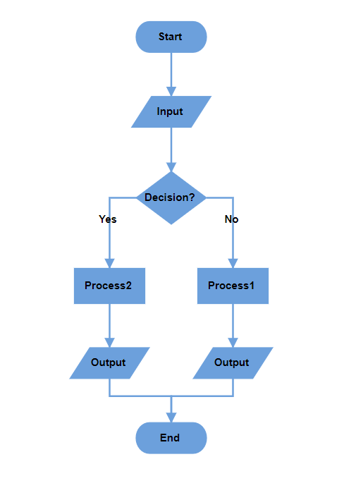
NOTE
To convert a data source into a flowchart layout, inject the DataBinding module along with the FlowchartLayout module in the diagram.
Configuring data source with appearance settings
In the flowchart layout, you can define the desired shape, style, and label for each node, as well as the decorator type for connectors, directly within the data source. Structure the data source as shown in the example below:
var Data = [
    {
        "id": "A",
        "name": "Start",
        "shape": "Terminator",
        "color": "#90EE90",
        "parentId": null,
        "stroke": "#333",
        "strokeWidth": 2
    },
    {
        "id": "B",
        "name": "Process",
        "shape": "Process",
        "color": "#4682B4",
        "parentId": [
            "A"
        ],
        "label": ['A-B'],
        "arrowType": "Fletch",
        "stroke": "#333",
        "strokeWidth": 2
    }
]
Data source field definitions
-
name: Text annotation displayed on the node -
shape: Node shape type (e.g., Terminator, Process, Decision) -
color: Fill color for the node background -
stroke: Border color of the node -
strokeWidth: Border thickness in pixels -
label: Annotations for incoming connectors -
arrowType: Arrowhead type for incoming connectors (e.g., Diamond, Fletch)
This structure enables comprehensive customization of the flowchart’s visual elements based on the provided data source.
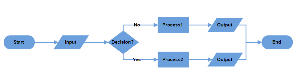
Render flowchart layout with nodes and connectors
The following example demonstrates how to render a flowchart layout using predefined nodes and connectors. Define the nodes and connectors collections and assign them to the diagram. Set the layoutType to Flowchart to enable automatic arrangement.
import { Component, ViewEncapsulation, ViewChild } from '@angular/core';
import { DiagramComponent, DiagramModule, DataBindingService, FlowchartLayoutService, NodeModel,
  ConnectorModel, Diagram, DataBinding, LayoutModel, FlowchartLayout } from '@syncfusion/ej2-angular-diagrams';

Diagram.Inject(DataBinding, FlowchartLayout);

@Component({
  imports: [DiagramModule],

  providers: [FlowchartLayoutService, DataBindingService],
  standalone: true,
  selector: 'app-container',
  template: `<ejs-diagram #diagram id="diagram" width="100%" height="650px"
  [nodes]='nodes' [connectors]='connectors' [getNodeDefaults]='nodeDefaults'
    [getConnectorDefaults]='connectorDefaults' [layout]='layout' ></ejs-diagram>`,
  encapsulation: ViewEncapsulation.None
})

export class AppComponent {
  @ViewChild('diagram')
  public diagram!: DiagramComponent;

  //Initialize nodes
  public nodes = [
    { id: '1', shape: { type: 'Flow', shape: 'Terminator' }, annotations: [{ content: 'Start' }], style: { fill: '#6CA0DC' } },
    { id: '2', shape: { type: 'Flow', shape: 'Data' }, annotations: [{ content: 'Input' }], style: { fill: '#6CA0DC' } },
    { id: '3', shape: { type: 'Flow', shape: 'Decision' }, annotations: [{ content: 'Decision?' }], style: { fill: '#6CA0DC' } },
    { id: '4', shape: { type: 'Flow', shape: 'Process' }, annotations: [{ content: 'Process1' }], style: { fill: '#6CA0DC' } },
    { id: '5', shape: { type: 'Flow', shape: 'Process' }, annotations: [{ content: 'Process2' }], style: { fill: '#6CA0DC' } },
    { id: '6', shape: { type: 'Flow', shape: 'Data' }, annotations: [{ content: 'Output' }], style: { fill: '#6CA0DC' } },
    { id: '7', shape: { type: 'Flow', shape: 'Data' }, annotations: [{ content: 'Output' }], style: { fill: '#6CA0DC' } },
    { id: '8', shape: { type: 'Flow', shape: 'Terminator' }, annotations: [{ content: 'End' }], style: { fill: '#6CA0DC' } }
  ];
  //Initialize connectors
  public connectors = [
    { id: 'connector1', sourceID: '1', targetID: '2' },
    { id: 'connector2', sourceID: '2', targetID: '3' },
    { id: 'connector3', sourceID: '3', targetID: '4', annotations: [{ content: 'No' }] },
    { id: 'connector4', sourceID: '3', targetID: '5', annotations: [{ content: 'Yes' }] },
    { id: 'connector5', sourceID: '5', targetID: '6' },
    { id: 'connector6', sourceID: '4', targetID: '7' },
    { id: 'connector7', sourceID: '6', targetID: '8' },
    { id: 'connector8', sourceID: '7', targetID: '8' }
  ];


  //Sets the default properties for all the Nodes
  public nodeDefaults(node: NodeModel): NodeModel {
    node.width = 120; node.height = 50;
    if ((node.shape as any).shape === 'Decision') {
      node.height = 80;
    }
    return node;
  };

  //Sets the default properties for all the Connector
  public connectorDefaults(connector: ConnectorModel): ConnectorModel {
    connector.type = 'Orthogonal';
    return connector;
  };

  //Uses layout to auto-arrange nodes on the Diagram page
  public layout: LayoutModel = {
    //Sets layout type
    type: 'Flowchart',
  };

}
import { bootstrapApplication } from '@angular/platform-browser';
import { AppComponent } from './app.component';
import 'zone.js';
bootstrapApplication(AppComponent).catch((err) => console.error(err));Customize flowchart layout orientation
Customize the flow direction of the flowchart using the orientation property of the layout class. The flowchart can flow either vertically from top to bottom or horizontally from left to right. The default orientation is TopToBottom.
Top to bottom orientation
This orientation arranges elements vertically, flowing from top to bottom. It is commonly used in flowcharts to represent the sequential progression of steps or actions in a process.
// Initialize the diagram
<ejs-diagram #diagram id="diagram" width="100%" height="600px" [layout]="layout"> </ejs-diagram>

export class AppComponent {
  @ViewChild("diagram")
  public diagram!: DiagramComponent;
  public layout?: LayoutModel;
  ngOnInit(): void {
    this.layout = {
        // Sets layout type
        type: 'Flowchart',
        // Sets the orientation of the layout
        orientation: 'TopToBottom'
    };
  }
}
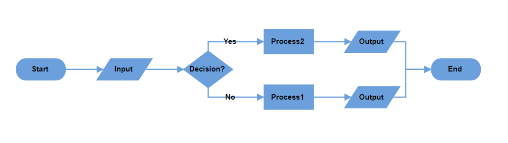
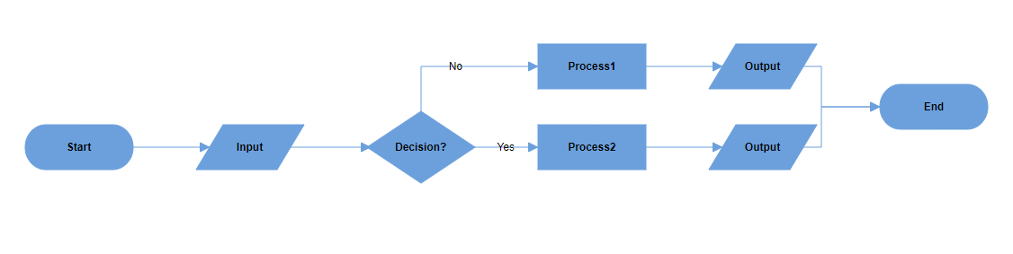
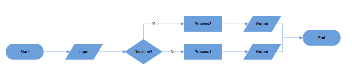
Left to right orientation
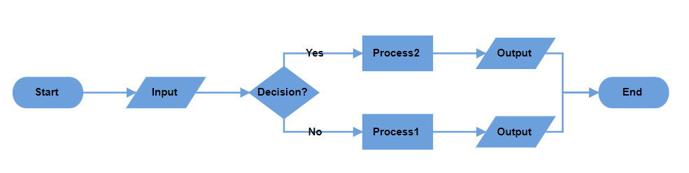
This orientation arranges elements horizontally, flowing from left to right. It is typically used to represent processes or workflows that move sequentially across the page, emphasizing a linear progression of steps or actions.
// Initialize the diagram
<ejs-diagram #diagram id="diagram" width="100%" height="600px" [layout]="layout"> </ejs-diagram>

export class AppComponent {
  @ViewChild("diagram")
  public diagram!: DiagramComponent;
  public layout?: LayoutModel;
  ngOnInit(): void {
    this.layout = {
        // Sets layout type
        type: 'Flowchart',
        // Sets the orientation of the layout
        orientation: 'LeftToRight'
    };
  }
}
Customize decision output directions
The decision symbol in a flowchart represents a question or condition that leads to different paths based on a binary outcome (Yes/No, True/False). Customize the output direction of these paths using the yesBranchDirection and noBranchDirection properties of the flowchartLayoutSettings class.
Branch direction options
-
LeftInFlow- Arranges the Yes/No branch to the left of the decision symbol -
RightInFlow- Arranges the Yes/No branch to the right of the decision symbol -
SameAsFlow- Aligns the Yes/No branch in the same direction as the flow of the decision symbol
The following example shows a flowchart layout with yesBranchDirection set to SameAsFlow and noBranchDirection set to LeftInFlow.
import { NgModule } from '@angular/core'
import { BrowserModule } from '@angular/platform-browser'
import { } from '@syncfusion/ej2-angular-diagrams'


import { Component, ViewEncapsulation, ViewChild } from '@angular/core';
import { DiagramComponent, DiagramModule, DataBindingService, FlowchartLayoutService, NodeModel,
  ConnectorModel, Diagram, DataBinding, LayoutModel, FlowchartLayout } from '@syncfusion/ej2-angular-diagrams';

Diagram.Inject(DataBinding, FlowchartLayout);

@Component({
  imports: [DiagramModule],

  providers: [FlowchartLayoutService, DataBindingService],
  standalone: true,
  selector: 'app-container',
  template: `<ejs-diagram #diagram id="diagram" width="100%" height="650px" [nodes]='nodes' [connectors]='connectors'
  [getNodeDefaults]='nodeDefaults' [getConnectorDefaults]='connectorDefaults' [layout]='layout' ></ejs-diagram>`,
  encapsulation: ViewEncapsulation.None
})

export class AppComponent {
  @ViewChild('diagram')
  public diagram!: DiagramComponent;

  //Initialize nodes
  public nodes = [
    { id: '1', shape: { type: 'Flow', shape: 'Terminator' }, annotations: [{ content: 'Start' }], style: { fill: '#6CA0DC' } },
    { id: '2', shape: { type: 'Flow', shape: 'Data' }, annotations: [{ content: 'Input' }], style: { fill: '#6CA0DC' } },
    { id: '3', shape: { type: 'Flow', shape: 'Decision' }, annotations: [{ content: 'Decision?' }], style: { fill: '#6CA0DC' } },
    { id: '4', shape: { type: 'Flow', shape: 'Process' }, annotations: [{ content: 'Process1' }], style: { fill: '#6CA0DC' } },
    { id: '5', shape: { type: 'Flow', shape: 'Process' }, annotations: [{ content: 'Process2' }], style: { fill: '#6CA0DC' } },
    { id: '6', shape: { type: 'Flow', shape: 'Data' }, annotations: [{ content: 'Output' }], style: { fill: '#6CA0DC' } },
    { id: '7', shape: { type: 'Flow', shape: 'Data' }, annotations: [{ content: 'Output' }], style: { fill: '#6CA0DC' } },
    { id: '8', shape: { type: 'Flow', shape: 'Terminator' }, annotations: [{ content: 'End' }], style: { fill: '#6CA0DC' } }
  ];

  //Initialize connectors
  public connectors = [
    { id: 'connector1', sourceID: '1', targetID: '2' },
    { id: 'connector2', sourceID: '2', targetID: '3' },
    { id: 'connector3', sourceID: '3', targetID: '4', annotations: [{ content: 'No' }] },
    { id: 'connector4', sourceID: '3', targetID: '5', annotations: [{ content: 'Yes' }] },
    { id: 'connector5', sourceID: '5', targetID: '6' },
    { id: 'connector6', sourceID: '4', targetID: '7' },
    { id: 'connector7', sourceID: '6', targetID: '8' },
    { id: 'connector8', sourceID: '7', targetID: '8' }
  ];

  //Sets the default properties for all the Nodes
  public nodeDefaults(node: NodeModel): NodeModel {
    node.width = 120; node.height = 50;
    if ((node.shape as any).shape === 'Decision') {
      node.height = 80;
    }
    return node;
  };

  //Sets the default properties for all the Connector
  public connectorDefaults(connector: ConnectorModel): ConnectorModel {
    connector.type = 'Orthogonal';
    return connector;
  };

  //Uses layout to auto-arrange nodes on the Diagram page
  public layout: LayoutModel = {
    //Sets layout type
    type: 'Flowchart',

    //Customizes the flowchart layout
    flowchartLayoutSettings: {
      //Sets the yes branch direction
      yesBranchDirection: 'SameAsFlow',
      //Sets the no branch direction
      noBranchDirection: 'LeftInFlow',
    }

  }
}
import { bootstrapApplication } from '@angular/platform-browser';
import { AppComponent } from './app.component';
import 'zone.js';
bootstrapApplication(AppComponent).catch((err) => console.error(err));Decision branch behavior reference
The following table illustrates the visual behavior of different branch direction combinations:
| YesBranchDirection | NoBranchDirection | TopToBottom | LeftToRight |
|---|---|---|---|
| Left In Flow | Right In Flow | 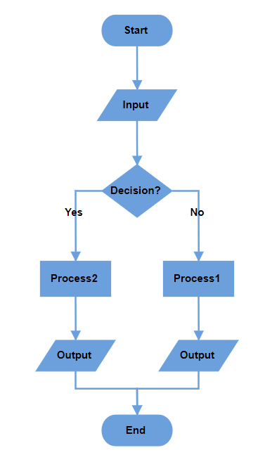 |
 |
| Right In Flow | Left In Flow | 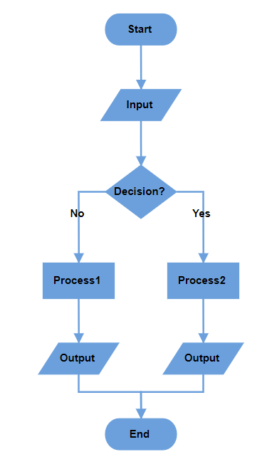 |
 |
| Same As Flow | Right In Flow | 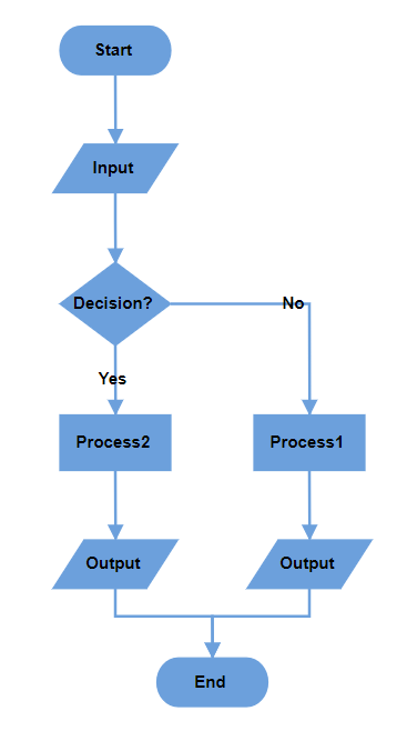 |
 |
| Same As Flow | Left In Flow | 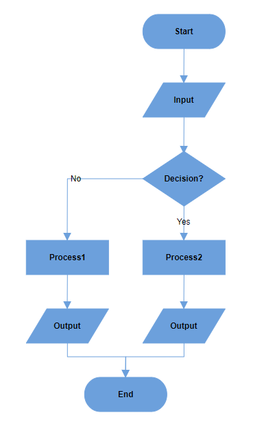 |
 |
| Right In Flow | Same As Flow | 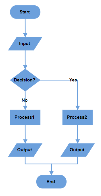 |
 |
| Left In Flow | Same As Flow | 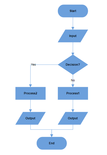 |
 |
| Same As Flow | Same As Flow | 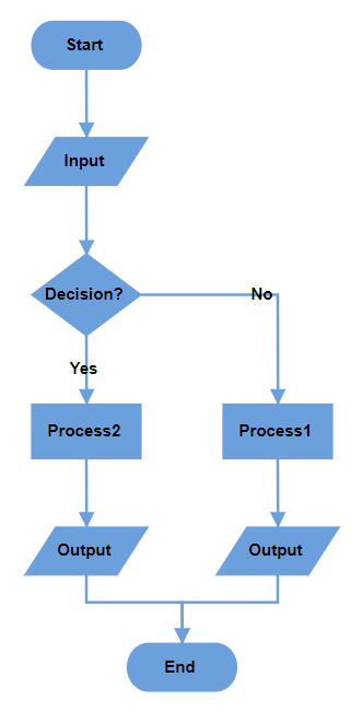 |
 |
NOTE
When both branch directions are set to the same value, the Yes branch takes priority in positioning.
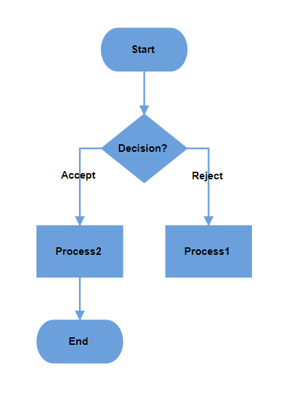
Custom Yes and No branch values
The decision symbol produces two output branches: a Yes branch and a No branch. Configure custom text values to determine branch classification using the yesBranchValues and noBranchValues properties of the flowchartLayoutSettings class.
Default branch values
By default:
-
yesBranchValuescontains: “Yes” and “True” -
noBranchValuescontains: “No” and “False”
Custom branch classification
When a connector’s text value matches any value in the yesBranchValues array, it is classified as a Yes branch. Similarly, when the connector text matches any value in the noBranchValues array, it is classified as a No branch. This enables flexible decision flow control using custom terminology appropriate for your specific use case.
The following example demonstrates how to set custom text values for yes and no branches.
import { Component, ViewEncapsulation, ViewChild } from '@angular/core';
import { DiagramComponent, NodeModel, DiagramModule, DataBindingService, FlowchartLayoutService,
  ConnectorModel, Diagram, DataBinding, LayoutModel, FlowchartLayout } from '@syncfusion/ej2-angular-diagrams';

Diagram.Inject(DataBinding, FlowchartLayout);

@Component({
  imports: [DiagramModule],

  providers: [FlowchartLayoutService, DataBindingService],
  standalone: true,
  selector: 'app-container',
  template: `<ejs-diagram #diagram id="diagram" width="100%" height="650px" [nodes]='nodes' [connectors]='connectors'
  [getNodeDefaults]='nodeDefaults' [getConnectorDefaults]='connectorDefaults' [layout]='layout' ></ejs-diagram>`,
  encapsulation: ViewEncapsulation.None
})


export class AppComponent {
  @ViewChild('diagram')
  public diagram!: DiagramComponent;

  //Initialize nodes
  public nodes = [
    { id: '1', shape: { type: 'Flow', shape: 'Terminator' }, annotations: [{ content: 'Start' }], style: { fill: '#6CA0DC' } },
    { id: '2', shape: { type: 'Flow', shape: 'Decision' }, annotations: [{ content: 'Decision?' }], style: { fill: '#6CA0DC' } },
    { id: '3', shape: { type: 'Flow', shape: 'Process' }, annotations: [{ content: 'Process1' }], style: { fill: '#6CA0DC' } },
    { id: '4', shape: { type: 'Flow', shape: 'Process' }, annotations: [{ content: 'Process2' }], style: { fill: '#6CA0DC' } },
    { id: '5', shape: { type: 'Flow', shape: 'Terminator' }, annotations: [{ content: 'End' }], style: { fill: '#6CA0DC' } }
  ];

  //Initialize connectors
  public connectors = [
    { id: 'connector1', sourceID: '1', targetID: '2' },
    { id: 'connector2', sourceID: '2', targetID: '3', annotations: [{ content: 'Reject' }] },
    { id: 'connector3', sourceID: '2', targetID: '4', annotations: [{ content: 'Accept' }] },
    { id: 'connector4', sourceID: '4', targetID: '5', },
  ];

  //Sets the default properties for all the Nodes
  public nodeDefaults(node: NodeModel): NodeModel {
    node.width = 120; node.height = 50;
    if ((node.shape as any).shape === 'Decision') {
      node.height = 80;
    }
    return node;
  };

  //Sets the default properties for all the Connector
  public connectorDefaults(connector: ConnectorModel): ConnectorModel {
    connector.type = 'Orthogonal';
    return connector;
  };

  //Uses layout to auto-arrange nodes on the Diagram page
  public layout: LayoutModel = {
    //Sets layout type
    type: 'Flowchart',

    //Customizes the flowchart layout
    flowchartLayoutSettings: {
      //Sets the yes branch values
      yesBranchValues: ["Yes", "Accept"],
      //Sets the no branch values
      noBranchValues: ["No", "Reject"]
    }
  }

}
import { bootstrapApplication } from '@angular/platform-browser';
import { AppComponent } from './app.component';
import 'zone.js';
bootstrapApplication(AppComponent).catch((err) => console.error(err));