Getting started with Angular Card component
6 Feb 20267 minutes to read
This section explains how to create a simple Card component using CSS classes, and configure the card structure including header sections, content areas, and action buttons with their available functionalities in Angular.
Dependencies
The Card Component is pure CSS component so no specific dependencies to render the card.
|-- @syncfusion/ej2-layoutsSetup Angular Environment
You can use Angular CLI to setup your Angular applications.
To install Angular CLI use the following command.
npm install -g @angular/cliAngular 21 Standalone Architecture: Standalone components are the default in Angular 21. This guide uses the modern standalone architecture. If you need more information about the standalone architecture, refer to the Standalone Guide.
Installing a specific version
To install a particular version of Angular CLI, use:
npm install -g @angular/[email protected]Create a new application
With Angular CLI installed, execute this command to generate a new application:
ng new syncfusion-angular-app- This command will prompt you to configure settings like enabling Angular routing and choosing a stylesheet format.
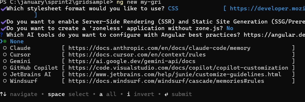
? Which stylesheet format would you like to use? (Use arrow keys)
> CSS             [ https://developer.mozilla.org/docs/Web/CSS                     ]
  Sass (SCSS)     [ https://sass-lang.com/documentation/syntax#scss                ]
  Sass (Indented) [ https://sass-lang.com/documentation/syntax#the-indented-syntax ]
Less [ http://lesscss.org ]- By default, a CSS-based application is created. Use SCSS if required:
ng new syncfusion-angular-app --style=scss- During project setup, when prompted for the Server-side rendering (SSR) option, choose the appropriate configuration.

- Select the required AI tool or ‘none’ if you do not need any AI tool.
- Navigate to your newly created application directory:
cd syncfusion-angular-appNote: In Angular 19 and below, it uses
app.component.ts,app.component.html,app.component.cssetc. In Angular 20+, the CLI generates a simpler structure withsrc/app/app.ts,app.html, andapp.css(no.component.suffixes).
Installing Syncfusion® Card package
Syncfusion® packages are distributed in npm as @syncfusion scoped packages. You can get all the Angular Syncfusion® packages from npm link.
Currently, Syncfusion® provides two types of package structures for Angular components:
- Ivy library distribution package format
- Angular compatibility compiler (Angular’s legacy compilation and rendering pipeline) package.
Ivy library distribution package
Syncfusion® Angular packages(>=20.2.36) has been moved to the Ivy distribution to support the Angular Ivy rendering engine and the package are compatible with Angular version 12 and above. To download the package use the below command.
Add @syncfusion/ej2-angular-layouts package to the application.
npm install @syncfusion/ej2-angular-layouts --saveAngular compatibility compiled package (ngcc)
For Angular versions below 12, you can use the legacy (ngcc) package of the Syncfusion® Angular components. To download the ngcc package use the command below.
Add @syncfusion/ej2-angular-layouts@ngcc package to the application.
npm install @syncfusion/ej2-angular-layouts@ngcc --saveTo mention the ngcc package in the package.json file, add the suffix -ngcc with the package version as shown below.
@syncfusion/ej2-angular-layouts:"20.2.38-ngcc"Note: If the ngcc tag is not specified while installing the package, the Ivy Library Package will be installed and this package will throw a warning.
Adding CSS reference
The following CSS files are available in the ../node_modules/@syncfusion package folder.
These can be referenced in [src/styles.css] using the following code.
@import '../node_modules/@syncfusion/ej2-base/styles/material3.css';
@import '../node_modules/@syncfusion/ej2-layouts/styles/material3.css';
Adding a simple Card
Add the HTML div element with the e-card class into your index.html.
[src/index.html]
        <div class = "e-card">
          Sample Card
        </div>
Adding a header to the card
Cards can be created with a header using a specific structure. To add a header, create a div element and add the e-card-header class.
You can include a heading inside the card header by adding a div element with the e-card-header-caption class, and content can be added using an element with the e-card-content class. For detailed information, refer to the Header and Content.
       <div class="e-card"> --> Root Element
            <div class="e-card-header"> --> Root Header Element
                <div class="e-card-header-caption"> --> Root Heading Element
                    <div class="e-card-header-title"></div> --> Heading Title Element
                </div>
            </div>
            <div class="e-card-content"></div> --> Card content Element
       </div>
Now, run the application in the browser using the following command.
 ```
   npm start
 ```
Output will be as follows:
import { NgModule } from '@angular/core'
import { BrowserModule } from '@angular/platform-browser'


import { Component, ViewChild } from '@angular/core';

@Component({
imports: [

    ],


standalone: true,
    selector: 'app-container',
    template: `
        <div tabindex="0" class="e-card" id="basic">
            <div class="e-card-header">
                <div class="e-card-header-caption">
                    <div class="e-card-title">Advanced UWP</div>
                </div>
            </div>
            <div class="e-card-content">
                Communicating with Windows 10 and Other Apps, the second in a five-part series written by Succinctly series
                author Matteo Pagani. To download the complete white paper, and other papers in the series, visit
                the White Paper section of Syncfusion’s Technology Resource Portal.
            </div>
        </div>
        `
})

export class AppComponent {
    @ViewChild('element') element: any;

}
import { bootstrapApplication } from '@angular/platform-browser';
import { AppComponent } from './app.component';
import 'zone.js';
bootstrapApplication(AppComponent).catch((err) => console.error(err));