Getting Started with the Vue Uploader Component in the Quasar Framework
25 Apr 20254 minutes to read
This article provides a step-by-step guide for setting up a Quasar project and integrating the Syncfusion® Vue Uploader component using the Composition API.
The Quasar Framework is a Vue.js-based open-source framework that empowers developers to create high-performance and responsive applications across various platforms, such as web, mobile, and desktop.
Prerequisites
System requirements for Syncfusion® Vue UI components
Set up the Quasar project
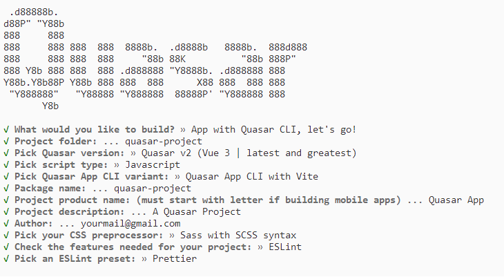
To initiate the creation of a new Quasar project, use the following commands:
npm init quasarThis command prompts additional configurations. Follow the steps outlined in the images below:
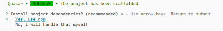
This generates the necessary files and prompts for project dependency installation. Respond with ‘yes’ to proceed with npm install, as shown in the image below:
Navigate to your project directory:
cd quasar-projectNow that quasar-project is ready to run with default settings, let’s add Syncfusion® components to the project.
Add the Syncfusion® Vue packages
Syncfusion® Vue component packages are available at npmjs.com. To use Syncfusion® Vue components in the project, install the corresponding npm package.
This article uses the Vue Uploader component as an example. To use the Vue Uploader component in the project, the @syncfusion/ej2-vue-inputs package needs to be installed using the following command:
npm install @syncfusion/ej2-vue-inputs --saveImport Syncfusion® CSS styles
You can import themes for the Syncfusion® Vue component in various ways, such as using CSS or SASS styles from npm packages, CDN, CRG and Theme Studio. Refer to the themes topic to learn more about built-in themes and different ways to refer to themes in a Vue project.
In this article, the Material 3 theme is applied using CSS styles, which are available in installed packages. The necessary Material 3 CSS styles for the Uploader component and its dependents were imported into the <style> section of the src/app.vue file.
<style>
@import "../node_modules/@syncfusion/ej2-base/styles/material3.css";
@import "../node_modules/@syncfusion/ej2-buttons/styles/material3.css";
@import "../node_modules/@syncfusion/ej2-vue-inputs/styles/material3.css";
</style>
The order of importing CSS styles should be in line with their dependency graph.
Add the Syncfusion® Vue component
Follow the below steps to add the Vue Uploader component:
1. First, add the setup attribute to the script tag to indicate that Vue will be using the Composition API. And import the Uploader component and its child directives in the script section of the src/app.vue file.
<script setup>
  import { UploaderComponent as EjsUploader } from "@syncfusion/ej2-vue-inputs";
</script>
2. Then, define the Uploader component in the src/app.vue file, as shown below:
<template>
    <div id="app">
        <div id="modalTarget" class="control-section; position:relative" style="height:350px;">
            <ejs-uploader ref="uploadObj" id='defaultfileupload' name="UploadFiles"></ejs-uploader>
        </div>
    </div>
</template>
Here is the summarized code for the above steps in the src/app.vue file:
<template>
    <div id="app">
        <div id="modalTarget" class="control-section; position:relative" style="height:350px;">
            <ejs-uploader ref="uploadObj" id='defaultfileupload' name="UploadFiles"></ejs-uploader>
        </div>
    </div>
</template>
<script setup>
import { UploaderComponent as EjsUploader } from "@syncfusion/ej2-vue-inputs";
</script>
<style>
@import "../node_modules/@syncfusion/ej2-base/styles/material3.css";
@import "../node_modules/@syncfusion/ej2-buttons/styles/material3.css";
@import "../node_modules/@syncfusion/ej2-vue-inputs/styles/material3.css";
#app {
    color: #008cff;
    height: 40px;
    left: 45%;
    position: absolute;
    top: 45%;
    width: 30%;
}
.control-section {
    height: 100%;
    min-height: 200px;
}
</style>
Run the project
To run the project, use the following command:
npm run devThe output will appear as follows: