- Prerequisites
- Creating Vue application using Vue CLI
- Adding Syncfusion Uploader package in the application
- Adding CSS reference for Syncfusion Vue Uploader component
- Adding Syncfusion Vue Uploader component in the application
- Running the application
- Adding drop area
- Configure asynchronous settings
- Handle success and failed upload
- See Also
Contact Support
Getting Started
16 Mar 20237 minutes to read
This section explains how to use Syncfusion Vue Uploader components in Vue 3 application.
Prerequisites
System requirements for Syncfusion Vue UI components
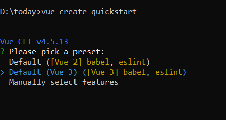
Creating Vue application using Vue CLI
The easiest way to create a Vue application is to use the Vue CLI. Vue CLI versions above 4.5.0 are mandatory for creating applications using Vue 3. Use the following command to uninstall older versions of the Vue CLI.
npm uninstall vue-cli -gUse the following commands to install the latest version of Vue CLI.
npm install -g @vue/cli
npm install -g @vue/cli-init
Create a new project using the command below.
vue create quickstartInitiating a new project prompts us to choose the type of project to be used for the current application. Select the option Default (Vue 3) from the menu.
Adding Syncfusion Uploader package in the application
Syncfusion Vue packages are maintained in the npmjs.com registry. The Uploader component will be used in this example. To install it use the following command.
npm install @syncfusion/ej2-vue-inputs --saveAdding CSS reference for Syncfusion Vue Uploader component
Import the needed css styles for the Uploader component along with dependency styles in the <style> section of the src/App.vue file as follows.
<style>
    @import "../node_modules/@syncfusion/ej2-base/styles/material.css";
    @import "../node_modules/@syncfusion/ej2-buttons/styles/material.css";
    @import "../node_modules/@syncfusion/ej2-vue-inputs/styles/material.css";
</style>
Adding Syncfusion Vue Uploader component in the application
You have completed all the necessary configurations needed for rendering the Syncfusion Vue component. Now, you are going to add the Uploader component using following steps.
Import the Uploader component in the <script> section of the src/App.vue file.
<script>
import { UploaderComponent } from "@syncfusion/ej2-vue-inputs";
</script>
Register the Uploader component.
import { UploaderComponent } from "@syncfusion/ej2-vue-inputs";
//Component registeration
export default {
    name: "App",
    components: {
        'ejs-uploader' : UploaderComponent,
    }
}
Add the component definition in template section.
<template>
  <div>
    <div id="modalTarget" class="control-section; position:relative" style="height:350px;">
        <ejs-uploader ref="uploadObj" id='defaultfileupload' name="UploadFiles"></ejs-uploader>
    </div>
  </div>
</template>
Summarizing the above steps, update the src/App.vue file with following code.
<template>
  <div>
    <div id="modalTarget" class="control-section; position:relative" style="height:350px;">
        <ejs-uploader ref="uploadObj" id='defaultfileupload' name="UploadFiles"></ejs-uploader>
    </div>
  </div>
</template>
<script>
import { UploaderComponent } from "@syncfusion/ej2-vue-inputs";
//Component registeration
export default {
    name: "App",
    components: {
        'ejs-uploader': UploaderComponent,
    },
    data: function() {
        return {  }
    }
}
</script>
<style>
    @import "../node_modules/@syncfusion/ej2-base/styles/material.css";
    @import "../node_modules/@syncfusion/ej2-buttons/styles/material.css";
    @import "../node_modules/@syncfusion/ej2-vue-inputs/styles/material.css";
    #app {
        color: #008cff;
        height: 40px;
        left: 45%;
        position: absolute;
        top: 45%;
        width: 20%;
    }
    .control-section {
        height: 100%;
        min-height: 200px;
    }
</style>
Running the application
Run the application using the following command.
npm run serveOutput be like the below.

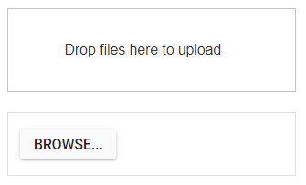
Adding drop area
By default, the uploader component allows to upload files by drag the files from file explorer, and drop into the drop area. You can configure any other external element as drop target using dropArea property.
In the following sample, drop target is configured.
<template>
  <div>
    <div id='droparea'>Drop files here to upload</div>
    <ejs-uploader ref="uploadObj" id='defaultfileupload' name="UploadFiles"  :dropArea = "dropElement"></ejs-uploader>
  </div>
</template>
<script>
import { UploaderComponent } from "@syncfusion/ej2-vue-inputs";
//Component registeration
export default {
    name: "App",
    components: {
        'ejs-uploader' : UploaderComponent,
    },
    data: function() {
        return {
            dropElement: '#droparea'
        }
    }
}
</script>
<style>
    @import "../node_modules/@syncfusion/ej2-base/styles/material.css";
    @import "../node_modules/@syncfusion/ej2-buttons/styles/material.css";
    @import "../node_modules/@syncfusion/ej2-vue-inputs/styles/material.css";
    #container {
        visibility: hidden;
        padding-left: 5%;
        width: 100%;
    }
    #loader {
        color: #008cff;
        font-family: 'Helvetica Neue','calibiri';
        font-size: 14px;
        height: 40px;
        left: 45%;
        position: absolute;
        top: 45%;
        width: 30%;
    }
    .fileupload {
        margin: 20px auto;
        width: 400px;
    }
    #droparea {
        padding: 50px 25px;
        margin: 30px auto;
        border: 1px solid #c3c3c3;
        text-align: center;
        width: 20%;
        display: inline-flex;
    }
    .e-file-select,
    .e-file-drop {
        display: none;
    }
    body .e-upload-drag-hover {
         outline: 2px dashed brown;
    }
    #uploadfile {
        width: 60%;
        display: inline-flex;
        margin-left: 5%;
    }
</style>
Output be like the below.
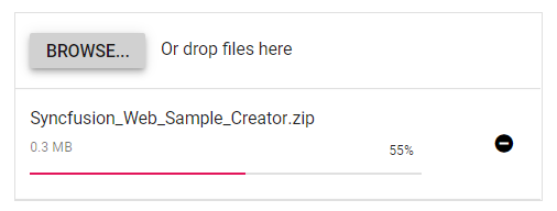
Configure asynchronous settings
The uploader component process the files to upload in Asynchronous mode by default. Define the properties saveUrl and removeUrl to handle the save and remove action as follows.
<template>
  <div>
    <ejs-uploader ref="uploadObj" id='defaultfileupload' name="UploadFiles" :asyncSettings= "path" ></ejs-uploader>
  </div>
</template>
<script>
import { UploaderComponent } from "@syncfusion/ej2-vue-inputs";
//Component registeration
export default {
    name: "App",
    components: {
        'ejs-uploader': UploaderComponent,
    },
    data: function() {
        return {
            path: {
                saveUrl: 'https://ej2.syncfusion.com/services/api/uploadbox/Save',
                removeUrl: 'https://ej2.syncfusion.com/services/api/uploadbox/Remove'
            }
        }
    }
}
</script>
<style>
    @import "../node_modules/@syncfusion/ej2-base/styles/material.css";
    @import "../node_modules/@syncfusion/ej2-buttons/styles/material.css";
    @import "../node_modules/@syncfusion/ej2-vue-inputs/styles/material.css";
</style>
Output be like the below.
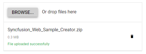
Handle success and failed upload
You can handle the success and failure actions using the success and failure events. To handle these event, define the function and assign it to corresponding event as follows.
<template>
  <div>
    <ejs-uploader ref="uploadObj" id='defaultfileupload' name="UploadFiles" :asyncSettings= "path" :success= "onUploadSuccess" :failure= "onUploadFailed" ></ejs-uploader>
  </div>
</template>
<script>
import { UploaderComponent } from "@syncfusion/ej2-vue-inputs";
//Component registeration
export default {
    name: "App",
    components: {
        'ejs-uploader' : UploaderComponent,
    },
    data: function() {
        return {
            path:  {
                saveUrl: 'https://ej2.syncfusion.com/services/api/uploadbox/Save',
                removeUrl: 'https://ej2.syncfusion.com/services/api/uploadbox/Remove'
            }
        }
    },
    methods: {
        onUploadSuccess: function () {
            console.log('Uploaded successfully');
        },
        onUploadFailed: function () {
            console.log('Upload fails');
        }
    }
}
</script>
<style>
    @import "../node_modules/@syncfusion/ej2-base/styles/material.css";
    @import "../node_modules/@syncfusion/ej2-buttons/styles/material.css";
    @import "../node_modules/@syncfusion/ej2-vue-inputs/styles/material.css";
</style>
Output be like the below.