How can I help you?
Getting Started with the Vue Textbox Component in Vue 2
10 Feb 202616 minutes to read
This article provides a step-by-step guide for setting up a Vue 2 project using Vue-CLI and integrating the Syncfusion® Vue TextBox component.
To get started quickly with Vue TextBox, check this video:
Prerequisites
System requirements for Syncfusion® Vue UI components
Setup the Vue 2 project
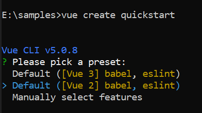
To generate a Vue 2 project using Vue-CLI, use the vue create command. Follow these steps to install Vue CLI and create a new project:
npm install -g @vue/cli
vue create quickstart
cd quickstart
npm run serve
or
yarn global add @vue/cli
vue create quickstart
cd quickstart
yarn run serve
When creating a new project, choose the option Default ([Vue 2] babel, eslint) from the menu.
Once the quickstart project is set up with default settings, proceed to add Syncfusion® components to the project.
Add Syncfusion® Vue packages
Syncfusion® packages are available at npmjs.com. To use Vue components, install the required npm package.
This article uses the Vue Textbox component as an example. Install the @syncfusion/ej2-vue-inputs package by running the following command:
npm install @syncfusion/ej2-vue-inputs --saveor
yarn add @syncfusion/ej2-vue-inputsImport Syncfusion® CSS styles
Syncfusion® components require CSS stylesheets to display correctly. You can import themes in various ways, such as using CSS or SASS styles from npm packages, CDN, CRG, and Theme Studio. Refer to themes topic to learn more about built-in themes and different ways to reference themes in a Vue project.
In this article, the Material3 theme is applied using CSS styles, which are available in installed packages. The necessary Material3 CSS styles for the TextBox component and its dependents were imported into the <style> section of the src/App.vue file.
<style>
@import "../node_modules/@syncfusion/ej2-base/styles/material.css";
@import "../node_modules/@syncfusion/ej2-vue-inputs/styles/material.css";
</style>
The order of CSS imports matters. Import base styles first, then component-specific styles. Missing CSS imports can result in misaligned layouts, buttons without styling, or missing visual elements in popups and dialogs.
Add Syncfusion® Vue component
Follow the below steps to add the Vue TextBox component:
1. First, import and register the TextBox component in the script section of the src/App.vue file.
<script>
import { TextBoxComponent } from '@syncfusion/ej2-vue-inputs';
export default {
name: "App",
 components: { 'ejs-textbox': TextBoxComponent },
}
</script>
2. In the template section, define the TextBox component.
<template>
  <div id="app">
      <ejs-textbox> </ejs-textbox>
  </div>
</template>
Adding icons to the TextBox
You can create a TextBox with icon as a group by creating the parent div element with the class e-input-group and add the icon element as span with the class e-input-group-icon. For detailed information, refer to the Groups section.
      <!--element which is going to render the TextBox with date icon-->
      <div class="e-input-group">
            <input class="e-input" name='input' type="text" placeholder="Enter Date"/>
            <span class="e-input-group-icon e-input-popup-date"></span>
      </div>
  .e-input-group-icon.e-input-popup-date:before {
    content: "\e901";
  }
Run the project
To run the project, use the following command:
npm run serveor
yarn run serveOutput will be as follows:
<template>
    <div class='wrap'>
        <div id='input-container'>
            <input class="e-input" type="text" placeholder="Enter Date" />
            <div class="e-input-group">
                <input class="e-input" name='input' type="text" placeholder="Enter Date" />
                <span class="e-input-group-icon e-input-popup-date"></span>
            </div>
        </div>
    </div>
</template>
<script setup>
import { onMounted } from 'vue';
onMounted(() => {
    // To get the all input fields and its container.

    let inputElement = document.querySelectorAll('.e-input-group .e-input,.e-float-input.e-input-group input');

    // Add 'e-input-focus' class to the input for achive ripple effect when focus on the input field.

    for (let i = 0; i < inputElement.length; i++) {
        inputElement[i].addEventListener("focus", function () {
            let parentElement = inputElement[i].parentNode;
            if (parentElement.classList.contains('e-input-in-wrap')) {
                parentElement.parentNode.classList.add('e-input-focus');
            } else {
                inputElement[i].parentNode.classList.add('e-input-focus');
            }
        });
        inputElement[i].addEventListener("blur", function () {
            let parentElement = inputElement[i].parentNode;
            if (parentElement.classList.contains('e-input-in-wrap')) {
                parentElement.parentNode.classList.remove('e-input-focus');
            } else {
                inputElement[i].parentNode.classList.remove('e-input-focus');
            }
        });
    }

    // Add 'e-input-btn-ripple' class to the icon element for achive ripple effect when click on the icon.

    var inputIcon = document.querySelectorAll('.e-input-group-icon');
    for (let i = 0; i < inputIcon.length; i++) {
        inputIcon[i].addEventListener('mousedown', function () {
            inputIcon[i].classList.add('e-input-btn-ripple');
        });
        inputIcon[i].addEventListener('mouseup', function () {
            setTimeout(function () {
                inputIcon[i].classList.remove('e-input-btn-ripple');
            }, 500);
        });
    }
});
</script>
<style>
@import "../node_modules/@syncfusion/ej2-base/styles/material.css";
@import "../node_modules/@syncfusion/ej2-vue-inputs/styles/material.css";

.wrap {
    box-sizing: border-box;
    margin: 0 auto;
    padding: 20px 10px;
    width: 340px;
}

#input-container .e-input-group {
    margin: 30px 0;
}

.e-input-group-icon:before {
    font-family: e-icons;
}

.e-input-group .e-input-group-icon.e-input-popup-date {
    font-size: 16px;
}

.e-input-group.e-small .e-input-group-icon.e-input-popup-date {
    font-size: 14px;
}

.e-input-group-icon.e-input-popup-date:before {
    content: "\e901";
}
</style><template>
<div class='wrap'>
<div id='input-container'>
<input class="e-input" type="text" placeholder="Enter Date" />
<div class="e-input-group">
<input class="e-input" name='input' type="text" placeholder="Enter Date" />
<span class="e-input-group-icon e-input-popup-date"></span>
</div>
</div>
</div>
</template>
<script>
export default {
data: function () {
return {}
},
mounted: function () {
// To get the all input fields and its container.
let inputElement = document.querySelectorAll('.e-input-group .e-input,.e-float-input.e-input-group input');
// Add 'e-input-focus' class to the input for achive ripple effect when focus on the input field.
for (let i = 0; i < inputElement.length; i++) {
inputElement[i].addEventListener("focus", function () {
let parentElement = this.parentNode;
if (parentElement.classList.contains('e-input-in-wrap')) {
parentElement.parentNode.classList.add('e-input-focus');
} else {
this.parentNode.classList.add('e-input-focus');
}
});
inputElement[i].addEventListener("blur", function () {
let parentElement = this.parentNode;
if (parentElement.classList.contains('e-input-in-wrap')) {
parentElement.parentNode.classList.remove('e-input-focus');
} else {
this.parentNode.classList.remove('e-input-focus');
}
});
}
// Add 'e-input-btn-ripple' class to the icon element for achive ripple effect when click on the icon.
var inputIcon = document.querySelectorAll('.e-input-group-icon');
for (let i = 0; i < inputIcon.length; i++) {
inputIcon[i].addEventListener('mousedown', function () {
this.classList.add('e-input-btn-ripple');
});
inputIcon[i].addEventListener('mouseup', function () {
let element = this;
setTimeout(function () {
element.classList.remove('e-input-btn-ripple');
}, 500);
});
}
}
}
</script>
<style>
@import "../node_modules/@syncfusion/ej2-base/styles/material.css";
@import "../node_modules/@syncfusion/ej2-vue-inputs/styles/material.css";
.wrap {
box-sizing: border-box;
margin: 0 auto;
padding: 20px 10px;
width: 340px;
}
#input-container .e-input-group {
margin: 30px 0;
}
.e-input-group-icon:before {
font-family: e-icons;
}
.e-input-group .e-input-group-icon.e-input-popup-date {
font-size: 16px;
}
.e-input-group.e-small .e-input-group-icon.e-input-popup-date {
font-size: 14px;
}
.e-input-group-icon.e-input-popup-date:before {
content: "\e901";
}
</style>Floating label
The floating label TextBox floats the label above the TextBox after focusing, or filled with value in the TextBox. You can create the floating label TextBox by using floatLabelType API.
<template>
  <div class='wrap'>
    <div id='input-container'>
      <ejs-textbox id='textbox' floatLabelType="Auto" placeholder="First Name"></ejs-textbox>
    </div>
  </div>
</template>
<script setup>
import { TextBoxComponent as EjsTextbox } from '@syncfusion/ej2-vue-inputs';

</script>
<style>
@import "../node_modules/@syncfusion/ej2-base/styles/material.css";
@import "../node_modules/@syncfusion/ej2-vue-inputs/styles/material.css";

.wrap {
  box-sizing: border-box;
  margin: 0 auto;
  padding: 20px 10px;
  width: 340px;
}
</style><template>
<div class='wrap'>
<div id='input-container'>
<ejs-textbox id='textbox' floatLabelType="Auto" placeholder="First Name"></ejs-textbox>
</div>
</div>
</template>
<script>
import { TextBoxComponent } from '@syncfusion/ej2-vue-inputs';
export default {
name: "App",
components: {
"ejs-textbox": TextBoxComponent
},
data: function () {
return {}
}
}
</script>
<style>
@import "../node_modules/@syncfusion/ej2-base/styles/material.css";
@import "../node_modules/@syncfusion/ej2-vue-inputs/styles/material.css";
.wrap {
box-sizing: border-box;
margin: 0 auto;
padding: 20px 10px;
width: 340px;
}
</style>