- Prerequisites
- Creating Vue application using Vue CLI
- Adding Syncfusion AutoComplete package in the application
- Adding CSS reference for Syncfusion Vue AutoComplete component
- Adding Syncfusion Vue AutoComplete component in the application
- Running the application
- Custom values
- Configure the suggestion list
- See Also
Contact Support
Getting Started
28 Mar 20237 minutes to read
This section explains how to use Syncfusion Vue AutoComplete components in Vue 3 application.
Prerequisites
System requirements for Syncfusion Vue UI components
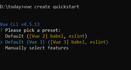
Creating Vue application using Vue CLI
The easiest way to create a Vue application is to use the Vue CLI. Vue CLI versions above 4.5.0 are mandatory for creating applications using Vue 3. Use the following command to uninstall older versions of the Vue CLI.
npm uninstall vue-cli -gUse the following commands to install the latest version of Vue CLI.
npm install -g @vue/cli
npm install -g @vue/cli-init
Create a new project using the command below.
vue create quickstartInitiating a new project prompts us to choose the type of project to be used for the current application. Select the option Default (Vue 3) from the menu.
Adding Syncfusion AutoComplete package in the application
Syncfusion Vue packages are maintained in the npmjs.com registry. The AutoComplete component will be used in this example. To install it use the following command.
npm install @syncfusion/ej2-vue-dropdowns --saveAdding CSS reference for Syncfusion Vue AutoComplete component
Import the needed css styles for the AutoComplete component along with dependency styles in the <style> section of the src/App.vue file as follows.
<style>
    @import "../node_modules/@syncfusion/ej2-base/styles/material.css";
    @import "../node_modules/@syncfusion/ej2-inputs/styles/material.css";
    @import "../node_modules/@syncfusion/ej2-vue-dropdowns/styles/material.css";
</style>
Adding Syncfusion Vue AutoComplete component in the application
You have completed all the necessary configurations needed for rendering the Syncfusion Vue component. Now, you are going to add the AutoComplete component using following steps.
Import the AutoComplete component in the <script> section of the src/App.vue file.
<script>
    import { AutoCompleteComponent } from "@syncfusion/ej2-vue-dropdowns";
</script>
Register the AutoComplete component.
import { AutoCompleteComponent } from "@syncfusion/ej2-vue-dropdowns";
//Component registeration
export default {
    name: "App",
    components: {
      'ejs-autocomplete' : AutoCompleteComponent,
    }
}
Add the component definition in template section.
<template>
    <div class="control_wrapper">
        <ejs-autocomplete :dataSource='sportsData' :placeholder="waterMark"></ejs-autocomplete>
    </div>
</template>
Summarizing the above steps, update the src/App.vue file with following code.
<template>
    <div class="control_wrapper">
        <ejs-autocomplete :dataSource='sportsData' :placeholder="waterMark"></ejs-autocomplete>
    </div>
</template>
<script>
    import { AutoCompleteComponent } from "@syncfusion/ej2-vue-dropdowns";
    //Component registeration
    export default {
        name: 'App',
        components: {
            "ejs-autocomplete": AutoCompleteComponent
        },
        data () {
            return {
                waterMark : 'e.g. Basketball',
                sportsData: ['American Football', 'Badminton', 'Basketball', 'Cricket',
                    'Football', 'Golf', 'Gymnastics',
                    'Hockey', 'Rugby', 'Snooker', 'Tennis'
                ]
            }
        }
    }
</script>
<style>
    @import "https://ej2.syncfusion.com/vue/documentation/node_modules/@syncfusion/ej2-base/styles/material.css";
    @import "../node_modules/@syncfusion/ej2-inputs/styles/material.css";
    @import "../node_modules/@syncfusion/ej2-vue-dropdowns/styles/material.css";
</style>
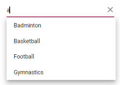
Running the application
Run the application using the following command.
npm run serveCustom values
The AutoComplete allows the user to give input as custom value which is not required to present in predefined set of values. By default, this support is enabled by allowCustom property. The custom value will be sent to post back handler when a form is about to be submitted.
<template>
    <div id="app">
        <ejs-autocomplete :dataSource='sportsData' :placeholder="waterMark" ></ejs-autocomplete>
  </div>
</template>
<script>
    import { AutoCompleteComponent } from "@syncfusion/ej2-vue-dropdowns";
    //Component registeration
    export default {
        name: 'App',
        components: {
            "ejs-autocomplete": AutoCompleteComponent
        },
        data () {
            return {
                waterMark : 'Find a game',
                sportsData: ['Badminton', 'Basketball', 'Cricket',
                    'Football', 'Golf', 'Gymnastics',
                    'Hockey', 'Rugby', 'Snooker', 'Tennis'
                ]
            }
        }
    }
</script>
<style>
    @import "https://ej2.syncfusion.com/vue/documentation/node_modules/@syncfusion/ej2-base/styles/material.css";
    @import "../node_modules/@syncfusion/ej2-inputs/styles/material.css";
    @import "../node_modules/@syncfusion/ej2-vue-dropdowns/styles/material.css";
    #app {
        color: #008cff;
        height: 40px;
        left: 35%;
        position: absolute;
        top: 35%;
        width: 30%;
    }
</style>
Configure the suggestion list
By default, suggestion list width automatically adjusts according to the AutoComplete input element’s width, and the height of the suggestion list has ‘300px’. The height and width of the popup list can also be customized using the popupHeight and popupWidth property respectively. In the following sample, suggestion list’s width and height are configured.
<template>
    <div id="app">
        <ejs-autocomplete :dataSource='sportsData' :popupHeight='height' :popupWidth='width' :placeholder="waterMark" ></ejs-autocomplete>
  </div>
</template>
<script>
    import { AutoCompleteComponent } from "@syncfusion/ej2-vue-dropdowns";
    //Component registeration
    export default {
        name: 'App',
        components: {
            "ejs-autocomplete": AutoCompleteComponent
        },
        data () {
            return {
                waterMark : 'Find a game',
                allowCustom: true,
                height: '250px',
                width: '250px',
                sportsData: ['Badminton', 'Basketball', 'Cricket',
                    'Football', 'Golf', 'Gymnastics',
                    'Hockey', 'Rugby', 'Snooker', 'Tennis'
                ]
            }
        }
    }
</script>
<style>
    @import "../node_modules/@syncfusion/ej2-base/styles/material.css";
    @import "../node_modules/@syncfusion/ej2-inputs/styles/material.css";
    @import "../node_modules/@syncfusion/ej2-vue-dropdowns/styles/material.css";
    #app {
        color: #008cff;
        height: 40px;
        left: 35%;
        position: absolute;
        top: 35%;
        width: 30%;
    }
</style>