How can I help you?
Getting started with React Tooltip component
13 Apr 202621 minutes to read
This section explains the steps required to create a simple React Tooltip component and demonstrate its basic usage in a React environment.
Ready to streamline your Syncfusion® React development? Discover the full potential of Syncfusion® React components with Syncfusion® AI Coding Assistant. Effortlessly integrate, configure, and enhance your projects with intelligent, context-aware code suggestions, streamlined setups, and real-time insights—all seamlessly integrated into your preferred AI-powered IDEs like VS Code, Cursor, Syncfusion® CodeStudio and more. Explore Syncfusion® AI Coding Assistant.
To get started quickly with React Tooltip, you can watch this video:
Setup for local development
Easily set up a React application using create-vite-app, which provides a faster development environment, smaller bundle sizes, and optimized builds compared to traditional tools like create-react-app. For detailed steps, refer to the Vite installation instructions. Vite sets up your environment using JavaScript and optimizes your application for production.
Note: To create a React application using
create-react-app, refer to this documentation for more details.
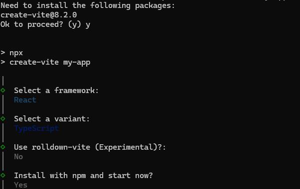
To create a new React application, run the following command.
npm create vite@latest my-appThis command will prompt you for a few settings for the new project, such as selecting a framework and a variant.
To set up a React application in TypeScript environment, run the following command.
npm create vite@latest my-app -- --template react-ts
cd my-app
npm run dev
To set up a React application in JavaScript environment, run the following command.
npm create vite@latest my-app -- --template react
cd my-app
npm run dev
Adding Syncfusion® Tooltip packages
All the available Essential® JS 2 packages are published in the npmjs.com public registry.
To install the Tooltip component, use the following command
npm install @syncfusion/ej2-react-popups --saveThe –save will instruct NPM to include the Tooltip package inside of the dependencies section of the package.json.
Adding CSS reference
The following CSS files are available in the ../node_modules/@syncfusion package folder. Add these as references in src/App.css.
@import "../node_modules/@syncfusion/ej2-base/styles/tailwind3.css";
@import "../node_modules/@syncfusion/ej2-react-popups/styles/tailwind3.css";
To refer App.css in the application then import it in the src/App.tsx file.
Adding Tooltip component
The React Tooltip component can be added to the application by following these steps. To get started, add the Tooltip component to the src/App.tsx file using the following code.
The following tooltip code should be placed in the src/App.tsx file.
import * as React from 'react';
import { TooltipComponent } from '@syncfusion/ej2-react-popups';
import './App.css';

function App() {
  const style: object = {
    display: 'inline-block',
    margin: '60px'
  };
  return (
    <TooltipComponent content="Tooltip Content" style={style}>
      Show Tooltip
    </TooltipComponent>
  );
}
export default App;
Run the application
Run the npm run dev command in the terminal to start the development server. This command compiles your code and serves the application locally, opening it in the browser.
npm run devThe output appears as follows.
import * as React from 'react';
import * as ReactDom from 'react-dom';
import { TooltipComponent } from '@syncfusion/ej2-react-popups';
function App() {
  return (<div id="container">
    <TooltipComponent position="TopCenter" content="Tooltip Content" target="#target">
      <button className="e-btn tooltipElement" id="target" >Show Tooltip</button>
    </TooltipComponent>
  </div>);
}
export default App;
ReactDom.render(<App />, document.getElementById('sample'));
import * as React from 'react';
import * as ReactDom from 'react-dom';
import { TooltipComponent } from '@syncfusion/ej2-react-popups';
function App() {
return (
<div id="container">
<TooltipComponent position="TopCenter" content="Tooltip Content" target="#target">
<button className="e-btn tooltipElement" id="target" >Show Tooltip</button>
</TooltipComponent>
</div>
);
}
export default App;
ReactDom.render(<App />, document.getElementById('sample'));<!DOCTYPE html>
<html lang="en">
<head>
<title>Syncfusion React Tooltip</title>
<meta charset="utf-8" />
<meta name="viewport" content="width=device-width, initial-scale=1.0" />
<meta name="description" content="Essential JS 2 for React Components" />
<meta name="author" content="Syncfusion" />
<link href="https://cdn.syncfusion.com/ej2/33.2.3/ej2-base/styles/tailwind3.css" rel="stylesheet" />
<link href="https://cdn.syncfusion.com/ej2/33.2.3/ej2-react-popups/styles/tailwind3.css" rel="stylesheet" />
<link href="https://cdn.syncfusion.com/ej2/33.2.3/ej2-react-buttons/styles/tailwind3.css" rel="stylesheet" />
<link href="https://cdn.syncfusion.com/ej2/33.2.3/ej2-inputs/styles/tailwind3.css" rel="stylesheet" />
<link href="index.css" rel="stylesheet" />
<link href="https://maxcdn.bootstrapcdn.com/bootstrap/3.3.7/css/bootstrap.min.css" rel="stylesheet" />
<script src="https://cdnjs.cloudflare.com/ajax/libs/systemjs/0.19.38/system.js"></script>
<script src="systemjs.config.js"></script>
</head>
<body>
<div id='sample'>
<div id='loader'>Loading....</div>
</div>
</body>
</html>.tooltipElement {
position: relative;
left: 50%;
margin-top: 150px;
transform: translateX(-50%);
}Initialize Tooltip within a container
You can create Tooltips on multiple targets within a container. To do this, define specific target elements using the target property so that the Tooltip is initialized only on matched targets within the container. In this case, the Tooltip content is assigned from the title attribute of each target element.
Refer to the following code example to create a Tooltip on multiple targets within a container.
import * as React from 'react';
import * as ReactDom from 'react-dom';
import { TooltipComponent } from '@syncfusion/ej2-react-popups';
import { ButtonComponent } from '@syncfusion/ej2-react-buttons';
function App() {
    return (<div id='container'>
        <TooltipComponent id="details" target='.e-info' position='RightCenter'>
            <form id="details" role="form">
                <table>
                    <tbody>
                        <tr>
                            <td className="info">User Name</td>
                            <td>
                                <input type="text" className="e-info" name="firstname" title="Please enter your name" /> </td>
                        </tr>
                        <tr>
                            <td className="info">Email Address</td>
                            <td>
                                <input type="text" className="e-info" name="email" title="Enter a valid email address" />
                            </td>
                        </tr>
                        <tr>
                            <td className="info">Password</td>
                            <td>
                                <input type="password" className="e-info" name="password" title="Be at least 8 characters length" />
                            </td>
                        </tr>
                        <tr>
                            <td className="info">Confirm Password</td>
                            <td>
                                <input type="password" className="e-info" name="Cpwd" title="Re-enter your password" />
                            </td>
                        </tr>
                        <tr>
                            <td>
                                <ButtonComponent id="sample" className="center" content="Submit" />
                            </td>
                            <td>
                                <ButtonComponent id="reset" className="center" content="Reset" />
                            </td>
                        </tr>
                    </tbody>
                </table>
            </form>
        </TooltipComponent>
    </div>);
}
export default App;
ReactDom.render(<App />, document.getElementById('sample'));
import * as React from 'react';
import * as ReactDom from 'react-dom';
import { TooltipComponent } from '@syncfusion/ej2-react-popups';
import { ButtonComponent } from '@syncfusion/ej2-react-buttons';
function App() {
return (
<div id='container'>
<TooltipComponent id="details" target='.e-info' position='RightCenter'>
<form id="details" role="form">
<table>
<tbody>
<tr>
<td className="info">User Name</td>
<td>
<input type="text" className="e-info" name="firstname" title="Please enter your name" /> </td>
</tr>
<tr>
<td className="info">Email Address</td>
<td>
<input type="text" className="e-info" name="email" title="Enter a valid email address" />
</td>
</tr>
<tr>
<td className="info">Password</td>
<td>
<input type="password" className="e-info" name="password" title="Be at least 8 characters length" />
</td>
</tr>
<tr>
<td className="info">Confirm Password</td>
<td>
<input type="password" className="e-info" name="Cpwd" title="Re-enter your password" />
</td>
</tr>
<tr>
<td>
<ButtonComponent id="sample" className="center" content="Submit" />
</td>
<td>
<ButtonComponent id="reset" className="center" content="Reset" />
</td>
</tr>
</tbody>
</table>
</form>
</TooltipComponent>
</div>
);
}
export default App;
ReactDom.render(<App />, document.getElementById('sample'));In the above sample,
detailsrefers to the container’s id, and the target.e-inforefers to the target elements available within that container.
Refer to the React Tooltip feature tour page for its groundbreaking feature representations. You can also explore our React Tooltip component example that shows how to render the Tooltip in React.