How can I help you?
Getting Started with React TextBox component
10 Feb 202617 minutes to read
This section explains the steps required to create a simple React TextBox component and demonstrate its basic usage in a React environment.
Ready to streamline your Syncfusion® React development? Discover the full potential of Syncfusion® React components with Syncfusion® AI Coding Assistant. Effortlessly integrate, configure, and enhance your projects with intelligent, context-aware code suggestions, streamlined setups, and real-time insights—all seamlessly integrated into your preferred AI-powered IDEs like VS Code, Cursor, Syncfusion® CodeStudio and more. Explore Syncfusion® AI Coding Assistant.
Setup for local development
Easily set up a React application using create-vite-app, which provides a faster development environment, smaller bundle sizes, and optimized builds compared to traditional tools like create-react-app. For detailed steps, refer to the Vite installation instructions. Vite sets up your environment using JavaScript and optimizes your application for production.
Note: To create a React application using
create-react-app, refer to this documentation for more details.
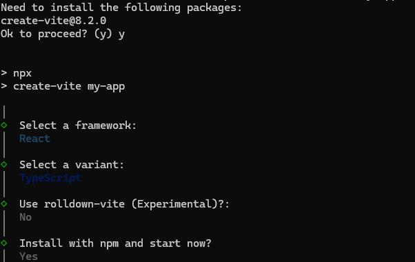
To create a new React application, run the following command.
npm create vite@latest my-appThis command will prompt you for a few settings for the new project, such as selecting a framework and a variant.
To set up a React application in TypeScript environment, run the following command.
npm create vite@latest my-app -- --template react-ts
cd my-app
npm run dev
To set up a React application in JavaScript environment, run the following command.
npm create vite@latest my-app -- --template react
cd my-app
npm run dev
Adding Syncfusion® TextBox packages
All the available Essential® JS 2 packages are published in the npmjs.com public registry.
To install the TextBox component, use the following command
npm install @syncfusion/ej2-react-inputs --saveThe –save will instruct NPM to include the TextBox package inside of the dependencies section of the package.json.
Adding CSS reference
The following CSS files are available in the ../node_modules/@syncfusion package folder. Add these as references in src/App.css.
@import "../node_modules/@syncfusion/ej2-base/styles/tailwind3.css";
@import "../node_modules/@syncfusion/ej2-icons/styles/tailwind3.css";
@import "../node_modules/@syncfusion/ej2-react-inputs/styles/tailwind3.css";
To refer App.css in the application then import it in the src/App.tsx file.
Adding TextBox component
The React TextBox component can be added to the application by following these steps. To get started, add the TextBox component to the src/App.tsx file using the following code.
The following textbox code should be placed in the src/App.tsx file.
[Class-component]
import * as React from "react";
import { TextBoxComponent } from '@syncfusion/ej2-react-inputs';
import './App.css';

export default class App extends React.Component<{}, {}> {
  public render() {
    return (
      // element which is going to render the TextBox
      <TextBoxComponent placeholder="Enter Name"></TextBoxComponent>
    );
  }
};
[Functional-component]
import * as React from "react";
import { TextBoxComponent } from '@syncfusion/ej2-react-inputs';
import './App.css';

export default function App() {
  return (
    // element which is going to render the TextBox
    <TextBoxComponent placeholder="Enter Name"></TextBoxComponent>
  );
};
Adding icons to the TextBox
You can create a TextBox with an icon by using the addIcon method within the created event. For detailed information, refer to the Groups section.
[Class-component]
import * as React from "react";
import { TextBoxComponent } from '@syncfusion/ej2-react-inputs';
import './App.css';

export default class App extends React.Component {
  public textboxObj = React.createRef<TextBoxComponent>();

  public oncreate = () => {
    (this.textboxObj.current as TextBoxComponent).addIcon('append', 'e-icons e-input-group-icon e-input-popup-date');
  };

  public render() {
    return (
      <TextBoxComponent
        id='textbox'
        placeholder="Enter Date"
        ref={this.textboxObj}
        created={this.oncreate}
      />
    );
  }
}
[Functional-component]
import * as React from "react";
import { TextBoxComponent } from '@syncfusion/ej2-react-inputs';
import { useRef } from 'react';
import './App.css';

export default function App() {
  const textboxObj = useRef<TextBoxComponent>(null);

  function oncreate() {
    if (textboxObj.current) {
      textboxObj.current.addIcon('append', 'e-icons e-input-group-icon e-input-popup-date');
    }
  }

  return (
    <TextBoxComponent
      id='textbox'
      placeholder="Enter Date"
      ref={textboxObj}
      created={oncreate}
    />
  );
};
Add the following CSS to your project’s stylesheet:
.e-input-group .e-icons.e-input-group-icon.e-input-popup-date {
    font-size:16px;
}
.e-input-group .e-icons.e-input-group-icon.e-input-popup-date:before {
    content: "\e901";
}
Run the application
Run the npm run dev command in the terminal to start the development server. This command compiles your code and serves the application locally, opening it in the browser.
npm run devThe output appears as follows.
[Class-component]
import * as React from "react";
import * as ReactDOM from "react-dom";
import { TextBoxComponent } from '@syncfusion/ej2-react-inputs';

export default class Default extends React.Component {
    textBoxObj = React.createRef();

    oncreate = () => {
        this.textBoxObj.current.addIcon('append', 'e-icons e-input-popup-date');
    }

    render() {
        return (
            <TextBoxComponent
                id='textbox'
                placeholder="Enter Date"
                ref={this.textBoxObj}
                created={this.oncreate}
            />
        );
    }
}

ReactDOM.render(<Default />, document.getElementById('default'));
import * as React from "react";
import * as ReactDOM from "react-dom";
import { TextBoxComponent } from '@syncfusion/ej2-react-inputs';
export default class Default extends React.Component {
public textBoxObj = React.createRef();
public oncreate() {
(this.textBoxObj.current as any).addIcon('append', 'e-icons e-input-popup-date');
}
public render() {
return (
<TextBoxComponent
id='textbox'
placeholder="Enter Date"
ref={this.textBoxObj}
created={this.oncreate}
/>
);
}
}
ReactDOM.render(<Default />, document.getElementById('default'));[Functional-component]
import * as React from "react";
import * as ReactDOM from "react-dom";
import { TextBoxComponent } from '@syncfusion/ej2-react-inputs';
import { useRef } from 'react';

function Default() {
    const textBoxObj = useRef(null);

    function oncreate() {
        textBoxObj.current.addIcon('append', 'e-icons e-input-popup-date');
    }

    return (
        <TextBoxComponent
            id='textbox'
            placeholder="Enter Date"
            ref={textBoxObj}
            created={oncreate}
        />
    );
};

ReactDOM.render(<Default />, document.getElementById('default'));
import * as React from "react";
import * as ReactDOM from "react-dom";
import { TextBoxComponent } from '@syncfusion/ej2-react-inputs';
import { useRef } from 'react';
function Default() {
const textBoxObj = useRef(null);
function oncreate() {
(textBoxObj.current as any).addIcon('append', 'e-icons e-input-popup-date');
}
return (
<TextBoxComponent
id='textbox'
placeholder="Enter Date"
ref={textBoxObj}
created={oncreate}
/>
);
};
ReactDOM.render(<Default />, document.getElementById('default'));Floating Label
The floating label TextBox floats the label above the TextBox after focusing, or filled with value in the TextBox.
You can create the floating label TextBox by using the floatLabelType API.
[Class-component]
import { TextBoxComponent } from '@syncfusion/ej2-react-inputs';
import * as React from "react";
import * as ReactDOM from "react-dom";

export default class App extends React.Component {
    render() {
        return (<div className="App">
            <div className="textboxes">
                <h4>FloatLabelType as Auto</h4>
                <TextBoxComponent placeholder="First Name" floatLabelType="Auto" />
            </div>
            <div className="textboxes">
                <h4>FloatLabelType as Always</h4>
                <TextBoxComponent placeholder="Last Name" floatLabelType="Always" />
            </div>
        </div>);
    }
};

ReactDOM.render(<App />, document.getElementById('input-container'));
import { TextBoxComponent } from '@syncfusion/ej2-react-inputs';
import * as React from "react";
import * as ReactDOM from "react-dom";
export default class App extends React.Component<{}, {}> {
public render() {
return (
<div className="App">
<div className="textboxes">
<h4>FloatLabelType as Auto</h4>
<TextBoxComponent placeholder="First Name" floatLabelType="Auto" />
</div>
<div className="textboxes">
<h4>FloatLabelType as Always</h4>
<TextBoxComponent placeholder="Last Name" floatLabelType="Always" />
</div>
</div>
)
}
};
ReactDOM.render(<App />, document.getElementById('input-container'));[Functional-component]
import { TextBoxComponent } from '@syncfusion/ej2-react-inputs';
import * as React from "react";
import * as ReactDOM from "react-dom";

function App() {
    return (<div className="App">
        <div className="textboxes">
            <h4>FloatLabelType as Auto</h4>
            <TextBoxComponent placeholder="First Name" floatLabelType="Auto" />
        </div>
        <div className="textboxes">
            <h4>FloatLabelType as Always</h4>
            <TextBoxComponent placeholder="Last Name" floatLabelType="Always" />
        </div>
    </div>);
};

ReactDOM.render(<App />, document.getElementById('input-container'));
import { TextBoxComponent } from '@syncfusion/ej2-react-inputs';
import * as React from "react";
import * as ReactDOM from "react-dom";
function App() {
return (
<div className="App">
<div className="textboxes">
<h4>FloatLabelType as Auto</h4>
<TextBoxComponent placeholder="First Name" floatLabelType="Auto" />
</div>
<div className="textboxes">
<h4>FloatLabelType as Always</h4>
<TextBoxComponent placeholder="Last Name" floatLabelType="Always" />
</div>
</div>
)
};
ReactDOM.render(<App />, document.getElementById('input-container'));Refer to the React TextBox feature tour page for its groundbreaking feature representations. You can also explore our React TextBox component example that shows how to render the TextBox in React.