How can I help you?
Paging Customization in React Grid Component
14 Feb 20262 minutes to read
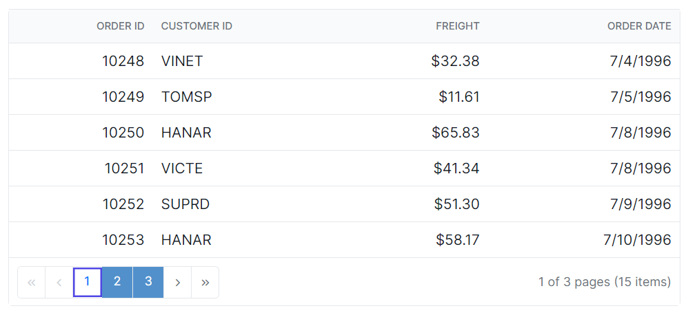
The appearance of the paging elements in the Syncfusion® React Grid component can be customized using CSS. Here are examples for customizing the pager root element, pager container element, pager navigation elements, pager page numeric link elements, and the pager current page numeric element.
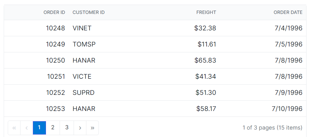
Customizing the grid pager root element
The .e-gridpager class is used to style the pager root element.
.e-grid .e-gridpager {
    font-family: cursive;
    background-color: #deecf9;
}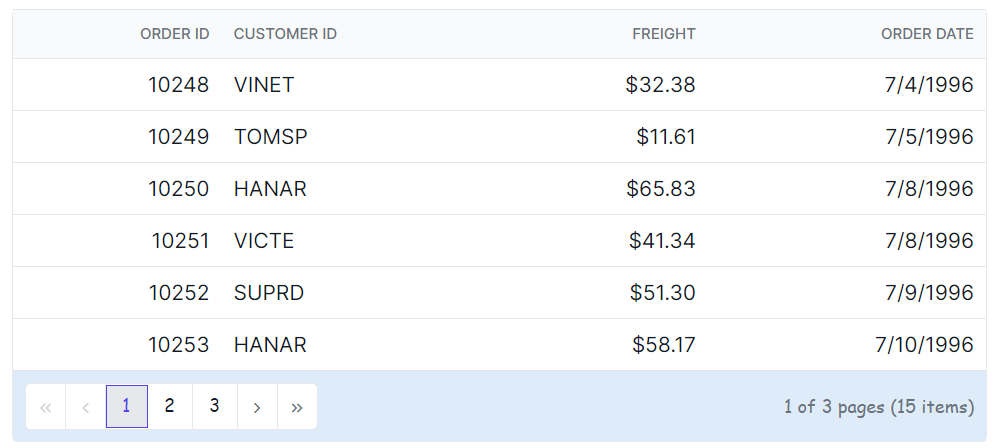
Customizing the grid pager container element
The .e-pagercontainer class is used to style the pager container element.
.e-grid .e-pagercontainer {
    border: 2px solid #00b5ff;
    font-family: cursive;
}
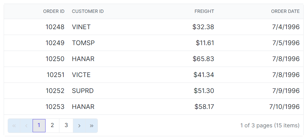
Customizing the grid pager navigation elements
The classes .e-prevpagedisabled, .e-prevpage, .e-nextpage, .e-nextpagedisabled, .e-lastpagedisabled, .e-lastpage, .e-firstpage, and .e-firstpagedisabled are used to style the various pager navigation elements.
.e-grid .e-gridpager .e-prevpagedisabled,
.e-grid .e-gridpager .e-prevpage,
.e-grid .e-gridpager .e-nextpage,
.e-grid .e-gridpager .e-nextpagedisabled,
.e-grid .e-gridpager .e-lastpagedisabled,
.e-grid .e-gridpager .e-lastpage,
.e-grid .e-gridpager .e-firstpage,
.e-grid .e-gridpager .e-firstpagedisabled {
    background-color: #deecf9;
}
Customizing the grid pager page numeric link elements
The .e-numericitem class is used to style the page numeric link elements.
.e-grid .e-gridpager .e-numericitem {
    background-color: #5290cb;
    color: #ffffff;
    cursor: pointer;
    }

    .e-grid .e-gridpager .e-numericitem:hover {
    background-color: white;
    color:  #007bff;
}
Customizing the grid pager current page numeric element
The .e-currentitem class is used to style the current page numeric item.
.e-grid .e-gridpager .e-currentitem {
    background-color: #0078d7;
    color: #fff;
}