How can I help you?
Header in React Grid Component
14 Feb 20261 minute to read
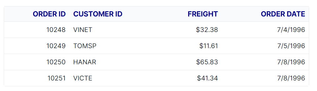
The appearance of the header elements in the Syncfusion® React Grid component can be customized using CSS. Here are examples for customizing the grid header, header cell, and header cell div element.
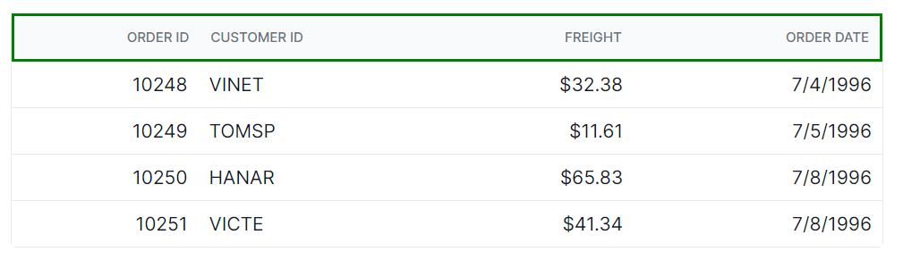
Customizing the grid header
The .e-gridheader class is used to style the root element of the grid header.
.e-grid .e-gridheader {
    border: 2px solid green;
}
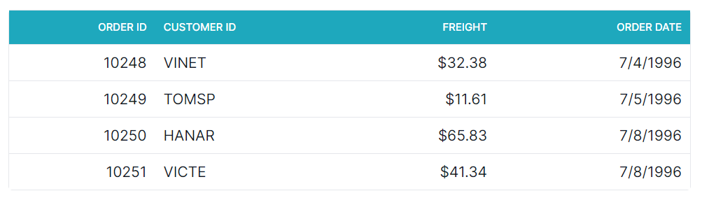
Customizing the grid header cell
The .e-headercell class is used to style the root element of the header cell elements.
.e-grid .e-headercell {
    color: #ffffff;
    background-color: #1ea8bd;
}
Customizing the grid header cell div element
The .e-headercelldiv class is used to apply custom styles to the div element inside each grid header cell.
.e-grid .e-headercelldiv {
    font-size: 15px;
    font-weight: bold;
    color: darkblue;
}