How can I help you?
Grouping Customization in React Grid Component
14 Feb 20261 minute to read
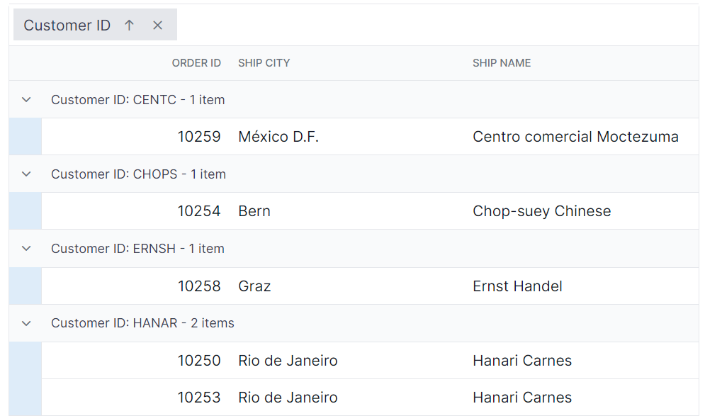
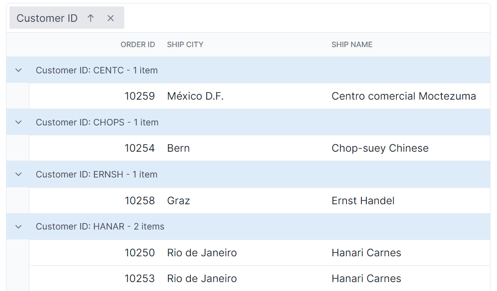
The appearance of grouping elements in the Syncfusion® React Grid component can be customized using CSS. Here are examples for customizing the group header, group expand/collapse icons, group caption row, and grouping indent cell.
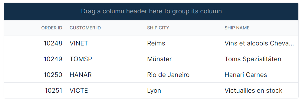
Customizing the group header
The .e-groupdroparea class is used to style the group header element.
.e-grid .e-groupdroparea {
    background-color: #132f49;
}
Customizing the group expand or collapse icons
The .e-icon-gdownarrow and .e-icon-grightarrow classes are used to style the expand and collapse icons.
.e-grid .e-icon-gdownarrow::before{
    content:'\e7c9'
    }
    .e-grid .e-icon-grightarrow::before{
    content:'\e80f'
}
In this example, the content property is modified to change the icon displayed. Available Syncfusion® icons can be used based on the active theme.
Customizing the group caption row
The .e-groupcaption class is used to style the group caption row element, and the .e-recordplusexpand and .e-recordpluscollapse classes are used for the icons indicating record expansion or collapse.
.e-grid .e-groupcaption {
    background-color: #deecf9;
}

.e-grid .e-recordplusexpand,
.e-grid .e-recordpluscollapse {
    background-color: #deecf9;
}
Customizing the grouping indent cell
The .e-indentcell class is used to style the indent cell that appears in grouped grid rows.
.e-grid .e-indentcell {
    background-color: #deecf9;
}