How can I help you?
Editing Customization in React Grid Component
11 Jun 20262 minutes to read
The appearance of editing-related elements in the React Data Grid component can be customized using CSS. Below are examples for customizing various editing-related elements.
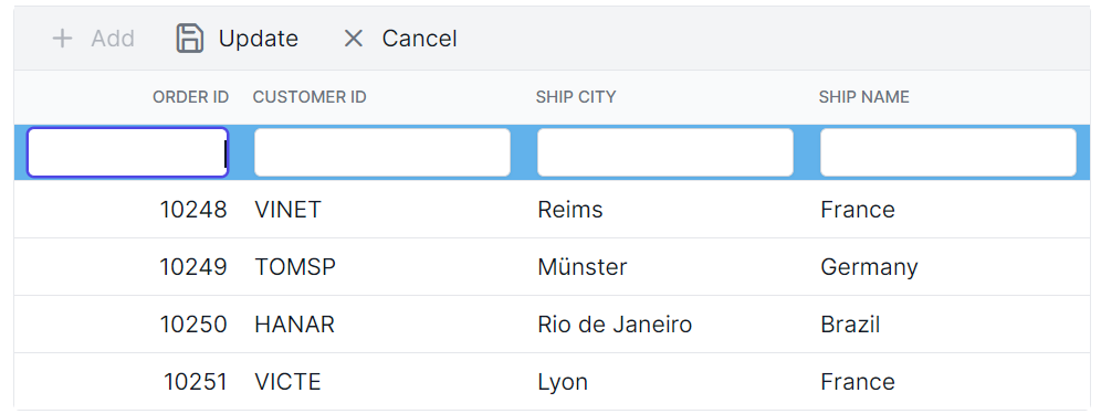
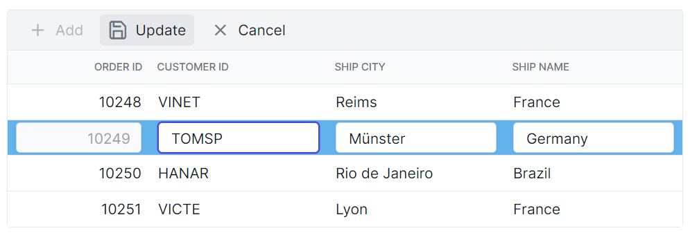
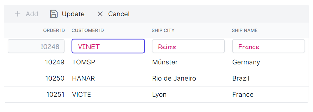
Customizing the edited and added row element
The .e-editedrow and .e-addedrow classes are used to style edited and added row table elements.
.e-grid .e-editedrow table, .e-grid .e-addedrow table {
    background-color: #62b2eb;
}
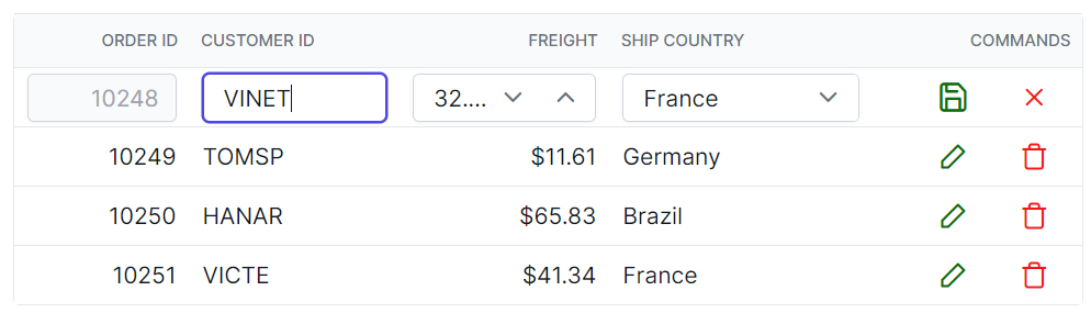
Customizing the edited row input element
The .e-gridform and .e-input classes are used to style edited form row input element.
.e-grid .e-gridform .e-rowcell .e-input-group .e-input.e-field {
    font-family: cursive;
    color:rgb(214, 33, 123)
}
Customizing the edit dialog header element
The .e-edit-dialog and .e-dlg-header-content classes are used to style the dialog header element.
.e-grid .e-edit-dialog .e-dlg-header-content {
    background-color: #deecf9;
}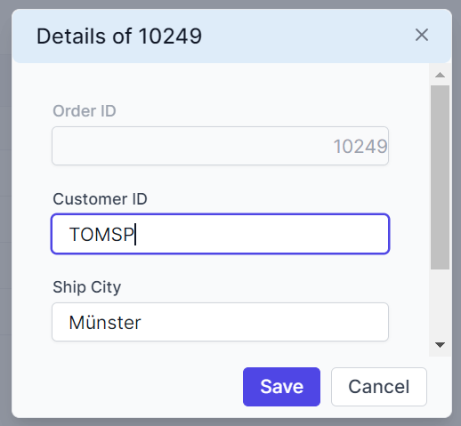
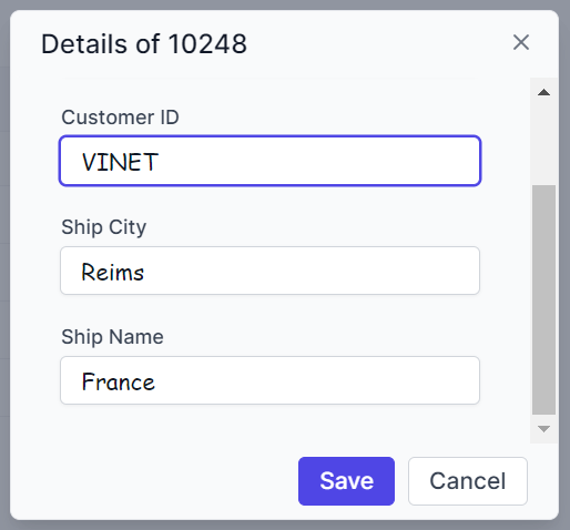
Customizing the edited row input element in dialog edit mode
The .e-gridform and .e-float-input classes are used to customize the input elements within the edit dialog.
.e-grid .e-gridform .e-rowcell .e-float-input .e-field {
    font-family: cursive;
}
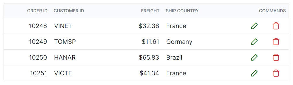
Customizing the command column buttons
The .e-edit, .e-delete, .e-update, and .e-cancel-icon classes are used to style the respective command column buttons in the grid.
.e-grid .e-delete::before ,.e-grid .e-cancel-icon::before{
    color: #f51717;
}
.e-grid .e-edit::before, .e-grid .e-update::before {
    color: #077005;
}