Templates in React Form Builder component
28 Sep 20266 minutes to read
Templates can be used in the Form Builder control to display third-party components within the form. This feature lets you configure the form schema with the properties of the third-party component.
This section explains how to use templates in the Form Builder component.
Adding Templates
Templates can be added to the Form Builder by configuring the third-party control in the template property of toolboxItems. Map the template to a specific form field by using the type property in toolboxItems.
toolboxItems is an array property, and any number of templates can be rendered in the Form Builder toolbox.
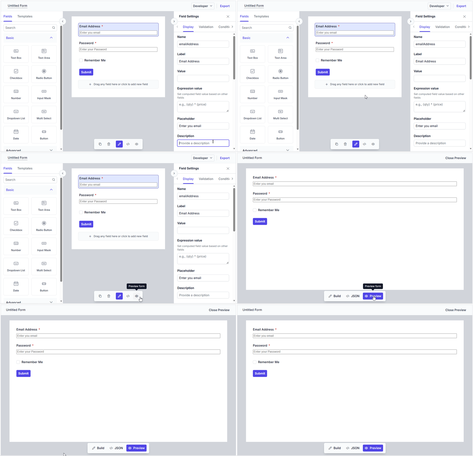
After you drag and drop the form field onto the central design canvas, the third-party component is rendered automatically.
import { useRef } from 'react';
import { FormBuilderComponent } from '@syncfusion/ej2-react-form-builder';
import { FormWidgetType } from '@syncfusion/ej2-form-builder';

const formSchema = {
	"version": "0.1.0",
	"properties": {
		"emailAddress": {
			"id": "textbox_1785491685456_167",
			"name": "emailAddress",
			"type": "string",
			"label": "Email Address",
			"textboxType": "email",
			"required": true,
			"placeholder": "Enter your email",
			"widget": "textbox",
		},
		"password": {
			"id": "textbox_1785491685456_537",
			"name": "password",
			"type": "string",
			"label": "Password",
			"textboxType": "password",
			"required": true,
			"minLength": 6,
			"placeholder": "Enter your password",
			"widget": "textbox"
		},
		"rememberMe": {
			"id": "checkbox_1785491685456_262",
			"name": "rememberMe",
			"type": "boolean",
			"label": "Remember Me",
			"widget": "checkbox"
		},
		"submit": {
			"id": "submit_button_initial",
			"name": "defaultFormsubmit",
			"type": "button",
			"label": "Submit",
			"buttonType": "submit",
			"widget": "button",
			"style": "primary",
			"disabled": false
		}
	},
	"layout": [
		{
			"type": "field",
			"propertyId": "emailAddress"
		},
		{
			"type": "field",
			"propertyId": "password"
		},
		{
			"type": "field",
			"propertyId": "rememberMe"
		},
		{
			"type": "field",
			"propertyId": "submit"
		}
	],
	"settings": {
		"name": "Untitled Form"
	}
};

export default function App() {
	const formBuilderRef = useRef<FormBuilderComponent | null>(null);

	function inputTemplate(data: any) {
		const { fieldData } = data;

		return (
			<input
				type={fieldData.textboxType ?? 'text'}
				id={fieldData.id}
				name={fieldData.name}
				placeholder={fieldData.placeholder}
				className="custom-input e-input"
				onChange={(event) => {
					formBuilderRef.current?.setFieldValue(fieldData.id, event.target.value);
				}}
				onBlur={(event) => {
					formBuilderRef.current?.setFieldValue(fieldData.id, event.target.value);
				}}
			/>
		);
	}

	return (
		<div id="formbuilder">
			<FormBuilderComponent
				ref={formBuilderRef}
				schema={formSchema}
				allowExport={false}
				toolboxItems={[
					{ type: FormWidgetType.Textbox, template: inputTemplate }
				]}
			/>
		</div>
	);
}
import { useRef } from 'react';
import { FormBuilderComponent } from '@syncfusion/ej2-react-form-builder';
import { FormWidgetType } from '@syncfusion/ej2-form-builder';
const formSchema = {
"version": "0.1.0",
"properties": {
"emailAddress": {
"id": "textbox_1785491685456_167",
"name": "emailAddress",
"type": "string",
"label": "Email Address",
"textboxType": "email",
"required": true,
"placeholder": "Enter your email",
"widget": "textbox",
},
"password": {
"id": "textbox_1785491685456_537",
"name": "password",
"type": "string",
"label": "Password",
"textboxType": "password",
"required": true,
"minLength": 6,
"placeholder": "Enter your password",
"widget": "textbox"
},
"rememberMe": {
"id": "checkbox_1785491685456_262",
"name": "rememberMe",
"type": "boolean",
"label": "Remember Me",
"widget": "checkbox"
},
"submit": {
"id": "submit_button_initial",
"name": "defaultFormsubmit",
"type": "button",
"label": "Submit",
"buttonType": "submit",
"widget": "button",
"style": "primary",
"disabled": false
}
},
"layout": [
{
"type": "field",
"propertyId": "emailAddress"
},
{
"type": "field",
"propertyId": "password"
},
{
"type": "field",
"propertyId": "rememberMe"
},
{
"type": "field",
"propertyId": "submit"
}
],
"settings": {
"name": "Untitled Form"
}
};
export default function App() {
const formBuilderRef = useRef(null);
function inputTemplate(data) {
const { fieldData } = data;
return (
<input
type={fieldData.textboxType ?? 'text'}
id={fieldData.id}
name={fieldData.name}
placeholder={fieldData.placeholder}
className="custom-input e-input"
onChange={(event) => {
formBuilderRef.current?.setFieldValue(fieldData.id, event.target.value);
}}
onBlur={(event) => {
formBuilderRef.current?.setFieldValue(fieldData.id, event.target.value);
}}
/>
);
}
return (
<div id="formbuilder">
<FormBuilderComponent
ref={formBuilderRef}
schema={formSchema}
allowExport={false}
toolboxItems={[
{ type: FormWidgetType.Textbox, template: inputTemplate }
]}
/>
</div>
);
}In the Preview tab, the templates are displayed so that you can validate the created form.
Adding properties of the template in property panel
The properties of the third party components can be added to the property panel using the setProperty method in the Form Builder. For more details, see this documentation
Exporting templates
When the form schema is exported, the template itself is not included in the schema. However, a templateId property is added to the form schema to notify Form Renderer that a template is mapped to the corresponding element. This value is set through the templateId property of toolboxItems.
In Form Renderer, additional configuration is required as described in the documentation to render templates in the form.