How can I help you?
Getting started with React Dialog component
27 Feb 202624 minutes to read
This section explains the steps required to create a simple React Dialog component and demonstrate its basic usage in a React environment.
Ready to streamline your Syncfusion® React development? Discover the full potential of Syncfusion® React components with Syncfusion® AI Coding Assistant. Effortlessly integrate, configure, and enhance your projects with intelligent, context-aware code suggestions, streamlined setups, and real-time insights—all seamlessly integrated into your preferred AI-powered IDEs like VS Code, Cursor, Syncfusion® CodeStudio and more. Explore Syncfusion® AI Coding Assistant.
To get started quickly with React Dialog, you can watch this video:
Setup for local development
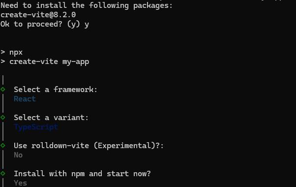
Easily set up a React application using create-vite-app, which provides a faster development environment, smaller bundle sizes, and optimized builds compared to traditional tools like create-react-app. For detailed steps, refer to the Vite installation instructions. Vite sets up your environment using JavaScript and optimizes your application for production.
Note: To create a React application using
create-react-app, refer to this documentation for more details.
To create a new React application, run the following command.
npm create vite@latest my-appThis command will prompt you for a few settings for the new project, such as selecting a framework and a variant.
To set up a React application in TypeScript environment, run the following command.
npm create vite@latest my-app -- --template react-ts
cd my-app
npm run dev
To set up a React application in JavaScript environment, run the following command.
npm create vite@latest my-app -- --template react
cd my-app
npm run dev
Adding Syncfusion® Dialog packages
All the available Essential® JS 2 packages are published in the npmjs.com public registry.
To install the Dialog component, use the following command
npm install @syncfusion/ej2-react-popups --saveThe –save will instruct NPM to include the Dialog package inside of the dependencies section of the package.json.
Adding CSS reference
The following CSS files are available in the ../node_modules/@syncfusion package folder. Add these as references in src/App.css.
@import "../node_modules/@syncfusion/ej2-base/styles/tailwind3.css";
@import '../node_modules/@syncfusion/ej2-buttons/styles/tailwind3.css';
@import "../node_modules/@syncfusion/ej2-react-popups/styles/tailwind3.css";
To refer App.css in the application then import it in the src/App.tsx file.
Adding Dialog component
The React Dialog component can be added to the application by following these steps. To get started, add the Dialog component to the src/App.tsx file using the following code.
The following dialog code should be placed in the src/App.tsx file.
[Class-component]
import React, { Component } from 'react';
import { DialogComponent } from '@syncfusion/ej2-react-popups';
import './App.css';

interface AppState { hideDialog: boolean; }

export default class App extends Component<{}, AppState> {
  constructor(props: {}) {
    super(props);
    this.state = {
      hideDialog: false
    };
  }

  handleClick = () => {
    this.setState({ hideDialog: true });
  };

  handleClose = () => {
    this.setState({ hideDialog: true });
  };

  render() {
    return (
      <div className="App" id="dialog-target">
        <button className="e-control e-btn" id="targetButton1" role="button" onClick={this.handleClick} > Open </button>
        <DialogComponent width="250px" content="This is a Dialog with content" target="#dialog-target" visible={this.state.hideDialog} showCloseIcon={true} close={this.handleClose} />
      </div>
    );
  }
}
[Functional-component]
import { DialogComponent } from '@syncfusion/ej2-react-popups';
import * as React from "react";
import './App.css';

export default function App() {
  const [status, setStatus] = React.useState({ hideDialog: false });
  function handleClick() {
    setStatus({ hideDialog: true })
  }
  function handleClose() {
    setStatus({ hideDialog: true })
  }
  return (
    <div className="App" id='dialog-target'>
      <button className='e-control e-btn' id='targetButton1' role='button' onClick={handleClick} >Open</button>
      <DialogComponent width='250px' content='This is a Dialog with content' target='#dialog-target' visible={status.hideDialog} showCloseIcon={true} onClick={handleClose} />
    </div>
  );
}
Run the application
Run the npm run dev command in the terminal to start the development server. This command compiles your code and serves the application locally, opening it in the browser.
npm run devThe output appears as follows.
[Class-component]
import { DialogComponent } from '@syncfusion/ej2-react-popups';
import * as React from "react";
class App extends React.Component {
    dialogInstance;
    constructor(props) {
        super(props);
        this.state = {
            hideDialog: false
        };
    }
    handleClick() {
        this.setState({ hideDialog: true });
    }
    dialogClose = () => {
        this.setState({ hideDialog: false });
    };
    render() {
        return (<div className="App" id='dialog-target'>
      <button className='e-control e-btn' id='targetButton1' role='button' onClick={this.handleClick = this.handleClick.bind(this)}>Open</button>
      <DialogComponent width='250px' content='This is a Dialog with content' target='#dialog-target' visible={this.state.hideDialog} close={this.dialogClose}/>
    </div>);
    }
}
export default App;
import { DialogComponent } from '@syncfusion/ej2-react-popups';
import * as React from "react";
class App extends React.Component<{}, {hideDialog: boolean;}> {
public dialogInstance: DialogComponent;
constructor(props: {}) {
super(props);
this.state = {
hideDialog : false
};
}
public handleClick() {
this.setState({ hideDialog: true })
}
public dialogClose = () => {
this.setState({ hideDialog: false })
}
public render() {
return (
<div className="App" id='dialog-target'>
<button className='e-control e-btn' id='targetButton1' role='button' onClick={this.handleClick = this.handleClick.bind(this)} >Open</button>
<DialogComponent width='250px' content='This is a Dialog with content' target='#dialog-target' visible = {this.state.hideDialog} close = {this.dialogClose}/>
</div>);
}
}
export default App;[Functional-component]
import { DialogComponent } from '@syncfusion/ej2-react-popups';
import * as React from "react";
function App() {
    let dialogInstance;
    const [status, setStatus] = React.useState({ hideDialog: false });
    function handleClick() {
        setStatus({ hideDialog: true });
    }
    function dialogClose() {
        setStatus({ hideDialog: false });
    }
    return (<div className="App" id='dialog-target'>
        <button className='e-control e-btn' id='targetButton1' role='button' onClick={handleClick.bind(this)}>Open</button>
        <DialogComponent width='250px' content='This is a Dialog with content' target='#dialog-target' visible={status.hideDialog} close={dialogClose}/>
    </div>);
}
export default App;
import { DialogComponent } from '@syncfusion/ej2-react-popups';
import * as React from "react";
function App() {
let dialogInstance: DialogComponent;
const [status, setStatus] = React.useState({ hideDialog: false });
function handleClick() {
setStatus({ hideDialog: true })
}
function dialogClose () {
setStatus({ hideDialog: false })
}
return (
<div className="App" id='dialog-target'>
<button className='e-control e-btn' id='targetButton1' role='button' onClick={handleClick.bind(this)} >Open</button>
<DialogComponent width='250px' content='This is a Dialog with content' target='#dialog-target' visible = {status.hideDialog} close = {dialogClose}/>
</div>
);
}
export default App;In the Dialog control, the
max-heightis calculated based on the height of the Dialog target element. If thetargetproperty is not configured,document.bodyis used as the target. To ensure the Dialog displays at the proper height, add amin-heightto the target element.
If the Dialog is rendered based on the body, the Dialog height is determined by the body element height. If the Dialog’s height is larger than the body height, the Dialog height will not be set; in that case, set the CSS forhtmlandbodyto ensure the Dialog can size correctly.
html, body {
   height: 100%;
}
Modal Dialog
A modal shows an overlay behind the Dialog. The user must interact with the Dialog before interacting with the remaining content in the application.
Clicks on the overlay can be handled through the overlayClick event. The sample below closes the Dialog when the overlay is clicked.
When a modal Dialog is opened, scrolling of the Dialog’s target is disabled. Scrolling is re-enabled after the Dialog is closed.
[Class-component]
import { DialogComponent } from '@syncfusion/ej2-react-popups';
import * as React from "react";
class App extends React.Component {
    dialogInstance;
    constructor(props) {
        super(props);
        this.state = {
            hideDialog: true
        };
    }
    onOverlayClick = () => {
        this.setState({ hideDialog: false });
    };
    dialogClose = () => {
        this.setState({ hideDialog: false });
    };
    handleClick() {
        this.setState({ hideDialog: true });
    }
    render() {
        return (<div className="App" id='dialog-target'>
          <button className='e-control e-btn' id='targetButton1' role='button' onClick={this.handleClick = this.handleClick.bind(this)}>Open</button>

        <DialogComponent width='250px' isModal={true} target='#dialog-target' visible={this.state.hideDialog} close={this.dialogClose} overlayClick={this.onOverlayClick}>
          This is a modal Dialog </DialogComponent>
      </div>);
    }
}
export default App;
import { DialogComponent } from '@syncfusion/ej2-react-popups';
import * as React from "react";
class App extends React.Component<{}, {hideDialog: boolean;}> {
public dialogInstance: DialogComponent;
constructor(props: {}) {
super(props);
this.state = {
hideDialog : true
};
}
public onOverlayClick = () => {
this.setState({ hideDialog: false })
}
public dialogClose = () => {
this.setState({ hideDialog: false })
}
public handleClick() {
this.setState({ hideDialog: true })
}
public render() {
return (
<div className="App" id='dialog-target'>
<button className='e-control e-btn' id='targetButton1' role='button' onClick={this.handleClick = this.handleClick.bind(this)} >Open</button>
<DialogComponent width='250px' isModal={true} target='#dialog-target' visible = {this.state.hideDialog} close = {this.dialogClose}
overlayClick={ this.onOverlayClick } >
This is a modal Dialog </DialogComponent>
</div>);
}
}
export default App;[Functional-component]
import { DialogComponent } from '@syncfusion/ej2-react-popups';
import * as React from "react";
function App() {
    let dialogInstance;
    const [status, setStatus] = React.useState({ hideDialog: true });
    function onOverlayClick() {
        setStatus({ hideDialog: false });
    }
    function dialogClose() {
        setStatus({ hideDialog: false });
    }
    function handleClick() {
        setStatus({ hideDialog: true });
    }
    return (<div className="App" id='dialog-target'>
          <button className='e-control e-btn' id='targetButton1' role='button' onClick={handleClick.bind(this)}>Open</button>

        <DialogComponent width='250px' isModal={true} target='#dialog-target' visible={status.hideDialog} close={dialogClose} overlayClick={onOverlayClick}>
          This is a modal Dialog </DialogComponent>
      </div>);
}
export default App;
import { DialogComponent } from '@syncfusion/ej2-react-popups';
import * as React from "react";
function App() {
let dialogInstance: DialogComponent;
const [status, setStatus] = React.useState({ hideDialog: true });
function onOverlayClick() {
setStatus({ hideDialog: false })
}
function dialogClose() {
setStatus({ hideDialog: false })
}
function handleClick() {
setStatus({ hideDialog: true })
}
return (
<div className="App" id='dialog-target'>
<button className='e-control e-btn' id='targetButton1' role='button' onClick={handleClick.bind(this)} >Open</button>
<DialogComponent width='250px' isModal={true} target='#dialog-target' visible = {status.hideDialog} close = {dialogClose}
overlayClick={ onOverlayClick } >
This is a modal Dialog </DialogComponent>
</div>
);
}
export default App;Enable header
Enable the Dialog header by providing text or HTML content to the header property.
[Class-component]
import { DialogComponent } from '@syncfusion/ej2-react-popups';
import * as React from "react";
class App extends React.Component {
    render() {
        return (<div className="App" id='dialog-target'>
          <DialogComponent width='250px' target='#dialog-target' showCloseIcon={true} header='Dialog' closeOnEscape={false}>
          This is a dialog with header </DialogComponent>
      </div>);
    }
}
export default App;
import { DialogComponent } from '@syncfusion/ej2-react-popups';
import * as React from "react";
class App extends React.Component<{}, {}> {
public render() {
return (
<div className="App" id='dialog-target'>
<DialogComponent width='250px' target='#dialog-target' showCloseIcon={true} header='Dialog' closeOnEscape = {false}>
This is a dialog with header </DialogComponent>
</div>);
}
}
export default App;[Functional-component]
import { DialogComponent } from '@syncfusion/ej2-react-popups';
import * as React from "react";
function App() {
    return (<div className="App" id='dialog-target'>
            <DialogComponent width='250px' target='#dialog-target' showCloseIcon={true} header='Dialog' closeOnEscape={false}>
            This is a dialog with header </DialogComponent>
        </div>);
}
export default App;
import { DialogComponent } from '@syncfusion/ej2-react-popups';
import * as React from "react";
function App() {
return (
<div className="App" id='dialog-target'>
<DialogComponent width='250px' target='#dialog-target' showCloseIcon={true} header='Dialog' closeOnEscape = {false}>
This is a dialog with header </DialogComponent>
</div>
);
}
export default App;Enable footer
The React Dialog provides built-in support to render buttons in the footer (for example, ‘OK’ or ‘Cancel’). Each Dialog button can perform any configured action when clicked.
The primary button receives focus automatically when the Dialog opens. Add the click event to handle button actions.
When the Dialog initializes with more than one primary button, the first primary button receives focus on open.
The sample below renders buttons and demonstrates handling their click events.
[Class-component]
import { DialogComponent } from '@syncfusion/ej2-react-popups';
import * as React from "react";
class App extends React.Component {
    buttons = [{
            buttonModel: {
                content: 'OK',
                cssClass: 'e-flat',
                isPrimary: true,
            },
            'click': () => {
                this.setState({ hideDialog: false });
            }
        },
        {
            buttonModel: {
                content: 'Cancel',
                cssClass: 'e-flat'
            },
            'click': () => {
                this.setState({ hideDialog: false });
            }
        }];
    constructor(props) {
        super(props);
        this.state = {
            hideDialog: true
        };
    }
    handleClick() {
        this.setState({ hideDialog: true });
    }
    dialogClose = () => {
        this.setState({ hideDialog: false });
    };
    render() {
        return (<div className="App" id='dialog-target'>
        <button className='e-control e-btn' id='targetButton1' role='button' onClick={this.handleClick = this.handleClick.bind(this)}>Open</button>
        <DialogComponent width='250px' target='#dialog-target' close={this.dialogClose} header='Dialog' visible={this.state.hideDialog} showCloseIcon={true} buttons={this.buttons}>
        This is a Dialog with button and primary button </DialogComponent>
    </div>);
    }
}
export default App;
import { DialogComponent } from '@syncfusion/ej2-react-popups';
import * as React from "react";
class App extends React.Component<{}, {hideDialog: boolean;}> {
public buttons: any = [{
buttonModel: {
content: 'OK',
cssClass: 'e-flat',
isPrimary: true,
},
'click': () => {
this.setState({ hideDialog: false })
}
},
{
buttonModel: {
content: 'Cancel',
cssClass: 'e-flat'
},
'click': () => {
this.setState({ hideDialog: false })
}
}];
constructor(props: {}) {
super(props);
this.state = {
hideDialog : true
};
}
public handleClick() {
this.setState({ hideDialog: true })
}
public dialogClose = () => {
this.setState({ hideDialog: false })
}
public render() {
return (
<div className="App" id='dialog-target'>
<button className='e-control e-btn' id='targetButton1' role='button' onClick={this.handleClick = this.handleClick.bind(this)}>Open</button>
<DialogComponent width='250px' target='#dialog-target' close = {this.dialogClose} header='Dialog' visible = {this.state.hideDialog}showCloseIcon={true} buttons={this.buttons}>
This is a Dialog with button and primary button </DialogComponent>
</div>);
}
}
export default App;[Functional-component]
import { DialogComponent } from '@syncfusion/ej2-react-popups';
import * as React from "react";
function App() {
    const [status, setStatus] = React.useState({ hideDialog: true });
    let buttons = [{
            buttonModel: {
                content: 'OK',
                cssClass: 'e-flat',
                isPrimary: true,
            },
            'click': () => {
                setStatus({ hideDialog: false });
            }
        },
        {
            buttonModel: {
                content: 'Cancel',
                cssClass: 'e-flat'
            },
            'click': () => {
                setStatus({ hideDialog: false });
            }
        }];
    function handleClick() {
        setStatus({ hideDialog: true });
    }
    function dialogClose() {
        setStatus({ hideDialog: false });
    }
    return (<div className="App" id='dialog-target'>
        <button className='e-control e-btn' id='targetButton1' role='button' onClick={handleClick.bind(this)}>Open</button>
        <DialogComponent width='250px' target='#dialog-target' close={dialogClose} header='Dialog' visible={status.hideDialog} showCloseIcon={true} buttons={buttons}>
        This is a Dialog with button and primary button </DialogComponent>
    </div>);
}
export default App;
import { DialogComponent } from '@syncfusion/ej2-react-popups';
import * as React from "react";
function App(){
const [status, setStatus] = React.useState({ hideDialog: true });
let buttons: any = [{
buttonModel: {
content: 'OK',
cssClass: 'e-flat',
isPrimary: true,
},
'click': () => {
setStatus({ hideDialog: false })
}
},
{
buttonModel: {
content: 'Cancel',
cssClass: 'e-flat'
},
'click': () => {
setStatus({ hideDialog: false })
}
}];
function handleClick() {
setStatus({ hideDialog: true })
}
function dialogClose() {
setStatus({ hideDialog: false })
}
return (
<div className="App" id='dialog-target'>
<button className='e-control e-btn' id='targetButton1' role='button' onClick={handleClick.bind(this)}>Open</button>
<DialogComponent width='250px' target='#dialog-target' close = {dialogClose} header='Dialog' visible = {status.hideDialog} showCloseIcon={true} buttons={buttons}>
This is a Dialog with button and primary button </DialogComponent>
</div>
);
}
export default App;Draggable
The Dialog supports dragging within its target container by grabbing the Dialog header, allowing the user to reposition the Dialog dynamically.
The Dialog is draggable only when the header is enabled. Starting from version
16.2.x, draggable support is enabled for modal dialogs as well.
[Class-component]
import { DialogComponent } from '@syncfusion/ej2-react-popups';
import * as React from "react";
class App extends React.Component {
    buttons = [{
            buttonModel: {
                content: 'OK',
                cssClass: 'e-flat',
                isPrimary: true,
            },
            'click': () => {
                this.setState({ hideDialog: false });
            }
        },
        {
            buttonModel: {
                content: 'Cancel',
                cssClass: 'e-flat'
            },
            'click': () => {
                this.setState({ hideDialog: false });
            }
        }];
    constructor(props) {
        super(props);
        this.state = {
            hideDialog: true
        };
    }
    handleClick() {
        this.setState({ hideDialog: true });
    }
    dialogClose = () => {
        this.setState({ hideDialog: false });
    };
    render() {
        return (<div className="App" id='dialog-target'>
      <button className='e-control e-btn' id='targetButton1' role='button' onClick={this.handleClick = this.handleClick.bind(this)}>Open</button>
      <DialogComponent width='250px' target='#dialog-target' visible={this.state.hideDialog} close={this.dialogClose} header='Dialog' allowDragging={true} showCloseIcon={true} buttons={this.buttons}>
      This is a Dialog with drag enabled </DialogComponent>
  </div>);
    }
}
export default App;
import { DialogComponent } from '@syncfusion/ej2-react-popups';
import * as React from "react";
class App extends React.Component<{}, {hideDialog: boolean;}> {
public buttons: any = [{
buttonModel: {
content: 'OK',
cssClass: 'e-flat',
isPrimary: true,
},
'click': () => {
this.setState({ hideDialog: false })
}
},
{
buttonModel: {
content: 'Cancel',
cssClass: 'e-flat'
},
'click': () => {
this.setState({ hideDialog: false })
}
}];
constructor(props: {}) {
super(props);
this.state = {
hideDialog : true
};
}
public handleClick() {
this.setState({ hideDialog: true })
}
public dialogClose = () => {
this.setState({ hideDialog: false })
}
public render() {
return (
<div className="App" id='dialog-target'>
<button className='e-control e-btn' id='targetButton1' role='button' onClick={this.handleClick = this.handleClick.bind(this)}>Open</button>
<DialogComponent width='250px' target='#dialog-target' visible = {this.state.hideDialog} close = {this.dialogClose} header='Dialog' allowDragging={true} showCloseIcon={true} buttons={this.buttons}>
This is a Dialog with drag enabled </DialogComponent>
</div>);
}
}
export default App;[Functional-component]
import { DialogComponent } from '@syncfusion/ej2-react-popups';
import * as React from "react";
function App() {
    const [status, setStatus] = React.useState({ hideDialog: true });
    let buttons = [{
            buttonModel: {
                content: 'OK',
                cssClass: 'e-flat',
                isPrimary: true,
            },
            'click': () => {
                setStatus({ hideDialog: false });
            }
        },
        {
            buttonModel: {
                content: 'Cancel',
                cssClass: 'e-flat'
            },
            'click': () => {
                setStatus({ hideDialog: false });
            }
        }];
    function handleClick() {
        setStatus({ hideDialog: true });
    }
    function dialogClose() {
        setStatus({ hideDialog: false });
    }
    return (<div className="App" id='dialog-target'>
            <button className='e-control e-btn' id='targetButton1' role='button' onClick={handleClick.bind(this)}>Open</button>
            <DialogComponent width='250px' target='#dialog-target' visible={status.hideDialog} close={dialogClose} header='Dialog' allowDragging={true} showCloseIcon={true} buttons={buttons}>
            This is a Dialog with drag enabled </DialogComponent>
        </div>);
}
export default App;
import { DialogComponent } from '@syncfusion/ej2-react-popups';
import * as React from "react";
function App() {
const [status, setStatus] = React.useState({ hideDialog: true });
let buttons: any = [{
buttonModel: {
content: 'OK',
cssClass: 'e-flat',
isPrimary: true,
},
'click': () => {
setStatus({ hideDialog: false })
}
},
{
buttonModel: {
content: 'Cancel',
cssClass: 'e-flat'
},
'click': () => {
setStatus({ hideDialog: false })
}
}];
function handleClick() {
setStatus({ hideDialog: true })
}
function dialogClose() {
setStatus({ hideDialog: false })
}
return (
<div className="App" id='dialog-target'>
<button className='e-control e-btn' id='targetButton1' role='button' onClick={handleClick.bind(this)}>Open</button>
<DialogComponent width='250px' target='#dialog-target' visible = {status.hideDialog} close = {dialogClose} header='Dialog' allowDragging={true} showCloseIcon={true} buttons={buttons}>
This is a Dialog with drag enabled </DialogComponent>
</div>
);
}
export default App;Positioning
The Dialog position can be set through the position property by providing X and Y coordinates. The Dialog can be positioned inside the target container based on the given X and Y values.
For example: position: { X: 'center', Y: 'center' }. Possible values:
- X:
left,center,right, or any offset value - Y:
top,center,bottom, or any offset value
The sample below demonstrates different Dialog positions.
[Class-component]
import { RadioButtonComponent } from '@syncfusion/ej2-react-buttons';
import { DialogComponent } from '@syncfusion/ej2-react-popups';
import * as React from "react";
class App extends React.Component {
    defaultDialogInstance;
    PositioningInstance;
    position;
    constructor(props) {
        super(props);
        this.state = {
            hideDialog: true
        };
        this.position = { X: 'center', Y: 'center' };
    }
    changePosition = (event) => {
        this.defaultDialogInstance.position = { X: event.currentTarget.value.split(" ")[0], Y: event.currentTarget.value.split(" ")[1] };
        this.PositioningInstance.innerHTML = 'Position: {X: "' + event.currentTarget.value.split(" ")[0] + '", Y: "' + event.currentTarget.value.split(" ")[1] + '"}';
        const txt = event.target.parentElement.querySelector('.e-label').innerText.split(" ");
        this.PositioningInstance.innerHTML = 'Position: { X: "' + txt[0] + '", Y: "' + txt[1] + '" }';
    };
    dialogClose = () => {
        this.setState({ hideDialog: false });
    };
    dialogOpen = () => {
        this.setState({ hideDialog: true });
    };
    footerTemplate = () => {
        return (<span id="posvalue"/>);
    };
    render() {
        return (<div className="App" id='dialog-target'>
    <DialogComponent id='defaultDialog' header='Choose a Dialog Position' visible={this.state.hideDialog} showCloseIcon={false} position={this.position} footerTemplate={this.footerTemplate} width='452px' ref={defaultDialog => this.defaultDialogInstance = defaultDialog} target='#dialog-target' open={this.dialogOpen} close={this.dialogClose} closeOnEscape={false}>
          <table id='poschange'>
          <tbody>
              <tr>
              <td><RadioButtonComponent id='radio1' label='Left Top' value='left top' name='xy' onClick={this.changePosition = this.changePosition.bind(this)}/></td>
              <td><RadioButtonComponent id='radio2' label='Center Top' value='center top' name='xy' onClick={this.changePosition = this.changePosition.bind(this)}/></td>
              <td><RadioButtonComponent id='radio3' label='Right Top' value='right top' name='xy' onClick={this.changePosition = this.changePosition.bind(this)}/></td>
            </tr>
            <tr>
              <td><RadioButtonComponent id='radio4' label='Left Center' value='left center' name='xy' onClick={this.changePosition = this.changePosition.bind(this)}/></td>
              <td><RadioButtonComponent id='radio5' checked={true} label='Center Center' value='center center' name='xy' onClick={this.changePosition = this.changePosition.bind(this)}/></td>
              <td><RadioButtonComponent id='radio6' label='Right Center' value='right center' name='xy' onClick={this.changePosition = this.changePosition.bind(this)}/></td>
            </tr>
            <tr>
              <td><RadioButtonComponent id='radio7' label='Left Bottom' value='left bottom' name='xy' onClick={this.changePosition = this.changePosition.bind(this)}/></td>
              <td><RadioButtonComponent id='radio8' label='Center Bottom' value='center bottom' name='xy' onClick={this.changePosition = this.changePosition.bind(this)}/></td>
              <td><RadioButtonComponent id='radio9' label='Right Bottom' value='right bottom' name='xy' onClick={this.changePosition = this.changePosition.bind(this)}/></td>
            </tr>
            </tbody>
      </table>
      </DialogComponent>
      </div>);
    }
}
export default App;
import { RadioButtonComponent } from '@syncfusion/ej2-react-buttons';
import { DialogComponent } from '@syncfusion/ej2-react-popups';
import * as React from "react";
class App extends React.Component<{}, {hideDialog: boolean;}> {
public defaultDialogInstance: DialogComponent;
public PositioningInstance: HTMLElement;
public position: any;
constructor(props: {}) {
super(props);
this.state = {
hideDialog : true
};
this.position = { X: 'center', Y: 'center' };
}
public changePosition = (event:any): void => {
this.defaultDialogInstance.position = { X: event.currentTarget.value.split(" ")[0], Y: event.currentTarget.value.split(" ")[1] };
this.PositioningInstance.innerHTML = 'Position: {X: "' + event.currentTarget.value.split(" ")[0] + '", Y: "' + event.currentTarget.value.split(" ")[1] + '"}'
const txt: string[] = event.target.parentElement.querySelector('.e-label').innerText.split(" ");
this.PositioningInstance.innerHTML = 'Position: { X: "' + txt[0] + '", Y: "' + txt[1] + '" }';
}
public dialogClose = () => {
this.setState({ hideDialog: false });
}
public dialogOpen = () => {
this.setState({ hideDialog: true });
}
public footerTemplate = (): JSX.Element => {
return (
<span id="posvalue" />
)
}
public render() {
return (
<div className="App" id='dialog-target'>
<DialogComponent id='defaultDialog' header='Choose a Dialog Position' visible={this.state.hideDialog} showCloseIcon={false} position={this.position} footerTemplate={this.footerTemplate} width='452px' ref={defaultDialog => this.defaultDialogInstance = defaultDialog!}
target='#dialog-target' open={this.dialogOpen} close={this.dialogClose} closeOnEscape={false}>
<table id ='poschange'>
<tbody>
<tr>
<td><RadioButtonComponent id='radio1' label='Left Top' value='left top' name='xy' onClick = {this.changePosition = this.changePosition.bind(this)} /></td>
<td><RadioButtonComponent id='radio2' label='Center Top' value='center top' name='xy' onClick={this.changePosition = this.changePosition.bind(this)}/></td>
<td><RadioButtonComponent id='radio3' label='Right Top' value='right top' name='xy' onClick={this.changePosition = this.changePosition.bind(this)}/></td>
</tr>
<tr>
<td><RadioButtonComponent id='radio4' label='Left Center' value='left center' name='xy' onClick={this.changePosition = this.changePosition.bind(this)} /></td>
<td><RadioButtonComponent id='radio5' checked = {true} label='Center Center' value='center center' name='xy' onClick={this.changePosition = this.changePosition.bind(this)} /></td>
<td><RadioButtonComponent id='radio6' label='Right Center' value='right center' name='xy' onClick={this.changePosition = this.changePosition.bind(this)} /></td>
</tr>
<tr>
<td><RadioButtonComponent id='radio7' label='Left Bottom' value='left bottom' name='xy' onClick={this.changePosition = this.changePosition.bind(this)} /></td>
<td><RadioButtonComponent id='radio8' label='Center Bottom' value='center bottom' name='xy' onClick={this.changePosition = this.changePosition.bind(this)} /></td>
<td><RadioButtonComponent id='radio9' label='Right Bottom' value='right bottom' name='xy' onClick={this.changePosition = this.changePosition.bind(this)} /></td>
</tr>
</tbody>
</table>
</DialogComponent>
</div>
);
}
}
export default App;[Functional-component]
import { RadioButtonComponent } from '@syncfusion/ej2-react-buttons';
import { DialogComponent } from '@syncfusion/ej2-react-popups';
import * as React from "react";
function App() {
    let defaultDialogInstance;
    let PositioningInstance;
    const [status, setStatus] = React.useState({ hideDialog: true });
    let position;
    position = { X: 'center', Y: 'center' };
    function changePosition(event) {
        defaultDialogInstance.position = { X: event.currentTarget.value.split(" ")[0], Y: event.currentTarget.value.split(" ")[1] };
        PositioningInstance.innerHTML = 'Position: {X: "' + event.currentTarget.value.split(" ")[0] + '", Y: "' + event.currentTarget.value.split(" ")[1] + '"}';
        const txt = event.target.parentElement.querySelector('.e-label').innerText.split(" ");
        PositioningInstance.innerHTML = 'Position: { X: "' + txt[0] + '", Y: "' + txt[1] + '" }';
    }
    function dialogClose() {
        setStatus({ hideDialog: false });
    }
    function dialogOpen() {
        setStatus({ hideDialog: true });
    }
    function footerTemplate() {
        return (<span id="posvalue"/>);
    }
    return (<div className="App" id='dialog-target'>
        <DialogComponent id='defaultDialog' header='Choose a Dialog Position' visible={status.hideDialog} showCloseIcon={false} position={position} footerTemplate={footerTemplate} width='452px' ref={defaultDialog => defaultDialogInstance = defaultDialog} target='#dialog-target' open={dialogOpen} close={dialogClose} closeOnEscape={false}>
            <table id='poschange'>
            <tbody>
                <tr>
                <td><RadioButtonComponent id='radio1' label='Left Top' value='left top' name='xy' onClick={changePosition.bind(this)}/></td>
                <td><RadioButtonComponent id='radio2' label='Center Top' value='center top' name='xy' onClick={changePosition.bind(this)}/></td>
                <td><RadioButtonComponent id='radio3' label='Right Top' value='right top' name='xy' onClick={changePosition.bind(this)}/></td>
                </tr>
                <tr>
                <td><RadioButtonComponent id='radio4' label='Left Center' value='left center' name='xy' onClick={changePosition.bind(this)}/></td>
                <td><RadioButtonComponent id='radio5' checked={true} label='Center Center' value='center center' name='xy' onClick={changePosition.bind(this)}/></td>
                <td><RadioButtonComponent id='radio6' label='Right Center' value='right center' name='xy' onClick={changePosition.bind(this)}/></td>
                </tr>
                <tr>
                <td><RadioButtonComponent id='radio7' label='Left Bottom' value='left bottom' name='xy' onClick={changePosition.bind(this)}/></td>
                <td><RadioButtonComponent id='radio8' label='Center Bottom' value='center bottom' name='xy' onClick={changePosition.bind(this)}/></td>
                <td><RadioButtonComponent id='radio9' label='Right Bottom' value='right bottom' name='xy' onClick={changePosition.bind(this)}/></td>
                </tr>
                </tbody>
        </table>
    </DialogComponent>
    </div>);
}
export default App;
import { RadioButtonComponent } from '@syncfusion/ej2-react-buttons';
import { DialogComponent,PositionDataModel } from '@syncfusion/ej2-react-popups';
import * as React from "react";
function App() {
let defaultDialogInstance: DialogComponent;
let PositioningInstance: HTMLElement;
const [status, setStatus] = React.useState({ hideDialog: true });
let position: PositionDataModel;
position = { X: 'center', Y: 'center' };
function changePosition(event: any): void {
defaultDialogInstance.position = { X: event.currentTarget.value.split(" ")[0], Y: event.currentTarget.value.split(" ")[1] };
PositioningInstance.innerHTML = 'Position: {X: "' + event.currentTarget.value.split(" ")[0] + '", Y: "' + event.currentTarget.value.split(" ")[1] + '"}'
const txt: string[] = event.target.parentElement.querySelector('.e-label').innerText.split(" ");
PositioningInstance.innerHTML = 'Position: { X: "' + txt[0] + '", Y: "' + txt[1] + '" }';
}
function dialogClose (){
setStatus({ hideDialog: false });
}
function dialogOpen() {
setStatus({ hideDialog: true });
}
function footerTemplate (): JSX.Element {
return (
<span id="posvalue" />
)
}
return (
<div className="App" id='dialog-target'>
<DialogComponent id='defaultDialog' header='Choose a Dialog Position' visible={status.hideDialog} showCloseIcon={false} position={position} footerTemplate={footerTemplate} width='452px' ref={defaultDialog => defaultDialogInstance = defaultDialog!}
target='#dialog-target' open={dialogOpen} close={dialogClose} closeOnEscape={false}>
<table id ='poschange'>
<tbody>
<tr>
<td><RadioButtonComponent id='radio1' label='Left Top' value='left top' name='xy' onClick = {changePosition.bind(this)} /></td>
<td><RadioButtonComponent id='radio2' label='Center Top' value='center top' name='xy' onClick={changePosition.bind(this)}/></td>
<td><RadioButtonComponent id='radio3' label='Right Top' value='right top' name='xy' onClick={changePosition.bind(this)}/></td>
</tr>
<tr>
<td><RadioButtonComponent id='radio4' label='Left Center' value='left center' name='xy' onClick={changePosition.bind(this)} /></td>
<td><RadioButtonComponent id='radio5' checked = {true} label='Center Center' value='center center' name='xy' onClick={changePosition.bind(this)} /></td>
<td><RadioButtonComponent id='radio6' label='Right Center' value='right center' name='xy' onClick={changePosition.bind(this)} /></td>
</tr>
<tr>
<td><RadioButtonComponent id='radio7' label='Left Bottom' value='left bottom' name='xy' onClick={changePosition.bind(this)} /></td>
<td><RadioButtonComponent id='radio8' label='Center Bottom' value='center bottom' name='xy' onClick={changePosition.bind(this)} /></td>
<td><RadioButtonComponent id='radio9' label='Right Bottom' value='right bottom' name='xy' onClick={changePosition.bind(this)} /></td>
</tr>
</tbody>
</table>
</DialogComponent>
</div>
);
}
export default App;Refer to the React Dialog feature tour page for its groundbreaking feature representations. You can also explore our React Dialog component example that shows how to render the Dialog in React.