How can I help you?
Symbol Palette customization in React Diagram Component
21 Oct 202524 minutes to read
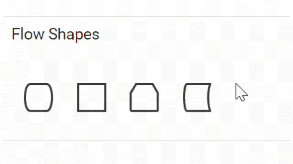
Customize the Palette Header
The header of a symbol palette serves as a label that identifies the category or group of symbols it contains. It helps users quickly locate and understand the purpose of each palette.
The title property displayed as the header text of palette.
The expanded property of the palette allows users to expand or collapse its palette items.
The height property of palette sets the height of the palette / symbol group.
The iconCss property sets the icon to be rendered with the title.
The following code example illustrates how to customize palette headers.
import * as React from "react";
import * as ReactDOM from "react-dom";
import { SymbolPaletteComponent } from "@syncfusion/ej2-react-diagrams";
//Initialize the basicshapes for the symbol palette
export function getBasicShapes() {
    let basicShapes = [
        {
            id: "Rectangle",
            shape: {
                type: "Basic",
                shape: "Rectangle",
            },
        },
        {
            id: "Ellipse",
            shape: {
                type: "Basic",
                shape: "Ellipse",
            },
        },
        {
            id: "Hexagon",
            shape: {
                type: "Basic",
                shape: "Hexagon",
            },
        },
    ];
    return basicShapes;
}
export function getFlowShapes() {
    let flowShapes = [{
        id: 'process',
        shape: {
            type: 'Flow',
            shape: 'Process'
        }
    },
    {
        id: 'document',
        shape: {
            type: 'Flow',
            shape: 'Document'
        }
    },
    {
        id: 'predefinedprocess',
        shape: {
            type: 'Flow',
            shape: 'PreDefinedProcess'
        }
    }
    ];
    return flowShapes;
};
export function getConnectors() {
    let connectorSymbols = [{
        id: 'Link1',
        type: 'Orthogonal',
        sourcePoint: {
            x: 0,
            y: 0
        },
        targetPoint: {
            x: 40,
            y: 40
        },
        targetDecorator: {
            shape: 'Arrow'
        }
    },
    {
        id: 'Link21',
        type: 'Straight',
        sourcePoint: {
            x: 0,
            y: 0
        },
        targetPoint: {
            x: 40,
            y: 40
        },
        targetDecorator: {
            shape: 'Arrow'
        }
    },
    {
        id: 'link33',
        type: 'Bezier',
        sourcePoint: {
            x: 0,
            y: 0
        },
        targetPoint: {
            x: 40,
            y: 40
        },
        style: {
            strokeWidth: 2
        },
        targetDecorator: {
            shape: 'None'
        }
    }
    ];
    return connectorSymbols;
};
const palettes = [{
    //Sets the id of the palette
    id: 'flow',
    //Sets whether the palette expands/collapse its children
    expanded: true,
    //Adds the palette items to palette
    symbols: getFlowShapes(),
    //Sets the header text of the palette
    title: 'Flow Shapes',
    //Sets the header icon of the palette
    iconCss: 'e-ddb-icons e-flow'
},
{
    id: 'basic',
    expanded: true,
    symbols: getBasicShapes(),
    title: 'Basic Shapes',
    iconCss: 'e-ddb-icons e-basic'
},
{
    id: 'connectors',
    expanded: true,
    symbols: getConnectors(),
    title: 'Connectors',
    iconCss: 'e-ddb-icons e-connector'
}
];
//Initializes the symbol palette
function App() {
    return (<SymbolPaletteComponent id="symbolpalette" width="100%" height="700px" expandMode={"Multiple"}
        palettes={palettes} symbolHeight={80} symbolWidth={80} />);
}
const root = ReactDOM.createRoot(document.getElementById("container"));
root.render(<App />);
import * as React from "react";
import * as ReactDOM from "react-dom";
import { SymbolPaletteComponent, NodeModel, ConnectorModel, PaletteModel } from "@syncfusion/ej2-react-diagrams";
//Initialize the basicshapes for the symbol palette
export function getBasicShapes(): NodeModel[] {
let basicShapes: NodeModel[] = [
{
id: "Rectangle",
shape: {
type: "Basic",
shape: "Rectangle",
},
},
{
id: "Ellipse",
shape: {
type: "Basic",
shape: "Ellipse",
},
},
{
id: "Hexagon",
shape: {
type: "Basic",
shape: "Hexagon",
},
},
];
return basicShapes;
}
export function getFlowShapes(): NodeModel[] {
let flowShapes: NodeModel[] = [{
id: 'process',
shape: {
type: 'Flow',
shape: 'Process'
}
},
{
id: 'document',
shape: {
type: 'Flow',
shape: 'Document'
}
},
{
id: 'predefinedprocess',
shape: {
type: 'Flow',
shape: 'PreDefinedProcess'
}
}
];
return flowShapes;
};
export function getConnectors(): ConnectorModel[] {
let connectorSymbols: ConnectorModel[] = [{
id: 'Link1',
type: 'Orthogonal',
sourcePoint: {
x: 0,
y: 0
},
targetPoint: {
x: 40,
y: 40
},
targetDecorator: {
shape: 'Arrow'
}
},
{
id: 'Link21',
type: 'Straight',
sourcePoint: {
x: 0,
y: 0
},
targetPoint: {
x: 40,
y: 40
},
targetDecorator: {
shape: 'Arrow'
}
},
{
id: 'link33',
type: 'Bezier',
sourcePoint: {
x: 0,
y: 0
},
targetPoint: {
x: 40,
y: 40
},
style: {
strokeWidth: 2
},
targetDecorator: {
shape: 'None'
}
}
];
return connectorSymbols;
};
const palettes: PaletteModel[] = [{
//Sets the id of the palette
id: 'flow',
//Sets whether the palette expands/collapse its children
expanded: true,
//Adds the palette items to palette
symbols: getFlowShapes(),
//Sets the header text of the palette
title: 'Flow Shapes',
//Sets the header icon of the palette
iconCss: 'e-ddb-icons e-flow'
},
{
id: 'basic',
expanded: true,
symbols: getBasicShapes(),
title: 'Basic Shapes',
iconCss: 'e-ddb-icons e-basic'
},
{
id: 'connectors',
expanded: true,
symbols: getConnectors(),
title: 'Connectors',
iconCss: 'e-ddb-icons e-connector'
}
];
//Initializes the symbol palette
function App() {
return (<SymbolPaletteComponent id="symbolpalette" width="100%" height="700px" expandMode={"Multiple"}
palettes={palettes} symbolHeight={80} symbolWidth={80} />);
}
const root = ReactDOM.createRoot(document.getElementById("container"));
root.render(<App />);Animation
The expand and collapse operations of the symbol palette can be animated by utilizing the enableAnimation property of the symbol palette. The following example demonstrates how to enable and disable animation for the symbol palette.
import * as React from "react";
import * as ReactDOM from "react-dom";
import { useRef, useState } from "react";
import { SymbolPaletteComponent } from "@syncfusion/ej2-react-diagrams";

// Initialize the basic shapes for the symbol palette
const getBasicShapes = () => [
    {
        id: 'rectangle',
        shape: { type: 'Basic', shape: 'Rectangle' },
    },
    {
        id: 'plus',
        shape: { type: 'Basic', shape: 'Plus' },
    },
    {
        id: 'triangle',
        shape: { type: 'Basic', shape: 'RightTriangle' },
    },
];

function App() {
    const symbolPaletteRef = useRef(null);
    const [enableAnimation, setEnableAnimation] = useState(true);
    // Toggle animation function
    const toggleAnimation = (event) => {
        setEnableAnimation(event.target.checked);
        if (symbolPaletteRef.current) {
            symbolPaletteRef.current.refresh();
        }
    };
    // Palettes array with basic shapes
    const palettes = [
        {
            id: 'basic',
            symbols: getBasicShapes(),
            title: 'Basic Shapes',
            iconCss: 'e-ddb-icons e-basic'
        },
    ];
    return (
        <div>
            <label htmlFor="enableAnimation">Enable Animation</label>
            <input id="enableAnimation" type="checkbox" checked={enableAnimation}
                onChange={toggleAnimation} />
            <SymbolPaletteComponent id="symbolpalette" ref={symbolPaletteRef}
                palettes={palettes} enableAnimation={enableAnimation} />
        </div>
    );
}

// Rendering the App component
const root = ReactDOM.createRoot(document.getElementById("container"));
root.render(<App />);
import * as React from "react";
import * as ReactDOM from "react-dom";
import { useRef, useState } from "react";
import { SymbolPaletteComponent, PaletteModel } from "@syncfusion/ej2-react-diagrams";
// Initialize the basic shapes for the symbol palette
const getBasicShapes = () => [
{
id: 'rectangle',
shape: { type: 'Basic', shape: 'Rectangle' },
},
{
id: 'plus',
shape: { type: 'Basic', shape: 'Plus' },
},
{
id: 'triangle',
shape: { type: 'Basic', shape: 'RightTriangle' },
},
];
function App() {
const symbolPaletteRef = useRef(null);
const [enableAnimation, setEnableAnimation] = useState(true);
// Toggle animation function
const toggleAnimation = (event) => {
setEnableAnimation(event.target.checked);
if (symbolPaletteRef.current) {
symbolPaletteRef.current.refresh();
}
};
// Palettes array with basic shapes
const palettes: PaletteModel[] = [
{
id: 'basic',
symbols: getBasicShapes(),
title: 'Basic Shapes',
iconCss: 'e-ddb-icons e-basic'
},
];
return (
<div>
<label htmlFor="enableAnimation">Enable Animation</label>
<input id="enableAnimation" type="checkbox" checked={enableAnimation}
onChange={toggleAnimation} />
<SymbolPaletteComponent id="symbolpalette" ref={symbolPaletteRef}
palettes={palettes} enableAnimation={enableAnimation} />
</div>
);
}
// Rendering the App component
const root = ReactDOM.createRoot(document.getElementById("container"));
root.render(<App />);Description for Symbols
The description property defines the descriptive text that appears beneath each symbol in the palette. This text provides additional information about the symbol’s purpose or usage within the diagramming context. The description can be dynamically retrieved and defined using the getSymbolInfo property, allowing information to assist users in understanding the function or meaning of each symbol.
import * as React from "react";
import * as ReactDOM from "react-dom";
import { SymbolPaletteComponent, NodeConstraints } from "@syncfusion/ej2-react-diagrams";

//Initialize the basicshapes for the symbol palette
export function getBasicShapes() {
    let basicShapes = [
        {
            id: 'rectangle',
            shape: {
                type: 'Basic',
                shape: 'Rectangle',
            },
            // Defines the tooltip for the shape
            tooltip: { content: 'Rectangle Basic shape', relativeMode: 'Object' },
            constraints: NodeConstraints.Default | NodeConstraints.Tooltip,
        },
        {
            id: 'plus',
            shape: {
                type: 'Basic',
                shape: 'Plus',
            },
            // Defines the tooltip for the shape
            tooltip: { content: 'Plus Basic shape', relativeMode: 'Object' },
            constraints: NodeConstraints.Default | NodeConstraints.Tooltip,
        },
        {
            id: 'triangle',
            shape: {
                type: 'Basic',
                shape: 'RightTriangle',
            },
            // Defines the tooltip for the shape
            tooltip: { content: 'RightTriangle Basic shape', relativeMode: 'Object' },
            constraints: NodeConstraints.Default | NodeConstraints.Tooltip,
        },
    ];
    return basicShapes;
}
const palettes = [{
    id: 'basic',
    symbols: getBasicShapes(),
    title: 'Basic Shapes',
    iconCss: 'e-ddb-icons e-basic'
}];
export function getSymbolInfo(symbol) {
    return {
        width: 50,
        height: 50,
        description: {
            //Defines the description text for the symbol
            text: symbol.id,
        },
    };
}
//Initializes the symbol palette
function App() {
    return (<SymbolPaletteComponent id="symbolpalette" palettes={palettes}
        getSymbolInfo={getSymbolInfo} />);
}
const root = ReactDOM.createRoot(document.getElementById("container"));
root.render(<App />);
import * as React from "react";
import * as ReactDOM from "react-dom";
import { SymbolPaletteComponent, NodeConstraints, NodeModel, PaletteModel, SymbolInfo } from "@syncfusion/ej2-react-diagrams";
//Initialize the basicshapes for the symbol palette
export function getBasicShapes(): NodeModel[] {
let basicShapes: NodeModel[] = [
{
id: 'rectangle',
shape: {
type: 'Basic',
shape: 'Rectangle',
},
// Defines the tooltip for the shape
tooltip: { content: 'Rectangle Basic shape', relativeMode: 'Object' },
constraints: NodeConstraints.Default | NodeConstraints.Tooltip,
},
{
id: 'plus',
shape: {
type: 'Basic',
shape: 'Plus',
},
// Defines the tooltip for the shape
tooltip: { content: 'Plus Basic shape', relativeMode: 'Object' },
constraints: NodeConstraints.Default | NodeConstraints.Tooltip,
},
{
id: 'triangle',
shape: {
type: 'Basic',
shape: 'RightTriangle',
},
// Defines the tooltip for the shape
tooltip: { content: 'RightTriangle Basic shape', relativeMode: 'Object' },
constraints: NodeConstraints.Default | NodeConstraints.Tooltip,
},
];
return basicShapes;
}
const palettes: PaletteModel = [{
id: 'basic',
symbols: getBasicShapes(),
title: 'Basic Shapes',
iconCss: 'e-ddb-icons e-basic'
}];
export function getSymbolInfo(symbol: NodeModel): SymbolInfo {
return {
width: 50,
height: 50,
description: {
//Defines the description text for the symbol
text: symbol.id,
},
};
}
//Initializes the symbol palette
function App() {
return (<SymbolPaletteComponent id="symbolpalette" palettes={palettes}
getSymbolInfo={getSymbolInfo} />);
}
const root = ReactDOM.createRoot(document.getElementById("container"));
root.render(<App />);Text wrapping and Text Overflow
The descriptive text that appears beneath each symbol can vary in length. In cases where the text might overlap neighboring symbols in the palette, text wrapping is employed. Text wrapping is controlled using the symbolInfo’s description property wrap , which supports three modes: Wrap, NoWrap, WrapWithOverflow. By default, text wrapping is set to ‘Wrap’.
Additionally, to handle overflowing text, the overflow property can be used. By default, textOverflow is set to ‘Ellipsis’, which truncates overflowing text with an ellipsis (…).
The following example demonstrates how text wrapping and text overflow are applied based on the symbol ID:
import * as React from "react";
import * as ReactDOM from "react-dom";
import { SymbolPaletteComponent } from "@syncfusion/ej2-react-diagrams";

//Initialize the basicshapes for the symbol palette
export function getBasicShapes() {
    let basicShapes = [
        {
            id: 'Rectangle-symbol',
            shape: {
                type: 'Basic',
                shape: 'Rectangle',
            },
        },
        {
            id: 'Ellipse-symbol',
            shape: {
                type: 'Basic',
                shape: 'Ellipse',
            },
        },
        {
            id: 'Hexagon-symbol',
            shape: {
                type: 'Basic',
                shape: 'Hexagon',
            },
        },
    ];
    return basicShapes;
}
const palettes = [{
    id: 'basic',
    symbols: getBasicShapes(),
    title: 'Basic Shapes',
    iconCss: 'e-ddb-icons e-basic'
}];
export function getSymbolInfo(symbol) {
    return {
        width: 50,
        height: 50,
        description: {
            //Defines the description text for the symbol
            text: symbol.id,
            //Defines the text wrapping based on symbol id
            wrap:
                symbol.id === 'Rectangle-symbol' || symbol.id === 'Ellipse-symbol'
                    ? 'NoWrap'
                    : 'WrapWithOverflow',
            //Defines the text overflow based on symbol id
            overflow:
                symbol.id === 'Rectangle-symbol'
                    ? 'Ellipsis'
                    : symbol.id === 'Ellipse-symbol'
                        ? 'Clip'
                        : 'Clip',
        },
    };
}
//Initializes the symbol palette
function App() {
    return (<SymbolPaletteComponent id="symbolpalette" palettes={palettes}
        getSymbolInfo={getSymbolInfo} />);
}
const root = ReactDOM.createRoot(document.getElementById("container"));
root.render(<App />);
import * as React from "react";
import * as ReactDOM from "react-dom";
import { SymbolPaletteComponent, NodeModel, PaletteModel, SymbolInfo } from "@syncfusion/ej2-react-diagrams";
//Initialize the basicshapes for the symbol palette
export function getBasicShapes(): NodeModel[] {
let basicShapes: NodeModel[] = [
{
id: 'Rectangle-symbol',
shape: {
type: 'Basic',
shape: 'Rectangle',
},
},
{
id: 'Ellipse-symbol',
shape: {
type: 'Basic',
shape: 'Ellipse',
},
},
{
id: 'Hexagon-symbol',
shape: {
type: 'Basic',
shape: 'Hexagon',
},
},
];
return basicShapes;
}
const palettes: PaletteModel[] = [{
id: 'basic',
symbols: getBasicShapes(),
title: 'Basic Shapes',
iconCss: 'e-ddb-icons e-basic'
}];
export function getSymbolInfo(symbol: NodeModel): SymbolInfo {
return {
width: 50,
height: 50,
description: {
//Defines the description text for the symbol
text: symbol.id,
//Defines the text wrapping based on symbol id
wrap:
symbol.id === 'Rectangle-symbol' || symbol.id === 'Ellipse-symbol'
? 'NoWrap'
: 'WrapWithOverflow',
//Defines the text overflow based on symbol id
overflow:
symbol.id === 'Rectangle-symbol'
? 'Ellipsis'
: symbol.id === 'Ellipse-symbol'
? 'Clip'
: 'Clip',
},
};
}
//Initializes the symbol palette
function App() {
return (<SymbolPaletteComponent id="symbolpalette" palettes={palettes}
getSymbolInfo={getSymbolInfo} />);
}
const root = ReactDOM.createRoot(document.getElementById("container"));
root.render(<App />);Appearance of Symbol Description
The appearance of a symbol description in the palette can be customized by changing its color , fill, fontSize , fontFamily, bold italic, textDecoration and margin
The following code example shows how to customize the symbol description.
import * as React from "react";
import * as ReactDOM from "react-dom";
import { SymbolPaletteComponent } from "@syncfusion/ej2-react-diagrams";

//Initialize the basic shapes for the symbol palette
export function getBasicShapes() {
    let basicShapes = [
        {
            id: 'Rectangle-symbol',
            shape: {
                type: 'Basic',
                shape: 'Rectangle',
            },
        },
        {
            id: 'Ellipse-symbol',
            shape: {
                type: 'Basic',
                shape: 'Ellipse',
            },
        },
        {
            id: 'Hexagon-symbol',
            shape: {
                type: 'Basic',
                shape: 'Hexagon',
            },
        },
    ];
    return basicShapes;
}
//Initialize the flow shapes for the symbol palette
export function getFlowShapes() {
    let flowShapes = [
        {
            id: 'Process',
            shape: { type: 'Flow', shape: 'Process' },
            style: { strokeWidth: 2 },
        },
        {
            id: 'Document',
            shape: { type: 'Flow', shape: 'Document' },
            style: { strokeWidth: 2 },
        },
    ];
    return flowShapes;
}
const palettes = [{
    id: 'basic',
    symbols: getBasicShapes(),
    title: 'Basic Shapes',
}, {
    id: 'flow',
    symbols: getFlowShapes(),
    title: 'Flow Shapes',
},];
export function getSymbolInfo(symbol) {
    return {
        width: 100,
        height: 50,
        description: {
            // Defines the description text for the symbol
            text: symbol.id,
            // Defines the margin between the symbol and text
            margin: { top: 20, bottom: 10 },
            // Defines the background color of the text
            fill: 'green',
            // Defines the font family of the text
            fontFamily: 'Calibri',
            // Defines the font size of the text
            fontSize: 15,
            // Defines if the text is bold
            bold: true,
            // Defines if the text is italic
            italic: true,
            // Defines the text decoration
            textDecoration: 'Underline',
            // Defines the color of the text
            color: 'white',
        },
    };
}
//Initializes the symbol palette
function App() {
    return (<SymbolPaletteComponent id="symbolpalette" palettes={palettes}
        getSymbolInfo={getSymbolInfo} enableSearch={true} />);
}
const root = ReactDOM.createRoot(document.getElementById("container"));
root.render(<App />);
import * as React from "react";
import * as ReactDOM from "react-dom";
import { SymbolPaletteComponent, NodeModel, PaletteModel, SymbolInfo } from "@syncfusion/ej2-react-diagrams";
//Initialize the basic shapes for the symbol palette
export function getBasicShapes(): NodeModel[] {
let basicShapes: NodeModel[] = [
{
id: 'Rectangle-symbol',
shape: {
type: 'Basic',
shape: 'Rectangle',
},
},
{
id: 'Ellipse-symbol',
shape: {
type: 'Basic',
shape: 'Ellipse',
},
},
{
id: 'Hexagon-symbol',
shape: {
type: 'Basic',
shape: 'Hexagon',
},
},
];
return basicShapes;
}
//Initialize the flow shapes for the symbol palette
export function getFlowShapes(): NodeModel[] {
let flowShapes: NodeModel[] = [
{
id: 'Process',
shape: { type: 'Flow', shape: 'Process' },
style: { strokeWidth: 2 },
},
{
id: 'Document',
shape: { type: 'Flow', shape: 'Document' },
style: { strokeWidth: 2 },
},
];
return flowShapes;
}
const palettes: PaletteModel = [{
id: 'basic',
symbols: getBasicShapes(),
title: 'Basic Shapes',
}, {
id: 'flow',
symbols: getFlowShapes(),
title: 'Flow Shapes',
},];
export function getSymbolInfo(symbol: NodeModel): SymbolInfo {
return {
width: 100,
height: 50,
description: {
// Defines the description text for the symbol
text: symbol.id,
// Defines the margin between the symbol and text
margin: { top: 20, bottom: 10 },
// Defines the background color of the text
fill: 'green',
// Defines the font family of the text
fontFamily: 'Calibri',
// Defines the font size of the text
fontSize: 15,
// Defines if the text is bold
bold: true,
// Defines if the text is italic
italic: true,
// Defines the text decoration
textDecoration: 'Underline',
// Defines the color of the text
color: 'white',
},
};
}
//Initializes the symbol palette
function App() {
return (<SymbolPaletteComponent id="symbolpalette" palettes={palettes}
getSymbolInfo={getSymbolInfo} enableSearch={true} />);
}
const root = ReactDOM.createRoot(document.getElementById("container"));
root.render(<App />);Symbol Size and Symbol Margin
The size of individual symbols can be customized. The symbolWidth and symbolHeight properties enables you to define the size of the symbols.
The symbolMargin property is used to create space around elements, outside of any defined borders. By setting the symbol margin with specific values for left, right, top, and bottom, you can create consistent spacing on all sides around the shape.
The following code example illustrates how to set symbol size and symbol margin for the symbol palette.
import * as React from "react";
import * as ReactDOM from "react-dom";
import { SymbolPaletteComponent } from "@syncfusion/ej2-react-diagrams";

//Initialize the basic shapes for the symbol palette
export function getBasicShapes() {
    let basicShapes = [
        {
            id: 'Rectangle-symbol',
            shape: {
                type: 'Basic',
                shape: 'Rectangle',
            },
        },
        {
            id: 'Ellipse-symbol',
            shape: {
                type: 'Basic',
                shape: 'Ellipse',
            },
        },
        {
            id: 'Hexagon-symbol',
            shape: {
                type: 'Basic',
                shape: 'Hexagon',
            },
        },
    ];
    return basicShapes;
}
const palettes = [{
    id: 'basic',
    expanded: true,
    symbols: getBasicShapes(),
    title: 'Basic Shapes',
    iconCss: 'e-ddb-icons e-basic'
}]
//Sets the space to be left around a symbol
const symbolMargin = {
    left: 15,
    right: 15,
    top: 15,
    bottom: 15
};

//Initializes the symbol palette
function App() {
    return (<SymbolPaletteComponent id="symbolpalette" width="100%" height="700px" symbolWidth={80} symbolHeight={80}
        palettes={palettes} expandMode={"Multiple"} symbolMargin={symbolMargin} />);
}
const root = ReactDOM.createRoot(document.getElementById("container"));
root.render(<App />);
import * as React from "react";
import * as ReactDOM from "react-dom";
import { SymbolPaletteComponent, NodeModel, PaletteModel, MarginModel } from "@syncfusion/ej2-react-diagrams";
//Initialize the basic shapes for the symbol palette
export function getBasicShapes(): NodeModel[] {
let basicShapes: NodeModel[] = [
{
id: 'Rectangle-symbol',
shape: {
type: 'Basic',
shape: 'Rectangle',
},
},
{
id: 'Ellipse-symbol',
shape: {
type: 'Basic',
shape: 'Ellipse',
},
},
{
id: 'Hexagon-symbol',
shape: {
type: 'Basic',
shape: 'Hexagon',
},
},
];
return basicShapes;
}
const palettes: PaletteModel[] = [{
id: 'basic',
expanded: true,
symbols: getBasicShapes(),
title: 'Basic Shapes',
iconCss: 'e-ddb-icons e-basic'
}]
//Sets the space to be left around a symbol
const symbolMargin: MarginModel = {
left: 15,
right: 15,
top: 15,
bottom: 15
};
//Initializes the symbol palette
function App() {
return (<SymbolPaletteComponent id="symbolpalette" width="100%" height="700px" symbolWidth={80} symbolHeight={80}
palettes={palettes} expandMode={"Multiple"} symbolMargin={symbolMargin} />);
}
const root = ReactDOM.createRoot(document.getElementById("container"));
root.render(<App />);Symbol Preview
The symbol preview size of the palette items can be customized using symbolPreview property of symbol palette.
The width and height properties allow you to define the preview size for all the symbol palette items. The offset property specifies the position of the dragging helper relative to the mouse cursor.
The following code example illustrates how to change the preview size of a palette item.
import * as React from "react";
import * as ReactDOM from "react-dom";
import { SymbolPaletteComponent, DiagramComponent } from "@syncfusion/ej2-react-diagrams";

//Initialize the basic shapes for the symbol palette
export function getBasicShapes() {
    let basicShapes = [
        {
            id: 'Rectangle-symbol',
            shape: {
                type: 'Basic',
                shape: 'Rectangle',
            },
        },
        {
            id: 'Ellipse-symbol',
            shape: {
                type: 'Basic',
                shape: 'Ellipse',
            },
        },
        {
            id: 'Hexagon-symbol',
            shape: {
                type: 'Basic',
                shape: 'Hexagon',
            },
        },
    ];
    return basicShapes;
}
const palettes =[{
    id: 'basic',
    expanded: true,
    symbols: getBasicShapes(),
    title: 'Basic Shapes',
    iconCss: 'e-ddb-icons e-basic'
}];
const getSymbolInfo = () => {
    // Enables to fit the content into the specified palette item size
    return {
        fit: true
    };
    // When it is set as false, the element is rendered with actual node size
};
//Sets the space to be left around a symbol
const symbolMargin = {
    left: 15,
    right: 15,
    top: 15,
    bottom: 15
};
 //Specifies the preview size and position to symbol palette items.
 const symbolPreview = {
    height: 100,
    width: 100,
    offset: {
        x: 1,
        y: 0.5
    }
}
function App() {
    return (
        <div>
            <SymbolPaletteComponent id="symbolpalette" symbolWidth={80} symbolHeight={80} palettes={palettes}
                expandMode={"Multiple"} symbolMargin={symbolMargin} symbolPreview={symbolPreview} getSymbolInfo={getSymbolInfo} />
            <DiagramComponent id="diagram" width={'100%'} height={'500px'} />
        </div>);
}
const root = ReactDOM.createRoot(document.getElementById("container"));
root.render(<App />);
import * as React from "react";
import * as ReactDOM from "react-dom";
import { SymbolPaletteComponent, DiagramComponent, NodeModel, PaletteModel, MarginModel, SymbolPreviewModel } from "@syncfusion/ej2-react-diagrams";
//Initialize the basic shapes for the symbol palette
export function getBasicShapes(): NodeModel[] {
let basicShapes: NodeModel[] = [
{
id: 'Rectangle-symbol',
shape: {
type: 'Basic',
shape: 'Rectangle',
},
},
{
id: 'Ellipse-symbol',
shape: {
type: 'Basic',
shape: 'Ellipse',
},
},
{
id: 'Hexagon-symbol',
shape: {
type: 'Basic',
shape: 'Hexagon',
},
},
];
return basicShapes;
}
const palettes: PaletteModel[] = [{
id: 'basic',
expanded: true,
symbols: getBasicShapes(),
title: 'Basic Shapes',
iconCss: 'e-ddb-icons e-basic'
}];
const getSymbolInfo = () => {
// Enables to fit the content into the specified palette item size
return {
fit: true
};
// When it is set as false, the element is rendered with actual node size
};
//Sets the space to be left around a symbol
const symbolMargin: MarginModel = {
left: 15,
right: 15,
top: 15,
bottom: 15
};
//Specifies the preview size and position to symbol palette items.
const symbolPreview: SymbolPreviewModel = {
height: 100,
width: 100,
offset: {
x: 1,
y: 0.5
}
}
function App() {
return (
<div>
<SymbolPaletteComponent id="symbolpalette" symbolWidth={80} symbolHeight={80} palettes={palettes}
expandMode={"Multiple"} symbolMargin={symbolMargin} symbolPreview={symbolPreview} getSymbolInfo={getSymbolInfo} />
<DiagramComponent id="diagram" width={'100%'} height={'500px'} />
</div>);
}
const root = ReactDOM.createRoot(document.getElementById("container"));
root.render(<App />);Symbol Drag Size
The symbolDragSize property sets the dimensions (height and width) of a shape while it is being dragged from the palette to the diagram canvas. This differs from the preview size, which only affects how symbols appear in the palette itself. The following code illustrates how to set symbolDragSize for the symbol palette.
import * as React from "react";
import * as ReactDOM from "react-dom";
import { SymbolPaletteComponent, DiagramComponent } from "@syncfusion/ej2-react-diagrams";
//Initialize the basic shapes for the symbol palette
export function getBasicShapes() {
    let basicShapes = [
        {
            id: 'rectangle',
            shape: {
                type: 'Basic',
                shape: 'Rectangle',
            },
        },
        {
            id: 'plus',
            shape: {
                type: 'Basic',
                shape: 'Plus',
            },
        },
        {
            id: 'triangle',
            shape: {
                type: 'Basic',
                shape: 'RightTriangle',
            },
        },
    ];
    return basicShapes;
}
const palettes = [{
    id: 'basic',
    expanded: true,
    symbols: getBasicShapes(),
    title: 'Basic Shapes',
}];
// Defines the size of the shape while dragging it from the palette to the diagram canvas
const symbolDragSize = { height: 30, width: 40 };
function App() {
    return (
        <div>
            <SymbolPaletteComponent id="symbolpalette" palettes={palettes} symbolDragSize={symbolDragSize} />
            <DiagramComponent id="diagram" width={'100%'} height={'500px'} />
        </div>);
}
const root = ReactDOM.createRoot(document.getElementById("container"));
root.render(<App />);
import * as React from "react";
import * as ReactDOM from "react-dom";
import { SymbolPaletteComponent, DiagramComponent, NodeModel, PaletteModel, SymbolDragSizeModel } from "@syncfusion/ej2-react-diagrams";
//Initialize the basic shapes for the symbol palette
export function getBasicShapes(): NodeModel[] {
let basicShapes: NodeModel[] = [
{
id: 'rectangle',
shape: {
type: 'Basic',
shape: 'Rectangle',
},
},
{
id: 'plus',
shape: {
type: 'Basic',
shape: 'Plus',
},
},
{
id: 'triangle',
shape: {
type: 'Basic',
shape: 'RightTriangle',
},
},
];
return basicShapes;
}
const palettes: PaletteModel[] = [{
id: 'basic',
expanded: true,
symbols: getBasicShapes(),
title: 'Basic Shapes',
}];
// Defines the size of the shape while dragging it from the palette to the diagram canvas
const symbolDragSize: SymbolDragSizeModel = { height: 30, width: 40 };
function App() {
return (
<div>
<SymbolPaletteComponent id="symbolpalette" palettes={palettes} symbolDragSize={symbolDragSize} />
<DiagramComponent id="diagram" width={'100%'} height={'500px'} />
</div>);
}
const root = ReactDOM.createRoot(document.getElementById("container"));
root.render(<App />);NOTE
If the size of the symbol is not defined, the default size will be determined based on its shape.
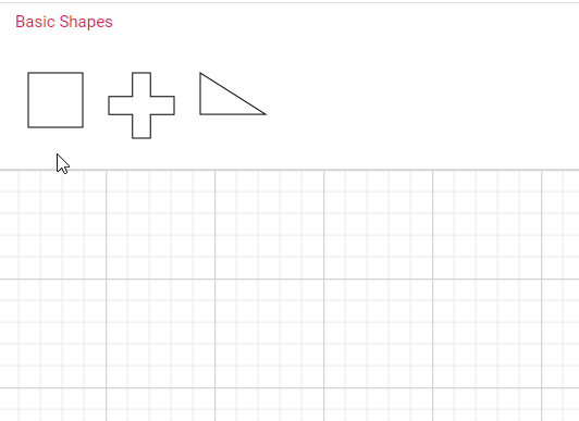
Expand Mode
The expandMode property of the symbol palette allows you to customize whether to expand all palettes simultaneously or to expand only one palette at a time.
The following example demonstrates how to set the expandMode property to control the expansion behavior of the palettes:
import * as React from "react";
import {useRef, useState} from "react";
import * as ReactDOM from "react-dom";
import { SymbolPaletteComponent } from "@syncfusion/ej2-react-diagrams";

//Initialize the basicshapes for the symbol palette
const getBasicShapes = () => {
    var basicShapes = [
        {
            id: 'Rectangle',
            shape: { type: 'Basic', shape: 'Rectangle' },
            style: { strokeWidth: 2 },
        },
        {
            id: 'Ellipse',
            shape: { type: 'Basic', shape: 'RightTriangle' },
            style: { strokeWidth: 2 },
        },
        {
            id: 'Hexagon',
            shape: { type: 'Basic', shape: 'Hexagon' },
            style: { strokeWidth: 2 },
        }
    ];
    return basicShapes;
}
//Initialize the flowshapes for the symbol palette
const getFlowShapes = () => {
    var flowShapes = [
        {
            id: 'Process',
            shape: { type: 'Flow', shape: 'Process' },
            style: { strokeWidth: 2 },
        },
        {
            id: 'Document',
            shape: { type: 'Flow', shape: 'Document' },
            style: { strokeWidth: 2 },
        }
    ];
    return flowShapes;
}
//Initialize connectors for symbol palette
const getConnectors = () => {
    var connectors = [
        {
            id: 'Straight',
            type: 'Straight',
            sourcePoint: { x: 0, y: 0 },
            targetPoint: { x: 60, y: 60 },
            targetDecorator: {
                shape: 'Arrow',
                style: { strokeColor: '#757575', fill: '#757575' },
            },
            style: { strokeWidth: 1, strokeColor: '#757575' },
        },
        {
            id: 'Orthogonal',
            type: 'Orthogonal',
            sourcePoint: { x: 0, y: 0 },
            targetPoint: { x: 60, y: 60 },
            targetDecorator: {
                shape: 'Arrow', style: { strokeColor: '#757575', fill: '#757575' },
            },
            style: { strokeWidth: 1, strokeColor: '#757575' },
        },
        {
            id: 'Bezier',
            type: 'Bezier',
            sourcePoint: { x: 0, y: 0 },
            targetPoint: { x: 60, y: 60 },
            targetDecorator: {
                shape: 'Arrow',
                style: { strokeColor: '#757575', fill: '#757575' },
            },
            style: { strokeWidth: 1, strokeColor: '#757575' },
        }
    ];
    return connectors;
}
const palettes = [{
    id: 'flow',
    expanded: true,
    symbols: getFlowShapes(),
    title: 'Flow Shapes',
    iconCss: 'e-ddb-icons e-flow'
},
{
    id: 'basic',
    expanded: true,
    symbols: getBasicShapes(),
    title: 'Basic Shapes',
    iconCss: 'e-ddb-icons e-basic'
},
{
    id: 'connectors',
    expanded: true,
    symbols: getConnectors(),
    title: 'Connectors',
    iconCss: 'e-ddb-icons e-connector'
}
];
function App() {
    const symbolPaletteRef = useRef(null);
    const [expandMode, setEnableAnimation] = useState("Single");
    // Toggle expandMode function
    const toggleExpandMode = (event) => {
        setEnableAnimation(event.target.value);
    };
    return (
        <div>
            <label htmlFor="expandMode">Expand Mode: </label>
            <select id="expandMode" onChange={toggleExpandMode}>
                <option value="Single">Single</option>
                <option value="Multiple">Multiple</option>
            </select>
            <SymbolPaletteComponent id="symbolpalette" width="100%" height="700px" expandMode={expandMode}
                palettes={palettes} symbolHeight={80} symbolWidth={80} />
        </div>);
}
const root = ReactDOM.createRoot(document.getElementById("container"));
root.render(<App />);
import * as React from "react";
import { useState } from "react";
import * as ReactDOM from "react-dom";
import { SymbolPaletteComponent, PaletteModel} from "@syncfusion/ej2-react-diagrams";
import { ExpandMode } from '@syncfusion/ej2-navigations';
//Initialize the basicshapes for the symbol palette
const getBasicShapes = () => {
var basicShapes = [
{
id: 'Rectangle',
shape: { type: 'Basic', shape: 'Rectangle' },
style: { strokeWidth: 2 },
},
{
id: 'Ellipse',
shape: { type: 'Basic', shape: 'RightTriangle' },
style: { strokeWidth: 2 },
},
{
id: 'Hexagon',
shape: { type: 'Basic', shape: 'Hexagon' },
style: { strokeWidth: 2 },
}
];
return basicShapes;
}
//Initialize the flowshapes for the symbol palette
const getFlowShapes = () => {
var flowShapes = [
{
id: 'Process',
shape: { type: 'Flow', shape: 'Process' },
style: { strokeWidth: 2 },
},
{
id: 'Document',
shape: { type: 'Flow', shape: 'Document' },
style: { strokeWidth: 2 },
}
];
return flowShapes;
}
//Initialize connectors for symbol palette
const getConnectors = () => {
var connectors = [
{
id: 'Straight',
type: 'Straight',
sourcePoint: { x: 0, y: 0 },
targetPoint: { x: 60, y: 60 },
targetDecorator: {
shape: 'Arrow',
style: { strokeColor: '#757575', fill: '#757575' },
},
style: { strokeWidth: 1, strokeColor: '#757575' },
},
{
id: 'Orthogonal',
type: 'Orthogonal',
sourcePoint: { x: 0, y: 0 },
targetPoint: { x: 60, y: 60 },
targetDecorator: {
shape: 'Arrow', style: { strokeColor: '#757575', fill: '#757575' },
},
style: { strokeWidth: 1, strokeColor: '#757575' },
},
{
id: 'Bezier',
type: 'Bezier',
sourcePoint: { x: 0, y: 0 },
targetPoint: { x: 60, y: 60 },
targetDecorator: {
shape: 'Arrow',
style: { strokeColor: '#757575', fill: '#757575' },
},
style: { strokeWidth: 1, strokeColor: '#757575' },
}
];
return connectors;
}
const palettes: PaletteModel[] = [{
id: 'flow',
expanded: true,
symbols: getFlowShapes(),
title: 'Flow Shapes',
iconCss: 'e-ddb-icons e-flow'
},
{
id: 'basic',
expanded: true,
symbols: getBasicShapes(),
title: 'Basic Shapes',
iconCss: 'e-ddb-icons e-basic'
},
{
id: 'connectors',
expanded: true,
symbols: getConnectors(),
title: 'Connectors',
iconCss: 'e-ddb-icons e-connector'
}
];
function App() {
const [expandMode, setEnableAnimation] = useState<ExpandMode>("Single");
// Toggle expandMode function
const toggleExpandMode = (event: any) => {
setEnableAnimation(event.target.value as ExpandMode);
};
return (
<div>
<label htmlFor="expandMode">Expand Mode: </label>
<select id="expandMode" onChange={toggleExpandMode}>
<option value="Single">Single</option>
<option value="Multiple">Multiple</option>
</select>
<SymbolPaletteComponent id="symbolpalette" width="100%" height="700px" expandMode={expandMode}
palettes={palettes} symbolHeight={80} symbolWidth={80} />
</div>);
}
const root = ReactDOM.createRoot(document.getElementById("container"));
root.render(<App />);Restrict Expand/Collapse of the Palette
The symbol palette panel can be restricted from expanding. When the expand icon of the palette is clicked, the paletteExpanding event is triggered. In this event, we can determine whether the palette’s panel should be expanded or collapsed by utilizing the cancel argument of the event. By default, the panel is expanded. This restriction can be applied to each palette in the symbol palette as desired.
In the following code example, the basic shapes palette is restricted from expanding, and the flow shapes palette is restricted from collapsing, whereas the swimlane shapes palette can be expanded or collapsed:
import * as React from "react";
import * as ReactDOM from "react-dom";
import { SymbolPaletteComponent } from "@syncfusion/ej2-react-diagrams";

//Expands only one palette at a time
const expandMode = "Multiple";
//Initialize the basicshapes for the symbol palette
const getBasicShapes = () => {
    let basicShapes = [
        {
            id: 'Rectangle',
            shape: { type: 'Basic', shape: 'Rectangle' },
            style: { strokeWidth: 2 },
        },
        {
            id: 'Ellipse',
            shape: { type: 'Basic', shape: 'RightTriangle' },
            style: { strokeWidth: 2 },
        },
        {
            id: 'Hexagon',
            shape: { type: 'Basic', shape: 'Hexagon' },
            style: { strokeWidth: 2 },
        }
    ];
    return basicShapes;
}
//Initialize the flowshapes for the symbol palette
const getFlowShapes = () => {
    let flowShapes = [
        {
            id: 'Process',
            shape: { type: 'Flow', shape: 'Process' },
            style: { strokeWidth: 2 },
        },
        {
            id: 'Document',
            shape: { type: 'Flow', shape: 'Document' },
            style: { strokeWidth: 2 },
        }
    ];
    return flowShapes;
}

const palettes = [{
    id: 'flow',
    expanded: true,
    symbols: getFlowShapes(),
    title: 'Flow Shapes',
    iconCss: 'e-ddb-icons e-flow'
},
{
    id: 'basic',
    expanded: true,
    symbols: getBasicShapes(),
    title: 'Basic Shapes',
    iconCss: 'e-ddb-icons e-basic'
}
];
const paletteExpanding = (args) => {
    if (args.palette.id === 'basic') {
        // Basic shapes panel does not collapse
        args.cancel = true;
    } else {
        // Flow shapes panel collapse and expand
        args.cancel = false;
    }
}
function App() {
    return (<SymbolPaletteComponent id="symbolpalette" width="100%" height="700px" expandMode={expandMode}
        palettes={palettes} symbolHeight={80} symbolWidth={80} paletteExpanding={paletteExpanding} />);
}
const root = ReactDOM.createRoot(document.getElementById("container"));
root.render(<App />);
import * as React from "react";
import * as ReactDOM from "react-dom";
import { SymbolPaletteComponent, NodeModel, PaletteModel, IPaletteExpandArgs } from "@syncfusion/ej2-react-diagrams";
import { ExpandMode } from '@syncfusion/ej2-navigations';
//Expands only one palette at a time
const expandMode: ExpandMode = "Multiple";
//Initialize the basicshapes for the symbol palette
const getBasicShapes: () => NodeModel[] = () => {
let basicShapes: NodeModel[] = [
{
id: 'Rectangle',
shape: { type: 'Basic', shape: 'Rectangle' },
style: { strokeWidth: 2 },
},
{
id: 'Ellipse',
shape: { type: 'Basic', shape: 'RightTriangle' },
style: { strokeWidth: 2 },
},
{
id: 'Hexagon',
shape: { type: 'Basic', shape: 'Hexagon' },
style: { strokeWidth: 2 },
}
];
return basicShapes;
}
//Initialize the flowshapes for the symbol palette
const getFlowShapes: () => NodeModel[] = () => {
let flowShapes: NodeModel[] = [
{
id: 'Process',
shape: { type: 'Flow', shape: 'Process' },
style: { strokeWidth: 2 },
},
{
id: 'Document',
shape: { type: 'Flow', shape: 'Document' },
style: { strokeWidth: 2 },
}
];
return flowShapes;
}
const palettes: PaletteModel[] = [{
id: 'flow',
expanded: true,
symbols: getFlowShapes(),
title: 'Flow Shapes',
iconCss: 'e-ddb-icons e-flow'
},
{
id: 'basic',
expanded: true,
symbols: getBasicShapes(),
title: 'Basic Shapes',
iconCss: 'e-ddb-icons e-basic'
}
];
const paletteExpanding = (args: IPaletteExpandArgs) => {
if (args.palette.id === 'basic') {
// Basic shapes panel does not collapse
args.cancel = true;
} else {
// Flow shapes panel collapse and expand
args.cancel = false;
}
}
function App() {
return (<SymbolPaletteComponent id="symbolpalette" width="100%" height="700px" expandMode={expandMode}
palettes={palettes} symbolHeight={80} symbolWidth={80} paletteExpanding={paletteExpanding} />);
}
const root = ReactDOM.createRoot(document.getElementById("container"));
root.render(<App />);Tooltip for Symbols in Symbol Palette
The symbol palette supports displaying tooltips when the mouse hovers over symbols. You can customize the tooltip for each symbol in the symbol palette.
Default Tooltip for Symbols
When hovering over symbols in the symbol palette, the default tooltip displays the symbol’s ID.
Refer to the image below for an illustration of the tooltip behavior in the symbol palette.
Custom Tooltip for Symbols
To customize tooltips for symbols in the symbol palette, assign a custom tooltip to the content property of ‘tooltip’ for each symbol. Once you define the custom tooltip, enable the Tooltip constraints for each symbol, ensuring that the tooltips are displayed when users hover over them.
The code provided below demonstrates how to define tooltip content for symbols within a symbol palette.
import * as React from "react";
import * as ReactDOM from "react-dom";
import { SymbolPaletteComponent, NodeConstraints } from "@syncfusion/ej2-react-diagrams";

//Initialize the basicshapes for the symbol palette
export function getBasicShapes() {
    let basicShapes = [
        {
            id: 'rectangle',
            shape: {
                type: 'Basic',
                shape: 'Rectangle',
            },
            // Defines the tooltip for the shape
            tooltip: { content: 'Rectangle Basic shape', relativeMode: 'Object' },
            constraints: NodeConstraints.Default | NodeConstraints.Tooltip,
        },
        {
            id: 'plus',
            shape: {
                type: 'Basic',
                shape: 'Plus',
            },
            // Defines the tooltip for the shape
            tooltip: { content: 'Plus Basic shape', relativeMode: 'Object' },
            constraints: NodeConstraints.Default | NodeConstraints.Tooltip,
        },
        {
            id: 'triangle',
            shape: {
                type: 'Basic',
                shape: 'RightTriangle',
            },
            // Defines the tooltip for the shape
            tooltip: { content: 'RightTriangle Basic shape', relativeMode: 'Object' },
            constraints: NodeConstraints.Default | NodeConstraints.Tooltip,
        },
    ];
    return basicShapes;
}
const palettes = [{
    id: 'basic',
    symbols: getBasicShapes(),
    title: 'Basic Shapes',
    iconCss: 'e-ddb-icons e-basic'
}];
export function getSymbolInfo(symbol) {
    return {
        width: 50,
        height: 50,
        description: {
            //Defines the description text for the symbol
            text: symbol.id,
        },
    };
}
//Initializes the symbol palette
function App() {
    return (<SymbolPaletteComponent id="symbolpalette" palettes={palettes}
        getSymbolInfo={getSymbolInfo} />);
}
const root = ReactDOM.createRoot(document.getElementById("container"));
root.render(<App />);
import * as React from "react";
import * as ReactDOM from "react-dom";
import { SymbolPaletteComponent, NodeConstraints, NodeModel, PaletteModel, SymbolInfo } from "@syncfusion/ej2-react-diagrams";
//Initialize the basicshapes for the symbol palette
export function getBasicShapes(): NodeModel[] {
let basicShapes: NodeModel[] = [
{
id: 'rectangle',
shape: {
type: 'Basic',
shape: 'Rectangle',
},
// Defines the tooltip for the shape
tooltip: { content: 'Rectangle Basic shape', relativeMode: 'Object' },
constraints: NodeConstraints.Default | NodeConstraints.Tooltip,
},
{
id: 'plus',
shape: {
type: 'Basic',
shape: 'Plus',
},
// Defines the tooltip for the shape
tooltip: { content: 'Plus Basic shape', relativeMode: 'Object' },
constraints: NodeConstraints.Default | NodeConstraints.Tooltip,
},
{
id: 'triangle',
shape: {
type: 'Basic',
shape: 'RightTriangle',
},
// Defines the tooltip for the shape
tooltip: { content: 'RightTriangle Basic shape', relativeMode: 'Object' },
constraints: NodeConstraints.Default | NodeConstraints.Tooltip,
},
];
return basicShapes;
}
const palettes: PaletteModel = [{
id: 'basic',
symbols: getBasicShapes(),
title: 'Basic Shapes',
iconCss: 'e-ddb-icons e-basic'
}];
export function getSymbolInfo(symbol: NodeModel): SymbolInfo {
return {
width: 50,
height: 50,
description: {
//Defines the description text for the symbol
text: symbol.id,
},
};
}
//Initializes the symbol palette
function App() {
return (<SymbolPaletteComponent id="symbolpalette" palettes={palettes}
getSymbolInfo={getSymbolInfo} />);
}
const root = ReactDOM.createRoot(document.getElementById("container"));
root.render(<App />);How to enable or disable the default tooltip for shapes in the symbol palette
By default, the symbol ID is displayed as a tooltip when hovering over a symbol in the Symbol Palette. To disable this default tooltip, you can use the showTooltip property within the getSymbolInfo method. The showTooltip property is set to true by default, which enables the tooltip.
The following example demonstrates how to configure selective tooltip display:
import * as React from "react";
import * as ReactDOM from "react-dom";
import { SymbolPaletteComponent } from "@syncfusion/ej2-react-diagrams";
import { CheckBoxComponent } from "@syncfusion/ej2-react-buttons";

let palette;
export function getBasicShapes() {
    let basicShapes = [
        { id: 'Rectangle', shape: { type: 'Basic', shape: 'Rectangle' } },
        { id: 'Ellipse', shape: { type: 'Basic', shape: 'Ellipse' } },
        { id: 'Hexagon', shape: { type: 'Basic', shape: 'Triangle' } },
        { id: 'Star', shape: { type: 'Basic', shape: 'Hexagon' } },
        { id: 'Pentagon', shape: { type: 'Basic', shape: 'Parallelogram' } },
        { id: 'Diamond', shape: { type: 'Basic', shape: 'Diamond' } },
        { id: 'Pentagon', shape: { type: 'Basic', shape: 'Pentagon' } },
        { id: 'Heptagon', shape: { type: 'Basic', shape: 'Heptagon' } },
    ];
    return basicShapes;
}
export function getFlowShapes() {
    let flowShapes = [
        { id: 'Terminator', shape: { type: 'Flow', shape: 'Terminator' } },
        { id: 'Process', shape: { type: 'Flow', shape: 'Process' } },
        { id: 'Decision', shape: { type: 'Flow', shape: 'Decision' } },
        { id: 'Document', shape: { type: 'Flow', shape: 'Document' } },
        { id: 'PreDefinedProcess', shape: { type: 'Flow', shape: 'PreDefinedProcess' } },
        { id: 'DirectData', shape: { type: 'Flow', shape: 'DirectData' } },
        { id: 'SequentialData', shape: { type: 'Flow', shape: 'Card' } },
        { id: 'Sort', shape: { type: 'Flow', shape: 'Collate' } },
    ];
    return flowShapes;
}
export function getSymbolInfo(symbol) {
    return {
        showTooltip: true,
    };
}
const symbolPreview = {
    height: 8,
    width: 80,
};
const symbolMargin = {
    left: 15,
    right: 15,
    top: 15,
    bottom: 15,
};
const palettes = [{
    id: 'flow',
    expanded: true,
    symbols: getFlowShapes(),
    title: 'Flow Shapes',
},
{
    id: 'basic',
    expanded: true,
    symbols: getBasicShapes(),
    title: 'Basic Shapes',
}];
function tooltipChange(args) {
    var checkBox = document.getElementById("showTooltip");
    palette.getSymbolInfo = function (symbol) {
        return { showTooltip: checkBox.checked };
    }
    palette.refresh();
}

function App() {
    return (
        <div>
            <SymbolPaletteComponent id="symbolpalette"
                palettes={palettes}
                ref={symbolpal => (palette = symbolpal)}
                expandMode={'Multiple'}
                width={700}
                height={300}
                symbolPreview={symbolPreview}
                symbolMargin={symbolMargin}
                symbolHeight={70}
                symbolWidth={70}
                getSymbolInfo={getSymbolInfo}
                getNodeDefaults={(node) => {
                    node.style.fill = '#6495ED';
                    node.style.strokeColor = '#6495ED';
                    return node;
                }}/>
            <CheckBoxComponent id="showTooltip" checked={true} change={tooltipChange} /> Show Tooltip
        </div>
    );
}
const root = ReactDOM.createRoot(document.getElementById("container"));
root.render(<App />);
import * as React from "react";
import * as ReactDOM from "react-dom";
import { SymbolPaletteComponent, NodeModel, PaletteModel, SymbolInfo } from "@syncfusion/ej2-react-diagrams";
import { CheckBoxComponent } from "@syncfusion/ej2-react-buttons";
let palette: SymbolPaletteComponent;
export function getBasicShapes(): NodeModel[] {
let basicShapes: NodeModel[] = [
{ id: 'Rectangle', shape: { type: 'Basic', shape: 'Rectangle' } },
{ id: 'Ellipse', shape: { type: 'Basic', shape: 'Ellipse' } },
{ id: 'Hexagon', shape: { type: 'Basic', shape: 'Triangle' } },
{ id: 'Star', shape: { type: 'Basic', shape: 'Hexagon' } },
{ id: 'Pentagon', shape: { type: 'Basic', shape: 'Parallelogram' } },
{ id: 'Diamond', shape: { type: 'Basic', shape: 'Diamond' } },
{ id: 'Pentagon', shape: { type: 'Basic', shape: 'Pentagon' } },
{ id: 'Heptagon', shape: { type: 'Basic', shape: 'Heptagon' } },
];
return basicShapes;
}
export function getFlowShapes(): NodeModel[] {
let basicShapes: NodeModel[] = [
{ id: 'Terminator', shape: { type: 'Flow', shape: 'Terminator' } },
{ id: 'Process', shape: { type: 'Flow', shape: 'Process' } },
{ id: 'Decision', shape: { type: 'Flow', shape: 'Decision' } },
{ id: 'Document', shape: { type: 'Flow', shape: 'Document' } },
{ id: 'PreDefinedProcess', shape: { type: 'Flow', shape: 'PreDefinedProcess' } },
{ id: 'DirectData', shape: { type: 'Flow', shape: 'DirectData' } },
{ id: 'SequentialData', shape: { type: 'Flow', shape: 'Card' } },
{ id: 'Sort', shape: { type: 'Flow', shape: 'Collate' } },
];
return basicShapes;
}
export function getSymbolInfo(symbol: SymbolInfo): SymbolInfo {
return {
showTooltip: true,
};
}
const symbolPreview = {
height: 8,
width: 80,
};
const symbolMargin = {
left: 15,
right: 15,
top: 15,
bottom: 15,
};
function tooltipChange() {
var checkBox = document.getElementById("showTooltip");
palette.getSymbolInfo = function (symbol: SymbolInfo): SymbolInfo {
return { showTooltip: (checkBox as any).checked };
}
palette.refresh();
}
const palettes: PaletteModel[] = [{
id: 'flow',
expanded: true,
symbols: getFlowShapes(),
title: 'Flow Shapes',
},
{
id: 'basic',
expanded: true,
symbols: getBasicShapes(),
title: 'Basic Shapes',
}];
function App() {
return (
<div>
<SymbolPaletteComponent id="symbolpalette"
ref={symbolpal => (palette = symbolpal)}
expandMode={'Multiple'}
palettes={palettes}
width={700}
height={300}
symbolPreview={symbolPreview}
symbolMargin={symbolMargin}
symbolHeight={70}
symbolWidth={70}
getSymbolInfo={getSymbolInfo}
getNodeDefaults={(node: NodeModel) => {
node.style.fill = '#6495ED';
node.style.strokeColor = '#6495ED';
return node;
}}/>
<CheckBoxComponent id="showTooltip" checked={true} change={tooltipChange} /> Show Tooltip
</div>
);
}
const root = ReactDOM.createRoot(document.getElementById("container"));
root.render(<App />);NOTE
This property is effective only when tooltip constraints are disabled for the symbol palette element.
How to provide different tooltip for Symbol palette and diagram elements.
When a custom tooltip is defined for a symbol, it will be displayed for both the symbol and the dropped node in the diagram canvas.
However, to provide distinct tooltips for symbols in the palette and dropped nodes, capture the dragEnter event and assign specific tooltips dynamically.
When a symbol is dragged from the symbol palette onto the diagram canvas, the DragEnter, event is triggered. This event provides an argument of type IDragEnterEventArgs. Within this event, you can define a custom tooltip for the dropped node by assigning content to its tooltip property, allowing you to display context-specific information.
The following image illustrates the differentiation of tooltips displayed in the Symbol Palette and the Diagram.
The following code snippet demonstrates how to define two different tooltips for symbols in the symbol palette and dropped nodes in the diagram canvas.
import * as React from "react";
import * as ReactDOM from "react-dom";
import { SymbolPaletteComponent, DiagramComponent, NodeConstraints } from "@syncfusion/ej2-react-diagrams";

//Initialize the basic shapes for the symbol palette
export function getBasicShapes() {
    let basicShapes = [
        {
            id: 'rectangle',
            shape: {
                type: 'Basic',
                shape: 'Rectangle',
            },
            // Defines the tooltip for the shape
            tooltip: { content: 'Rectangle Basic shape', relativeMode: 'Object' },
            constraints: NodeConstraints.Default | NodeConstraints.Tooltip,
        },
        {
            id: 'plus',
            shape: {
                type: 'Basic',
                shape: 'Plus',
            },
            // Defines the tooltip for the shape
            tooltip: { content: 'Plus Basic shape', relativeMode: 'Object' },
            constraints: NodeConstraints.Default | NodeConstraints.Tooltip,
        },
        {
            id: 'triangle',
            shape: {
                type: 'Basic',
                shape: 'RightTriangle',
            },
            // Defines the tooltip for the shape
            tooltip: { content: 'RightTriangle Basic shape', relativeMode: 'Object' },
            constraints: NodeConstraints.Default | NodeConstraints.Tooltip,
        },
    ];
    return basicShapes;
}
const palettes = [{
    id: 'basic',
    symbols: getBasicShapes(),
    title: 'Basic Shapes',
    iconCss: 'e-ddb-icons e-basic'
}];
function App() {
    const dragEnter = (args) => {
        const node = args.element;
        //Setting new tooltip content for the dragEntered node
        node.tooltip.content = 'New ' + node.shape.shape + ' node';
    }
    return (
        <div>
            <SymbolPaletteComponent id="symbolpalette" palettes={palettes} symbolWidth={80} symbolHeight={80} />
            <DiagramComponent id="diagram" width={'1000px'} height={'500px'} dragEnter={dragEnter} />
        </div>);
}
const root = ReactDOM.createRoot(document.getElementById("container"));
root.render(<App />);
import * as React from "react";
import * as ReactDOM from "react-dom";
import { SymbolPaletteComponent, DiagramComponent, NodeConstraints, NodeModel, PaletteModel, IDragEnterEventArgs } from "@syncfusion/ej2-react-diagrams";
//Initialize the basic shapes for the symbol palette
export function getBasicShapes(): NodeModel[] {
let basicShapes: NodeModel[] = [
{
id: 'rectangle',
shape: {
type: 'Basic',
shape: 'Rectangle',
},
// Defines the tooltip for the shape
tooltip: { content: 'Rectangle Basic shape', relativeMode: 'Object' },
constraints: NodeConstraints.Default | NodeConstraints.Tooltip,
},
{
id: 'plus',
shape: {
type: 'Basic',
shape: 'Plus',
},
// Defines the tooltip for the shape
tooltip: { content: 'Plus Basic shape', relativeMode: 'Object' },
constraints: NodeConstraints.Default | NodeConstraints.Tooltip,
},
{
id: 'triangle',
shape: {
type: 'Basic',
shape: 'RightTriangle',
},
// Defines the tooltip for the shape
tooltip: { content: 'RightTriangle Basic shape', relativeMode: 'Object' },
constraints: NodeConstraints.Default | NodeConstraints.Tooltip,
},
];
return basicShapes;
}
const palettes: PaletteModel[] = [{
id: 'basic',
symbols: getBasicShapes(),
title: 'Basic Shapes',
iconCss: 'e-ddb-icons e-basic'
}];
function App() {
const dragEnter = (args: IDragEnterEventArgs) => {
const node = args.element;
//Setting new tooltip content for the dragEntered node
node.tooltip.content = 'New ' + node.shape.shape + ' node';
}
return (
<div>
<SymbolPaletteComponent id="symbolpalette" palettes={palettes} symbolWidth={80} symbolHeight={80} />
<DiagramComponent id="diagram" width={'1000px'} height={'500px'} dragEnter={dragEnter} />
</div>);
}
const root = ReactDOM.createRoot(document.getElementById("container"));
root.render(<App />);Localization
To localize the symbol palette search box, we need to define the locale property of the symbol palette with the preferred culture. In the example below, ‘de-DE’ is used, which is the locale code for German as used in Germany.
The following code shows how to localize symbol palette.
import * as React from "react";
import * as ReactDOM from "react-dom";
import { L10n, setCulture } from '@syncfusion/ej2-base';
import { SymbolPaletteComponent } from "@syncfusion/ej2-react-diagrams";

//Initialize the basic shapes for the symbol palette
export function getBasicShapes() {
    let basicShapes = [
        {
            id: 'Rectangle',
            shape: {
                type: 'Basic',
                shape: 'Rectangle',
            },
        },
        {
            id: 'Ellipse',
            shape: {
                type: 'Basic',
                shape: 'Ellipse',
            },
        },
        {
            id: 'Hexagon',
            shape: {
                type: 'Basic',
                shape: 'Hexagon',
            },
        },
    ];
    return basicShapes;
}

const palettes = [{
    id: 'basic',
    symbols: getBasicShapes(),
    title: 'Basic Shapes',
}];

// Override the global culture and localization value
const locale = 'de-DE';

// Set the default culture to German
setCulture('de');

// Load locale text for the SearchShapes
L10n.load({
    'de-DE': {
        SymbolPalette: {
            SearchShapes: 'Formen suchen',
        },
    },
});
//Initializes the symbol palette
function App() {
    return (<SymbolPaletteComponent id="symbolpalette" palettes={palettes} enableSearch={true}
        locale={locale} symbolWidth={80} symbolHeight={80} enableAnimation={false} />);
}
const root = ReactDOM.createRoot(document.getElementById("container"));
root.render(<App />);
import * as React from "react";
import * as ReactDOM from "react-dom";
import { L10n, setCulture } from '@syncfusion/ej2-base';
import { SymbolPaletteComponent, PaletteModel, NodeModel } from "@syncfusion/ej2-react-diagrams";
//Initialize the basic shapes for the symbol palette
export function getBasicShapes(): NodeModel[] {
let basicShapes: NodeModel[] = [
{
id: 'Rectangle',
shape: {
type: 'Basic',
shape: 'Rectangle',
},
},
{
id: 'Ellipse',
shape: {
type: 'Basic',
shape: 'Ellipse',
},
},
{
id: 'Hexagon',
shape: {
type: 'Basic',
shape: 'Hexagon',
},
},
];
return basicShapes;
}
const palettes: PaletteModel[] = [{
id: 'basic',
symbols: getBasicShapes(),
title: 'Basic Shapes',
}];
// Override the global culture and localization value
const locale: string = 'de-DE';
// Set the default culture to German
setCulture('de');
// Load locale text for the SearchShapes
L10n.load({
'de-DE': {
SymbolPalette: {
SearchShapes: 'Formen suchen',
},
},
});
//Initializes the symbol palette
function App() {
return (<SymbolPaletteComponent id="symbolpalette" palettes={palettes} enableSearch={true}
locale={locale} symbolWidth={80} symbolHeight={80} enableAnimation={false} />);
}
const root = ReactDOM.createRoot(document.getElementById("container"));
root.render(<App />);Restrict Symbol Dragging from Palette
You can restrict the symbols getting dragged from the symbol palette by setting the allowDrag property of symbol palette as false. By default, the allowDrag is set as true.
import * as React from "react";
import * as ReactDOM from "react-dom";
import { SymbolPaletteComponent, DiagramComponent } from "@syncfusion/ej2-react-diagrams";

//Initialize the basic shapes for the symbol palette
export function getBasicShapes() {
    let basicShapes = [
        {
            id: 'rectangle',
            shape: {
                type: 'Basic',
                shape: 'Rectangle',
            },
        },
        {
            id: 'plus',
            shape: {
                type: 'Basic',
                shape: 'Plus',
            },
        },
        {
            id: 'triangle',
            shape: {
                type: 'Basic',
                shape: 'RightTriangle',
            },
        }
    ];
    return basicShapes;
}

const palettes = [{
    id: 'basic',
    symbols: getBasicShapes(),
    title: 'Basic Shapes',
}];
//Determines to allow drag symbols
const allowDrag = false;
function App() {
    return (
        <div>
            <SymbolPaletteComponent id="symbolpalette" palettes={palettes}
                symbolWidth={80} symbolHeight={80} allowDrag={allowDrag} />
            <DiagramComponent id="diagram" width="1000px" height="700px" />
        </div>);
}
const root = ReactDOM.createRoot(document.getElementById("container"));
root.render(<App />);
import * as React from "react";
import * as ReactDOM from "react-dom";
import { SymbolPaletteComponent, DiagramComponent, NodeModel, PaletteModel } from "@syncfusion/ej2-react-diagrams";
//Initialize the basic shapes for the symbol palette
export function getBasicShapes(): NodeModel[] {
let basicShapes: NodeModel[] = [
{
id: 'rectangle',
shape: {
type: 'Basic',
shape: 'Rectangle',
},
},
{
id: 'plus',
shape: {
type: 'Basic',
shape: 'Plus',
},
},
{
id: 'triangle',
shape: {
type: 'Basic',
shape: 'RightTriangle',
},
}
];
return basicShapes;
}
const palettes: PaletteModel[] = [{
id: 'basic',
symbols: getBasicShapes(),
title: 'Basic Shapes',
}];
//Determines to allow drag symbols
const allowDrag: boolean = false;
function App() {
return (
<div>
<SymbolPaletteComponent id="symbolpalette" palettes={palettes}
symbolWidth={80} symbolHeight={80} allowDrag={allowDrag} />
<DiagramComponent id="diagram" width="1000px" height="700px" />
</div>);
}
const root = ReactDOM.createRoot(document.getElementById("container"));
root.render(<App />);Search Symbol
The diagram provides support for enabling the search option in the palette. The enableSearch property of the palette is used to show or hide the search textbox in the palette. You can search for symbols in the palette by entering the symbol ID (e.g., “rectangle”) and search keywords into the search text box. The symbols are retrieved by matching the value of the ID property with the string entered in the search textbox.
import * as React from "react";
import * as ReactDOM from "react-dom";
import { SymbolPaletteComponent } from "@syncfusion/ej2-react-diagrams";

const flowShapes = [
    { id: 'terminator', shape: { type: 'Flow', shape: 'Terminator' } },
    { id: 'process', shape: { type: 'Flow', shape: 'Process' } },
    { id: 'decision', shape: { type: 'Flow', shape: 'Decision' } },
    { id: 'document', shape: { type: 'Flow', shape: 'Document' } },
    {
        id: 'preDefinedProcess',
        shape: { type: 'Flow', shape: 'PreDefinedProcess' },
    },
    { id: 'paperTap', shape: { type: 'Flow', shape: 'PaperTap' } },
    { id: 'directData', shape: { type: 'Flow', shape: 'DirectData' } },
    { id: 'sequentialData', shape: { type: 'Flow', shape: 'SequentialData' } },
    { id: 'sort', shape: { type: 'Flow', shape: 'Sort' } },
];
const palettes = [
    {
        id: 'basic',
        symbols: flowShapes,
        title: 'Basic Shapes',
    },
];
//enables the search option in the palette
const enableSearch = true;
function App() {
    return (<SymbolPaletteComponent id="symbolpalette" palettes={palettes} symbolHeight={60} symbolWidth={60}
        enableSearch={enableSearch} />);
}
const root = ReactDOM.createRoot(document.getElementById("container"));
root.render(<App />);
import * as React from "react";
import * as ReactDOM from "react-dom";
import { SymbolPaletteComponent, NodeModel, PaletteModel } from "@syncfusion/ej2-react-diagrams";
const flowShapes: NodeModel[] = [
{ id: 'terminator', shape: { type: 'Flow', shape: 'Terminator' } },
{ id: 'process', shape: { type: 'Flow', shape: 'Process' } },
{ id: 'decision', shape: { type: 'Flow', shape: 'Decision' } },
{ id: 'document', shape: { type: 'Flow', shape: 'Document' } },
{
id: 'preDefinedProcess',
shape: { type: 'Flow', shape: 'PreDefinedProcess' },
},
{ id: 'paperTap', shape: { type: 'Flow', shape: 'PaperTap' } },
{ id: 'directData', shape: { type: 'Flow', shape: 'DirectData' } },
{ id: 'sequentialData', shape: { type: 'Flow', shape: 'SequentialData' } },
{ id: 'sort', shape: { type: 'Flow', shape: 'Sort' } },
];
const palettes: PaletteModel[] = [
{
id: 'basic',
symbols: flowShapes,
title: 'Basic Shapes',
},
];
//enables the search option in the palette
const enableSearch: boolean = true;
function App() {
return (<SymbolPaletteComponent id="symbolpalette" palettes={palettes} symbolHeight={60} symbolWidth={60}
enableSearch={enableSearch} />);
}
const root = ReactDOM.createRoot(document.getElementById("container"));
root.render(<App />);Ignore Symbols on Search
The ignoreSymbolsOnSearch property allows you to specify which symbols should be excluded from search results within the symbol palette. By setting this property, you can control the visibility of specific symbols during a search operation. This feature is useful for hiding certain symbols that should not be shown through search functionality.
In the following example, the symbol with the ID ‘plus’ is ignored, so it will not appear in search results.
import * as React from "react";
import * as ReactDOM from "react-dom";
import { SymbolPaletteComponent } from "@syncfusion/ej2-react-diagrams";

const basicShapes = [
    {
        id: 'rectangle',
        shape: {
            type: 'Basic',
            shape: 'Rectangle',
        },
    },
    {
        id: 'plus',
        shape: {
            type: 'Basic',
            shape: 'Plus',
        },
    },
    {
        id: 'triangle',
        shape: {
            type: 'Basic',
            shape: 'RightTriangle',
        },
    },
];
const palettes = [
    {
        id: 'basic',
        symbols: basicShapes,
        title: 'Basic Shapes',
    },
];
// collection of shapes to be ignored on search
const ignoreSymbolsOnSearch = ['plus'];
function App() {
    return (<SymbolPaletteComponent id="symbolpalette" palettes={palettes} symbolHeight={60} symbolWidth={60}
        enableSearch={true} ignoreSymbolsOnSearch={ignoreSymbolsOnSearch} />);
}
const root = ReactDOM.createRoot(document.getElementById("container"));
root.render(<App />);
import * as React from "react";
import * as ReactDOM from "react-dom";
import { SymbolPaletteComponent, NodeModel, PaletteModel } from "@syncfusion/ej2-react-diagrams";
const basicShapes: NodeModel[] = [
{
id: 'rectangle',
shape: {
type: 'Basic',
shape: 'Rectangle',
},
},
{
id: 'plus',
shape: {
type: 'Basic',
shape: 'Plus',
},
},
{
id: 'triangle',
shape: {
type: 'Basic',
shape: 'RightTriangle',
},
},
];
const palettes: PaletteModel = [
{
id: 'basic',
symbols: basicShapes,
title: 'Basic Shapes',
},
];
// collection of shapes to be ignored on search
const ignoreSymbolsOnSearch: string[] = ['plus'];
function App() {
return (<SymbolPaletteComponent id="symbolpalette" palettes={palettes} symbolHeight={60} symbolWidth={60}
enableSearch={true} ignoreSymbolsOnSearch={ignoreSymbolsOnSearch} />);
}
const root = ReactDOM.createRoot(document.getElementById("container"));
root.render(<App />);Filter Search
You can filter the search results based on your specific requirements. To achieve this, customize the filterSymbols method of the symbol palette according to your needs. In the following example, the results are filtered to display only flow shapes in the search palette.
import * as React from "react";
import * as ReactDOM from "react-dom";
import { SymbolPaletteComponent, DiagramComponent } from "@syncfusion/ej2-react-diagrams";

//Initialize the basic shapes for the symbol palette
export function getBasicShapes() {
    let basicShapes = [
        {
            id: 'rectangle',
            shape: {
                type: 'Basic',
                shape: 'Rectangle',
            },
        },
        {
            id: 'plus',
            shape: {
                type: 'Basic',
                shape: 'Plus',
            },
        },
        {
            id: 'triangle',
            shape: {
                type: 'Basic',
                shape: 'RightTriangle',
            },
        },
    ];
    return basicShapes;
}
//Initialize the flow shapes for the symbol palette
export function getFlowShapes() {
    let flowShapes = [
        {
            id: 'process',
            shape: {
                type: 'Flow',
                shape: 'Process',
            },
        },
        {
            id: 'terminator',
            shape: {
                type: 'Flow',
                shape: 'Terminator',
            },
        },
        {
            id: 'decision',
            shape: {
                type: 'Flow',
                shape: 'Decision',
            },
        },
        {
            id: 'document',
            shape: {
                type: 'Flow',
                shape: 'Document',
            },
        },
        {
            id: 'data',
            shape: {
                type: 'Flow',
                shape: 'Data',
            },
        },
    ];
    return flowShapes;
}
const palettes = [
    {
        id: 'basic',
        symbols: getBasicShapes(),
        title: 'Basic Shapes',
    },
    {
        id: 'flow',
        symbols: getFlowShapes(),
        title: 'Flow Shapes',
    }
];
//enables search option in the palette
const enableSearch = true;
export function filterSymbols(symbols) {
    let symbolGroup = [];
    for (let i = 0; i < symbols.length; i++) {
        let symbol = symbols[i];
        //Filters symbol based on type
        if (symbol.shape.type === 'Flow') {
            symbolGroup.push(symbol);
        }
    }
    return symbolGroup;
}
function App() {
    return (
        <div>
            <SymbolPaletteComponent id="symbolpalette" palettes={palettes} symbolHeight={60} symbolWidth={60}
                enableSearch={enableSearch} filterSymbols={filterSymbols} />
            <DiagramComponent id="diagram" width="100%" height="700px" />
        </div>
    );
}
const root = ReactDOM.createRoot(document.getElementById("container"));
root.render(<App />);
import * as React from "react";
import * as ReactDOM from "react-dom";
import { SymbolPaletteComponent, DiagramComponent, NodeModel, PaletteModel } from "@syncfusion/ej2-react-diagrams";
//Initialize the basic shapes for the symbol palette
export function getBasicShapes(): NodeModel[] {
let basicShapes: NodeModel[] = [
{
id: 'rectangle',
shape: {
type: 'Basic',
shape: 'Rectangle',
},
},
{
id: 'plus',
shape: {
type: 'Basic',
shape: 'Plus',
},
},
{
id: 'triangle',
shape: {
type: 'Basic',
shape: 'RightTriangle',
},
},
];
return basicShapes;
}
//Initialize the flow shapes for the symbol palette
export function getFlowShapes(): NodeModel[] {
let flowShapes: NodeModel[] = [
{
id: 'process',
shape: {
type: 'Flow',
shape: 'Process',
},
},
{
id: 'terminator',
shape: {
type: 'Flow',
shape: 'Terminator',
},
},
{
id: 'decision',
shape: {
type: 'Flow',
shape: 'Decision',
},
},
{
id: 'document',
shape: {
type: 'Flow',
shape: 'Document',
},
},
{
id: 'data',
shape: {
type: 'Flow',
shape: 'Data',
},
},
];
return flowShapes;
}
const palettes: PaletteModel[] = [
{
id: 'basic',
symbols: getBasicShapes(),
title: 'Basic Shapes',
},
{
id: 'flow',
symbols: getFlowShapes(),
title: 'Flow Shapes',
}
];
//enables search option in the palette
const enableSearch = true;
export function filterSymbols(symbols: NodeModel[]): NodeModel[] {
let symbolGroup: NodeModel[] = [];
for (let i: number = 0; i < symbols.length; i++) {
let symbol = symbols[i];
//Filters symbol based on type
if ((symbol as any).shape.type === 'Flow') {
symbolGroup.push(symbol);
}
}
return symbolGroup;
}
function App() {
return (
<div>
<SymbolPaletteComponent id="symbolpalette" palettes={palettes} symbolHeight={60} symbolWidth={60}
enableSearch={enableSearch} filterSymbols={filterSymbols} />
<DiagramComponent id="diagram" width="100%" height="700px" />
</div>
);
}
const root = ReactDOM.createRoot(document.getElementById("container"));
root.render(<App />);NOTE
The diagram provides support to cancel the drag and drop operation from the symbol palette to the diagram when the ESC key is pressed.