Label Interaction in React Diagram
01 Sep 202624 minutes to read
The React Diagram component allows labels to be interactive through selecting, dragging, rotating, and resizing operations. Label interaction is disabled by default. Enable label interaction using the constraints property of the label. You can also control specific interaction types by enabling individual constraints for selecting, dragging, rotating, or resizing. The following code demonstrates how to enable interactive mode.
import * as React from "react";
import * as ReactDOM from "react-dom";
import { DiagramComponent, AnnotationConstraints } from "@syncfusion/ej2-react-diagrams";
// A node is created and stored in nodes array.
let node = [{
        id: 'node1',
        // Position of the node
        offsetX: 100,
        offsetY: 100,
        // Size of the node
        width: 100,
        height: 100,
        // Sets the annotation for the node
        annotations: [{
                content: 'Annotation Text',
                //Sets the constraints as Interaction
                constraints: AnnotationConstraints.Interaction
            }]
    }];
// initialize Diagram component
function App() {
    return (<DiagramComponent id="container" width={'100%'} height={'600px'} nodes={node}/>);
}
const root = ReactDOM.createRoot(document.getElementById('diagram'));
root.render(<App />);
import * as React from "react";
import * as ReactDOM from "react-dom";
import {
DiagramComponent,
NodeModel,
AnnotationConstraints
} from "@syncfusion/ej2-react-diagrams";
// A node is created and stored in nodes array.
let node: NodeModel[] = [{
id: 'node1',
// Position of the node
offsetX: 100,
offsetY: 100,
// Size of the node
width: 100,
height: 100,
// Sets the annotation for the node
annotations: [{
content: 'Annotation Text',
//Sets the constraints as Interaction
constraints: AnnotationConstraints.Interaction
}]
}];
// initialize Diagram component
function App() {
return (
<DiagramComponent
id="container"
width={'100%'}
height={'600px'}
nodes={node}
/>
);
}
const root = ReactDOM.createRoot(document.getElementById('diagram'));
root.render(<App />);Constraints
The constraints property of labels allows enabling or disabling specific label behaviors. The available AnnotationConstraints values include Select, Drag, Rotate, Resize, Edit, ReadOnly, and Interaction (a combined flag of the common interactions). Use these constraints to control which interaction types are available for each label. The following code example shows how to enable Select, Drag, Rotate, and Resize constraints individually for a label.
import * as React from "react";
import * as ReactDOM from "react-dom";
import {
    DiagramComponent,
    AnnotationConstraints
} from "@syncfusion/ej2-react-diagrams";
// A node is created and stored in nodes array.
let node = [{
    id: 'node1',
    // Position of the node
    offsetX: 100,
    offsetY: 100,
    // Size of the node
    width: 100,
    height: 100,
    // Sets the annotation for the node
    annotations: [{
        content: 'Annotation Text',
        //Enables Select, Drag, Rotate and Resize constraints
        constraints: AnnotationConstraints.Select
            | AnnotationConstraints.Drag
            | AnnotationConstraints.Rotate
            | AnnotationConstraints.Resize
    }]
}];
// initialize Diagram component
function App() {
  return (
    <DiagramComponent
      id="container"
      width={'100%'}
      height={'600px'}
      nodes={node}
    />
  );
}
const root = ReactDOM.createRoot(document.getElementById('diagram'));
root.render(<App />);
import * as React from "react";
import * as ReactDOM from "react-dom";
import {
DiagramComponent,
NodeModel,
AnnotationConstraints
} from "@syncfusion/ej2-react-diagrams";
// A node is created and stored in nodes array.
let node: NodeModel[] = [{
id: 'node1',
// Position of the node
offsetX: 100,
offsetY: 100,
// Size of the node
width: 100,
height: 100,
// Sets the annotation for the node
annotations: [{
content: 'Annotation Text',
//Enables Select, Drag, Rotate and Resize constraints
constraints: AnnotationConstraints.Select
| AnnotationConstraints.Drag
| AnnotationConstraints.Rotate
| AnnotationConstraints.Resize
}]
}];
// initialize Diagram component
function App() {
return (
<DiagramComponent
id="container"
width={'100%'}
height={'600px'}
nodes={node}
/>
);
}
const root = ReactDOM.createRoot(document.getElementById('diagram'));
root.render(<App />);Label Editing
The React Diagram component supports editing labels at runtime, both programmatically and interactively. By default, labels are in view mode. Labels can be switched to edit mode using two approaches:
Programmatic Editing
By using startTextEdit method to programmatically enter edit mode for a specific label. Capture the diagram instance via a ref so the method can be invoked, as shown below.
import * as React from "react";
import * as ReactDOM from "react-dom";
import { DiagramComponent } from "@syncfusion/ej2-react-diagrams";
let diagramInstance;
// A node is created and stored in nodes array.
let node = [{
    id: 'node1',
    // Position of the node
    offsetX: 100,
    offsetY: 100,
    // Size of the node
    width: 100,
    height: 100,
    // Sets the annotation for the node
    annotations: [{
        content: 'Annotation Text',
    }]
}];
// initialize Diagram component
function App() {
    const editAnnotation = () => {
        //Method to edit the annotation programmatically
        diagramInstance.startTextEdit(diagramInstance.nodes[0]);
    };
    return (
        <div>
            <button id="editAnnotation" onClick={editAnnotation}>Edit Annotation</button>
            <DiagramComponent id="container" ref={(diagram) => (diagramInstance = diagram)} width={'100%'} height={'600px'} nodes={node}/>
        </div>
    );
}
const root = ReactDOM.createRoot(document.getElementById('diagram'));
root.render(<App />);
import * as React from "react";
import * as ReactDOM from "react-dom";
import {
DiagramComponent,
NodeModel
} from "@syncfusion/ej2-react-diagrams";
let diagramInstance: DiagramComponent;
// A node is created and stored in nodes array.
let node: NodeModel[] = [{
id: 'node1',
// Position of the node
offsetX: 100,
offsetY: 100,
// Size of the node
width: 100,
height: 100,
// Sets the annotation for the node
annotations: [{
content: 'Annotation Text',
}]
}];
// initialize Diagram component
function App() {
const editAnnotation = () => {
//Method to edit the annotation programmatically
diagramInstance.startTextEdit(diagramInstance.nodes[0]);
};
return (
<div>
<button id="editAnnotation" onClick={editAnnotation}>Edit Annotation</button>
<DiagramComponent id="container" ref={(diagram) => (diagramInstance = diagram)} width={'100%'} height={'600px'} nodes={node}/>
</div>
);
}
const root = ReactDOM.createRoot(document.getElementById('diagram'));
root.render(<App />);Interactive Editing
Labels can be edited interactively through user actions:
- Double-clicking the label.
- Selecting the item and pressing the F2 key.
Double-clicking any label enables editing mode, provided the label’s constraints include the AnnotationConstraints.Edit value. When the editor loses focus, the label content is updated. The doubleClick event triggers when double-clicking on nodes, connectors, or the diagram canvas. For the full list of label events, see Label Events.
Label Rotation
The rotationReference property controls whether labels rotate relative to their parent node or remain fixed relative to the page. The following code examples demonstrate how to configure rotationReference for labels.
import * as React from "react";
import * as ReactDOM from "react-dom";
import { DiagramComponent } from "@syncfusion/ej2-react-diagrams";
// A node is created and stored in nodes array.
let node = [{
        // Position of the node
        offsetX: 100,
        offsetY: 100,
        // Size of the node
        width: 100,
        height: 100,
        // Sets the Annotation for the Node
        annotations: [{
                content: 'Annotation',
                //set rotationReference to "page" to disable rotation
                rotationReference: 'Page'

            }]
    }];

// initialize Diagram component
function App() {
    return (<DiagramComponent id="container" width={'100%'} height={'600px'} nodes={node}/>);
}
const root = ReactDOM.createRoot(document.getElementById('diagram'));
root.render(<App />);
import * as React from "react";
import * as ReactDOM from "react-dom";
import {
DiagramComponent,
NodeModel, ConnectorModel
} from "@syncfusion/ej2-react-diagrams";
// A node is created and stored in nodes array.
let node: NodeModel[] = [{
// Position of the node
offsetX: 100,
offsetY: 100,
// Size of the node
width: 100,
height: 100,
// Sets the Annotation for the Node
annotations: [{
content: 'Annotation',
//set rotationReference to "page" to disable rotation
rotationReference: 'Page'
}]
}];
// initialize Diagram component
function App() {
return (
<DiagramComponent
id="container"
width={'100%'}
height={'600px'}
nodes={node}
/>
);
}
const root = ReactDOM.createRoot(document.getElementById('diagram'));
root.render(<App />);| Value | Description | Image |
|---|---|---|
| Page | When this option is set, the annotation remains fixed in its original orientation even if its parent node is rotated. | 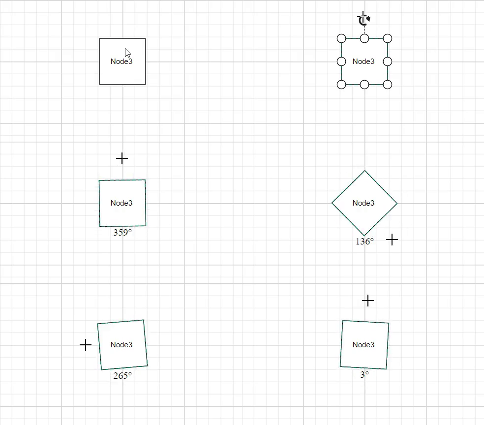 |
| Parent | When this option is set, the annotation rotates along with its parent node. | 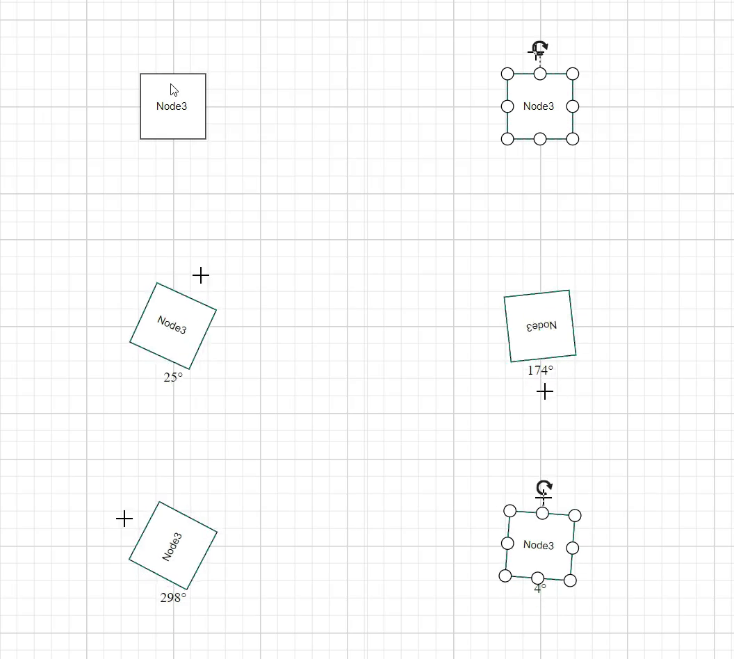 |
Read-only Labels
The React Diagram component supports creating read-only labels that cannot be edited by users. Set the read-only constraint in the label’s constraints property. The following code demonstrates how to enable read-only mode.
import * as React from "react";
import * as ReactDOM from "react-dom";
import { DiagramComponent, AnnotationConstraints } from "@syncfusion/ej2-react-diagrams";
// A node is created and stored in nodes array.
let node = [{
        id: 'node1',
        // Position of the node
        offsetX: 100,
        offsetY: 100,
        // Size of the node
        width: 100,
        height: 100,
        // Sets the annotation for the node
        annotations: [{
                content: 'Annotation Text',
                //Sets the constraints as Read only
                constraints: AnnotationConstraints.ReadOnly
            }]
    }];
// initialize Diagram component
function App() {
    return (<DiagramComponent id="container" width={'100%'} height={'600px'} nodes={node}/>);
}
const root = ReactDOM.createRoot(document.getElementById('diagram'));
root.render(<App />);
import * as React from "react";
import * as ReactDOM from "react-dom";
import {
DiagramComponent,
NodeModel,
AnnotationConstraints
} from "@syncfusion/ej2-react-diagrams";
// A node is created and stored in nodes array.
let node: NodeModel[] = [{
id: 'node1',
// Position of the node
offsetX: 100,
offsetY: 100,
// Size of the node
width: 100,
height: 100,
// Sets the annotation for the node
annotations: [{
content: 'Annotation Text',
//Sets the constraints as Read only
constraints: AnnotationConstraints.ReadOnly
}]
}];
// initialize Diagram component
function App() {
return (
<DiagramComponent
id="container"
width={'100%'}
height={'600px'}
nodes={node}
/>
);
}
const root = ReactDOM.createRoot(document.getElementById('diagram'));
root.render(<App />);Drag Limits
The React Diagram control supports defining the dragLimit property for connector labels to restrict dragging within specified boundaries. The drag limit automatically updates the label position to the nearest segment offset when dragging.
Configure drag limit boundaries using the left, right, top, and bottom properties of the dragLimit object (typed as MarginModel). These properties limit connector label dragging based on user-defined values.
Drag limits are disabled by default for connectors. Enable drag limits by setting the connector constraints to include drag functionality.
The following code demonstrates how to configure dragLimit for connector labels:
import * as React from "react";
import * as ReactDOM from "react-dom";
import { DiagramComponent, AnnotationConstraints } from "@syncfusion/ej2-react-diagrams";
// A node is created and stored in nodes array.
let connector = [{
        id: 'connector',
        type: 'Orthogonal',
        sourcePoint: { x: 200, y: 200 },
        targetPoint: { x: 300, y: 300 },
        annotations: [
            {
                content: 'connector',
                //Enables drag constraints for a connector.
                constraints: AnnotationConstraints.Interaction | AnnotationConstraints.Drag,
                //Set drag limit for a connector annotation.
                dragLimit: { left: 20, right: 20, top: 20, bottom: 20 }
            }
        ],
    }];
// initialize Diagram component
function App() {
    return (<DiagramComponent id="container" width={'100%'} height={'600px'} connectors={connector}/>);
}
const root = ReactDOM.createRoot(document.getElementById('diagram'));
root.render(<App />);
import * as React from "react";
import * as ReactDOM from "react-dom";
import {
DiagramComponent,
ConnectorModel,
AnnotationConstraints
} from "@syncfusion/ej2-react-diagrams";
// A node is created and stored in nodes array.
let connector: ConnectorModel[] = [{
id: 'connector',
type: 'Orthogonal',
sourcePoint: { x: 200, y: 200 },
targetPoint: { x: 300, y: 300 },
annotations: [
{
content: 'connector',
//Enables drag constraints for a connector.
constraints:AnnotationConstraints.Interaction | AnnotationConstraints.Drag,
//Set drag limit for a connector annotation.
dragLimit:{left:20,right:20,top:20,bottom:20}
}
],
}];
// initialize Diagram component
function App() {
return (
<DiagramComponent
id="container"
width={'100%'}
height={'600px'}
connectors={connector}
/>
);
}
const root = ReactDOM.createRoot(document.getElementById('diagram'));
root.render(<App />);Multiple Labels
Nodes and connectors support multiple labels. Each label can have independent properties and constraints. The following code demonstrates how to add multiple labels to nodes and connectors.
import * as React from "react";
import * as ReactDOM from "react-dom";
import { DiagramComponent } from "@syncfusion/ej2-react-diagrams";
// A node is created and stored in nodes array.
let node = [{
        id: 'node1',
        // Position of the node
        offsetX: 100,
        offsetY: 100,
        // Size of the node
        width: 100,
        height: 100,
        // Sets the multiple annotation for the node
        annotations: [{
                content: 'Left',
                offset: {
                    x: 0.12,
                    y: 0.1
                }
            },
            {
                content: 'Center',
                offset: {
                    x: 0.5,
                    y: 0.5
                }
            },
            {
                content: 'Right',
                offset: {
                    x: 0.82,
                    y: 0.9
                }
            }
        ]
    }];
    let connector = [{
        id: 'connector',
        sourcePoint: { x: 200, y: 200 },
        targetPoint: { x: 300, y: 300 },
        // Sets the multiple annotation for the node
        annotations: [
          {
            content: 'connector Top',
            offset: 0.2,
          },
          {
            content: 'connector Center',
            offset: 0.5,
          },
          {
            content: 'connector Bottom',
            offset: 0.8,
          },
        ],
      }];
// initialize Diagram component
function App() {
    return (<DiagramComponent id="container" width={'100%'} height={'600px'} nodes={node} connectors={connector}/>);
}
const root = ReactDOM.createRoot(document.getElementById('diagram'));
root.render(<App />);
import * as React from "react";
import * as ReactDOM from "react-dom";
import {
DiagramComponent,
NodeModel,
AnnotationConstraints,
ConnectorModel
} from "@syncfusion/ej2-react-diagrams";
// A node is created and stored in nodes array.
let node: NodeModel[] = [{
id: 'node1',
// Position of the node
offsetX: 100,
offsetY: 100,
// Size of the node
width: 100,
height: 100,
// Sets the multiple annotation for the node
annotations: [{
content: 'Left',
offset: {
x: 0.12,
y: 0.1
}
},
{
content: 'Center',
offset: {
x: 0.5,
y: 0.5
}
},
{
content: 'Right',
offset: {
x: 0.82,
y: 0.9
}
}
]
}];
let connector: ConnectorModel[] = [{
id: 'connector',
sourcePoint: { x: 200, y: 200 },
targetPoint: { x: 300, y: 300 },
// Sets the multiple annotation for the node
annotations: [
{
content: 'connector Top',
offset: 0.2,
},
{
content: 'connector Center',
offset: 0.5,
},
{
content: 'connector Bottom',
offset: 0.8,
},
],
}];
// initialize Diagram component
function App() {
return (
<DiagramComponent
id="container"
width={'100%'}
height={'600px'}
nodes={node}
connectors={connector}
/>
);
}
const root = ReactDOM.createRoot(document.getElementById('diagram'));
root.render(<App />);