How can I help you?
Connector Customization
21 Oct 202524 minutes to read
The Diagram component provides extensive customization options for connectors, allowing developers to modify visual appearance, behavior, and interaction properties. This guide covers decorator shapes, styling options, spacing controls, bridging effects, and advanced connector features.
Decorator Shapes and Customization
Decorators are visual elements that appear at the starting and ending points of connectors, typically used to indicate direction or relationship types such as arrows, circles, diamonds, or custom shapes.
Basic Decorator Configuration
-
Starting and ending points of a connector can be decorated with some customizable shapes like arrows, circles, diamond, or path. The connection end points can be decorated with the
sourceDecoratorandtargetDecoratorproperties of the connector. -
The
shapeproperty ofsourceDecoratorallows to define the shape of the decorators. Similarly, theshapeproperty oftargetDecoratorallows to define the shape of the decorators. -
To create custom shape for source decorator, use the
pathDataproperty to define SVG path strings for both source and target decorators. -
The following code example illustrates how to create decorators of various shapes.
import * as React from "react";
import * as ReactDOM from "react-dom";
import { DiagramComponent } from "@syncfusion/ej2-react-diagrams";
let connectors = [{
        id: "connector1",
        type: 'Straight',
        // Decorator shape- circle
        sourceDecorator: {
            shape: 'Circle',
            // Defines the style for the sourceDecorator
        },
        // Decorator shape - Diamond
        targetDecorator: {
            // Defines the custom shape for the connector's target decorator
            shape: 'Custom',
            //Defines the  path for the connector's target decorator
            pathData: 'M80.5,12.5 C80.5,19.127417 62.59139,24.5 40.5,24.5 C18.40861,24.5 0.5,19.127417 0.5,12.5' +
                'C0.5,5.872583 18.40861,0.5 40.5,0.5 C62.59139,0.5 80.5,5.872583 80.5,12.5 z',
        },
        sourcePoint: {
            x: 100,
            y: 100
        },
        targetPoint: {
            x: 200,
            y: 200
        }
    },
    {
        id: "connectors2",
        type: 'Straight',
        // Decorator shape - IndentedArrow
        sourceDecorator: {
            shape: 'IndentedArrow',
        },
        // Decorator shape - OutdentedArrow
        targetDecorator: {
            shape: 'OutdentedArrow',
        },
        sourcePoint: {
            x: 400,
            y: 100
        },
        targetPoint: {
            x: 300,
            y: 200
        }
    }];
function App() {
    return (<DiagramComponent id="container" width={'100%'} height={'600px'} connectors={connectors}/>);
}
const root = ReactDOM.createRoot(document.getElementById('diagram'));
root.render(<App />);
import * as React from "react";
import * as ReactDOM from "react-dom";
import {
Diagram,
DiagramComponent,
ConnectorModel
} from "@syncfusion/ej2-react-diagrams";
let connectors: ConnectorModel[] = [{
id: "connector1",
type: 'Straight',
// Decorator shape- circle
sourceDecorator: {
shape: 'Circle',
},
// Decorator shape - Diamond
targetDecorator: {
// Defines the custom shape for the connector's target decorator
shape: 'Custom',
//Defines the path for the connector's target decorator
pathData: 'M80.5,12.5 C80.5,19.127417 62.59139,24.5 40.5,24.5 C18.40861,24.5 0.5,19.127417 0.5,12.5' +
'C0.5,5.872583 18.40861,0.5 40.5,0.5 C62.59139,0.5 80.5,5.872583 80.5,12.5 z',
},
sourcePoint: {
x: 100,
y: 100
},
targetPoint: {
x: 200,
y: 200
}
},
{
id: "connectors2",
type: 'Straight',
// Decorator shape - IndentedArrow
sourceDecorator: {
shape: 'IndentedArrow',
},
// Decorator shape - OutdentedArrow
targetDecorator: {
shape: 'OutdentedArrow',
},
sourcePoint: {
x: 400,
y: 100
},
targetPoint: {
x: 300,
y: 200
}
}];
function App() {
return (
<DiagramComponent
id="container"
width={'100%'}
height={'600px'}
connectors={connectors}
/>
);
}
const root = ReactDOM.createRoot(document.getElementById('diagram'));
root.render(<App />);Customize the Decorator Appearance
The visual appearance of decorators can be customized using stroke and fill properties to match design requirements or highlight specific connector types.
-
The source decorator’s
strokeColor,strokeWidth, andstrokeDashArrayproperties are used to customize the color, width, and appearance of the decorator. -
To set the border stroke color, stroke width, and stroke dash array for the target decorator, use
strokeColor,strokeWidth, andstrokeDashArray. -
To set the size for source and target decorator, use width and height properties.
The following code example illustrates how to customize the appearance of the decorator.
import * as React from "react";
import * as ReactDOM from "react-dom";
import { DiagramComponent } from "@syncfusion/ej2-react-diagrams";
let connectors = [{
        id: "connector1",
        type: 'Straight',
        // Decorator shape- circle
        sourceDecorator: {
            shape: 'Circle',
            // Defines the style for the sourceDecorator
            style: {
                // Defines the strokeWidth for the sourceDecorator
                strokeWidth: 3,
                // Defines the strokeColor for the sourceDecorator
                strokeColor: 'red'
            },
        },
        // Decorator shape - Diamond
        targetDecorator: {
            // Defines the custom shape for the connector's target decorator
            shape: 'Custom',
            //Defines the  path for the connector's target decorator
            pathData: 'M80.5,12.5 C80.5,19.127417 62.59139,24.5 40.5,24.5 C18.40861,24.5 0.5,19.127417 0.5,12.5' +
                'C0.5,5.872583 18.40861,0.5 40.5,0.5 C62.59139,0.5 80.5,5.872583 80.5,12.5 z',
            //defines the style for the target decorator
            style: {
                // Defines the strokeWidth for the targetDecorator
                strokeWidth: 3,
                // Defines the strokeColor for the sourceDecorator
                strokeColor: 'green',
                // Defines the opacity for the sourceDecorator
                opacity: .8
            },
        },
        sourcePoint: {
            x: 100,
            y: 100
        },
        targetPoint: {
            x: 200,
            y: 200
        }
    },
    {
        id: "connectors2",
        type: 'Straight',
        // Decorator shape - IndentedArrow
        sourceDecorator: {
            shape: 'IndentedArrow',
            style: {
                strokeWidth: 3,
                strokeColor: 'blue'
            },
        },
        // Decorator shape - OutdentedArrow
        targetDecorator: {
            shape: 'OutdentedArrow',
            style: {
                strokeWidth: 3,
                strokeColor: 'yellow'
            },
        },
        sourcePoint: {
            x: 400,
            y: 100
        },
        targetPoint: {
            x: 300,
            y: 200
        }
    }];
function App() {
    return (<DiagramComponent id="container" width={'100%'} height={'600px'} connectors={connectors}/>);
}
const root = ReactDOM.createRoot(document.getElementById('diagram'));
root.render(<App />);
import * as React from "react";
import * as ReactDOM from "react-dom";
import {
DiagramComponent,
ConnectorModel
} from "@syncfusion/ej2-react-diagrams";
let connectors: ConnectorModel[] = [{
id: "connector1",
type: 'Straight',
// Decorator shape- circle
sourceDecorator: {
shape: 'Circle',
// Defines the style for the sourceDecorator
style: {
// Defines the strokeWidth for the sourceDecorator
strokeWidth: 3,
// Defines the strokeColor for the sourceDecorator
strokeColor: 'red'
},
},
// Decorator shape - Diamond
targetDecorator: {
// Defines the custom shape for the connector's target decorator
shape: 'Custom',
//Defines the path for the connector's target decorator
pathData: 'M80.5,12.5 C80.5,19.127417 62.59139,24.5 40.5,24.5 C18.40861,24.5 0.5,19.127417 0.5,12.5' +
'C0.5,5.872583 18.40861,0.5 40.5,0.5 C62.59139,0.5 80.5,5.872583 80.5,12.5 z',
//defines the style for the target decorator
style: {
// Defines the strokeWidth for the targetDecorator
strokeWidth: 3,
// Defines the strokeColor for the sourceDecorator
strokeColor: 'green',
// Defines the opacity for the sourceDecorator
opacity: .8
},
},
sourcePoint: {
x: 100,
y: 100
},
targetPoint: {
x: 200,
y: 200
}
},
{
id: "connectors2",
type: 'Straight',
// Decorator shape - IndentedArrow
sourceDecorator: {
shape: 'IndentedArrow',
style: {
strokeWidth: 3,
strokeColor: 'blue'
},
},
// Decorator shape - OutdentedArrow
targetDecorator: {
shape: 'OutdentedArrow',
style: {
strokeWidth: 3,
strokeColor: 'yellow'
},
},
sourcePoint: {
x: 400,
y: 100
},
targetPoint: {
x: 300,
y: 200
}
}];
function App() {
return (
<DiagramComponent
id="container"
width={'100%'}
height={'600px'}
connectors={connectors}
/>
);
}
const root = ReactDOM.createRoot(document.getElementById('diagram'));
root.render(<App />);Gradient Styling for Decorators
The gradient property applies smooth color transitions to decorators, providing enhanced visual appeal for complex diagrams or when highlighting important connections.
The gradient property supports two types of gradients:
- Linear - Creates a straight-line color transition.
- Radial - Creates a circular color transition from center outward.
The following code example illustrates how to apply gradient effects to decorators.
import * as React from "react";
import * as ReactDOM from "react-dom";
import { DiagramComponent } from "@syncfusion/ej2-react-diagrams";
let diagramInstance;
let connectors = [
    {
        id: 'connector1',
        type: 'Straight',
        style: {
          strokeColor: '#6BA5D7',
          fill: '#6BA5D7',
          strokeWidth: 2,
        },
        // Cutomize the target decorator
        targetDecorator: {
          style: {
            strokeWidth: 1,
            opacity: 0.5,
            gradient: {
              x1: 20,
              y1: 20,
              x2: 70,
              y2: 70,
              stops: [
                {
                  color: 'green',
                  offset: 50,
                  opacity: 1,
                },
                {
                  color: 'yellow',
                  offset: 100,
                  opacity: 1,
                },
              ],
              type: 'Linear',
            } ,
          },
        },
        sourcePoint: {
          x: 100,
          y: 100,
        },
        targetPoint: {
          x: 200,
          y: 200,
        },
      },
      {
        id: 'connector2',
        type: 'Straight',
        style: {
          strokeColor: '#6BA5D7',
          fill: '#6BA5D7',
          strokeWidth: 2,
        },
        // Cutomize the target decorator
        targetDecorator: {
          style: {
            gradient: {
              cx: 50,
              cy: 50,
              fx: 50,
              fy: 50,
              stops: [
                { color: '#00555b', offset: 0 },
                { color: 'yellow', offset: 90 },
              ],
              type: 'Radial',
            },
          },
        },
        sourcePoint: {
          x: 300,
          y: 100,
        },
        targetPoint: {
          x: 400,
          y: 200,
        },
      },
];
function App() {
    return (<DiagramComponent id="container" width={'100%'} height={'600px'} connectors={connectors}
    ref={(diagram) => (diagramInstance = diagram)}
    created={() => {
        diagramInstance.zoomTo({
            type:'ZoomIn',
            ZoomFactor:2,
            focusPoint:{x:0,y:0.5}
        });
        diagramInstance.fitToPage();
    }}

    />);
}
const root = ReactDOM.createRoot(document.getElementById('diagram'));
root.render(<App />);
import * as React from "react";
import * as ReactDOM from "react-dom";
import { DiagramComponent,ConnectorModel,GradientModel } from "@syncfusion/ej2-react-diagrams";
let diagramInstance:DiagramComponent;
let connectors: ConnectorModel[] = [
{
id: 'connector1',
type: 'Straight',
style: {
strokeColor: '#6BA5D7',
fill: '#6BA5D7',
strokeWidth: 2,
},
// Cutomize the target decorator
targetDecorator: {
style: {
strokeWidth: 1,
opacity: 0.5,
gradient: {
x1: 20,
y1: 20,
x2: 70,
y2: 70,
stops: [
{
color: 'green',
offset: 50,
opacity: 1,
},
{
color: 'yellow',
offset: 100,
opacity: 1,
},
],
type: 'Linear',
} as GradientModel,
},
},
sourcePoint: {
x: 100,
y: 100,
},
targetPoint: {
x: 200,
y: 200,
},
},
{
id: 'connector2',
type: 'Straight',
style: {
strokeColor: '#6BA5D7',
fill: '#6BA5D7',
strokeWidth: 2,
},
// Cutomize the target decorator
targetDecorator: {
style: {
gradient: {
cx: 50,
cy: 50,
fx: 50,
fy: 50,
stops: [
{ color: '#00555b', offset: 0 },
{ color: 'yellow', offset: 90 },
],
type: 'Radial',
} as GradientModel,
},
},
sourcePoint: {
x: 300,
y: 100,
},
targetPoint: {
x: 400,
y: 200,
},
},
];
function App() {
return (<DiagramComponent id="container" width={'100%'} height={'600px'} connectors={connectors}
ref={(diagram) => (diagramInstance = diagram)}
created={() => {
diagramInstance.zoomTo({
type:'ZoomIn',
ZoomFactor:2,
focusPoint:{x:0,y:0.5}
});
diagramInstance.fitToPage();
}}
/>);
}
const root = ReactDOM.createRoot(document.getElementById('diagram'));
root.render(<App />);Connector Appearance and Styling
The visual appearance of connector segments can be customized to distinguish different types of connections or match application themes.
The connector’s strokeWidth, strokeColor, strokeDashArray, and opacity properties are used to customize the appearance of the connector segments.
The visible property of the connector enables or disables the visibility of the connector.
Default values for all connectors can be set using the getConnectorDefaults properties. This is useful when all connectors share the same type or properties, allowing common settings to be centralized.
Spacing and Padding Controls
Padding between Connectors and Nodes
Padding creates visual separation between connector endpoints and the nodes they connect, preventing connectors from appearing to touch or overlap with node boundaries.
-
The
sourcePaddingproperty of connector defines space between the source point and the source node of the connector. -
The
targetPaddingproperty of connector defines space between the end point and the target node of the connector. -
The following code example illustrates how to leave space between the connection end points and source and target nodes.
import * as React from "react";
import * as ReactDOM from "react-dom";
import { DiagramComponent, ConnectorConstraints } from "@syncfusion/ej2-react-diagrams";
let nodes = [{
    id: 'node',
    width: 100,
    height: 100,
    offsetX: 100,
    offsetY: 100,
},
{
    id: 'node1',
    width: 100,
    height: 100,
    offsetX: 300,
    offsetY: 100,
}
];
let connectors = [{
    // Name of the connector
    id: "connector1",
    // ID of the source and target nodes
    sourceID: "node",
    targetID: "node1",
    // Set Source Padding value
    sourcePadding: 20,
    // Set Target Padding value
    targetPadding: 20
}];
function App() {
    return (<DiagramComponent id="container" width={'100%'} height={'600px'} nodes={nodes} connectors={connectors} getNodeDefaults={(node) => {
        node.height = 100;
        node.width = 100;
        node.shape = { type: 'Basic', shape: 'Rectangle' };
        node.style.fill = '#6BA5D7';
        node.style.strokeColor = 'white';
        return node;
    }} getConnectorDefaults={(connector) => {
        connector.constraints =
            ConnectorConstraints.Default | ConnectorConstraints.DragSegmentThumb;
    }} />);
}
const root = ReactDOM.createRoot(document.getElementById('diagram'));
root.render(<App />);
import * as React from "react";
import * as ReactDOM from "react-dom";
import {
Diagram,
DiagramComponent,
NodeModel,
ConnectorModel, ConnectorConstraints
} from "@syncfusion/ej2-react-diagrams";
let nodes: NodeModel[] = [{
id: 'node',
width: 100,
height: 100,
offsetX: 100,
offsetY: 100,
},
{
id: 'node1',
width: 100,
height: 100,
offsetX: 300,
offsetY: 100,
}
];
let connectors: ConnectorModel[] = [{
// Name of the connector
id: "connector1",
// ID of the source and target nodes
sourceID: "node",
targetID: "node1",
// Set Source Padding value
sourcePadding: 20,
// Set Target Padding value
targetPadding: 20
}];
function App() {
return (
<DiagramComponent
id="container"
width={'100%'}
height={'600px'}
nodes={nodes}
connectors={connectors}
getNodeDefaults={(node: NodeModel) => {
node.height = 100;
node.width = 100;
node.shape = { type: 'Basic', shape: 'Rectangle' };
node.style.fill = '#6BA5D7';
node.style.strokeColor = 'white';
return node;
}}
getConnectorDefaults={(connector: ConnectorModel) => {
connector.constraints =
ConnectorConstraints.Default | ConnectorConstraints.DragSegmentThumb;
}}
/>
);
}
const root = ReactDOM.createRoot(document.getElementById('diagram'));
root.render(<App />);Advanced Connector Features
Line Bridging for Intersection Handling
Line bridging creates visual bridges where connectors intersect, helping users distinguish between different connection paths in complex diagrams. By default, bridgeDirection is set to top, with the bridge appearing based on the specified direction.
Bridging can be enabled or disabled using either connector.constraints or diagram.constraints. The following code example illustrates how to enable line bridging.
import * as React from "react";
import * as ReactDOM from "react-dom";
import { DiagramComponent, Inject, ConnectorBridging, DiagramConstraints } from "@syncfusion/ej2-react-diagrams";
let node1 = [{
        id: 'Transaction',
        width: 150,
        height: 60,
        offsetX: 300,
        offsetY: 60,
        shape: {
            type: 'Flow',
            shape: 'Terminator'
        },
        annotations: [{
                id: 'label1',
                content: 'Start Transaction',
                offset: {
                    x: 0.5,
                    y: 0.5
                }
            }],
    },
    {
        id: 'Verification',
        width: 150,
        height: 60,
        offsetX: 300,
        offsetY: 250,
        shape: {
            type: 'Flow',
            shape: 'Process'
        },
        annotations: [{
                id: 'label2',
                content: 'Verification',
                offset: {
                    x: 0.5,
                    y: 0.5
                }
            }]
    }];
let connectors = [{
        id: 'connector1',
        type: 'Straight',
        sourceID: 'Transaction',
        targetID: 'Verification'
    },
    {
        id: 'connector2',
        type: 'Straight',
        sourcePoint: {
            x: 200,
            y: 130
        },
        targetPoint: {
            x: 400,
            y: 130
        },
        bridgeSpace: 20,
    },
    {
        id: 'connector3',
        type: 'Straight',
        sourcePoint: {
            x: 200,
            y: 170
        },
        targetPoint: {
            x: 400,
            y: 170
        }
    }];
// Enables bridging for every connector added in the model
function App() {
    return (<DiagramComponent id="container" width={'100%'}  getNodeDefaults={(node) => {
            node.height = 100;
            node.width = 100;
            node.style.fill = '#6BA5D7';
            node.style.strokeColor = 'white';
            return node;
        }} nodes={node1} connectors={connectors} height={'600px'}
    // Enables the bridging constraints for the connector
    constraints={DiagramConstraints.Default | DiagramConstraints.Bridging}>
      <Inject services={[ConnectorBridging]}/>{' '}
    </DiagramComponent>);
}
const root = ReactDOM.createRoot(document.getElementById('diagram'));
root.render(<App />);
import * as React from "react";
import * as ReactDOM from "react-dom";
import {
DiagramComponent,
Inject,
ConnectorBridging,
DiagramConstraints,
ConnectorModel,
NodeModel
} from "@syncfusion/ej2-react-diagrams";
let node1: NodeModel[] = [{
id: 'Transaction',
width: 150,
height: 60,
offsetX: 300,
offsetY: 60,
shape: {
type: 'Flow',
shape: 'Terminator'
},
annotations: [{
id: 'label1',
content: 'Start Transaction',
offset: {
x: 0.5,
y: 0.5
}
}],
},
{
id: 'Verification',
width: 150,
height: 60,
offsetX: 300,
offsetY: 250,
shape: {
type: 'Flow',
shape: 'Process'
},
annotations: [{
id: 'label2',
content: 'Verification',
offset: {
x: 0.5,
y: 0.5
}
}]
}];
let connectors: ConnectorModel[] = [{
id: 'connector1',
type: 'Straight',
sourceID: 'Transaction',
targetID: 'Verification'
},
{
id: 'connector2',
type: 'Straight',
sourcePoint: {
x: 200,
y: 130
},
targetPoint: {
x: 400,
y: 130
},
bridgeSpace: 20,
},
{
id: 'connector3',
type: 'Straight',
sourcePoint: {
x: 200,
y: 170
},
targetPoint: {
x: 400,
y: 170
}
}];
// Enables bridging for every connector added in the model
function App() {
return (
<DiagramComponent
id="container"
width={'100%'}
getNodeDefaults={(node: NodeModel) => {
node.height = 100;
node.width = 100;
node.style.fill = '#6BA5D7';
node.style.strokeColor = 'white';
return node;
}}
nodes={node1}
connectors={connectors}
height={'600px'}
// Enables the bridging constraints for the connector
constraints={DiagramConstraints.Default | DiagramConstraints.Bridging}
>
<Inject services={[ConnectorBridging]} />{' '}
</DiagramComponent>
);
}
const root = ReactDOM.createRoot(document.getElementById('diagram'));
root.render(<App />);NOTE
The connector bridging module must be injected into the diagram to use this feature.
The bridgeSpace property of connectors can be used to define the width for line bridging.
Limitation: Bezier segments do not support bridging functionality.
Hit Padding for Interaction
-
The
hitPaddingproperty defines the clickable area around the connector path, making it easier for users to select connectors, especially thin ones. This improves user experience by expanding the interactive zone without changing the visual appearance. The default value for hitPadding is 10. -
The following code example illustrates how to specify hit padding for connectors.
import * as React from "react";
import * as ReactDOM from "react-dom";
import { Diagram, DiagramComponent, ConnectorEditing, ConnectorConstraints } from "@syncfusion/ej2-react-diagrams";
Diagram.Inject(ConnectorEditing);
let connectors = [{
    // Name of the connector
    id: "connector1",
    type:"Orthogonal",
    //set hit padding
    hitPadding:50,
    sourcePoint: { x: 100, y: 100 },
    targetPoint: { x: 300, y: 300 }
}];
function App() {
    return (<DiagramComponent id="container" width={'100%'} height={'600px'} connectors={connectors}
    getConnectorDefaults={(connector) => {
            connector.constraints =
                ConnectorConstraints.Default | ConnectorConstraints.DragSegmentThumb;
        }}/>);
}
const root = ReactDOM.createRoot(document.getElementById('diagram'));
root.render(<App />);
import * as React from "react";
import * as ReactDOM from "react-dom";
import {
Diagram,
DiagramComponent,
ConnectorModel,ConnectorConstraints,ConnectorEditing
} from "@syncfusion/ej2-react-diagrams";
Diagram.Inject(ConnectorEditing);
let connectors: ConnectorModel[] = [{
// Name of the connector
id: "connector1",
type:"Orthogonal",
//set hit padding
hitPadding:50,
sourcePoint: { x: 100, y: 100 },
targetPoint: { x: 300, y: 300 }
}];
function App() {
return (
<DiagramComponent
id="container"
width={'100%'}
height={'600px'}
connectors={connectors}
getConnectorDefaults={(connector: ConnectorModel) => {
connector.constraints =
ConnectorConstraints.Default | ConnectorConstraints.DragSegmentThumb;
}}
/>
);
}
const root = ReactDOM.createRoot(document.getElementById('diagram'));
root.render(<App />);Corner Radius for Rounded Connectors
Corner radius creates connectors with rounded corners instead of sharp angles, providing a more polished appearance for diagrams. The radius of the rounded corner is set with the cornerRadius property.
import * as React from "react";
import * as ReactDOM from "react-dom";
import { DiagramComponent } from "@syncfusion/ej2-react-diagrams";
let nodes = [{
        id: 'node1',
        width: 100,
        height: 100,
        offsetX: 100,
        offsetY: 100,
    },
    {
        id: 'node2',
        width: 100,
        height: 100,
        offsetX: 100,
        offsetY: 350,
    }
];
let connectors = [{
        id: "connector1",
        type: 'Orthogonal',
        // Sets the radius for the rounded corner
        cornerRadius: 10,
        sourceID: 'node1',
        targetID: 'node2',
        segments: [{
                type: 'Orthogonal',
                direction: 'Right',
                length: 50
            }],
    }];
function App() {
    return (<DiagramComponent id="container" width={'100%'} getNodeDefaults={(node) => {
            node.height = 100;
            node.width = 100;
            node.style.fill = '#6BA5D7';
            node.style.strokeColor = 'white';
            return node;
        }} nodes={nodes} connectors={connectors} height={'600px'}
        >
    </DiagramComponent>);
}
const root = ReactDOM.createRoot(document.getElementById('diagram'));
root.render(<App />);
import * as React from "react";
import * as ReactDOM from "react-dom";
import {
DiagramComponent,
NodeModel,
ConnectorModel
} from "@syncfusion/ej2-react-diagrams";
let nodes: NodeModel[] = [{
id: 'node1',
width: 100,
height: 100,
offsetX: 100,
offsetY: 100,
},
{
id: 'node2',
width: 100,
height: 100,
offsetX: 100,
offsetY: 350,
}
];
let connectors: ConnectorModel[] = [{
id: "connector1",
type: 'Orthogonal',
// Sets the radius for the rounded corner
cornerRadius: 10,
sourceID: 'node1',
targetID: 'node2',
segments: [{
type: 'Orthogonal',
direction: 'Right',
length: 50
}],
}];
function App() {
return (
<DiagramComponent
id="container"
width={'100%'}
getNodeDefaults={(node: NodeModel) => {
node.height = 100;
node.width = 100;
node.style.fill = '#6BA5D7';
node.style.strokeColor = 'white';
return node;
}}
nodes={nodes}
connectors={connectors}
height={'600px'}
>
</DiagramComponent>
);
}
const root = ReactDOM.createRoot(document.getElementById('diagram'));
root.render(<App />);Connector Appearance
-
The connector’s
strokeWidth,strokeColor,strokeDashArray, andopacity] properties are used to customize the appearance of the connector segments. -
The
visibleproperty of the connector enables or disables the visibility of connector. -
Default values for all the
connectorscan be set using thegetConnectorDefaultsproperties. For example, if all connectors have the same type or having the same property then such properties can be moved intogetConnectorDefaults.
Segment Appearance
The following code example illustrates how to customize the segment appearance.
import * as React from "react";
import * as ReactDOM from "react-dom";
import { DiagramComponent } from "@syncfusion/ej2-react-diagrams";
let connectors = [{
    id: 'connector1',
    targetDecorator: {
      style: {
        strokeColor: '#6BA5D7',
        fill: '#6BA5D7',
        strokeWidth: 2,
      },
    },
    style: {
      // Stroke color
      strokeColor: '#6BA5D7',
      fill: '#6BA5D7',
      // Stroke width of the line
      strokeWidth: 5,
      // Line style
      strokeDashArray: '2,2',
    },
    sourcePoint: {
      x: 100,
      y: 100,
    },
    targetPoint: {
      x: 200,
      y: 200,
    },
  },
  {
    id: 'connector2',
    // Set the visibility of the connector to false
    visible: true,
    type: 'Orthogonal',
    targetDecorator: {
      style: {
        strokeColor: '#6BA5D7',
        fill: '#6BA5D7',
        strokeWidth: 2,
      },
    },
    style: {
      // Stroke color
      strokeColor: '#6BA5D7',
      fill: '#6BA5D7',
      // Stroke width of the line
      strokeWidth: 5,
      // Line style
      strokeDashArray: '2,2',
    },
    sourcePoint: {
      x: 300,
      y: 300,
    },
    targetPoint: {
      x: 400,
      y: 400,
    },
    segments: [
      {
        type: 'Orthogonal',
        direction: 'Right',
        length: 50,
      },
    ],
  },
  {
    id: 'connector3',
    // Set the visibility of the connector to false
    visible: true,
    type: 'Bezier',
    targetDecorator: {
      style: {
        strokeColor: '#6BA5D7',
        fill: '#6BA5D7',
        strokeWidth: 2,
      },
    },
    style: {
      // Stroke color
      strokeColor: '#6BA5D7',
      fill: '#6BA5D7',
      // Stroke width of the line
      strokeWidth: 5,
      // Line style
      strokeDashArray: '2,2',
    },
    sourcePoint: {
      x: 500,
      y: 100,
    },
    targetPoint: {
      x: 600,
      y: 300,
    },
    segments: [
      {
        type: 'Bezier',
      },
    ],
  },
];
function App() {
    return (<DiagramComponent id="container" width={'100%'} height={'600px'}
    // Define the default values for all the connector.Similary we can add all the properties
    getConnectorDefaults={(obj) => {
            obj.type = 'Orthogonal';
            return obj;
        }} connectors={connectors}/>);
}
const root = ReactDOM.createRoot(document.getElementById('diagram'));
root.render(<App />);
import * as React from "react";
import * as ReactDOM from "react-dom";
import {
DiagramComponent,
ConnectorModel
} from "@syncfusion/ej2-react-diagrams";
let connectors: ConnectorModel[] = [{
id: 'connector1',
targetDecorator: {
style: {
strokeColor: '#6BA5D7',
fill: '#6BA5D7',
strokeWidth: 2,
},
},
style: {
// Stroke color
strokeColor: '#6BA5D7',
fill: '#6BA5D7',
// Stroke width of the line
strokeWidth: 5,
// Line style
strokeDashArray: '2,2',
},
sourcePoint: {
x: 100,
y: 100,
},
targetPoint: {
x: 200,
y: 200,
},
},
{
id: 'connector2',
// Set the visibility of the connector to false
visible: true,
type: 'Orthogonal',
targetDecorator: {
style: {
strokeColor: '#6BA5D7',
fill: '#6BA5D7',
strokeWidth: 2,
},
},
style: {
// Stroke color
strokeColor: '#6BA5D7',
fill: '#6BA5D7',
// Stroke width of the line
strokeWidth: 5,
// Line style
strokeDashArray: '2,2',
},
sourcePoint: {
x: 300,
y: 300,
},
targetPoint: {
x: 400,
y: 400,
},
segments: [
{
type: 'Orthogonal',
direction: 'Right',
length: 50,
},
],
},
{
id: 'connector3',
// Set the visibility of the connector to false
visible: true,
type: 'Bezier',
targetDecorator: {
style: {
strokeColor: '#6BA5D7',
fill: '#6BA5D7',
strokeWidth: 2,
},
},
style: {
// Stroke color
strokeColor: '#6BA5D7',
fill: '#6BA5D7',
// Stroke width of the line
strokeWidth: 5,
// Line style
strokeDashArray: '2,2',
},
sourcePoint: {
x: 500,
y: 100,
},
targetPoint: {
x: 600,
y: 300,
},
segments: [
{
type: 'Bezier',
},
],
},
];
function App() {
return (
<DiagramComponent
id="container"
width={'100%'}
height={'600px'}
// Define the default values for all the connector.Similary we can add all the properties
getConnectorDefaults={(obj: ConnectorModel): ConnectorModel => {
obj.type = 'Orthogonal';
return obj;
}}
connectors={connectors}
/>
);
}
const root = ReactDOM.createRoot(document.getElementById('diagram'));
root.render(<App />);Connector Constraints and Behavior
-
The
constraintsproperty of connector allows to enable/disable certain features of connectors. -
To enable or disable the constraints, refer
constraints.
The following code illustrates how to disable selection for a connector.
import * as React from "react";
import * as ReactDOM from "react-dom";
import { DiagramComponent, ConnectorConstraints } from "@syncfusion/ej2-react-diagrams";
let connectors = [{
    id: 'connector1',
    constraints: ConnectorConstraints.Default & ~ConnectorConstraints.Select,
    annotations: [{ content: 'Connector Selection disabled' }],
    type: 'Straight',
    sourcePoint: {
      x: 100,
      y: 100,
    },
    targetPoint: {
      x: 200,
      y: 200,
    },
  },
  {
    id: 'connector2',
    constraints: ConnectorConstraints.Default & ~ConnectorConstraints.Drag,
    annotations: [{ content: 'Connector Drag disabled' }],
    type: 'Straight',
    sourcePoint: {
      x: 300,
      y: 100,
    },
    targetPoint: {
      x: 400,
      y: 200,
    },
  },
  {
    id: 'connector3',
    constraints:
      ConnectorConstraints.Default & ~ConnectorConstraints.DragSourceEnd,
    annotations: [{ content: 'Connector Source end disabled' }],
    sourcePoint: {
      x: 500,
      y: 100,
    },
    targetPoint: {
      x: 600,
      y: 200,
    },
  },
  {
    id: 'connector4',
    constraints:
      ConnectorConstraints.Default & ~ConnectorConstraints.DragTargetEnd,
    annotations: [{ content: 'Connector Target end disabled' }],
    sourcePoint: {
      x: 700,
      y: 100,
    },
    targetPoint: {
      x: 800,
      y: 200,
    },
  },];
function App() {
    return (<DiagramComponent id="container" width={'100%'} height={'700px'} connectors={connectors}/>);
}
const root = ReactDOM.createRoot(document.getElementById('diagram'));
root.render(<App />);
import * as React from "react";
import * as ReactDOM from "react-dom";
import {
DiagramComponent,
ConnectorConstraints,
ConnectorModel
} from "@syncfusion/ej2-react-diagrams";
let connectors: ConnectorModel[] = [{
id: 'connector1',
constraints: ConnectorConstraints.Default & ~ConnectorConstraints.Select,
annotations: [{ content: 'Connector Selection disabled' }],
type: 'Straight',
sourcePoint: {
x: 100,
y: 100,
},
targetPoint: {
x: 200,
y: 200,
},
},
{
id: 'connector2',
constraints: ConnectorConstraints.Default & ~ConnectorConstraints.Drag,
annotations: [{ content: 'Connector Drag disabled' }],
type: 'Straight',
sourcePoint: {
x: 300,
y: 100,
},
targetPoint: {
x: 400,
y: 200,
},
},
{
id: 'connector3',
constraints:
ConnectorConstraints.Default & ~ConnectorConstraints.DragSourceEnd,
annotations: [{ content: 'Connector Source end disabled' }],
type: 'Straight',
sourcePoint: {
x: 500,
y: 100,
},
targetPoint: {
x: 600,
y: 200,
},
},
{
id: 'connector4',
constraints:
ConnectorConstraints.Default & ~ConnectorConstraints.DragTargetEnd,
annotations: [{ content: 'Connector Target end disabled' }],
type: 'Straight',
sourcePoint: {
x: 700,
y: 100,
},
targetPoint: {
x: 800,
y: 200,
},
}];
function App() {
return (
<DiagramComponent
id="container"
width={'100%'}
height={'700px'}
connectors={connectors}
/>
);
}
const root = ReactDOM.createRoot(document.getElementById('diagram'));
root.render(<App />);Additional Connector Properties
Adding Custom Information
The addInfo property of connectors allows maintaining additional information or metadata associated with connectors for application-specific requirements.
var connectors = {
        id: 'connector1',
        //AddInfo for connector
        addInfo: {type:'connector',id:'connector1'},
        type: 'Straight',
        sourcePoint: {x: 300,y: 100},
        targetPoint: {x: 300,y: 200}
    }
ZIndex for Connector
The connectors zIndex property specifies the stack order of connectors. A connector with a greater stack order appears in front of connectors with lower stack orders, enabling precise control over visual layering.
The following code illustrates how to render connectors based on stack order.
import * as React from "react";
import * as ReactDOM from "react-dom";
import { DiagramComponent } from "@syncfusion/ej2-react-diagrams";
let connectors = [{
        id: 'connector1',
        // Defines the z-index value for the connector
        zIndex: 2,
        type: 'Straight',
        sourcePoint: {
            x: 300,
            y: 100
        },
        targetPoint: {
            x: 300,
            y: 200
        }
    },
    {
        id: 'connector2',
        type: 'Straight',
        // Defines the z-index value for the connector
        zIndex: 1,
        sourcePoint: {
            x: 100,
            y: 100
        },
        targetPoint: {
            x: 200,
            y: 200
        }
    }];
function App() {
    return (<DiagramComponent id="container" width={'100%'} getConnectorDefaults={(obj) => {
            obj.style.strokeColor = '#6BA5D7';
            obj.style.fill = '#6BA5D7';
            obj.style.strokeWidth = 2;
            obj.targetDecorator.style.fill = '#6BA5D7';
            obj.targetDecorator.style.strokeColor = '#6BA5D7';
            return obj;
        }} height={'600px'} connectors={connectors}/>);
}
const root = ReactDOM.createRoot(document.getElementById('diagram'));
root.render(<App />);
import * as React from "react";
import * as ReactDOM from "react-dom";
import {
Diagram,
DiagramComponent,
ConnectorModel
} from "@syncfusion/ej2-react-diagrams";
let connectors: ConnectorModel[] = [{
id: 'connector1',
// Defines the z-index value for the connector
zIndex: 2,
type: 'Straight',
sourcePoint: {
x: 300,
y: 100
},
targetPoint: {
x: 300,
y: 200
}
},
{
id: 'connector2',
type: 'Straight',
// Defines the z-index value for the connector
zIndex: 1,
sourcePoint: {
x: 100,
y: 100
},
targetPoint: {
x: 200,
y: 200
}
}];
function App() {
return (
<DiagramComponent
id="container"
width={'100%'}
getConnectorDefaults={(obj) => {
obj.style.strokeColor = '#6BA5D7';
obj.style.fill = '#6BA5D7';
obj.style.strokeWidth = 2;
obj.targetDecorator.style.fill = '#6BA5D7';
obj.targetDecorator.style.strokeColor = '#6BA5D7';
return obj;
}}
height={'600px'}
connectors={connectors}
/>
);
}
const root = ReactDOM.createRoot(document.getElementById('diagram'));
root.render(<App />);Connector Spacing for Routing
- The
connectorSpacingproperty defines the minimum distance between the source node and the connector when automatic routing occurs. This determines how far the connector will reroute around obstacles or the minimum length for new segments.
The following code example illustrates how to configure connector spacing.
import * as React from "react";
import * as ReactDOM from "react-dom";
import { DiagramComponent } from "@syncfusion/ej2-react-diagrams";
let nodes = [{
    id: 'Start',
    width: 140,
    height: 50,
    offsetX: 300,
    offsetY: 100,
    annotations: [{
        id: 'label1',
        content: 'Start'
    }],
    shape: {
        type: 'Flow',
        shape: 'Terminator'
    }
},
{
    id: 'Init',
    width: 140,
    height: 50,
    offsetX: 300,
    offsetY: 300,
    shape: {
        type: 'Flow',
        shape: 'Process'
    },
    annotations: [{
        content: 'var i = 0;'
    }]
}
];
let connectors = [{
    id: "connector1",
    // ID of the source and target nodes
    sourceID: "Start",
    targetID: "Init",
    //set connectorSpacing
    connectorSpacing: 7,
    type: 'Orthogonal'
    }];
function App() {
    return (<DiagramComponent id="container" width={'100%'} getNodeDefaults={(node) => {
            node.height = 100;
            node.width = 100;
            node.style.fill = '#6BA5D7';
            node.style.strokeColor = 'white';
            return node;
        }} nodes={nodes} connectors={connectors} height={'600px'}
        >
    </DiagramComponent>);
}
const root = ReactDOM.createRoot(document.getElementById('diagram'));
root.render(<App />);
import * as React from "react";
import * as ReactDOM from "react-dom";
import { DiagramComponent,NodeModel,ConnectorModel } from "@syncfusion/ej2-react-diagrams";
let nodes:NodeModel[] = [{
id: 'Start',
width: 140,
height: 50,
offsetX: 300,
offsetY: 100,
annotations: [{
id: 'label1',
content: 'Start'
}],
shape: {
type: 'Flow',
shape: 'Terminator'
}
},
{
id: 'Init',
width: 140,
height: 50,
offsetX: 300,
offsetY: 300,
shape: {
type: 'Flow',
shape: 'Process'
},
annotations: [{
content: 'var i = 0;'
}]
}
];
let connectors:ConnectorModel [] = [{
id: "connector1",
// ID of the source and target nodes
sourceID: "Start",
targetID: "Init",
//set connectorSpacing
connectorSpacing: 7,
type: 'Orthogonal'
}];
function App() {
return (<DiagramComponent id="container" width={'100%'} getNodeDefaults={(node) => {
node.height = 100;
node.width = 100;
node.style.fill = '#6BA5D7';
node.style.strokeColor = 'white';
return node;
}} nodes={nodes} connectors={connectors} height={'600px'}
>
</DiagramComponent>);
}
const root = ReactDOM.createRoot(document.getElementById('diagram'));
root.render(<App />);Maximum Segment Thumbs
The maxSegmentThumbproperty limits the number of segment manipulation handles displayed on a connector, helping maintain clean interfaces in complex diagrams.
import * as React from "react";
import * as ReactDOM from "react-dom";
import { DiagramComponent ,ConnectorConstraints} from "@syncfusion/ej2-react-diagrams";

let connectors = [{
    id: "connector1",
    type: 'Orthogonal',
    segments: [{
        type: 'Orthogonal',
        // Defines the direction for the segment lines
        direction: 'Right',
        // Defines the length for the segment lines
        length: 50
    }],
    sourcePoint: {
        x: 100,
        y: 100
    },
    targetPoint: {
        x: 200,
        y: 200
    }
},
{
    id: "connector2",
    type: 'Orthogonal',
    // Defines multile segemnts for the connectors
    segments: [{
            type: 'Orthogonal',
            direction: 'Bottom',
            length: 150
        },
        {
            type: 'Orthogonal',
            direction: 'Right',
            length: 150
        }
    ],
    sourcePoint: {
        x: 300,
        y: 100
    },
    targetPoint: {
        x: 400,
        y: 200,
    },
    maxSegmentThumb: 3,
    constraints:ConnectorConstraints.Default | ConnectorConstraints.DragSegmentThumb,
}];
function App() {
    return (<DiagramComponent id="container" width={'100%'}  connectors={connectors} height={'600px'}
        >
    </DiagramComponent>);
}
const root = ReactDOM.createRoot(document.getElementById('diagram'));
root.render(<App />);
import * as React from "react";
import * as ReactDOM from "react-dom";
import { DiagramComponent ,ConnectorConstraints, ConnectorModel} from "@syncfusion/ej2-react-diagrams";
let connectors:ConnectorModel [] = [{
id: "connector1",
type: 'Orthogonal',
segments: [{
type: 'Orthogonal',
// Defines the direction for the segment lines
direction: 'Right',
// Defines the length for the segment lines
length: 50
}],
sourcePoint: {
x: 100,
y: 100
},
targetPoint: {
x: 200,
y: 200
}
},
{
id: "connector2",
type: 'Orthogonal',
// Defines multile segemnts for the connectors
segments: [{
type: 'Orthogonal',
direction: 'Bottom',
length: 150
},
{
type: 'Orthogonal',
direction: 'Right',
length: 150
}
],
sourcePoint: {
x: 300,
y: 100
},
targetPoint: {
x: 400,
y: 200,
},
maxSegmentThumb: 3,
constraints:ConnectorConstraints.Default | ConnectorConstraints.DragSegmentThumb,
}];
function App() {
return (<DiagramComponent id="container" width={'100%'} connectors={connectors} height={'600px'}
>
</DiagramComponent>);
}
const root = ReactDOM.createRoot(document.getElementById('diagram'));
root.render(<App />);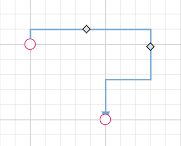
Reset Segments
The resetSegments method resets connector segments to their default state based on connection points. This operation removes custom segments and restores connectors to their original configuration, useful for cleaning up user modifications.
import * as React from "react";
import * as ReactDOM from "react-dom";
import { Diagram,DiagramComponent ,HierarchicalTree,ConnectorConstraints,ConnectorEditing} from "@syncfusion/ej2-react-diagrams";
Diagram.Inject(HierarchicalTree, ConnectorEditing);
let diagramInstance;
let nodes= [
    {
      id: 'Start',
      width: 140,
      height: 50,
      offsetX: 300,
      offsetY: 50,
      annotations: [
        {
          content: 'Node1',
        },
      ],
      style: {
        fill: '#6BA5D7',
        strokeColor: 'white',
      },
      expandIcon: {
        shape: 'ArrowDown',
        width: 20,
        height: 15,
      },
      collapseIcon: {
        shape: 'ArrowUp',
        width: 20,
        height: 15,
      },
    },
    {
      id: 'Init',
      width: 140,
      height: 50,
      offsetX: 200,
      offsetY: 240,
      style: {
        fill: '#6BA5D7',
        strokeColor: 'white',
      },
      annotations: [
        {
          content: 'Node2',
        },
      ],
    },
  ];
let connectors = [ {
    // Unique name for the connector
    id: 'connector1',
    // Source and Target node's name to which connector needs to be connected.
    sourceID: 'Start',
    targetID: 'Init',
    type: 'Orthogonal',
    constraints:
      ConnectorConstraints.Default | ConnectorConstraints.DragSegmentThumb,
  },];
function App() {
    const resetSegment = () =>{
        diagramInstance.resetSegments();
    }
    return (
    <div>
    <button onClick={resetSegment}>resetSegment</button>
    <DiagramComponent id="container" width={'100%'}  connectors={connectors} nodes={nodes} height={'600px'}
    ref={(diagram) => (diagramInstance = diagram)}
        >
    </DiagramComponent>
    </div>
    );

}
const root = ReactDOM.createRoot(document.getElementById('diagram'));
root.render(<App />);
import * as React from "react";
import * as ReactDOM from "react-dom";
import { Diagram,DiagramComponent ,HierarchicalTree,ConnectorConstraints,ConnectorEditing,NodeModel,ConnectorModel} from "@syncfusion/ej2-react-diagrams";
Diagram.Inject(HierarchicalTree, ConnectorEditing);
let diagramInstance:DiagramComponent;
let nodes:NodeModel[] = [
{
id: 'Start',
width: 140,
height: 50,
offsetX: 300,
offsetY: 50,
annotations: [
{
content: 'Node1',
},
],
style: {
fill: '#6BA5D7',
strokeColor: 'white',
},
expandIcon: {
shape: 'ArrowDown',
width: 20,
height: 15,
},
collapseIcon: {
shape: 'ArrowUp',
width: 20,
height: 15,
},
},
{
id: 'Init',
width: 140,
height: 50,
offsetX: 200,
offsetY: 240,
style: {
fill: '#6BA5D7',
strokeColor: 'white',
},
annotations: [
{
content: 'Node2',
},
],
},
];
let connectors:ConnectorModel[] = [ {
// Unique name for the connector
id: 'connector1',
// Source and Target node's name to which connector needs to be connected.
sourceID: 'Start',
targetID: 'Init',
type: 'Orthogonal',
constraints:
ConnectorConstraints.Default | ConnectorConstraints.DragSegmentThumb,
},];
function App() {
const resetSegment = () =>{
diagramInstance.resetSegments();
}
return (
<div>
<button onClick={resetSegment}>resetSegment</button>
<DiagramComponent id="container" width={'100%'} connectors={connectors} nodes={nodes} height={'600px'}
ref={(diagram) => (diagramInstance = diagram)}
>
</DiagramComponent>
</div>
);
}
const root = ReactDOM.createRoot(document.getElementById('diagram'));
root.render(<App />);Dynamic Connector Manipulation
Enable Connector Splitting
Connector splitting allows creating new connections when a node is dropped onto an existing connector. The connector splits at the drop point, creating connections between the new node and the existing connected nodes. Enable this feature by setting enableConnectorSplit to true. The default value is false.
The following code illustrates how to enable connector splitting functionality..
import * as React from "react";
import * as ReactDOM from "react-dom";
import { ConnectorConstraints,DiagramComponent } from '@syncfusion/ej2-react-diagrams';
let nodes = [{
        id: 'node1',
        width: 100, height: 100,
        offsetX: 150, offsetY: 150,
        annotations: [{ content: 'node1' }]
    },
    {
        id: 'node2',
        width: 100, height: 100,
        offsetX: 650, offsetY: 150,
        annotations: [{ content: 'node2' }]
    },
    {
        id: 'node3',
        width: 100, height: 100,
        offsetX: 490, offsetY: 290,
        annotations: [{ content: 'node3' }]
    },
];
let connectors = [{
        id: 'connector1', sourceID: "node1", targetID: "node2",
        constraints: ConnectorConstraints.Default | ConnectorConstraints.AllowDrop
    }
];
function App() {
    return (<DiagramComponent id="container" width={1500} height={1000} enableConnectorSplit={true} nodes={nodes} connectors={connectors}/>);
}
const root = ReactDOM.createRoot(document.getElementById('diagram'));
root.render(<App />);
import * as React from "react";
import * as ReactDOM from "react-dom";
import {
Diagram,NodeModel,ConnectorModel,ConnectorConstraints,DiagramComponent
} from '@syncfusion/ej2-react-diagrams';
let nodes: NodeModel[] = [{
id: 'node1',
width: 100, height: 100,
offsetX: 150, offsetY: 150,
annotations: [{ content: 'node1' }]
},
{
id: 'node2',
width: 100, height: 100,
offsetX: 650, offsetY: 150,
annotations: [{ content: 'node2' }]
},
{
id: 'node3',
width: 100, height: 100,
offsetX: 490, offsetY: 290,
annotations: [{ content: 'node3' }]
},
];
let connectors: ConnectorModel[] = [{
id: 'connector1',sourceID:"node1",targetID:"node2",
constraints: ConnectorConstraints.Default | ConnectorConstraints.AllowDrop
}
];
function App() {
return (
<DiagramComponent
id="container"
width={1500}
height={1000}
enableConnectorSplit={true}
nodes={nodes}
connectors={connectors}
/>
);
}
const root = ReactDOM.createRoot(document.getElementById('diagram'));
root.render(<App />);
Preserve Connector Styling During Splitting
When splitting a connector using enableConnectorSplit, the newly created connector appears as a default connector without inheriting the original connector’s styling. To maintain consistent styling, use the collectionChange event to apply the original connector’s properties to the new connector.
The following example demonstrates how to preserve the original connector’s styling for newly created connectors during splitting:
import * as React from "react";
import * as ReactDOM from "react-dom";
import { ConnectorConstraints,DiagramComponent,NodeConstraints,Connector } from '@syncfusion/ej2-react-diagrams';
let diagramInstance;
let nodes = [{
        id: 'node1',
        offsetX: 150, offsetY: 150,
        annotations: [{ content: 'node1' }]
    },
    {
        id: 'node2',
        offsetX: 650, offsetY: 150,
        annotations: [{ content: 'node2' }]
    },
    {
        id: 'node3',
        offsetX: 490, offsetY: 290,
        annotations: [{ content: 'node3' }]
    },
];
let connectors = [{
        id: 'connector1', sourceID: "node1", targetID: "node2",
        style: { strokeColor: 'red', strokeWidth: 2, strokeDashArray: '3,3' }
    }
];
function App() {
    return (<DiagramComponent id="container" width={1500} height={1000}
    ref={(diagram) => (diagramInstance = diagram)}
    enableConnectorSplit={true} nodes={nodes} connectors={connectors}
    getConnectorDefaults={(obj) => {
        obj.constraints =
        ConnectorConstraints.Default | ConnectorConstraints.AllowDrop;
    }}
    getNodeDefaults={(obj) => {
        obj.width = 100;
        obj.height = 100;
        obj.constraints = NodeConstraints.Default | NodeConstraints.AllowDrop;
    }}
    collectionChange={(args)=>{
        if (args.state === 'Changed' && args.element instanceof Connector) {
        let sourceNode = diagramInstance.getObject(args.element.sourceID);
        if (sourceNode) {
            sourceNode.inEdges.forEach((edgeId) => {
                let initialConnector = diagramInstance.getObject(edgeId);
                args.element.style = initialConnector.style;
              });
        }
        }
        diagramInstance.dataBind();
    }}
    />);
}
const root = ReactDOM.createRoot(document.getElementById('diagram'));
root.render(<App />);
import * as React from "react";
import * as ReactDOM from "react-dom";
import { ConnectorConstraints,NodeModel,ConnectorModel,DiagramComponent,NodeConstraints,Connector,ICollectionChangeEventArgs } from '@syncfusion/ej2-react-diagrams';
let diagramInstance:DiagramComponent;
let nodes:NodeModel[] = [{
id: 'node1',
offsetX: 150, offsetY: 150,
annotations: [{ content: 'node1' }]
},
{
id: 'node2',
offsetX: 650, offsetY: 150,
annotations: [{ content: 'node2' }]
},
{
id: 'node3',
offsetX: 490, offsetY: 290,
annotations: [{ content: 'node3' }]
},
];
let connectors: ConnectorModel[]= [{
id: 'connector1', sourceID: "node1", targetID: "node2",
style: { strokeColor: 'red', strokeWidth: 2, strokeDashArray: '3,3' }
}
];
function App() {
return (<DiagramComponent id="container" width={1500} height={1000}
ref={(diagram) => (diagramInstance = diagram)}
enableConnectorSplit={true} nodes={nodes} connectors={connectors}
getConnectorDefaults={(obj:ConnectorModel) => {
obj.constraints =
ConnectorConstraints.Default | ConnectorConstraints.AllowDrop;
}}
getNodeDefaults={(obj:NodeModel) => {
obj.width = 100;
obj.height = 100;
obj.constraints = NodeConstraints.Default | NodeConstraints.AllowDrop;
}}
collectionChange={(args: ICollectionChangeEventArgs)=>{
if (args.state === 'Changed' && args.element instanceof Connector) {
let sourceNode = diagramInstance.getObject(args.element.sourceID);
if (sourceNode) {
sourceNode.inEdges.forEach((edgeId) => {
let initialConnector = diagramInstance.getObject(edgeId);
args.element.style = initialConnector.style;
});
}
}
diagramInstance.dataBind();
}}
/>);
}
const root = ReactDOM.createRoot(document.getElementById('diagram'));
root.render(<App />);