How can I help you?
Integration of Syncfusion® React Components in Redux Form
3 Feb 202611 minutes to read
Redux Form is a library for managing form state in React applications. It integrates with the Redux state management library (Redux Store) and provides a straightforward way to handle form inputs, validation, submission, and synchronization with Redux.
This guide provides a step-by-step process for creating a Redux form, integrating Syncfusion® components, and implementing form validation.
Create a Redux Form
To create a simple login form using Redux Form, follow these steps:
-
Create a new React project.
-
Install the necessary Redux dependencies. Run the following command:
npm install --save redux react-redux redux-formIn this command:
- Redux is a state container that stores application data.
- React Redux provides bindings to use Redux with React components.
- Redux Form manages form state in React.
- Create a basic form component structure by creating a new file called LoginForm.js and defining the form component:
import { reduxForm } from "redux-form";

let LoginForm = (props) => {
    return (
        <form />
    );
};- Include the form component in the React project by adding the following code to App.js:
import './App.css';
import LoginForm from "./LoginForm";

function App() {
  return (
    <div className="App">
      <div className="login-form">
        <h2>Redux form</h2>
        <LoginForm />
      </div>
    </div>
  );
}
export default App;
Setting up the Redux Store
Set up a Redux store in the index.js file to store the form state and provide the store to the application using the Provider component.
import React from 'react';
import ReactDOM from 'react-dom/client';
import { Provider } from 'react-redux';
import { createStore, combineReducers } from 'redux';
import { reducer as formReducer } from 'redux-form';
import App from './App';

const appReducer = combineReducers({ form: formReducer });
const store = createStore(appReducer);
const root = ReactDOM.createRoot(document.getElementById('root'));
root.render(<Provider store={store}><App /></Provider>);
Connect the Form with Redux Form
Update LoginForm.js to connect the form component with Redux Form by exporting it using the reduxForm higher-order component. This integration enables Redux Form to manage the form’s state within the Redux store:
import { reduxForm } from "redux-form";

let LoginForm = (props) => {
    return (
        <form />
    );
};

export default LoginForm = reduxForm({
    form: "login"
})(LoginForm);
Add Syncfusion® React Components
To incorporate Syncfusion® React components (DatePicker, TextBox, Button) into the login form, follow these steps:
- Install the required Syncfusion packages:
npm install @syncfusion/ej2-react-calendars @syncfusion/ej2-react-inputs @syncfusion/ej2-react-buttons --save- Import the Syncfusion theme stylesheet in App.js to ensure proper component styling:
import './App.css';
import '@syncfusion/ej2-base/styles/tailwind3.css';
import '@syncfusion/ej2-react-inputs/styles/tailwind3.css';
import '@syncfusion/ej2-react-calendars/styles/tailwind3.css';
import '@syncfusion/ej2-react-buttons/styles/tailwind3.css';
import LoginForm from "./LoginForm";- Integrate the Syncfusion components within the login form using the
Fieldcomponent provided by Redux Form. TheFieldcomponent connects each form input to the Redux store, enabling state management and validation. Update LoginForm.js with the following code:
import { reduxForm, Field } from "redux-form";
import { DatePickerComponent } from '@syncfusion/ej2-react-calendars';
import { TextBoxComponent } from "@syncfusion/ej2-react-inputs";
import { ButtonComponent } from "@syncfusion/ej2-react-buttons";

const textBox = ({ placeholder }) => {
    return <TextBoxComponent placeholder={placeholder} floatLabelType="Auto" />
};
const datePicker = ({ placeholder }) => {
    return <DatePickerComponent placeholder={placeholder} floatLabelType="Auto" />
};
let LoginForm = () => {
    return (
        <form>
            <Field name="username" component={textBox} placeholder="Enter the user name" />
            <Field name="password" component={textBox} placeholder="Enter the password" />
            <Field name="dob" component={datePicker} placeholder="Enter the date of birth" />
            <ButtonComponent type="submit">Submit</ButtonComponent>
        </form>
    );
};

export default LoginForm = reduxForm({
    form: "login"
})(LoginForm);- Define a handler function to handle form submission and display the form data in App.js:
function App() {
  const handleLogin = values => {
    console.log(`User name: ${values.username}`);
    console.log(`Password: ${values.password}`);
    console.log(`DOB: ${values.dob}`);
  }
  return (
    <div className="App">
      <div className="login-form">
        <h2>Redux form</h2>
        <LoginForm onSubmit={handleLogin} />
      </div>
    </div>
  );
}
export default App;- Update the
LoginFormcomponent in LoginForm.js to handle form submission using thehandleSubmitfunction provided by Redux Form:
let LoginForm = (props) => {
    const { handleSubmit } = props;
    return (
        <form onSubmit={handleSubmit}>
            <Field name="username" component={textBox} placeholder="Enter the user name" />
            <Field name="password" component={textBox} placeholder="Enter the password" />
            <Field name="dob" component={datePicker} placeholder="Enter the date of birth" />
            <ButtonComponent type="submit">Submit</ButtonComponent>
        </form>
    );
};
Implementing Form Validation with Redux Form
Redux Form provides integrated support for validation. Define a validate function to check input values and return error messages if validation fails. Form fields are validated upon form submission. Add the validation logic to LoginForm.js:
const validate = values => {
    const errors = {};
    if (!values.username) {
        errors.username = 'Required';
    }
    if (!values.password) {
        errors.password = 'Required';
    }
    if (!values.dob) {
        errors.dob = 'Required';
    }
    return errors;
}

export default LoginForm = reduxForm({
    form: "login",
    validate
})(LoginForm);
Displaying Validation Errors
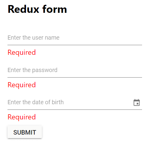
Upon form submission, the form fields will be validated and corresponding error messages will be displayed below the respective input fields. Update the textBox and datePicker functions in LoginForm.js to display validation errors. The input prop contains Redux Form’s field state and change handlers, while the meta prop provides validation state including touched (whether the field has been focused) and error (the validation error message):
const textBox = ({ placeholder, input, meta: { touched, error } }) => {
    return <div>
        <TextBoxComponent placeholder={placeholder} floatLabelType="Auto" {...input}
            onChange={(e) => {
                input.onChange(e.target.value);
            }}
        />
        {touched && error && <span className="error">{error}</span>}
    </div>
};
const datePicker = ({ placeholder, input, meta: { touched, error } }) => {
    return <div>
      <DatePickerComponent placeholder={placeholder} floatLabelType="Auto" {...input}
         onChange={(e) => {
            input.onChange(e.target.value);
         }}
      />
      {touched && error && <span className="error">{error}</span>}
    </div>
};
Run the Project
To run the project, use the following command:
npm startRefer to the following output image.
Refer to the GitHub repository for a runnable demo.