About CSS variables in themes
3 Feb 202624 minutes to read
CSS variables, also known as custom properties, allow authors to define reusable values in CSS files. Variable names start with two hyphens (--) followed by an identifier and can store values such as colors, lengths, or fonts. Reference these variables using the var() function across stylesheets.
Syncfusion provides modern, highly customizable themes that leverage CSS variables for consistent and visually appealing styling across all components. The supported themes are:
- Material 3 Theme
- Fluent 2 Theme
- Bootstrap 5.3 Theme
- Tailwind 3.4 Theme
CSS themes — Syncfusion® React components
Material 3, Fluent 2, Bootstrap 5.3, and Tailwind 3.4 themes are supported across all React controls. Each includes light and dark variants and uses CSS variables to enable straightforward color customization in CSS. This design simplifies toggling between light and dark schemes to accommodate user preferences and application needs.
Note: Material 3 defines color variables using
rgb()values (comma-separated). Using hex values may produce inconsistent results. For example, the primary color uses--color-sf-primary: 98, 0, 238;instead of a hex format like#6200ee.
Utilizing CSS variables in modern themes
Modern themes simplify color customization through CSS variables. Each theme defines its own variable set; consult the specific theme documentation to ensure consistent styling when overriding values.
Below are examples of how CSS variables are defined in each theme:
/* rgb() values of material3 theme */
:root {
    --color-sf-black: 0, 0, 0;
    --color-sf-white: 255, 255, 255;
    --color-sf-primary: 103, 80, 164;
    --color-sf-primary-container: 234, 221, 255;
    --color-sf-secondary: 98, 91, 113;
    --color-sf-secondary-container: 232, 222, 248;
    --color-sf-tertiary: 125, 82, 96;
    --color-sf-tertiary-container: 255, 216, 228;
    --color-sf-surface: 255, 255, 255;
    --color-sf-surface-variant: 231, 224, 236;
    --color-sf-background: var(--color-sf-surface);
    --color-sf-on-primary: 255, 255, 255;
    --color-sf-on-primary-container: 33, 0, 94;
    --color-sf-on-secondary: 255, 255, 255;
    --color-sf-on-secondary-container: 30, 25, 43;
    --color-sf-on-tertiary: 255, 255, 255;
  }
/* Hex values of fluent2 theme */
:root {
--color-sf-black: #000;
--color-sf-white: #fff;
--color-sf-primary: #0f6cbd;
--color-sf-primary-text-color: #fff;
--color-sf-primary-light: #b4d6fa;
--color-sf-primary-lighter: #ebf3fc;
--color-sf-primary-dark: #0f548c;
--color-sf-primary-darker: #0c3b5e;
--color-sf-success: #0e700e;
--color-sf-info: #008aa9;
--color-sf-warning: #bc4b09;
--color-sf-danger: #d13438;
--color-sf-success-light: #54b054;
--color-sf-info-light: #56bfd7;
--color-sf-warning-light: #fee5d7;
--color-sf-danger-light: #eeacb2;
--color-sf-success-dark: #54b054;
--color-sf-info-dark: #56bfd7;
--color-sf-warning-dark: #8a3707;
--color-sf-danger-dark: #6e0811;
}:root {
--color-sf-black: 0, 0, 0;
--color-sf-white: 255, 255, 255;
--color-sf-content-bg-color: #fff;
--color-sf-content-bg-color-alt1: #f8f9fa;
--color-sf-content-bg-color-alt2: #e9ecef;
--color-sf-content-bg-color-alt3: #dee2e6;
--color-sf-content-bg-color-alt4: #ced4da;
--color-sf-content-bg-color-alt5: #adb5bd;
--color-sf-content-bg-color-hover: #f8f9fa;
--color-sf-content-bg-color-pressed: #e9ecef;
--color-sf-content-bg-color-focus: #e9ecef;
--color-sf-content-bg-color-selected: #0d6efd;
--color-sf-content-bg-color-dragged: #ced4da;
--color-sf-content-bg-color-disabled: #e9ecef;
--color-sf-flyout-bg-color: #fff;
--color-sf-flyout-bg-color-hover: #f8f9fa;
--color-sf-flyout-bg-color-pressed: #0d6efd;
--color-sf-flyout-bg-color-focus: #f8f9fa;
--color-sf-overlay-bg-color: 0, 0, 0;
--color-sf-table-bg-color-hover: rgba(0, 0, 0, .07);
}:root{
--color-sf-content-bg-color: rgba(255, 255, 255);
--color-sf-content-bg-color-alt1: #f9fafb;
--color-sf-content-bg-color-alt2: #f3f4f6;
--color-sf-content-bg-color-alt3: #e5e7eb;
--color-sf-content-bg-color-alt4: #9ca3af;
--color-sf-content-bg-color-alt5: #6b7280;
--color-sf-content-bg-color-hover: #f9fafb;
--color-sf-content-bg-color-pressed: #f3f4f6;
--color-sf-content-bg-color-focus: #f9fafb;
--color-sf-content-bg-color-selected: #e5e7eb;
--color-sf-content-bg-color-dragged: #f3f4f6;
--color-sf-content-bg-color-disabled: #ffffff;
--color-sf-flyout-bg-color: #ffffff;
--color-sf-flyout-bg-color-hover: #f3f4f6;
--color-sf-flyout-bg-color-pressed: #e5e7eb;
--color-sf-flyout-bg-color-focus: #f3f4f6;
--color-sf-flyout-bg-color-selected: #e5e7eb;
--color-sf-flyout-bg-color-disabled: #fff;
--color-sf-overlay-bg-color: rgba(107, 114, 128, 74.9);
--color-sf-table-bg-color-hover: #f9fafb;
--color-sf-table-bg-color-pressed: #f3f4f6;
--color-sf-table-bg-color-selected: #e5e7eb;
--color-sf-text-input-bg-color: #ffffff;
--color-sf-treeview-item-active-hover-bg: #e5e7eb;
}How to get these themes?
Syncfusion themes are available via npm packages or CDN links. Use matching versions across packages and CDN for compatibility.
Color customization in themes
CSS variables support dynamic color changes, including runtime modifications via JavaScript, enabling interactive or context-aware styling.
Customization using CSS
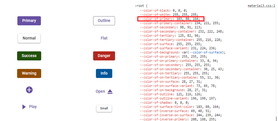
Example for Material 3 customization using a CSS class:
import * as React from 'react';
import * as ReactDom from 'react-dom';
import { ButtonComponent } from '@syncfusion/ej2-react-buttons';
import { enableRipple } from '@syncfusion/ej2-base';
enableRipple(true);
function App() {
    return (<div>
          {/* Primary Button - Used to represent a primary action. */}
          <ButtonComponent cssClass='e-primary'>button</ButtonComponent>
      </div>);
}
export default App;
ReactDom.render(<App />, document.getElementById('button'));
import {ButtonComponent} from '@syncfusion/ej2-react-buttons';
import { enableRipple } from '@syncfusion/ej2-base';
import * as React from 'react';
import * as ReactDom from 'react-dom';
enableRipple(true);
function App() {
return (
<div>
{ /* Primary Button - Used to represent a primary action. */ }
<ButtonComponent cssClass='e-primary'>Button</ButtonComponent>
</div>
);
}
export default App;
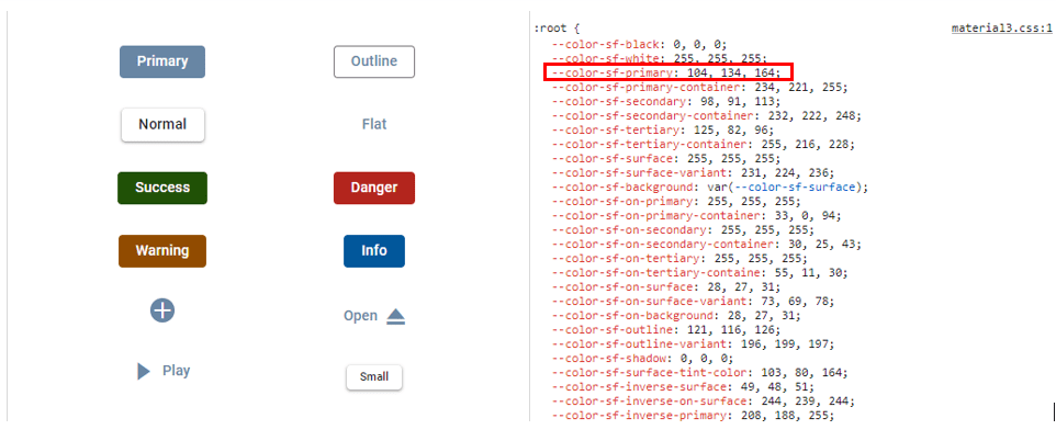
ReactDom.render(<App />,document.getElementById('button'));:root {
--color-sf-primary: 104, 134, 164;
}
button {
margin: 25px 5px 20px 20px;
}
#loader {
color: #008cff;
height: 40px;
left: 45%;
position: absolute;
top: 45%;
width: 30%;
}Default Material 3 primary value
Customized Material 3 primary value
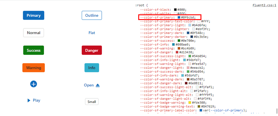
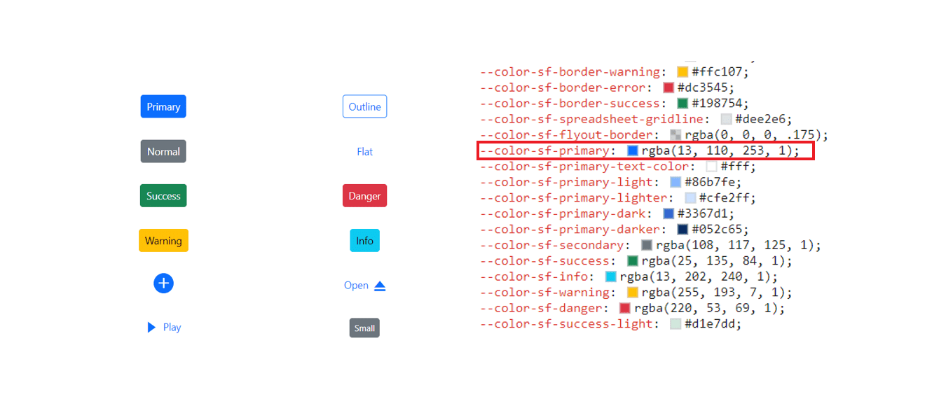
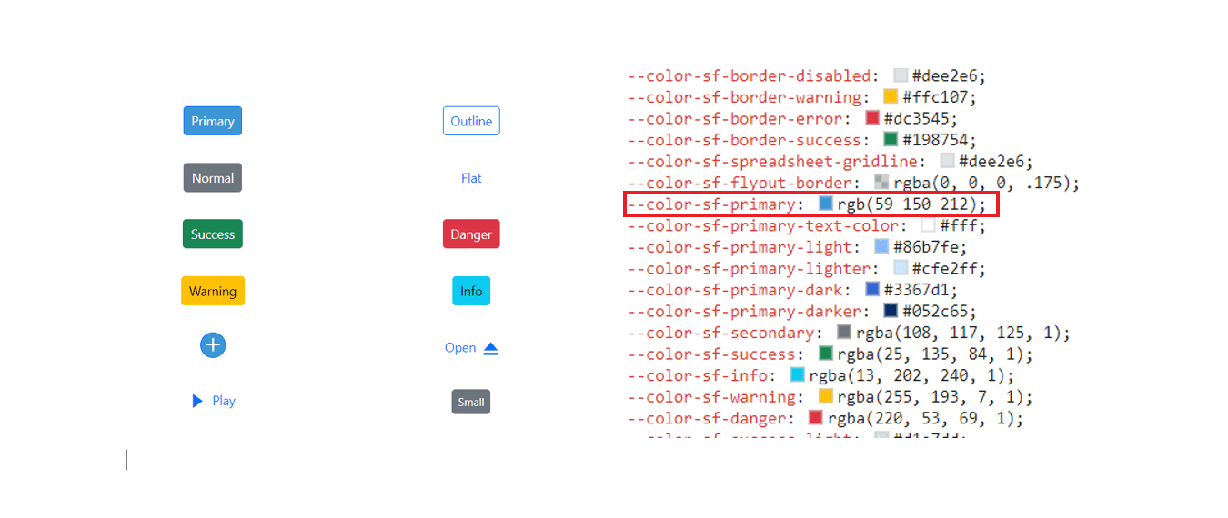
Example for Fluent 2 customization using a CSS class:
import * as React from 'react';
import * as ReactDom from 'react-dom';
import { ButtonComponent } from '@syncfusion/ej2-react-buttons';
import { enableRipple } from '@syncfusion/ej2-base';
enableRipple(true);
function App() {
    return (<div>
          {/* Primary Button - Used to represent a primary action. */}
          <ButtonComponent cssClass='e-primary'>button</ButtonComponent>
      </div>);
}
export default App;
ReactDom.render(<App />, document.getElementById('button'));
import {ButtonComponent} from '@syncfusion/ej2-react-buttons';
import { enableRipple } from '@syncfusion/ej2-base';
import * as React from 'react';
import * as ReactDom from 'react-dom';
enableRipple(true);
function App() {
return (
<div>
{ /* Primary Button - Used to represent a primary action. */ }
<ButtonComponent cssClass='e-primary'>Button</ButtonComponent>
</div>
);
}
export default App;
ReactDom.render(<App />,document.getElementById('button'));:root {
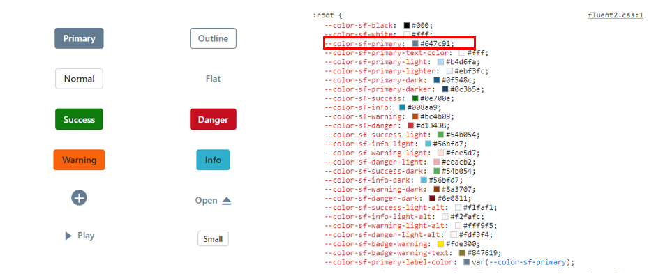
--color-sf-primary: #6886a4;
}
button {
margin: 25px 5px 20px 20px;
}
#loader {
color: #008cff;
height: 40px;
left: 45%;
position: absolute;
top: 45%;
width: 30%;
}Default Fluent 2 primary value
Customized Fluent 2 primary value
Example for Bootstrap 5.3 customization using a CSS class:
import * as React from 'react';
import * as ReactDom from 'react-dom';
import { ButtonComponent } from '@syncfusion/ej2-react-buttons';
import { enableRipple } from '@syncfusion/ej2-base';
enableRipple(true);
function App() {
    return (<div>
          {/* Primary Button - Used to represent a primary action. */}
          <ButtonComponent cssClass='e-primary'>button</ButtonComponent>
      </div>);
}
export default App;
ReactDom.render(<App />, document.getElementById('button'));
import {ButtonComponent} from '@syncfusion/ej2-react-buttons';
import { enableRipple } from '@syncfusion/ej2-base';
import * as React from 'react';
import * as ReactDom from 'react-dom';
enableRipple(true);
function App() {
return (
<div>
{ /* Primary Button - Used to represent a primary action. */ }
<ButtonComponent cssClass='e-primary'>Button</ButtonComponent>
</div>
);
}
export default App;
ReactDom.render(<App />,document.getElementById('button'));:root {
--color-sf-primary: #6886a4;
}
button {
margin: 25px 5px 20px 20px;
}
#loader {
color: #008cff;
height: 40px;
left: 45%;
position: absolute;
top: 45%;
width: 30%;
}Default Bootstrap 5.3 primary value
Customized Bootstrap 5.3 primary value
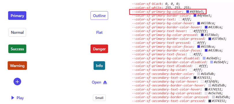
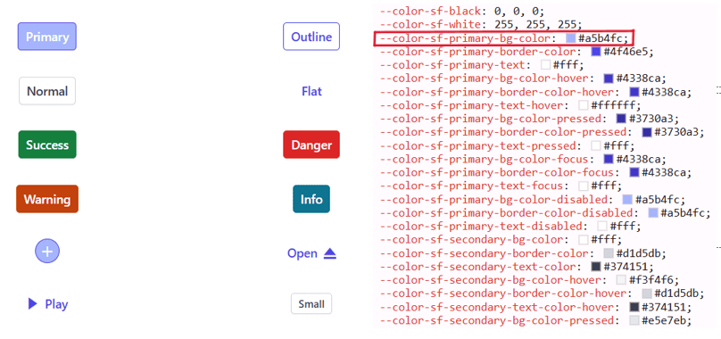
Example for Tailwind 3.4 customization using a CSS class:
import * as React from 'react';
import * as ReactDom from 'react-dom';
import { ButtonComponent } from '@syncfusion/ej2-react-buttons';
import { enableRipple } from '@syncfusion/ej2-base';
enableRipple(true);
function App() {
    return (<div>
          {/* Primary Button - Used to represent a primary action. */}
          <ButtonComponent cssClass='e-primary'>button</ButtonComponent>
      </div>);
}
export default App;
ReactDom.render(<App />, document.getElementById('button'));
import {ButtonComponent} from '@syncfusion/ej2-react-buttons';
import { enableRipple } from '@syncfusion/ej2-base';
import * as React from 'react';
import * as ReactDom from 'react-dom';
enableRipple(true);
function App() {
return (
<div>
{ /* Primary Button - Used to represent a primary action. */ }
<ButtonComponent cssClass='e-primary'>Button</ButtonComponent>
</div>
);
}
export default App;
ReactDom.render(<App />,document.getElementById('button'));:root {
--color-sf-primary-bg-color: '#a5b4fc';
}
button {
margin: 25px 5px 20px 20px;
}
#loader {
color: #008cff;
height: 40px;
left: 45%;
position: absolute;
top: 45%;
width: 30%;
}Default Tailwind 3.4 primary value
Customized Tailwind 3.4 primary value
With CSS variable support, color customization for Syncfusion React components becomes straightforward and flexible.
Switching light and dark mode with CSS variables
Modern themes enable easy toggling between light and dark modes by applying a single CSS class. Each theme’s CSS file includes separate selectors for light and dark variants.
import * as React from 'react';
import * as ReactDom from 'react-dom';
import { useState } from 'react';
import { ButtonComponent, CheckBoxComponent } from '@syncfusion/ej2-react-buttons';
import { enableRipple } from '@syncfusion/ej2-base';
enableRipple(true);
function App() {
    const [isChecked, setIsChecked] = useState(false);

  const handleCheckboxChange = (event) => {
    setIsChecked(event.checked);

    // Add or remove the classes on the body element based on the checkbox state
    const body = document.body;

    if (event.checked) {
      body.classList.add('dark');
      body.classList.add('e-dark-mode');
    } else {
      body.classList.remove('dark');
      body.classList.remove('e-dark-mode');
    }
  };
    return (<div>
          {/* Primary Button - Used to represent a primary action. */}
          <CheckBoxComponent label="Enable Darkmode" checked={isChecked} change={handleCheckboxChange}/><br/>
          <ButtonComponent cssClass='e-primary'>button</ButtonComponent>

          {/* Success Button - Used to represent a positive action. */}
          <ButtonComponent cssClass='e-success'>button</ButtonComponent>

          {/* Info Button - Used to represent an informative action. */}
          <ButtonComponent cssClass='e-info'>button</ButtonComponent>

          {/* Warning Button - Used to represent an action with caution.*/}
          <ButtonComponent cssClass='e-warning'>button</ButtonComponent>

          {/* Danger Button - Used to represent a negative action.*/}
          <ButtonComponent cssClass='e-danger'>button</ButtonComponent>

      </div>);
}
export default App;
ReactDom.render(<App />, document.getElementById('button'));
import {ButtonComponent, CheckBoxComponent} from '@syncfusion/ej2-react-buttons';
import { enableRipple } from '@syncfusion/ej2-base';
import { ChangeEventArgs } from '@syncfusion/ej2-buttons';
import * as React from 'react';
import * as ReactDom from 'react-dom';
import { useState } from 'react';
enableRipple(true);
function App() {
const [isChecked, setIsChecked] = useState(false);
const handleCheckboxChange = (event: ChangeEventArgs) => {
const checked = event.checked ?? false;
setIsChecked(checked);
// Add or remove the class on the body element based on the checkbox state
if (checked) {
document.body.classList.add('dark');
document.body.classList.add('e-dark-mode');
} else {
document.body.classList.remove('dark');
document.body.classList.remove('e-dark-mode');
}
};
return (
<div>
{ /* checkbox - Used to represent checkbox. */ }
<CheckBoxComponent label="Enable Darkmode" checked={isChecked} change={handleCheckboxChange}/><br/>
{ /* Primary Button - Used to represent a primary action. */ }
<ButtonComponent cssClass='e-primary'>Button</ButtonComponent>
{ /* Success Button - Used to represent a positive action. */ }
<ButtonComponent cssClass='e-success'>Button</ButtonComponent>
{ /* Info Button - Used to represent an informative action. */ }
<ButtonComponent cssClass='e-info'>Button</ButtonComponent>
{ /* Warning Button - Used to represent an action with caution.*/ }
<ButtonComponent cssClass='e-warning'>Button</ButtonComponent>
{ /* Danger Button - Used to represent a negative action.*/ }
<ButtonComponent cssClass='e-danger'>Button</ButtonComponent>
</div>
);
}
export default App;
ReactDom.render(<App />,document.getElementById('button'));Mode switching in Fluent 2 theme
Fluent 2 supports light and dark variants through dedicated class selectors.
import * as React from 'react';
import * as ReactDom from 'react-dom';
import { useState } from 'react';
import { ButtonComponent, CheckBoxComponent } from '@syncfusion/ej2-react-buttons';
import { enableRipple } from '@syncfusion/ej2-base';
enableRipple(true);
function App() {
    const [isChecked, setIsChecked] = useState(false);

  const handleCheckboxChange = (event) => {
    setIsChecked(event.target.checked);

    // Add or remove the classes on the body element based on the checkbox state
    const body = document.body;

    if (event.target.checked) {
      body.classList.add('dark');
      body.classList.add('e-dark-mode');
    } else {
      body.classList.remove('dark');
      body.classList.remove('e-dark-mode');
    }
  };
    return (<div>
          {/* Primary Button - Used to represent a primary action. */}
          <CheckBoxComponent label="Enable Darkmode" checked={isChecked} onChange={handleCheckboxChange}/><br/>
          <ButtonComponent cssClass='e-primary'>button</ButtonComponent>

          {/* Success Button - Used to represent a positive action. */}
          <ButtonComponent cssClass='e-success'>button</ButtonComponent>

          {/* Info Button - Used to represent an informative action. */}
          <ButtonComponent cssClass='e-info'>button</ButtonComponent>

          {/* Warning Button - Used to represent an action with caution.*/}
          <ButtonComponent cssClass='e-warning'>button</ButtonComponent>

          {/* Danger Button - Used to represent a negative action.*/}
          <ButtonComponent cssClass='e-danger'>button</ButtonComponent>

      </div>);
}
export default App;
ReactDom.render(<App />, document.getElementById('button'));
import {ButtonComponent, CheckBoxComponent} from '@syncfusion/ej2-react-buttons';
import { enableRipple } from '@syncfusion/ej2-base';
import * as React from 'react';
import * as ReactDom from 'react-dom';
import { useState } from 'react';
enableRipple(true);
function App() {
const [isChecked, setIsChecked] = useState(false);
const handleCheckboxChange = (event: React.ChangeEvent<HTMLInputElement>) => {
setIsChecked(event.target.checked);
// Add or remove the class on the body element based on the checkbox state
if (event.target.checked) {
document.body.classList.add('dark');
document.body.classList.add('e-dark-mode');
} else {
document.body.classList.remove('dark');
document.body.classList.remove('e-dark-mode');
}
};
return (
<div>
{ /* checkbox - Used to represent checkbox. */ }
<CheckBoxComponent label="Enable Darkmode" checked={isChecked} onChange={handleCheckboxChange}/><br/>
{ /* Primary Button - Used to represent a primary action. */ }
<ButtonComponent cssClass='e-primary'>Button</ButtonComponent>
{ /* Success Button - Used to represent a positive action. */ }
<ButtonComponent cssClass='e-success'>Button</ButtonComponent>
{ /* Info Button - Used to represent an informative action. */ }
<ButtonComponent cssClass='e-info'>Button</ButtonComponent>
{ /* Warning Button - Used to represent an action with caution.*/ }
<ButtonComponent cssClass='e-warning'>Button</ButtonComponent>
{ /* Danger Button - Used to represent a negative action.*/ }
<ButtonComponent cssClass='e-danger'>Button</ButtonComponent>
</div>
);
}
export default App;
ReactDom.render(<App />,document.getElementById('button'));Mode switching in Bootstrap 5.3 theme
Bootstrap 5.3 provides class selectors for switching between light and dark variants at runtime.
import * as React from 'react';
import * as ReactDom from 'react-dom';
import { useState } from 'react';
import { ButtonComponent, CheckBoxComponent } from '@syncfusion/ej2-react-buttons';
import { enableRipple } from '@syncfusion/ej2-base';
enableRipple(true);
function App() {
    const [isChecked, setIsChecked] = useState(false);

  const handleCheckboxChange = (event) => {
    setIsChecked(event.target.checked);

    // Add or remove the classes on the body element based on the checkbox state
    const body = document.body;

    if (event.target.checked) {
      body.classList.add('dark');
      body.classList.add('dark');
    } else {
      body.classList.remove('e-dark-mode');
      body.classList.remove('e-dark-mode');
    }
  };
    return (<div>
          {/* Primary Button - Used to represent a primary action. */}
          <CheckBoxComponent label="Enable Darkmode" checked={isChecked} onChange={handleCheckboxChange}/><br/>
          <ButtonComponent cssClass='e-primary'>button</ButtonComponent>

          {/* Success Button - Used to represent a positive action. */}
          <ButtonComponent cssClass='e-success'>button</ButtonComponent>

          {/* Info Button - Used to represent an informative action. */}
          <ButtonComponent cssClass='e-info'>button</ButtonComponent>

          {/* Warning Button - Used to represent an action with caution.*/}
          <ButtonComponent cssClass='e-warning'>button</ButtonComponent>

          {/* Danger Button - Used to represent a negative action.*/}
          <ButtonComponent cssClass='e-danger'>button</ButtonComponent>

      </div>);
}
export default App;
ReactDom.render(<App />, document.getElementById('button'));
import {ButtonComponent, CheckBoxComponent} from '@syncfusion/ej2-react-buttons';
import { enableRipple } from '@syncfusion/ej2-base';
import * as React from 'react';
import * as ReactDom from 'react-dom';
import { useState } from 'react';
enableRipple(true);
function App() {
const [isChecked, setIsChecked] = useState(false);
const handleCheckboxChange = (event: React.ChangeEvent<HTMLInputElement>) => {
setIsChecked(event.target.checked);
// Add or remove the class on the body element based on the checkbox state
if (event.target.checked) {
document.body.classList.add('dark');
document.body.classList.add('e-dark-mode');
} else {
document.body.classList.remove('dark');
document.body.classList.remove('e-dark-mode');
}
};
return (
<div>
{ /* checkbox - Used to represent checkbox. */ }
<CheckBoxComponent label="Enable Darkmode" checked={isChecked} onChange={handleCheckboxChange}/><br/>
{ /* Primary Button - Used to represent a primary action. */ }
<ButtonComponent cssClass='e-primary'>Button</ButtonComponent>
{ /* Success Button - Used to represent a positive action. */ }
<ButtonComponent cssClass='e-success'>Button</ButtonComponent>
{ /* Info Button - Used to represent an informative action. */ }
<ButtonComponent cssClass='e-info'>Button</ButtonComponent>
{ /* Warning Button - Used to represent an action with caution.*/ }
<ButtonComponent cssClass='e-warning'>Button</ButtonComponent>
{ /* Danger Button - Used to represent a negative action.*/ }
<ButtonComponent cssClass='e-danger'>Button</ButtonComponent>
</div>
);
}
export default App;
ReactDom.render(<App />,document.getElementById('button'));Mode switching in Tailwind 3.4 theme
Tailwind 3.4 offers class selectors for light and dark modes, as demonstrated in the preview.
import * as React from 'react';
import * as ReactDom from 'react-dom';
import { useState } from 'react';
import { ButtonComponent, CheckBoxComponent } from '@syncfusion/ej2-react-buttons';
import { enableRipple } from '@syncfusion/ej2-base';
enableRipple(true);
function App() {
    const [isChecked, setIsChecked] = useState(false);

  const handleCheckboxChange = (event) => {
    setIsChecked(event.target.checked);

    // Add or remove the classes on the body element based on the checkbox state
    const body = document.body;

    if (event.target.checked) {
      body.classList.add('dark');
      body.classList.add('dark');
    } else {
      body.classList.remove('e-dark-mode');
      body.classList.remove('e-dark-mode');
    }
  };
    return (<div>
          {/* Primary Button - Used to represent a primary action. */}
          <CheckBoxComponent label="Enable Darkmode" checked={isChecked} onChange={handleCheckboxChange}/><br/>
          <ButtonComponent cssClass='e-primary'>button</ButtonComponent>

          {/* Success Button - Used to represent a positive action. */}
          <ButtonComponent cssClass='e-success'>button</ButtonComponent>

          {/* Info Button - Used to represent an informative action. */}
          <ButtonComponent cssClass='e-info'>button</ButtonComponent>

          {/* Warning Button - Used to represent an action with caution.*/}
          <ButtonComponent cssClass='e-warning'>button</ButtonComponent>

          {/* Danger Button - Used to represent a negative action.*/}
          <ButtonComponent cssClass='e-danger'>button</ButtonComponent>

      </div>);
}
export default App;
ReactDom.render(<App />, document.getElementById('button'));
import {ButtonComponent, CheckBoxComponent} from '@syncfusion/ej2-react-buttons';
import { enableRipple } from '@syncfusion/ej2-base';
import * as React from 'react';
import * as ReactDom from 'react-dom';
import { useState } from 'react';
enableRipple(true);
function App() {
const [isChecked, setIsChecked] = useState(false);
const handleCheckboxChange = (event: React.ChangeEvent<HTMLInputElement>) => {
setIsChecked(event.target.checked);
// Add or remove the class on the body element based on the checkbox state
if (event.target.checked) {
document.body.classList.add('dark');
document.body.classList.add('e-dark-mode');
} else {
document.body.classList.remove('dark');
document.body.classList.remove('e-dark-mode');
}
};
return (
<div>
{ /* checkbox - Used to represent checkbox. */ }
<CheckBoxComponent label="Enable Darkmode" checked={isChecked} onChange={handleCheckboxChange}/><br/>
{ /* Primary Button - Used to represent a primary action. */ }
<ButtonComponent cssClass='e-primary'>Button</ButtonComponent>
{ /* Success Button - Used to represent a positive action. */ }
<ButtonComponent cssClass='e-success'>Button</ButtonComponent>
{ /* Info Button - Used to represent an informative action. */ }
<ButtonComponent cssClass='e-info'>Button</ButtonComponent>
{ /* Warning Button - Used to represent an action with caution.*/ }
<ButtonComponent cssClass='e-warning'>Button</ButtonComponent>
{ /* Danger Button - Used to represent a negative action.*/ }
<ButtonComponent cssClass='e-danger'>Button</ButtonComponent>
</div>
);
}
export default App;
ReactDom.render(<App />,document.getElementById('button'));How to switch dark mode?
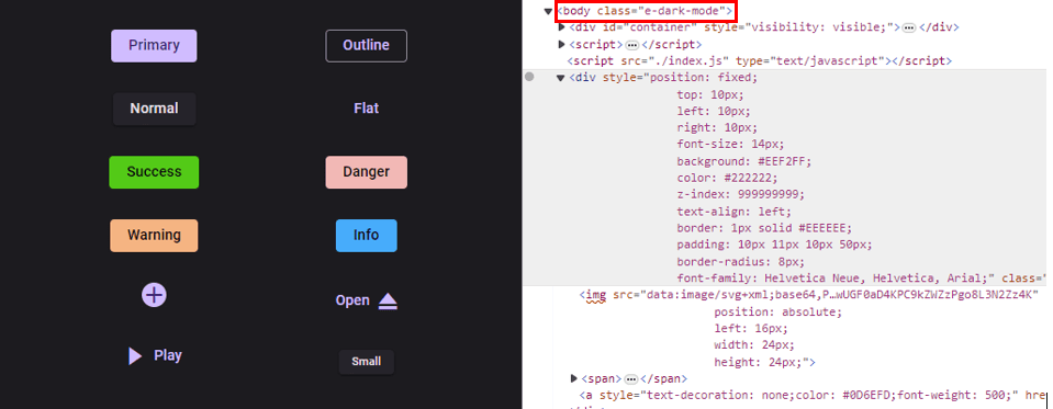
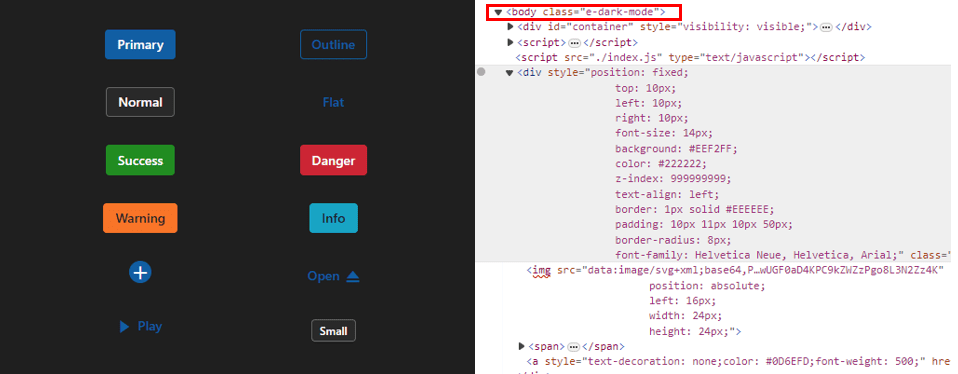
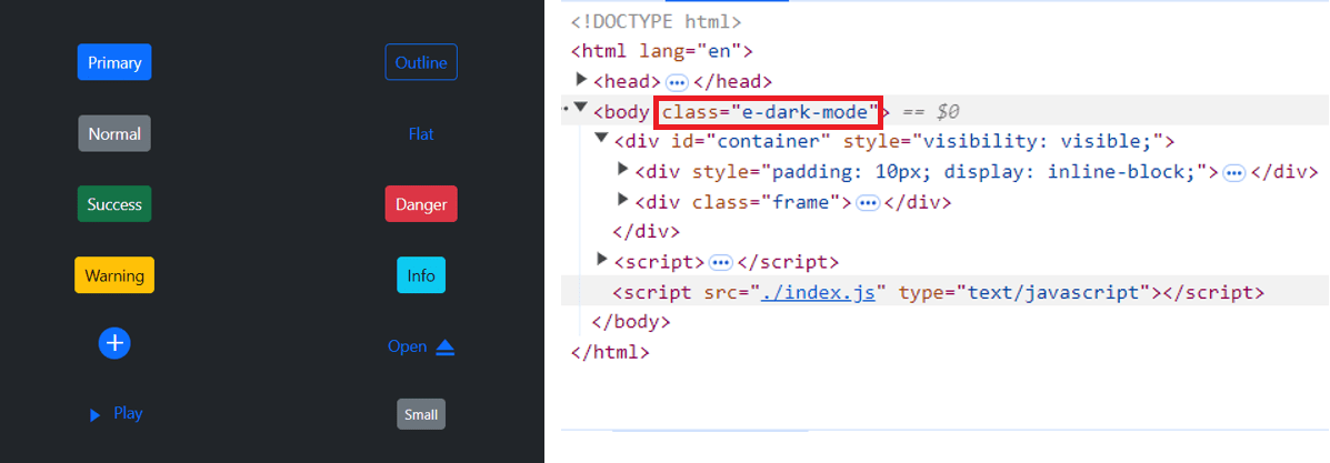
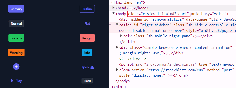
To enable dark mode in Material 3, Fluent 2, Bootstrap 5.3, or Tailwind 3.4 themes, add the e-dark-mode class to the <body> element. This triggers the dark variant across components.
Material 3 dark mode
Fluent 2 dark mode
Bootstrap 5.3 dark mode
Tailwind 3.4 dark mode
ThemeStudio application
ThemeStudio supports full customization for Material 3 and Fluent 2 themes, including variable-level adjustments for comprehensive personalization.
Access Syncfusion ThemeStudio here: Theme Studio