Material 3 Theme with CSS Variables
6 Feb 202615 minutes to read
Material 3 is the latest version of Google’s open-source design system, Material Design. As the successor to Material 2, Material 3 has been specifically designed to align seamlessly with the visual style and system UI introduced in Android 12 and above.
CSS variables, also known as custom properties, are entities defined by CSS authors that contain specific values that can be reused throughout a CSS file. They are identified by their name, which must begin with two hyphens (–) followed by an identifier. These variables can be assigned any valid CSS value, such as colors, lengths, or fonts. To retrieve the value of a CSS variable, the var() function is used.
Material 3 - Syncfusion® EJ2 JavaScript Controls
Syncfusion® has introduced the Material 3 theme across all EJ2 Controls, featuring both light and dark variants. This theme utilizes CSS variables to allow easy customization of control colors in CSS format. With this implementation, users can seamlessly switch between light and dark color schemes, providing a flexible solution to meet their preferences and application needs.
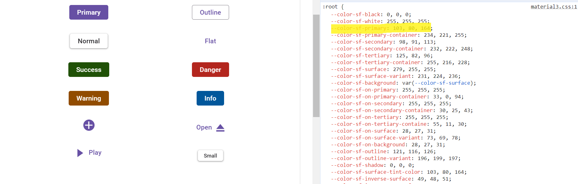
Kindly note that in the Material 3 theme, Syncfusion® utilizes CSS variables with rgb() values for color variables. The use of hex values in this context may lead to improper functionality. For example, in previous versions of the Material theme or other themes, the primary color variable was defined as follows: $primary: #6200ee;. However, in the Material 3 theme, the primary color variable is defined as follows: –color-sf-primary: 98, 0, 238;.
How does Syncfusion® Material 3 theme utilize CSS Variables?
Syncfusion’s® Material 3 theme incorporates support for CSS variables, utilizing rgb() values for customizing colors. For more information, refer to the documentation for color variables of the Material 3 theme.
:root {
  --color-sf-black: 0, 0, 0;
  --color-sf-white: 255, 255, 255;
  --color-sf-primary: 103, 80, 164;
  --color-sf-primary-container: 234, 221, 255;
  --color-sf-secondary: 98, 91, 113;
  --color-sf-secondary-container: 232, 222, 248;
  --color-sf-tertiary: 125, 82, 96;
  --color-sf-tertiary-container: 255, 216, 228;
  --color-sf-surface: 255, 255, 255;
  --color-sf-surface-variant: 231, 224, 236;
  --color-sf-background: var(--color-sf-surface);
  --color-sf-on-primary: 255, 255, 255;
  --color-sf-on-primary-container: 33, 0, 94;
  --color-sf-on-secondary: 255, 255, 255;
  --color-sf-on-secondary-container: 30, 25, 43;
  --color-sf-on-tertiary: 255, 255, 255;
}
How to get the Material 3 theme?
To access the Material 3 theme provided by Syncfusion®, two primary options are available:
- Package - Install theme files locally via npm for bundled applications and offline development.
- CDN links - Load theme files from the Syncfusion CDN for rapid prototyping and simplified deployment.
The table below lists the theme options. Ensure the version number in the CDN URL matches the Syncfusion package version installed in the project to avoid compatibility issues.
| Light | Dark | |
|---|---|---|
| Package | Material 3 Light | Material 3 Dark |
| CDN | Material 3 Light | Material 3 Dark |
Color Customization in Material 3
CSS variables allows you to dynamically change color values in real-time using JavaScript. This flexibility enables you to create interactive experiences where colors can adjust based on user interactions or other dynamic factors.
Customization using CSS
The following example demonstrates Material 3 customization using a CSS class.
var checkBoxObj = new ej.buttons.CheckBox({ label: 'Enable DarkMode', change: onDarkMode });
checkBoxObj.appendTo('#darkmode');

function onDarkMode(e) {
    e.checked ? document.body.classList.add('e-dark-mode') : document.body.classList.remove('e-dark-mode');
}
    var btnObj = new ej.buttons.Button({ isPrimary: true });
    btnObj.appendTo('#normal4');
    btnObj = new ej.buttons.Button({ cssClass: 'e-success' });
    btnObj.appendTo('#normal5');
    btnObj = new ej.buttons.Button({ cssClass: 'e-info' });
    btnObj.appendTo('#normal6');
    btnObj = new ej.buttons.Button({ cssClass: 'e-warning' });
    btnObj.appendTo('#normal7');
    btnObj = new ej.buttons.Button({ cssClass: 'e-danger' });
    btnObj.appendTo('#normal8');
<!DOCTYPE html><html lang="en"><head>
<title>EJ2 Material3</title>
<meta charset="utf-8">
<meta name="viewport" content="width=device-width, initial-scale=1.0">
<meta name="description" content="Typescript Grid Control">
<meta name="author" content="Syncfusion">
<link href="./index.css" rel="stylesheet">
<link href="https://cdn.syncfusion.com/ej2/34.1.29/material3.css" rel="stylesheet">
<script src="https://cdn.syncfusion.com/ej2/34.1.29/dist/ej2.min.js" type="text/javascript"></script>
</head>
<body>
<div id="container">
<div style="padding: 10px; display: inline-block;">
<input id="darkmode" type="checkbox" />
</div>
<div class="frame">
<table id="basic-button">
<tbody>
<tr>
<td><button id="normal4">Button</button></td>
<td><button id="normal5">Button</button></td>
<td><button id="normal6">Button</button></td>
<td><button id="normal7">Button</button></td>
<td><button id="normal8">Button</button></td>
</tr>
</tbody>
</table>
</div>
</div>
<script>
var ele = document.getElementById('container');
if(ele) {
ele.style.visibility = "visible";
}
</script>
<script src="./index.js" type="text/javascript"></script>
</body></html>Customization using JavaScript
The following example demonstrates Material 3 customization using JavaScript.
var button = new ej.buttons.Button({
    content: 'Button', cssClass: 'e-primary'
});
button.appendTo('#element');

var root = document.documentElement;
var colorSFPrimary = '104, 134, 164';
root.style.setProperty('--color-sf-primary', colorSFPrimary);
<!DOCTYPE html><html lang="en"><head>
<title>EJ2 Material3</title>
<meta charset="utf-8">
<meta name="viewport" content="width=device-width, initial-scale=1.0">
<meta name="description" content="Typescript Grid Control">
<meta name="author" content="Syncfusion">
<link href="./index.css" rel="stylesheet">
<link href="https://cdn.syncfusion.com/ej2/34.1.29/material3.css" rel="stylesheet">
<script src="https://cdn.syncfusion.com/ej2/34.1.29/dist/ej2.min.js" type="text/javascript"></script>
</head>
<body>
<div id='container'>
<button id='element'></button>
</div>
<script>
var ele = document.getElementById('container');
if(ele) {
ele.style.visibility = "visible";
}
</script>
<script src="./index.js" type="text/javascript"></script>
</body></html>Default primary value
Customized primary value
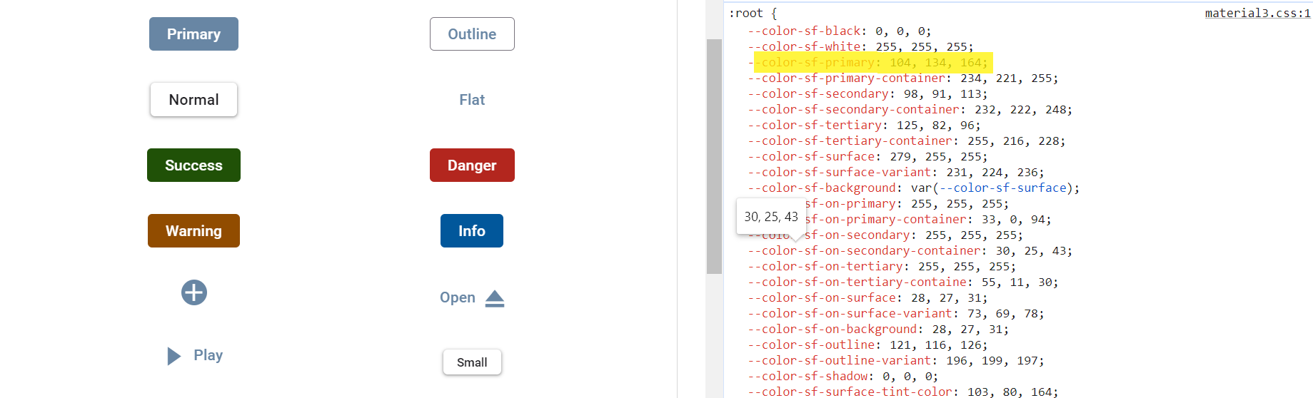
With this CSS variable support, color variable values for Syncfusion® JavaScript controls can be customized effortlessly.
Material 3 Light Theme
Syncfusion® has implemented the Material 3 theme, offering both Light and Dark variants. In the Material 3 light theme, there are distinct class variables for both light and dark modes, providing flexibility for seamless switching between the two modes within your application.
var checkBoxObj = new ej.buttons.CheckBox({ label: 'Enable DarkMode', change: onDarkMode });
checkBoxObj.appendTo('#darkmode');

function onDarkMode(e) {
    e.checked ? document.body.classList.add('e-dark-mode') : document.body.classList.remove('e-dark-mode');
}
    var btnObj = new ej.buttons.Button({ isPrimary: true });
    btnObj.appendTo('#normal4');
    btnObj = new ej.buttons.Button({ cssClass: 'e-success' });
    btnObj.appendTo('#normal5');
    btnObj = new ej.buttons.Button({ cssClass: 'e-info' });
    btnObj.appendTo('#normal6');
    btnObj = new ej.buttons.Button({ cssClass: 'e-warning' });
    btnObj.appendTo('#normal7');
    btnObj = new ej.buttons.Button({ cssClass: 'e-danger' });
    btnObj.appendTo('#normal8');
<!DOCTYPE html><html lang="en"><head>
<title>EJ2 Material3</title>
<meta charset="utf-8">
<meta name="viewport" content="width=device-width, initial-scale=1.0">
<meta name="description" content="Typescript Grid Control">
<meta name="author" content="Syncfusion">
<link href="./index.css" rel="stylesheet">
<link href="https://cdn.syncfusion.com/ej2/34.1.29/material3.css" rel="stylesheet">
<script src="https://cdn.syncfusion.com/ej2/34.1.29/dist/ej2.min.js" type="text/javascript"></script>
</head>
<body>
<div id="container">
<div style="padding: 10px; display: inline-block;">
<input id="darkmode" type="checkbox" />
</div>
<div class="frame">
<table id="basic-button">
<tbody>
<tr>
<td><button id="normal4">Button</button></td>
<td><button id="normal5">Button</button></td>
<td><button id="normal6">Button</button></td>
<td><button id="normal7">Button</button></td>
<td><button id="normal8">Button</button></td>
</tr>
</tbody>
</table>
</div>
</div>
<script>
var ele = document.getElementById('container');
if(ele) {
ele.style.visibility = "visible";
}
</script>
<script src="./index.js" type="text/javascript"></script>
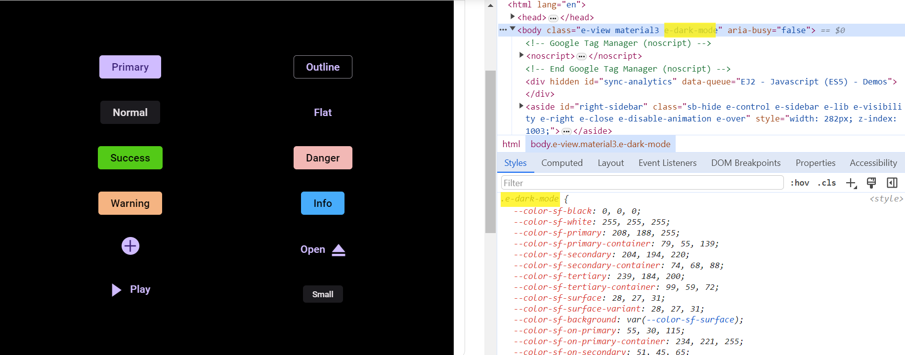
</body></html>How to switch dark mode?
With CSS variable support, transitioning between light and dark theme modes has become effortless. To activate dark mode, just append the e-dark-mode class to the body section of your application. Once applied, the theme seamlessly switches to dark mode. Please refer to the example image below for visual guidance.
ThemeStudio Application
The ThemeStudio application now includes seamless integration with the Material 3 theme, offering a comprehensive solution for customization requirements. This enhancement enables effortless theme customization and personalization.
Access the Syncfusion® ThemeStudio application, featuring the Material 3 theme, via the following link: Link to Syncfusion® ThemeStudio with Material 3 Theme