Columns
25 Feb 202224 minutes to read
The column definitions are used as the DataSource schema in the TreeGrid. This plays a vital role in rendering column values in the required format.
The treegrid operations such as sorting, filtering and searching etc. are performed based on column definitions. The Field property of the Columns
is necessary to map the data source values in TreeGrid Columns.
TreeColumnIndex property denotes the column that is used to expand and collapse child rows.
Header Template
You can customize the header element by using the HeaderTemplate property.
@using Syncfusion.EJ2.Grids

@(Html.EJS().TreeGrid("HeaderTemplate")
      .DataSource((IEnumerable<object>)ViewBag.datasource)
      .Columns(col =>
       {
          col.Field("TaskName").HeaderTemplate("#projectName").Width(220).Add();
          col.Field("StartDate").HeaderTemplate("#dateTemplate").Format("yMd").TextAlign(TextAlign.Right).Add();
          col.Field("Duration").HeaderTemplate("#durationTemplate").TextAlign(TextAlign.Right).Add();
          col.Field("Progress").HeaderTemplate("#progressTemplate").TextAlign(TextAlign.Right).Add();

       }).Height(315).ChildMapping("Children").TreeColumnIndex(0).Render()
)

<script type="text/x-template" id="projectName">
    <div>
        <div>
            <img src="images/__Task name.png" width="20" height="20" class="e-image" />  Task Name
        </div>
    </div>
</script>
<script type="text/x-template" id="dateTemplate">
    <div>
        <div>
            <img src="images/__Start name.png" width="20" height="20" class="e-image" />  Start Date
        </div>
    </div>
</script>
<script type="text/x-template" id="durationTemplate">
    <div>
        <div>
            <img src="images/__Duration.png" width="20" height="20" class="e-image" />  Duration
        </div>
    </div>
</script>
<script type="text/x-template" id="progressTemplate">
    <div>
        <div>
            <img src="images/__progress.png" width="20" height="20" class="e-image" />  Progress
        </div>
    </div>
</script>
public ActionResult HeaderTemplate()
{
var treeData = TreeGridHeader.GetDataSource();
ViewBag.datasource = treeData;
return View();
}Header text
By default, column header title is displayed from column Field value. To override the default header title, you have to define the HeaderText value.
@using Syncfusion.EJ2.Grids

@(Html.EJS().TreeGrid("HeaderText").DataSource((IEnumerable<object>)ViewBag.datasource)
      .Columns(col =>
       {
        col.Field("TaskId").HeaderText("Task ID").Width(90).TextAlign(TextAlign.Right).Add();
        col.Field("TaskName").HeaderText("Task Name").Width(180).Add();
        col.Field("StartDate").HeaderText("Start Date").Format("yMd").TextAlign(TextAlign.Right).Width(90).Add();
        col.Field("Duration").HeaderText("Duration").Width(80).TextAlign(TextAlign.Right).Add();

      }).Height(315).ChildMapping("Children").TreeColumnIndex(1).Render()
)
public ActionResult HeaderText()
{
var treeData = TreeGridItems.GetTreeData();
ViewBag.datasource = treeData;
return View();
}If both the
FieldandHeaderTextare not defined in the column, the column renders with “empty” header text.
Format
To format cell values based on specific culture, use the Format property of Column. The TreeGrid uses Internalization library to format number and date
values.
@using Syncfusion.EJ2.Grids

@(Html.EJS().TreeGrid("Formatting").AllowPaging()
      .DataSource((IEnumerable<object>)ViewBag.datasource)
      .Columns(col =>
       {
        col.Field("ID").HeaderText("Order ID").Width(90).TextAlign(TextAlign.Right).Add();
        col.Field("Name").HeaderText("Order Name").Width(180).Add();
        col.Field("Price").HeaderText("Price").Format("yMd").TextAlign(TextAlign.Right).Width(90).Format("c2").Add();

       }).Height(315).ChildMapping("Children").TreeColumnIndex(1).Render()
)
public ActionResult Formatting()
{
var treeData = ShipmentData.GetShipmentData();
ViewBag.datasource = treeData;
return View();
}By default, the
numberanddatevalues are formatted inen-USlocale.
Number formatting
The number or integer values can be formatted using the below format strings.
| Format | Description | Remarks |
|---|---|---|
| N | Denotes numeric type. | The numeric format is followed by integer value as N2, N3. etc which denotes the number of precision to be allowed. |
| C | Denotes currency type. | The currency format is followed by integer value as C2, C3. etc which denotes the number of precision to be allowed. |
| P | Denotes percentage type | The percentage format expects the input value to be in the range of 0 to 100. For example the cell value 0.2 is formatted as 20%. The percentage format is followed by integer value as P2, P3. etc which denotes the number of precision to be allowed. |
Please refer to the link to know more about Number formatting.
Date formatting
You can format date values either using built-in date format string or custom format string.
For built-in date format you can specify Format property as string (Example: yMd). Please refer to the link to know more about Date formatting.
You can also use custom format string to format the date values. Some of the custom formats and the formatted date values are given in the below table.
| Format | Formatted value |
|---|---|
| { type:’date’, format:’dd/MM/yyyy’ } | 04/07/1996 |
| { type:’date’, format:’dd.MM.yyyy’ } | 04.07.1996 |
| { type:’date’, skeleton:’short’ } | 7/4/96 |
| { type: ‘dateTime’, format: ‘dd/MM/yyyy hh:mm a’ } | 04/07/1996 12:00 AM |
| { type: ‘dateTime’, format: ‘MM/dd/yyyy hh:mm:ss a’ } | 07/04/1996 12:00:00 AM |
@using Syncfusion.EJ2.Grids

@(Html.EJS().TreeGrid("DateFormatting")
      .DataSource((IEnumerable<object>)ViewBag.datasource)
      .Columns(col =>
       {
         col.Field("ID").HeaderText("Order ID").Width(90).TextAlign(TextAlign.Right).Add();
         col.Field("Name").HeaderText("Order Name").Width(180).Add();
         col.Field("OrderDate").HeaderText("Order Date").Format("yMd").TextAlign(TextAlign.Right).Width(90).Add();
         col.Field("Price").HeaderText("Price").TextAlign(TextAlign.Right).Width(80).Format("C2").Add();

       }).Height(315).ChildMapping("Children").TreeColumnIndex(1).Render()
)
public ActionResult Dateformatting()
{
var treeData = ShipmentData.GetShipmentData();
ViewBag.datasource = treeData;
return View();
}AutoFit specific columns
The autoFitColumns method resizes the column to fit the widest cell’s content without wrapping. You can autofit a specific column at initial rendering by invoking the autoFitColumns method in DataBound event.
@using Syncfusion.EJ2.Grids

@(Html.EJS().TreeGrid("AutoFit").AllowResizing()
      .DataSource((IEnumerable<object>)ViewBag.datasource)
      .Columns(col =>
       {
         col.Field("TaskId").HeaderText("Task ID").Width(90).TextAlign(TextAlign.Right).Add();
         col.Field("TaskName").HeaderText("Task Name").Width(60).Add();
         col.Field("StartDate").HeaderText("Start Date").Format("yMd").TextAlign(TextAlign.Right).Width(120).Add();
         col.Field("Duration").HeaderText("Duration").Width(120).TextAlign(TextAlign.Right).Add();
         col.Field("Progress").HeaderText("Progress").Width(120).TextAlign(TextAlign.Right).Add();

       }).Height(315).DataBound("dataBound").ChildMapping("Children").TreeColumnIndex(1).Render()
)

<script>
    function dataBound(args) {
        var treegrid = document.getElementById("AutoFit").ej2_instances[0];
        treegrid.autoFitColumns(['TaskName']);
    }
</script>
public ActionResult AutoFit()
{
var treeData = TreeGridItems.GetTreeData();
ViewBag.datasource = treeData;
return View();
}You can autofit all the columns by invoking the
autoFitColumnsmethod without column names.
Reorder
Reordering can be done by drag and drop of a particular column header from one index to another index within the treegrid. To enable reordering, set the AllowReordering to true.
@using Syncfusion.EJ2.Grids

@(Html.EJS().TreeGrid("Reorder").AllowReordering()
            .DataSource((IEnumerable<object>)ViewBag.datasource)
            .Columns(col =>
             {
               col.Field("TaskId").HeaderText("Task ID").Width(80).TextAlign(TextAlign.Right).Add();
               col.Field("TaskName").HeaderText("Task Name").Width(200).Add();
               col.Field("Duration").HeaderText("Duration").Width(80).TextAlign(TextAlign.Right).Add();
               col.Field("Progress").HeaderText("Progress").Width(80).TextAlign(TextAlign.Right).Add();

             }).Height(315).ChildMapping("Children").TreeColumnIndex(1).Render()
)
public ActionResult Reorder()
{
var treeData = TreeGridItems.GetTreeData();
ViewBag.datasource = treeData;
return View();
}You can disable reordering a particular column by setting the
AllowReorderingofColumnto false.
Reorder Multiple Columns
Multiple columns can be reordered at a time by using the reorderColumns method.
@using Syncfusion.EJ2.Grids

@Html.EJS().Button("reorderMultipleCols").Content("Reorder Multiple Columns").Render()

@(Html.EJS().TreeGrid("Reorder").AllowReordering()
            .DataSource((IEnumerable<object>)ViewBag.datasource)
            .Columns(col =>
             {
               col.Field("TaskId").HeaderText("Task ID").Width(90).TextAlign(TextAlign.Right).Add();
               col.Field("TaskName").HeaderText("Task Name").Width(180).Add();
               col.Field("Duration").HeaderText("Duration").Width(90).TextAlign(TextAlign.Right).Add();
               col.Field("Progress").HeaderText("Progress").Width(80).TextAlign(TextAlign.Right).Add();

             }).Height(315).ChildMapping("Children").TreeColumnIndex(1).Render()
)

<script>
    document.getElementById("reorderMultipleCols").addEventListener('click', () => {
        var treegrid = document.getElementById("Reorder").ej2_instances[0];
        treegrid.reorderColumns(['TaskId', 'Duration'], 'Progress');

    });

</script>
public ActionResult reorderMultipleCols()
{
var treeData = TreeGridItems.GetTreeData();
ViewBag.datasource = treeData;
return View();
}Lock Columns
You can lock columns by using LockColumn property of Column. The locked columns will be moved to the first position. Also you can’t reorder its position.
In the below example, Duration column is locked and its reordering functionality is disabled.
@using Syncfusion.EJ2.Grids

@(Html.EJS().TreeGrid("Lock")
      .DataSource((IEnumerable<object>)ViewBag.datasource)
      .Columns(col =>
       {
         col.Field("TaskId").HeaderText("Task ID").Width(90).TextAlign(TextAlign.Right).Add();
         col.Field("TaskName").HeaderText("Task Name").Width(180).Add();
         col.Field("StartDate").HeaderText("Start Date").Format("yMd").TextAlign(TextAlign.Right).Width(90).Add();
         col.Field("Duration").HeaderText("Duration").Width(80).TextAlign(TextAlign.Right).LockColumn(true).Add();

       }).Height(315).ChildMapping("Children").AllowReordering().TreeColumnIndex(2).Render()
)
public ActionResult Lock()
{
var treeData = TreeGridItems.GetTreeData();
ViewBag.datasource = treeData;
return View();
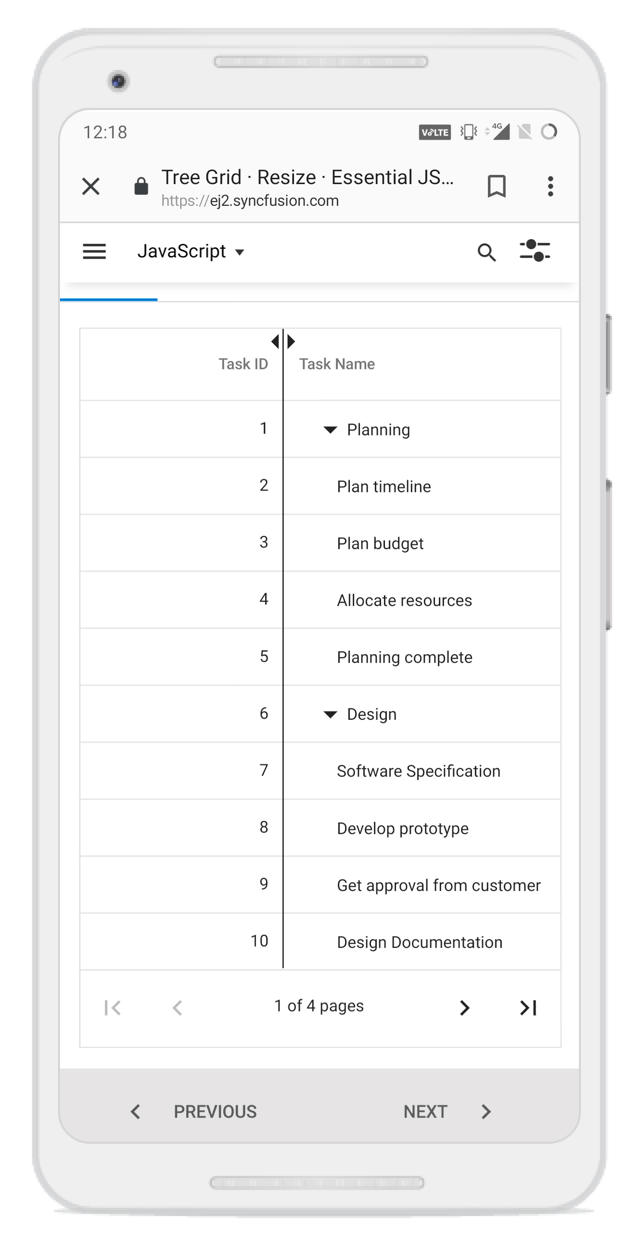
}Column resizing
Column width can be resized by clicking and dragging the right edge of the column header. While dragging, the width of the respective column will be resized immediately. Each column can be auto resized by double-clicking the right edge of the column header to fit the width of that column based on the widest cell content. To enable column resize, set the AllowResizing property to true.
@using Syncfusion.EJ2.Grids

@(Html.EJS().TreeGrid("Resize").AllowResizing()
            .DataSource((IEnumerable<object>)ViewBag.datasource)
            .Columns(col =>
             {
               col.Field("TaskId").HeaderText("Task ID").Width(90).TextAlign(TextAlign.Right).Add();
               col.Field("TaskName").HeaderText("Task Name").Width(180).Add();
               col.Field("Duration").HeaderText("Duration").Width(90).TextAlign(TextAlign.Right).Add();
               col.Field("Progress").HeaderText("Progress").Width(80).TextAlign(TextAlign.Right).Add();

             }).Height(315).ChildMapping("Children").TreeColumnIndex(1).Render()
)
public ActionResult Resize()
{
var treeData = TreeGridItems.GetTreeData();
ViewBag.datasource = treeData;
return View();
}You can disable resizing for a particular column by setting the
AllowResizingproperty ofColumnto false.
In RTL mode, you can click and drag the left edge of the header cell to resize the column.
Min and max width
Column resize can be restricted between minimum and maximum width by defining the MinWidth and MaxWidth in Column API.
In the following sample, minimum and maximum width are defined for Duration, and Task Name columns.
@using Syncfusion.EJ2.Grids

@(Html.EJS().TreeGrid("Minmax").AllowResizing()
            .DataSource((IEnumerable<object>)ViewBag.datasource)
            .Columns(col =>
             {
               col.Field("TaskId").HeaderText("Task ID").Width(90).TextAlign(TextAlign.Right).Add();
               col.Field("TaskName").HeaderText("Task Name").Width(180).MinWidth(170).MaxWidth(250).Add();
               col.Field("Duration").HeaderText("Duration").Width(80).MinWidth(50).MaxWidth(150).TextAlign(TextAlign.Right).Add();
               col.Field("Progress").HeaderText("Progress").Width(80).TextAlign(TextAlign.Right).Add();

             }).Height(315).ChildMapping("Children").TreeColumnIndex(1).Render()
)
public ActionResult Minmax()
{
var treeData = TreeGridItems.GetTreeData();
ViewBag.datasource = treeData;
return View();
}Resize Stacked Column
Stacked columns can be resized by clicking and dragging the right edge of the stacked column header. While dragging, the width of the respective child columns will be resized at the same time. You can disable resize for particular stacked column by setting AllowResizing as false to its columns.
@(Html.EJS().TreeGrid("StackedResize").AllowResizing().DataSource((IEnumerable<object>)ViewBag.datasource)
            .Columns(col =>
             {
               col.HeaderText("Order Details").Columns(
                   new List<Syncfusion.EJ2.TreeGrid.TreeGridColumn>() {
                       new Syncfusion.EJ2.TreeGrid.TreeGridColumn { Field = "ID", Width = "90",
                       HeaderText = "Order ID",
                       TextAlign =Syncfusion.EJ2.Grids.TextAlign.Right
                   },
                   new Syncfusion.EJ2.TreeGrid.TreeGridColumn { Field = "Name", Width = "170",
                       HeaderText = "Order Name"
                   },
               }).Add();
               col.HeaderText("Shipment Details").Columns(
                   new List<Syncfusion.EJ2.TreeGrid.TreeGridColumn>() {
                       new Syncfusion.EJ2.TreeGrid.TreeGridColumn { Field = "ShipmentCategory", Width = "90",
                       HeaderText = "Category"
                   },
                   new Syncfusion.EJ2.TreeGrid.TreeGridColumn { Field = "ShippedDate", Width = "90",
                       HeaderText = "Shipped Date", TextAlign=Syncfusion.EJ2.Grids.TextAlign.Right,
                       Format = "yMd"
                   }
               }).Add();

             }).Height(260).ChildMapping("Children").TreeColumnIndex(1).Render()
)
public ActionResult StackedResize()
{
var treeData = ShipmentData.GetShipmentData();
ViewBag.datasource = treeData;
return View();
}Touch interaction
When the right edge of the header cell is tapped, a floating handler will be visible over the right border of the column. To resize the column, tap and drag the floating handler as needed.
The following screenshot represents the column resizing in touch device.
Column template
The column Template has options to display custom element instead of a field value in the column.
@using Syncfusion.EJ2.Grids

@(Html.EJS().TreeGrid("ColumnTemplate").DataSource((IEnumerable<object>)ViewBag.datasource)
            .Columns(col =>
             {
               col.Field("EmployeeID").HeaderText("Employee ID").Width(95).Add();
               col.Field("Name").HeaderText("Name").Width(110).Add();
               col.Field("DOB").HeaderText("DOB").Format("yMd").TextAlign(TextAlign.Right).Width(90).Add();
               col.HeaderText("Year GR").Template("#columnTemplate3").Width(120).TextAlign(TextAlign.Center).Add();

             }).Height(260).Width("auto").ChildMapping("Children").RowHeight(83).RowDataBound("rowDataBound")
               .TreeColumnIndex(0).Render()
)

<script type="text/x-template" id="columnTemplate3">
    <div id="spkwl${EmployeeID}"></div>
</script>

<script>

    var columnData = [
        [0, 6, -4, 1, -3, 2, 5],
        [5, -4, 6, 3, -1, 2, 0],
        [6, 4, 0, 3, -2, 5, 1],
        [4, -6, 3, 0, 1, -2, 5],
        [3, 5, -6, -4, 0, 1, 2],
        [1, -3, 4, -2, 5, 0, 6],
        [2, 4, 0, -3, 5, -6, 1],
        [5, 4, -6, 3, 1, -2, 0],
        [0, -6, 4, 1, -3, 2, 5],
        [6, 4, 0, -3, 2, -5, 1],
        [4, 6, -3, 0, 1, 2, 5],
        [3, -5, -6, 4, 0, 1, 2],
        [1, 3, -4, -2, 5, 0, 6],
        [2, -4, 0, -3, 5, 6, 1],
        [5, 4, -6, 3, 1, -2, 0],
        [0, 6, 4, -1, -3, 2, 5],
        [6, -4, 0, -3, 2, 5, 1],
        [4, 6, -3, 0, -1, 2, 5],
        [6, 4, 0, -3, 2, -5, 1],
        [3, 5, 6, -4, 0, 1, 2],
        [1, 3, -4, 2, -5, 0, 6]
    ];

    function rowDataBound(args) {

        var winloss = new ej.charts.Sparkline({
            height: '50px',
            width: '150px',
            type: 'WinLoss',
            valueType: 'Numeric',
            fill: '#3C78EF',
            tiePointColor: 'darkgray',
            negativePointColor: '#f7a816',
            dataSource: columnData[args.data.EmployeeID]
        });
        winloss.appendTo(args.row.querySelector('#spkwl' + args.data.EmployeeID));
    }

</script>
public ActionResult ColumnTemplate()
{
var treeData = TreeGridItems.GetTemplateData();
ViewBag.datasource = treeData;
return View();
}TreeGrid actions such as editing, filtering and sorting etc. will depend upon the column
Field. If theFieldis not specified in the template column, the treegrid actions cannot be performed.
Using condition template
You can render the template elements based on condition.
In the following code, checkbox is rendered based on Approved field value.
  <script id="template" type="text/x-template">
            <div class="template_checkbox">
                ${if(approved)}
                <input type="checkbox" checked> ${else}
                <input type="checkbox"> ${/if}
            </div>
</script>@using Syncfusion.EJ2.Grids
@(Html.EJS().TreeGrid("Condition").AllowResizing()
.DataSource((IEnumerable<object>)ViewBag.datasource)
.Columns(col =>
{
col.Field("TaskId").HeaderText("Task ID").Width(90).TextAlign(TextAlign.Right).Add();
col.Field("TaskName").HeaderText("Task Name").Width(180).Add();
col.HeaderText("Approved").Template("#template").TextAlign(TextAlign.Center).Width(120).Add();
col.Field("Progress").HeaderText("Progress").Width(80).TextAlign(TextAlign.Right).Add();
}).Height(315).ChildMapping("Children").TreeColumnIndex(1).Render()
)
<script id="template" type="text/x-template">
<div class="template_checkbox">
${if(Approved)}
<input type="checkbox" checked> ${else}
<input type="checkbox"> ${/if}
</div>
</script>public ActionResult Condition()
{
var treeData = TreeGridItems.GetTreeData();
ViewBag.datasource = treeData;
return View();
}Column type
Column type can be specified using the Type property in Column. It specifies the type of data the column binds.
If the Format is defined for a column, the column uses Type to select the appropriate format option (number
or date).
TreeGrid column supports the following types:
- string
- number
- boolean
- date
- datetime
If the
Typeis not defined, it will be determined from the first record of theDataSource.
Column Chooser
The column chooser has options to show or hide columns dynamically. It can be enabled by defining the ShowColumnChooser as true.
@(Html.EJS().TreeGrid("ColumnChooser").ShowColumnChooser(true).PageSettings(p => p.PageSize(10))
      .DataSource((IEnumerable<object>)ViewBag.datasource)
      .Columns(col =>
       {
         col.Field("TaskId").HeaderText("Task ID").Width(90).TextAlign(TextAlign.Right).Add();
         col.Field("TaskName").HeaderText("Task Name").Width(180).ShowInColumnChooser(false).Add();
         col.Field("StartDate").HeaderText("Start Date").Format("yMd").TextAlign(TextAlign.Right).Width(90).Add();
         col.Field("Duration").HeaderText("Duration").Width(80).Add();

       }).Height(315).ChildMapping("Children").TreeColumnIndex(1).AllowPaging().Toolbar(new List<string>() { "ColumnChooser" })Render()
)
public ActionResult ColumnChooser()
{
var treeData = TreeGridItems.GetTreeData();
ViewBag.datasource = treeData;
return View();
}You can hide the column names in column chooser by defining the
ShowInColumnChooseras false.
Open column chooser by external button
The Column chooser can be displayed on a page through external button by invoking the openColumnChooser method with X and Y axis positions.
@Html.EJS().Button("opencolumnchooser").Content("Open Column Chooser").IsPrimary(true).Render()

@(Html.EJS().TreeGrid("ColumnChooserTreeGrid").
      .ShowColumnChooser()
      .PageSettings(p => p.PageSize(10))
      .DataSource((IEnumerable<object>)ViewBag.datasource)
      .Columns(col =>
       {
         col.Field("TaskId").HeaderText("Task ID").Width(90).TextAlign(TextAlign.Right).Add();
         col.Field("TaskName").HeaderText("Task Name").Width(180).ShowInColumnChooser(false).Add();
         col.Field("StartDate").HeaderText("Start Date").Format("yMd").TextAlign(TextAlign.Right).Width(90).Add();
         col.Field("Duration").HeaderText("Duration").Width(80).Add();

       }).Height(315).ChildMapping("Children").TreeColumnIndex(1).AllowPaging().Render()
)
<script>
    document.getElementById('opencolumnchooser').addEventListener("click", () => {
        var treeGrid = document.getElementById('ColumnChooserTreeGrid').ej2_instances[0];
       treeGrid.columnChooserModule.openColumnChooser(200, 50); // give X and Y axis
    });
</script>
public ActionResult ColumnChooserbutton()
{
var treeData = TreeGridItems.GetTreeData();
ViewBag.datasource = treeData;
return View();
}Column menu
The column menu has options to integrate features like sorting, filtering, and autofit. It will show a menu with the integrated feature when users click on multiple icon of the column. To enable column menu, you need to define the ShowColumnMenu property as true.
The default items are displayed in following table.
| Item | Description |
|---|---|
SortAscending |
Sort the current column in ascending order. |
SortDescending |
Sort the current column in descending order. |
AutoFit |
Auto fit the current column. |
AutoFitAll |
Auto fit all columns. |
Filter |
Show the filter option as given in filterSettings.type
|
@using Syncfusion.EJ2.Grids

@(Html.EJS().TreeGrid("ColumnMenu").AllowFiltering().AllowSorting().AllowResizing()
      .ShowColumnMenu()
      .PageSettings(p => p.PageSize(10))
      .FilterSettings(f => f.Type(Syncfusion.EJ2.TreeGrid.FilterType.Menu))
      .DataSource((IEnumerable<object>)ViewBag.datasource)
      .Columns(col =>
       {
         col.Field("TaskId").HeaderText("Task ID").Width(90).TextAlign(TextAlign.Right).Add();
         col.Field("TaskName").HeaderText("Task Name").Width(180).Add();
         col.Field("StartDate").HeaderText("Start Date").Format("yMd").TextAlign(TextAlign.Right).Width(90).Add();
         col.Field("Duration").HeaderText("Duration").Width(80).Add();

       }).Height(315).ChildMapping("Children").TreeColumnIndex(1).Render()
)
public ActionResult ColumnMenu()
{
var treeData = TreeGridItems.GetTreeData();
ViewBag.datasource = treeData;
return View();
}You can disable column menu for a particular column by defining the
ShowColumnMenuinColumnas false.
Checkbox Column
To render checkboxes in existing column, you need to set ShowCheckbox property as true.
It is also possible to select the rows hierarchically using checkboxes in TreeGrid by enabling AutoCheckHierarchy property. When we check on any parent record checkbox then the child record checkboxes will get checked.
@using Syncfusion.EJ2.Grids

@(Html.EJS().TreeGrid("CheckboxSelection")
            .Height(400)
            .DataSource((IEnumerable<object>)ViewBag.datasource)
            .AutoCheckHierarchy(true)
            .Columns(col =>
            {
                col.Field("TaskId").HeaderText("Task ID").Width(110).TextAlign(TextAlign.Right).Add();
                col.Field("TaskName").HeaderText("Task Name").ShowCheckbox(true).Width(210).Add();
                col.Field("StartDate").HeaderText("Start Date").TextAlign(TextAlign.Right).Format("yMd").Width(210).Add();
                col.Field("Duration").HeaderText("Duration").TextAlign(TextAlign.Right).Width(190).Add();
            })
            .ChildMapping("Children").TreeColumnIndex(1).Render()
)
public IActionResult Index()
{
var tree = TreeData.GetDefaultData();
ViewBag.datasource = tree;
return View();
}Responsive columns
You can toggle column visibility based on media queries which are defined at the HideAtMedia.
The HideAtMedia accepts valid
Media Queries.
@using Syncfusion.EJ2.Grids

@(Html.EJS().TreeGrid("ResponsiveColumns")
      .DataSource((IEnumerable<object>)ViewBag.datasource)
      .Columns(col =>
       {
         col.Field("TaskID").HeaderText("Task ID").Width(90).HideAtMedia("max-width: 700px").TextAlign(TextAlign.Right).Add();
         col.Field("TaskName").HeaderText("Task Name").Width(180).Add();
         col.Field("StartDate").HeaderText("Start Date").Format("yMd").TextAlign(TextAlign.Right).Width(120).Add();
         col.Field("Duration").HeaderText("Duration").HideAtMedia("max-width: 500px").Width(80).TextAlign(TextAlign.Right).Add();

       }).Height(315).ChildMapping("Children").TreeColumnIndex(1).Render()
)
public ActionResult ResponsiveColumns()
{
var treeData = TreeGridItems.GetTreeData();
ViewBag.datasource = treeData;
return View();
}Controlling TreeGrid actions
You can enable or disable treegrid action for a particular column by setting the AllowFiltering, and AllowSorting properties in Column.
@using Syncfusion.EJ2.Grids

@(Html.EJS().TreeGrid("GridAction").AllowFiltering().AllowSorting()
      .DataSource((IEnumerable<object>)ViewBag.datasource)
      .Columns(col =>
       {
         col.Field("TaskId").HeaderText("Task ID").Width(90).AllowSorting(false).TextAlign(TextAlign.Right).Add();
         col.Field("TaskName").HeaderText("Task Name").Width(180).Add();
         col.Field("StartDate").HeaderText("Start Date").Format("yMd").AllowFiltering(false).TextAlign(TextAlign.Right).Width(90).Add();
         col.Field("Duration").HeaderText("Duration").Width(80).Add();

       }).Height(270).ChildMapping("Children").TreeColumnIndex(1).Render()
)
public ActionResult GridAction()
{
var treeData = TreeGridItems.GetTreeData();
ViewBag.datasource = treeData;
return View();
}Show/hide columns by external button
You can show or hide treegrid columns dynamically using external buttons by invoking the showColumns or hideColumns method.
@using Syncfusion.EJ2.Grids

@Html.EJS().Button("button1").Content("SHOW").Render()

@Html.EJS().Button("button2").Content("HIDE").Render()

@(Html.EJS().TreeGrid("ShowHide").DataSource((IEnumerable<object>)ViewBag.datasource)
            .Columns(col =>
             {
               col.Field("TaskId").HeaderText("Task ID").Width(90).TextAlign(TextAlign.Right).Add();
               col.Field("TaskName").HeaderText("Task Name").Width(180).Add();
               col.Field("StartDate").HeaderText("Start Date").Format("yMd").TextAlign(TextAlign.Right).Width(120).Add();
               col.Field("Duration").HeaderText("Duration").Width(80).TextAlign(TextAlign.Right).Add();

             }).Height(270).ChildMapping("Children").TreeColumnIndex(1).Render()
)

<script>
    document.getElementById("button1").addEventListener('click', () => {
        var treegrid = document.getElementById("ShowHide").ej2_instances[0];
        treegrid.showColumns(['Task ID', 'Duration']); //show by HeaderText
    });
    document.getElementById("button2").addEventListener('click', () => {
        var treegrid = document.getElementById("ShowHide").ej2_instances[0];
        treegrid.hideColumns(['Task ID', 'Duration']); //hide by HeaderText
    });
</script>
public ActionResult ShowHide()
{
var treeData = TreeGridItems.GetTreeData();
ViewBag.datasource = treeData;
return View();
}Complex data binding
You can achieve complex data binding in the treegrid by using the dot(.) operator in the Field in Column.
@using Syncfusion.EJ2.Grids

@(Html.EJS().TreeGrid("ComplexBinding").DataSource((IEnumerable<object>)ViewBag.datasource)
            .Columns(col =>
             {
               col.Field("taskID").HeaderText("Task ID").Width(90).TextAlign(TextAlign.Right).Add();
               col.Field("taskName").HeaderText("Task Name").Width(180).Add();
               col.Field("assignee.firstname").HeaderText("Duration").Width(90).TextAlign(TextAlign.Right).Add();
               col.Field("duration").HeaderText("Duration").Width(80).TextAlign(TextAlign.Right).Add();

             }).Height(315).ChildMapping("Children").TreeColumnIndex(1).Render()
)
public ActionResult ComplexBinding()
{
var treeData = TreeGridItems.GetTreeData();
ViewBag.datasource = treeData;
return View();
}ValueAccessor
The ValueAccessor is used to access/manipulate the value of display data. You can achieve custom value formatting by using the ValueAccessor.
@using Syncfusion.EJ2.Grids

@(Html.EJS().TreeGrid("Value").DataSource((IEnumerable<object>)ViewBag.datasource)
      .Columns(col =>
      {
          col.Field("orderID").HeaderText("Order ID").Width(90).TextAlign(TextAlign.Right).Add();
          col.Field("orderName").HeaderText("Order Name").Width(180).ValueAccessor("orderFormatter").Add();
          col.Field("orderDate").HeaderText("Order Date").Format("yMd").TextAlign(TextAlign.Right).Width(90).Add();
          col.Field("price").HeaderText("Price").ValueAccessor("currencyFormatter").TextAlign(TextAlign.Right).Width(80).Add();

      }).Height(315).ChildMapping("subTasks").TreeColumnIndex(1).Render()
)

<script>
    function currencyFormatter(field, data, column) {
        return '€' + data['price'];
    }

    function orderFormatter(field, data, column) {
        return data[field] + '-' + data['category'];
    }
</script>
public ActionResult Value()
{
var treeData = TreeGridItems.GetTreeData();
ViewBag.datasource = treeData;
return View();
}Display array type columns
You can bind an array of objects in a column by using the ValueAccessor property.
In this example, the name field has an array of two objects, FirstName and LastName. These two objects are joined and bound to a column using the
ValueAccessor.
@using Syncfusion.EJ2.Grids

@(Html.EJS().TreeGrid("ValueArray").DataSource((IEnumerable<object>)ViewBag.datasource)
      .Columns(col =>
       {
         col.Field("TaskId").HeaderText("Task ID").Width(90).TextAlign(TextAlign.Right).Add();
         col.Field("TaskName").HeaderText("Task Name").Width(180).Add();
         col.Field("name").HeaderText("Assignee").Width(90).ValueAccessor("orderFormatter").TextAlign(TextAlign.Right).Add();
         col.Field("Duration").HeaderText("Duration").Width(80).TextAlign(TextAlign.Right).Add();

       }).Height(315).ChildMapping("Children").TreeColumnIndex(1).Render()
)

<script>
    function orderFormatter(field, data, column) {
        return data[field].map(function (s) {
            return s.lastName || s.firstName
        }).join(' ');
    }
</script>
public ActionResult ValueArray()
{
var treeData = TreeGridItems.GetTreeData();
ViewBag.datasource = treeData;
return View();
}Expression column
You can achieve the expression column by using the ValueAccessor property.
@using Syncfusion.EJ2.Grids

@(Html.EJS().TreeGrid("Expression").DataSource((IEnumerable<object>)ViewBag.datasource)
      .Columns(col =>
       {
         col.Field("orderID").HeaderText("Order ID").Width(90).TextAlign(TextAlign.Right).Add();
         col.Field("orderName").HeaderText("Order Name").Width(180).Add();
         col.Field("units").HeaderText("Units").TextAlign(TextAlign.Right).Width(90).Add();
         col.Field("unitPrice").HeaderText("Unit Price").TextAlign(TextAlign.Right).Width(80).Format("c2").Add();
         col.Field("price").HeaderText("Price").TextAlign(TextAlign.Right).ValueAccessor("totalPrice").Width(80).Format("c2").Add();

       }).Height(315).ChildMapping("subTasks").TreeColumnIndex(1).Render()
)

<script>
    function totalPrice(field, data, column) {
        return data.units * data.unitPrice;
    };
</script>
public ActionResult Expression()
{
var treeData = TreeGridItems.GetTreeData();
ViewBag.datasource = treeData;
return View();
}How to render boolean values as checkbox
To render boolean values as checkbox in columns, you need to set DisplayAsCheckBox property as true.
@using Syncfusion.EJ2.Grids

@(Html.EJS().TreeGrid("DisplayAsCheckbox").DataSource((IEnumerable<object>)ViewBag.datasource)
      .Columns(col =>
       {
         col.Field("TaskId").HeaderText("Task ID").Width(90).TextAlign(TextAlign.Right).Add();
         col.Field("TaskName").HeaderText("Task Name").Width(180).Add();
         col.Field("Approved").HeaderText("Approved").DisplayAsCheckBox(true).Width("90").Add();
         col.Field("Duration").HeaderText("Duration").Width(80).Add();

       }).Height(315).ChildMapping("Children").TreeColumnIndex(1).Render()
)
public ActionResult DisplayAsCheckbox()
{
var treeData = TreeGridItems.GetTreeData();
ViewBag.datasource = treeData;
return View();
}You can refer to our
ASP.NET MVC Tree Gridfeature tour page for its groundbreaking feature representations. You can also explore ourASP.NET MVC Tree Grid exampleto knows how to present and manipulate data.