Customization in Tooltip Control
26 Oct 20224 minutes to read
The Tooltip can be customized by using the cssClass property, which accepts custom CSS class names that define specific user-defined styles and themes to be applied on the Tooltip element.
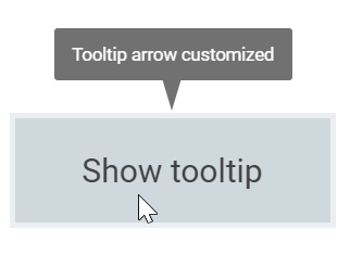
Tip pointer customization
Styling the tip pointer’s size, background, and border color’s can be done using the cssClass property, as given below.
@using Syncfusion.EJ2
@using Syncfusion.EJ2.Popups

@Html.EJS().Tooltip("tooltip")
    .Position(Syncfusion.EJ2.Popups.Position.TopCenter)
    .CssClass("customtip")
    .Content("Tooltip arrow customized")
    .ContentTemplate(@<div id="target">Show tooltip</div>)
    .Render()

<style>
    #target {
        background-color: #ececec;
        border: 1px solid #c8c8c8;
        box-sizing: border-box;
        margin: 70px auto;
        padding: 20px;
        width: 200px;
    }

    /* csslint ignore:start */

    .customtip.e-tooltip-wrap {
        padding: 4px;
    }

    .customtip.e-tooltip-wrap .e-arrow-tip {
        width: 12px;
    }

    .customtip.e-tooltip-wrap .e-arrow-tip.e-tip-bottom,
    .customtip.e-tooltip-wrap .e-arrow-tip.e-tip-top {
        height: 20px;
    }

    .customtip.e-tooltip-wrap .e-arrow-tip.e-tip-left,
    .customtip.e-tooltip-wrap .e-arrow-tip.e-tip-right {
        height: 12px;
        width: 20px;
    }

    .customtip.e-tooltip-wrap .e-arrow-tip-outer.e-tip-bottom,
    .customtip.e-tooltip-wrap .e-arrow-tip-outer.e-tip-top {
        border-left: 6px solid transparent;
        border-right: 6px solid transparent;
    }

    .customtip.e-tooltip-wrap .e-arrow-tip-outer.e-tip-bottom {
        border-top: 20px solid #616161;
    }

    .customtip.e-tooltip-wrap .e-arrow-tip-outer.e-tip-top {
        border-bottom: 20px solid #616161;
    }

    .customtip.e-tooltip-wrap .e-arrow-tip-outer.e-tip-left,
    .customtip.e-tooltip-wrap .e-arrow-tip-outer.e-tip-right {
        border-bottom: 6px solid transparent;
        border-top: 6px solid transparent;
    }

    .customtip.e-tooltip-wrap .e-arrow-tip-outer.e-tip-left {
        border-right: 20px solid #616161;
    }

    .customtip.e-tooltip-wrap .e-arrow-tip-outer.e-tip-right {
        border-left: 20px solid #616161;
    }
</style>
public ActionResult TooltipPointer()
{
return View();
}Output be like the below.
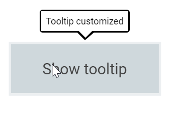
Tooltip customization
The complete look and feel of the Tooltip can be customized by changing it’s background color, opacity, content font, etc. The following code example shows the way to achieve it.
@using Syncfusion.EJ2
@using Syncfusion.EJ2.Popups

@Html.EJS().Tooltip("target")
    .CssClass("customtooltip")
    .Content("Tooltip customized")
    .ContentTemplate(@<text> Show tooltip </text>)
    .Render()

<style>
#target {
    background-color: #cfd8dc;
    border: 3px solid #eceff1;
    box-sizing: border-box;
    margin: 80px auto;
    padding: 20px 0;
    width: 200px;
    text-align: center;
    color: #424242;
    font-size: 20px;
    user-select: none;
  }

  /* Custom Tooltip Styles Start */
  .customtooltip.e-tooltip-wrap {
    border-radius: 4px;
    opacity: 1;
    background-color: #fff;
    border: 2px solid #000;
  }

  .customtooltip.e-tooltip-wrap .e-tip-content {
    line-height: 20px;
    color: #000;
    font-size: 12px;
  }

  .customtooltip.e-tooltip-wrap .e-arrow-tip.e-tip-bottom,
  .customtooltip.e-tooltip-wrap .e-arrow-tip.e-tip-top {
    height: 12px;
    width: 24px;
    left: 50%;
  }

  .customtooltip.e-tooltip-wrap .e-arrow-tip-outer.e-tip-bottom {
    border-left: 12px solid transparent;
    border-right: 14px solid transparent;
    border-top: 12px solid #000;
  }

  .customtooltip.e-tooltip-wrap .e-arrow-tip-outer.e-tip-right {
    border-bottom: 12px solid transparent;
    border-left: 12px solid #000;
    border-top: 12px solid transparent;
  }

  .customtooltip.e-tooltip-wrap .e-arrow-tip-inner.e-tip-bottom {
    color: #fff;
    font-size: 25.9px;
  }

</style>
public ActionResult TooltipView()
{
return View();
}Output be like the below.