Responsive Mode in ASP.NET MVC Toolbar
26 Aug 202616 minutes to read
This section explains the supported display modes of the Toolbar when the content exceeds the viewing area. Possible modes are:
- Scrollable
- Popup
Scrollable
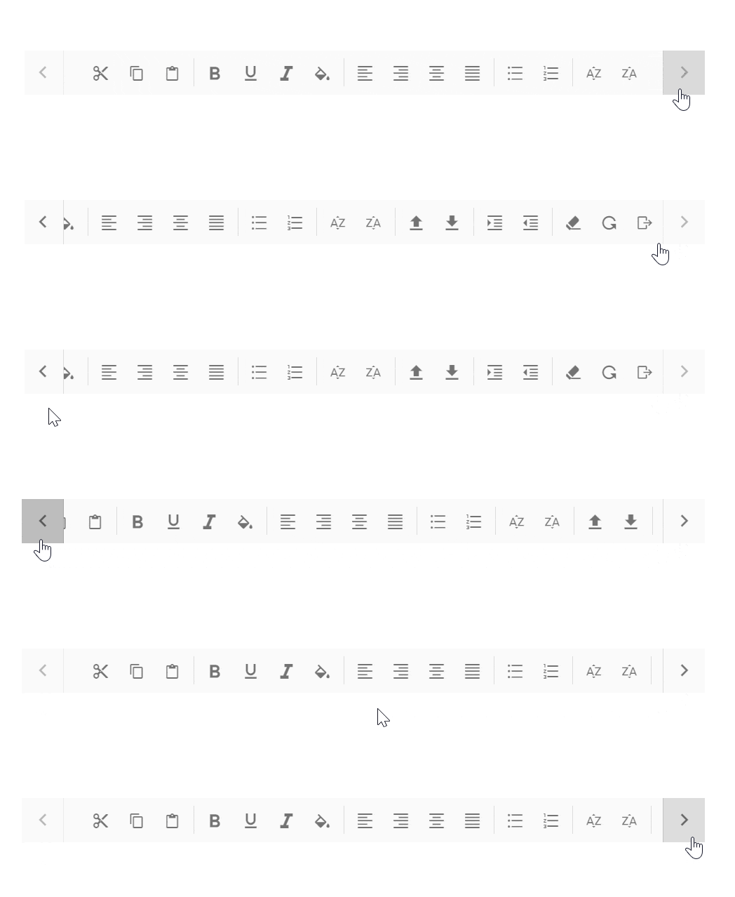
The default overflow mode of the Toolbar is Scrollable. Scrollable display mode supports display of commands in a single line with horizontal scrolling enabled when commands overflow to available space.
- The right and left navigation arrows are added to the start and end of the Toolbar to navigate to hidden commands.
- You can also see the hidden commands using touch swipe action.
- By default, if the left navigation icon is disabled, you can see the hidden commands by moving to the
right. - By clicking or continuously holding the navigation arrow, hidden commands will become visible.
- If device navigation arrows are not available, swipe to view the hidden commands of the Toolbar.

- Once the Toolbar reaches the last or first command, the corresponding navigation icon will be disabled and you can move to the opposite direction.
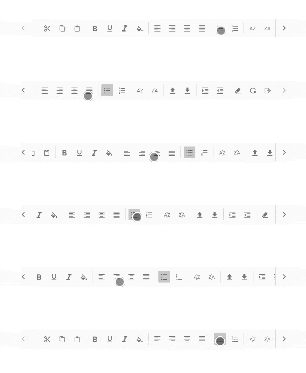
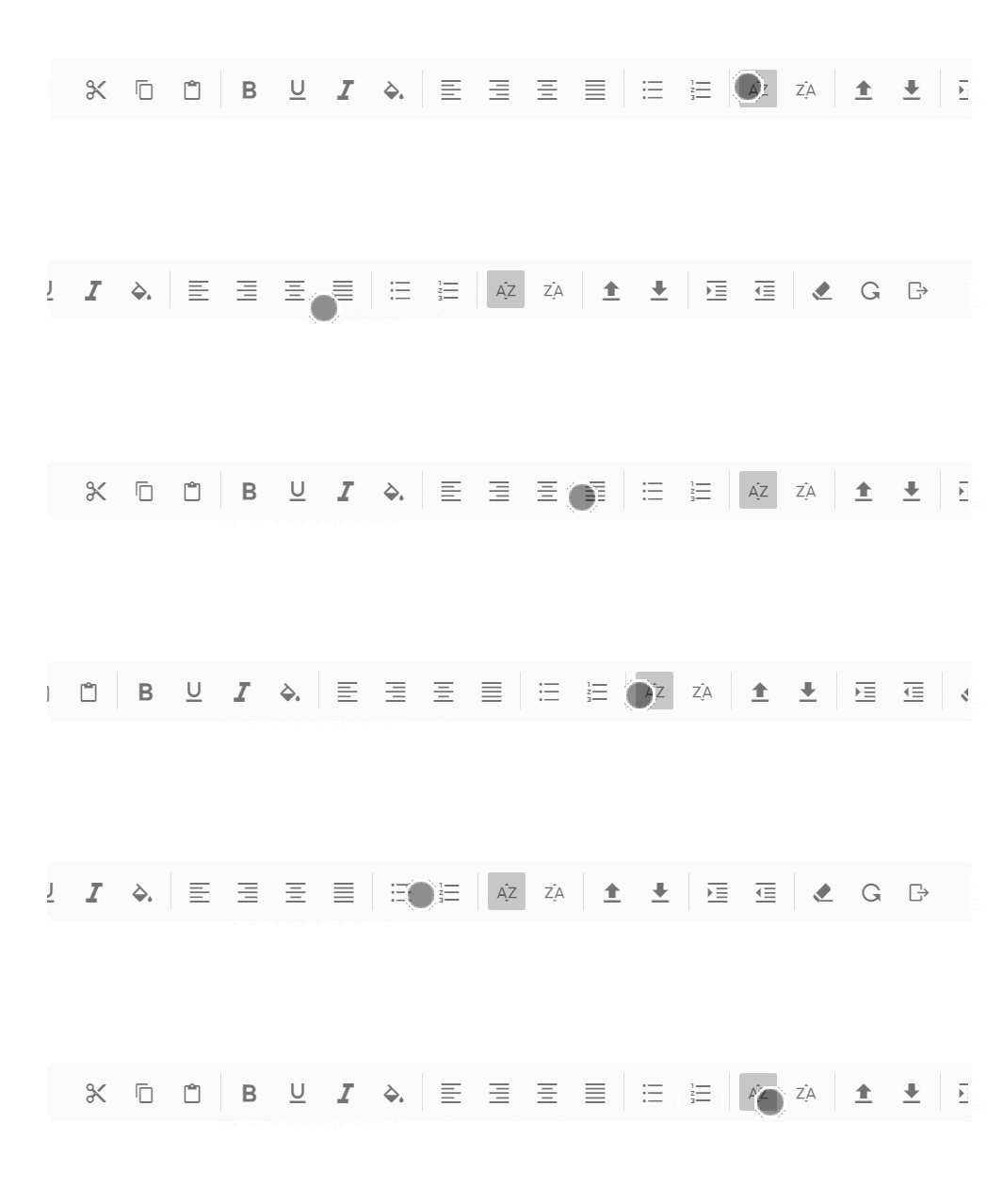
- You can continuously scroll the Toolbar content by holding the navigation icon.
@using Syncfusion.EJ2.Navigations;

@(Html.EJS().Toolbar("defaultToolbar")
    .Items(new List<ToolbarItem> {
        new ToolbarItem { Type = ItemType.Button, PrefixIcon = "e-cut-icon", Text = "Cut" },
        new ToolbarItem { Type = ItemType.Button, PrefixIcon = "e-copy-icon", Text = "Copy" },
        new ToolbarItem { Type = ItemType.Button, PrefixIcon = "e-paste-icon", Text = "Paste" },
        new ToolbarItem { Type = ItemType.Separator },
        new ToolbarItem { Type = ItemType.Button, PrefixIcon = "e-bold-icon", Text = "Bold" },
        new ToolbarItem { Type = ItemType.Button, PrefixIcon = "e-underline-icon", Text = "Underline" },
        new ToolbarItem { Type = ItemType.Button, PrefixIcon = "e-italic-icon", Text = "Italic" },
        new ToolbarItem { Type = ItemType.Button, PrefixIcon = "e-color-icon", Text = "Color-Picker" },
        new ToolbarItem { Type = ItemType.Separator },
        new ToolbarItem { Type = ItemType.Button, PrefixIcon = "e-ascending-icon", Text = "A-Z Sort" },
        new ToolbarItem { Type = ItemType.Button, PrefixIcon = "e-descending-icon", Text = "Z-A Sort" },
        new ToolbarItem { Type = ItemType.Button, PrefixIcon = "e-clear-icon", Text = "Clear" },
    })
    .Width("600")
    .Render()
)

<style>
    /* Toolbar Styles */
    .e-cut-icon:before {
        content: "\e604"
    }

    .e-copy-icon:before {
        content: "\e70a"
    }

    .e-paste-icon:before {
        content: "\e712"
    }

    .e-color-icon:before {
        content: "\e703";
    }

    .e-bold-icon:before {
        content: "\e339"
    }

    .e-underline-icon:before {
        content: "\e706";
    }

    .e-alignleft-icon:before {
        content: "\e717"
    }

    .e-alignright-icon:before {
        content: "\e715"
    }

    .e-aligncenter-icon:before {
        content: "\e704"
    }

    .e-alignjustify-icon:before {
        content: "\e71b"
    }

    .e-upload-icon:before {
        content: "\e71e"
    }

    .e-download-icon:before {
        content: "\e70a"
    }

    .e-indent-icon:before {
        content: "\e70b"
    }

    .e-outdent-icon:before {
        content: "\e700"
    }

    .e-clear-icon:before {
        content: "\e70d"
    }

    .e-reload-icon:before {
        content: "\e71c"
    }

    .e-export-icon:before {
        content: "\e720";
    }

    .e-italic-icon:before {
        content: "\e710"
    }

    .e-bullets-icon:before {
        content: "\e711";
    }

    .e-numbering-icon:before {
        content: "\e70e";
    }

    .e-ascending-icon:before {
        content: "\e70f";
    }

    .e-descending-icon:before {
        content: "\e707";
    }
</style>
public ActionResult Index()
{
return View();
}Popup
Popup is another type of OverflowMode in which the Toolbar container holds the commands that can be placed in the available space. The rest of the overflowing commands that do not fit within the viewing area moves to the overflow popup container.
The commands placed in the popup can be viewed by opening the popup using the drop down icon given at the end of the Toolbar.
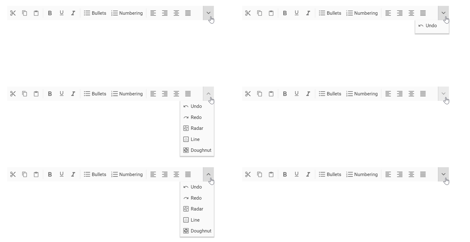
If the popup content overflows the height of the page, then the rest of the commands will be hidden.
Priority of commands
Default popup priority is set as none, and when the commands of the Toolbar overflow, the ones listed last will be moved to the popup.
You can customize the priority of commands to be displayed on the Toolbar and popup by using the Overflow property on individual toolbar items. Set the Overflow property to control whether each command appears on the Toolbar first or in the popup:
| Property | Description |
|---|---|
show |
Always shows items on the Toolbar with primary priority. |
hide |
Always shows items in the popup with secondary priority. |
none |
No priority display, commands are moved to the popup in normal order when content exceeds viewing area. |
If primary priority commands also exceed available space, they are moved to the popup container at the top and placed before the secondary priority commands.
You can maintain a toolbar item in the popup always by using the ShowAlwaysInPopup property, and this behavior is not applicable for toolbar items with Overflow property as ‘show’.
@using Syncfusion.EJ2.Navigations;

@(Html.EJS().Toolbar("defaultToolbar")
    .Items(ViewBag.popItems)
    .Width("380")
    .OverflowMode(OverflowMode.Popup)
    .Render()
)

<style>
    /* Toolbar Styles */
    .e-cut-icon:before {
        content: "\e604"
    }

    .e-copy-icon:before {
        content: "\e70a"
    }

    .e-paste-icon:before {
        content: "\e712"
    }

    .e-color-icon:before {
        content: "\e703";
    }

    .e-bold-icon:before {
        content: "\e339"
    }

    .e-underline-icon:before {
        content: "\e706";
    }

    .e-alignleft-icon:before {
        content: "\e717"
    }

    .e-alignright-icon:before {
        content: "\e715"
    }

    .e-aligncenter-icon:before {
        content: "\e704"
    }

    .e-alignjustify-icon:before {
        content: "\e71b"
    }

    .e-upload-icon:before {
        content: "\e71e"
    }

    .e-download-icon:before {
        content: "\e70a"
    }

    .e-indent-icon:before {
        content: "\e70b"
    }

    .e-outdent-icon:before {
        content: "\e700"
    }

    .e-clear-icon:before {
        content: "\e70d"
    }

    .e-reload-icon:before {
        content: "\e71c"
    }

    .e-export-icon:before {
        content: "\e720";
    }

    .e-italic-icon:before {
        content: "\e710"
    }

    .e-bullets-icon:before {
        content: "\e711";
    }

    .e-numbering-icon:before {
        content: "\e70e";
    }

    .e-ascending-icon:before {
        content: "\e70f";
    }

    .e-descending-icon:before {
        content: "\e707";
    }
</style>
public ActionResult Index()
{
List<ToolbarItem> popItems = new List<ToolbarItem>();
popItems.Add(new ToolbarItem { PrefixIcon = "e-cut-icon", Text = "Cut", Overflow = OverflowOption.Show });
popItems.Add(new ToolbarItem { PrefixIcon = "e-copy-icon", Text = "Copy", Overflow = OverflowOption.Show });
popItems.Add(new ToolbarItem { PrefixIcon = "e-paste-icon", Text = "Paste", Overflow = OverflowOption.Show });
popItems.Add(new ToolbarItem { Type = ItemType.Separator });
popItems.Add(new ToolbarItem { PrefixIcon = "e-bold-icon", Text = "Bold", Overflow = OverflowOption.Show });
popItems.Add(new ToolbarItem { PrefixIcon = "e-underline-icon", Text = "Underline", Overflow = OverflowOption.Show });
popItems.Add(new ToolbarItem { PrefixIcon = "e-italic-icon", Text = "Italic", Overflow = OverflowOption.Show });
popItems.Add(new ToolbarItem { Type = ItemType.Separator });
popItems.Add(new ToolbarItem { PrefixIcon = "e-ascending-icon", Text = "A-Z Sort", Overflow = OverflowOption.Show });
popItems.Add(new ToolbarItem { PrefixIcon = "e-descending-icon", Text = "Z-A Sort", Overflow = OverflowOption.Show });
ViewBag.popItems = popItems;
return View();
}Text mode for buttons
The ShowTextOn property is used to decide button text display area on the Toolbar, popup, or both. This is useful for customization of both text and image representation of commands.
For example, you can show icon only button on the Toolbar, and in the popup container display more information about the commands with icon and text.
Possible values are,
| Property | Description |
|---|---|
Both |
Button text is visible in both Toolbar and Popup. |
Overflow |
Button text is visible only in the Popup. |
Toolbar |
Button text is visible only on the Toolbar. |
In the following code sample, text is visible only in the popup container and not on the Toolbar:
@using Syncfusion.EJ2.Navigations;

@(Html.EJS().Toolbar("defaultToolbar")
    .Items(ViewBag.popItems)
    .Width("330")
    .OverflowMode(OverflowMode.Popup)
    .Render()
)

<style>
    /* Toolbar Styles */
    .e-cut-icon:before {
        content: "\e604"
    }

    .e-copy-icon:before {
        content: "\e70a"
    }

    .e-paste-icon:before {
        content: "\e712"
    }

    .e-color-icon:before {
        content: "\e703";
    }

    .e-bold-icon:before {
        content: "\e339"
    }

    .e-underline-icon:before {
        content: "\e706";
    }

    .e-alignleft-icon:before {
        content: "\e717"
    }

    .e-alignright-icon:before {
        content: "\e715"
    }

    .e-aligncenter-icon:before {
        content: "\e704"
    }

    .e-alignjustify-icon:before {
        content: "\e71b"
    }

    .e-upload-icon:before {
        content: "\e71e"
    }

    .e-download-icon:before {
        content: "\e70a"
    }

    .e-indent-icon:before {
        content: "\e70b"
    }

    .e-outdent-icon:before {
        content: "\e700"
    }

    .e-clear-icon:before {
        content: "\e70d"
    }

    .e-reload-icon:before {
        content: "\e71c"
    }

    .e-export-icon:before {
        content: "\e720";
    }

    .e-italic-icon:before {
        content: "\e710"
    }

    .e-bullets-icon:before {
        content: "\e711";
    }

    .e-numbering-icon:before {
        content: "\e70e";
    }

    .e-ascending-icon:before {
        content: "\e70f";
    }

    .e-descending-icon:before {
        content: "\e707";
    }
</style>
public ActionResult Index()
{
List<ToolbarItem> popItems = new List<ToolbarItem>();
popItems.Add(new ToolbarItem { PrefixIcon = "e-cut-icon", Text = "Cut", ShowTextOn = DisplayMode.Overflow, Overflow = OverflowOption.Show });
popItems.Add(new ToolbarItem { PrefixIcon = "e-copy-icon", Text = "Copy", ShowTextOn = DisplayMode.Overflow, Overflow = OverflowOption.Show });
popItems.Add(new ToolbarItem { PrefixIcon = "e-paste-icon", Text = "Paste", ShowTextOn = DisplayMode.Overflow, Overflow = OverflowOption.Show });
popItems.Add(new ToolbarItem { Type = ItemType.Separator });
popItems.Add(new ToolbarItem { PrefixIcon = "e-bold-icon", Text = "Bold", ShowTextOn = DisplayMode.Overflow, Overflow = OverflowOption.Show });
popItems.Add(new ToolbarItem { PrefixIcon = "e-underline-icon", Text = "Underline", ShowTextOn = DisplayMode.Overflow, Overflow = OverflowOption.Show });
popItems.Add(new ToolbarItem { PrefixIcon = "e-italic-icon", Text = "Italic", ShowTextOn = DisplayMode.Overflow, Overflow = OverflowOption.Show });
popItems.Add(new ToolbarItem { PrefixIcon = "e-color-icon", Text = "Color-Picker", ShowTextOn = DisplayMode.Overflow, Overflow = OverflowOption.Show });
popItems.Add(new ToolbarItem { Type = ItemType.Separator });
popItems.Add(new ToolbarItem { PrefixIcon = "e-ascending-icon", Text = "A-Z Sort", ShowTextOn = DisplayMode.Overflow, Overflow = OverflowOption.Show });
popItems.Add(new ToolbarItem { PrefixIcon = "e-descending-icon", Text = "Z-A Sort", ShowTextOn = DisplayMode.Overflow, Overflow = OverflowOption.Show });
popItems.Add(new ToolbarItem { PrefixIcon = "e-clear-icon", Text = "Clear", ShowTextOn = DisplayMode.Overflow, Overflow = OverflowOption.Show });
ViewBag.popItems = popItems;
return View();
}