Adornments in ASP.NET MVC TextBox control
22 Dec 20256 minutes to read
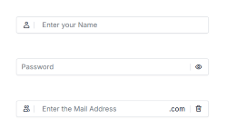
Adornments allow you to add custom elements before or after the TextBox using prependTemplate and appendTemplate. These elements can include icons, text labels, or action buttons to improve usability and provide visual context.
Overview
Adornments are useful for:
- Visual Context: Adding icons that indicate the expected input type (e.g., user icon for username, envelope icon for email)
- Functional Enhancement: Including action buttons such as password visibility toggles or clear buttons
- Input Validation: Displaying validation status icons or error indicators
- Unit Indicators: Showing currency symbols, temperature units, domain extensions, or measurement units
- Accessibility: Providing visual and interactive guidance to help users input and improve discoverability
Common Use Cases
- Visual Indicators: Icons for expected input type (e.g., user icon for username, envelope icon for email).
- Functional Enhancements: Buttons for password visibility toggle or clear input.
- Validation Status: Icons for error or success indicators.
- Unit Indicators: Currency symbols, measurement units, or domain extensions.
Adding Adornments to TextBox
Use prependTemplate and appendTemplate properties to add custom HTML content before and after the TextBox.
-
prependTemplate: Renders elements before the TextBox. -
appendTemplate: Renders elements after the TextBox.
The following example demonstrates how to add adornments in the TextBox control.
@using Syncfusion.EJ2.Inputs
@using Syncfusion.EJ2.DropDowns
@using EJ2MVCSampleBrowser.Models
@using Syncfusion.EJ2
@section ControlsSection {
    <div class="col-lg-12 control-section">
        <div class="content-wrapper ador-textbox">
            <div class="row">
                @Html.EJS().TextBox("prepend").Placeholder("Enter your Name").CssClass("e-prepend-textbox").FloatLabelType(FloatLabelType.Auto).PrependTemplate("<span class=\'e-icons e-user\'></span><span class=\'e-input-separator\'></span>").Render()
            </div>
            <div class="row">
                @Html.EJS().TextBox("append").Placeholder("Password").CssClass("e-eye-icon").FloatLabelType(FloatLabelType.Auto).AppendTemplate("<span class='e-input-separator'></span><span id='text-icon' class='e-icons e-eye'></span>").Created("onAppendCreated").Render()
            </div>
            <div class="row">
                @Html.EJS().TextBox("iconTextbox").Placeholder("Enter the Mail Address").CssClass("e-icon-textbox").FloatLabelType(FloatLabelType.Auto).Created("onIconTemplateCreated").PrependTemplate("<span class='e-icons e-people'></span><span class='e-input-separator'></span>").AppendTemplate("<span>.com</span><span class='e-input-separator'></span><span id='delete-text' class='e-icons e-trash'></span>").Render()
            </div>
        </div>
    </div>
}

<script type="text/javascript">
    function onAppendCreated() {
        var textIcon = document.querySelector('#text-icon');
        if (textIcon) {
            textIcon.addEventListener('click', function() {
                var appendTextbox = document.getElementById("append").ej2_instances[0];
                if (appendTextbox.type === 'text') {
                    appendTextbox.type = 'Password';
                    textIcon.className = 'e-icons e-eye-slash';
                } else {
                    appendTextbox.type = 'text';
                    textIcon.className = 'e-icons e-eye';
                }
                appendTextbox.dataBind();
            });
        }
    }
    function onIconTemplateCreated() {
        var deleteIcon = document.querySelector('#delete-text');
        if (deleteIcon) {
            deleteIcon.addEventListener('click', function() {
                var iconTextbox = document.getElementById("iconTextbox").ej2_instances[0];
                iconTextbox.value = '';
                iconTextbox.dataBind();
            });
        }
    }
</script>

@*custom code start*@
<style>
    .content-wrapper {
        width: 35%;
        margin: 5% auto;
        min-width: 250px;
    }
    .ador-textbox .row {
        margin: 7% 0;
    }
    .e-float-input span:not([class]):not(.e-float-text):not(.e-input-separator):not(.e-delete-text) {
        line-height: 1;
        padding-right: 5px;
    }
    .material3 .e-eye-icon label.e-float-text,
    .material3-dark .e-eye-icon label.e-float-text {
        top: -3px !important;
    }
    .bootstrap5\.3 .ador-textbox .e-icon-textbox .e-prepend-template,
    .bootstrap5\.3 .ador-textbox .e-prepend-textbox .e-prepend-template,
    .bootstrap5\.3-dark .ador-textbox .e-icon-textbox .e-prepend-template,
    .bootstrap5\.3-dark .ador-textbox .e-prepend-textbox .e-prepend-template,
    .tailwind3 .ador-textbox .e-icon-textbox .e-prepend-template,
    .tailwind3 .ador-textbox .e-prepend-textbox .e-prepend-template,
    .tailwind3-dark .ador-textbox .e-icon-textbox .e-prepend-template,
    .tailwind3-dark .ador-textbox .e-prepend-textbox .e-prepend-template {
        padding-right: 0 !important;
    }
    .tailwind3 .ador-textbox .e-icon-textbox.e-float-input:not(.e-error):not(.e-input-focus) input:not(:focus):valid~label.e-float-text.e-label-bottom,
    .tailwind3 .ador-textbox .e-prepend-textbox.e-float-input:not(.e-error):not(.e-input-focus) input:not(:focus):valid~label.e-float-text.e-label-bottom,
    .tailwind3-dark .ador-textbox .e-icon-textbox.e-float-input:not(.e-error):not(.e-input-focus) input:not(:focus):valid~label.e-float-text.e-label-bottom,
    .tailwind3-dark .ador-textbox .e-prepend-textbox.e-float-input:not(.e-error):not(.e-input-focus) input:not(:focus):valid~label.e-float-text.e-label-bottom {
        top: 50% !important;
    }
    .e-bigger.material3 .ador-textbox .e-float-input:not(.e-error):not(.e-input-focus) input:not(:focus):valid~label.e-float-text.e-label-bottom,
    .e-bigger.material3-dark .ador-textbox .e-float-input:not(.e-error):not(.e-input-focus) input:not(:focus):valid~label.e-float-text.e-label-bottom {
        top: -5px !important;
        padding-left: 11px !important;
    }
    .e-bigger.fluent2 .ador-textbox .e-float-input:not(.e-error):not(.e-input-focus) input:not(:focus):valid~label.e-float-text.e-label-bottom,
    .e-bigger.fluent2-dark .ador-textbox .e-float-input:not(.e-error):not(.e-input-focus) input:not(:focus):valid~label.e-float-text.e-label-bottom,
    .e-bigger.fluent2-highcontrast .ador-textbox .e-float-input:not(.e-error):not(.e-input-focus) input:not(:focus):valid~label.e-float-text.e-label-bottom {
        top: -8px !important;
    }
    .ador-textbox .e-eye-icon .e-icons.e-eye,
    .ador-textbox .e-eye-icon .e-icons.e-eye-slash,
    .ador-textbox .e-icon-textbox .e-icons.e-trash {
        cursor: pointer;
    }
</style>
@*custom code end*@
Output be like the below.