Sizing in ASP.NET MVC TextArea Control
22 Mar 202411 minutes to read
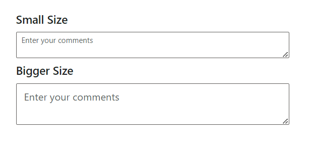
you can adjust the size of the TextArea by applying specific classes:
| Property | Description |
|---|---|
| Small | Add the e-small class to the input element or its container to render a smaller-sized TextArea. |
| Bigger | Add the e-bigger class to the input element or its container to render a larger-sized TextArea. |
By applying these classes, users can easily customize the appearance of the TextArea to better fit their application’s design requirements.
<div class="control-section">
    <h4> Small Size </h4>

    <div class="e-input-group e-small">
        <textarea class="e-input" placeholder="Enter your comments"></textarea>
    </div>

    <h4> Bigger Size </h4>

    <div class="e-input-group e-bigger">
        <textarea class="e-input" placeholder="Enter your comments"></textarea>
    </div>
</div>

<script>
    var input = document.querySelectorAll('.e-input-group .e-input,.e-float-input.e-input-group textarea');
    var focusFn = function (index) {
        return function () {
            getParentNode(input[index]).classList.add('e-input-focus');
        };
    };

    var blurFn = function (index) {
        return function () {
            getParentNode(input[index]).classList.remove('e-input-focus');
        };
    };

    for (var index = 0; index < input.length; index++) {
        //Focus Event binding for textarea component
        input[index].addEventListener('focus', focusFn(index));
        //Blur Event binding for textarea component
        input[index].addEventListener('blur', blurFn(index));
    }

    function getParentNode(element) {
        var parentNode = element.parentNode;
        if (parentNode.classList.contains('e-input-in-wrap')) {
            return parentNode.parentNode;
        }
        return parentNode;
    }
</script>
public ActionResult Sizing()
{
return View();
}Output be like the below.
Filled and outline mode
The Filled and Outline modes can be enabled in the TextArea control by adding the e-outline or e-filled class to the CssClass API.
By adding these classes, users can choose between a filled or outline appearance for the TextArea control, aligning with the design aesthetics of their application.
<div class="control-section">
    <div class="control_wrapper textarea-control-section">
        <label className="custom-input-label"> Filled TextArea </label>
        <div id='container'>
            @Html.EJS().TextArea("filled").Placeholder("Filled").FloatLabelType(FloatLabelType.Auto).CssClass("e-filled").Render()
        </div>
        <label className="custom-input-label"> Outlined TextArea </label>
        <div id='container1'>
            @Html.EJS().TextArea("outlined").Placeholder("Outlined").FloatLabelType(FloatLabelType.Auto).CssClass("e-outline").Render()
        </div>
    </div>
</div>
public ActionResult FilledOutlined()
{
return View();
}Output be like the below.

Note: Filled and Outline theme customization are available only with Material themes.
Custom styling with cssClass API in TextArea
The CssClass Api provides a powerful way to apply custom styling to the TextArea control, allowing users to customize its appearance and layout according to their design requirements.
By utilizing the CssClass API, users can apply custom CSS classes to the TextArea control’s container, enabling control over its styling properties such as color, padding, margins, borders, and more.
<div class="control-section">
    <div class="control_wrapper textarea-control-section">
        @Html.EJS().TextArea("default").Placeholder("Enter your comments").FloatLabelType(FloatLabelType.Auto).CssClass("custom-textarea").Render()
    </div>
</div>

<style>
    /* Custom CSS class for TextArea styling */
    #input-container .custom-textarea {
        border: 2px solid #ccc;
        border-radius: 5px;
        padding: 10px;
        background-color: antiquewhite;
    }
</style>
public ActionResult CssClass()
{
return View();
}Setting the disabled state in TextArea
To disable the TextArea, you can utilize the Enabled property. When set to false, the TextArea becomes disabled, preventing user interaction.
@Html.EJS().TextArea("default").Enabled(false).Render()Set the readonly TextArea
To make the TextArea read-only , you can use the Readonly property. When set to true, it prevents users from editing the content of the TextArea.
@Html.EJS().TextArea("default").Readonly(true).Value("Readonly").Render()Set the rounded corner in TextArea
Render the TextArea with rounded corner by adding the e-corner class to the input parent element.
This rounded corner is visible only in box model input component
<div class="e-input-group e-corner">
    <textarea class="e-input" placeholder="Enter your comments"></textarea>
</div>
Static clear button in TextArea
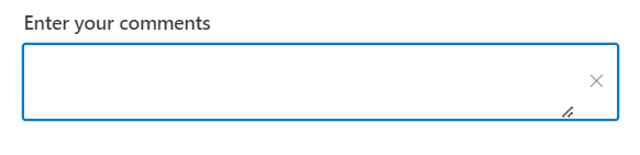
To display a static clear button in the TextArea control, you can add the e-static-clear class to the CssClass property. This class ensures that the clear button remains visible at all times, providing users with the ability to easily clear the TextArea content without needing to focus on the control.
<div class="control-section">
    <div class="control_wrapper textarea-control-section">
        @Html.EJS().TextArea("default").Placeholder("Enter your comments").CssClass("e-static-clear").ShowClearButton(true).Render()
    </div>
</div>
public ActionResult StaticClear()
{
return View();
}Output be like the below.
Customize the TextArea background color and text color
You can customize the TextArea styles such as background-color, text-color and border-color by overriding its default styles to achieve the desired appearance for the TextArea.
<div class="control-section">
    <div class="control_wrapper textarea-control-section">
        @Html.EJS().TextArea("default").Placeholder("Enter your comments").FloatLabelType(FloatLabelType.Auto).Render()
    </div>
</div>

<style>
    /* To change the background-color and text-color for textarea */
    .e-input-group,
    .e-float-input,
    .e-float-input.e-input-group { /* csslint allow: adjoining-classes */
        background : lightgray;
        color: green;
    }

    /* To change the border-color of the textarea */
    .e-input-group:not(.e-success):not(.e-warning):not(.e-error):not(.e-float-icon-left),
    .e-input-group:hover:not(.e-success):not(.e-warning):not(.e-error):not(.e-float-icon-left) { /* csslint allow: adjoining-classes */
        border-color: #0800ff;
    }
</style>
public ActionResult TextAreaColor()
{
return View();
}Output be like the below.
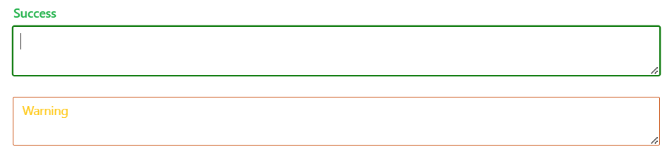
Change the floating label color of the TextArea
You can change the floating label color of the TextArea for both success and warning validation states by applying the following CSS styles.
    /* For Success state */
    .e-float-input.e-success label.e-float-text,
    .e-float-input.e-success input:focus ~ label.e-float-text,
    .e-float-input.e-success input:valid ~ label.e-float-text {
      color: #22b24b;
    }

    /* For Warning state */
    .e-float-input.e-warning label.e-float-text,
    .e-float-input.e-warning input:focus ~ label.e-float-text,
    .e-float-input.e-warning input:valid ~ label.e-float-text {
      color: #ffca1c;
}<div class="control-section">
<div class="control_wrapper textarea-control-section">
<div>
@Html.EJS().TextArea("default1").Placeholder("Success").FloatLabelType(FloatLabelType.Auto).CssClass("e-success").Render()
</div>
<div>
@Html.EJS().TextArea("default2").Placeholder("Warning").FloatLabelType(FloatLabelType.Auto).CssClass("e-warning").Render()
</div>
</div>
</div>
<style>
.e-float-input.e-success label.e-float-text{ /* csslint allow: adjoining-classes */
color: #22b24b;
}
.e-float-input.e-success input:focus ~ label.e-float-text{ /* csslint allow: adjoining-classes */
color: #22b24b;
}
.e-float-input.e-success input:valid ~ label.e-float-text { /* csslint allow: adjoining-classes */
color: #22b24b;
}
.e-float-input.e-warning label.e-float-text{ /* csslint allow: adjoining-classes */
color: #ffca1c;
}
.e-float-input.e-warning input:focus ~ label.e-float-text{ /* csslint allow: adjoining-classes */
color: #ffca1c;
}
.e-float-input.e-warning input:valid ~ label.e-float-text { /* csslint allow: adjoining-classes */
color: #ffca1c;
}
</style>public ActionResult FloatLabelColor()
{
return View();
}Output be like the below.
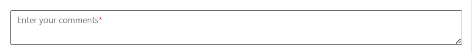
Adding mandatory asterisk to placeholder
To add a mandatory asterisk (*) to the placeholder in the TextArea control, you can utilize CSS to append the asterisk after the placeholder text.
/* To add asterick to float label in textarea */
.e-float-input.e-control-wrapper .e-float-text::after {
  content: '*'; /* Add asterisk after the placeholder */
  color: red; /* Customize asterisk color */
}<div class="control-section">
<div class="control_wrapper textarea-control-section">
@Html.EJS().TextArea("default").Placeholder("Enter your comments").FloatLabelType(FloatLabelType.Auto).Render()
</div>
</div>
<style>
/* To add asterick to float label in textarea */
.e-float-input.e-control-wrapper .e-float-text::after {
content: '*';
color: red;
}
</style>public ActionResult Asterisk()
{
return View();
}Output be like the below.