Custom animation effects with sidebar
17 Feb 202210 minutes to read
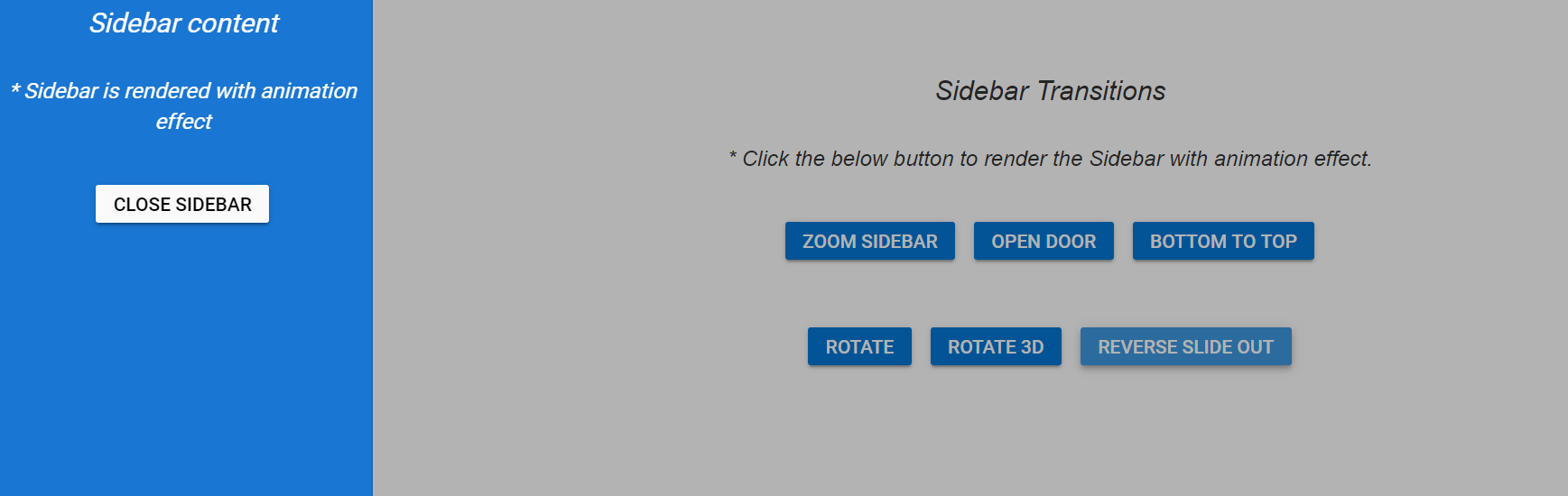
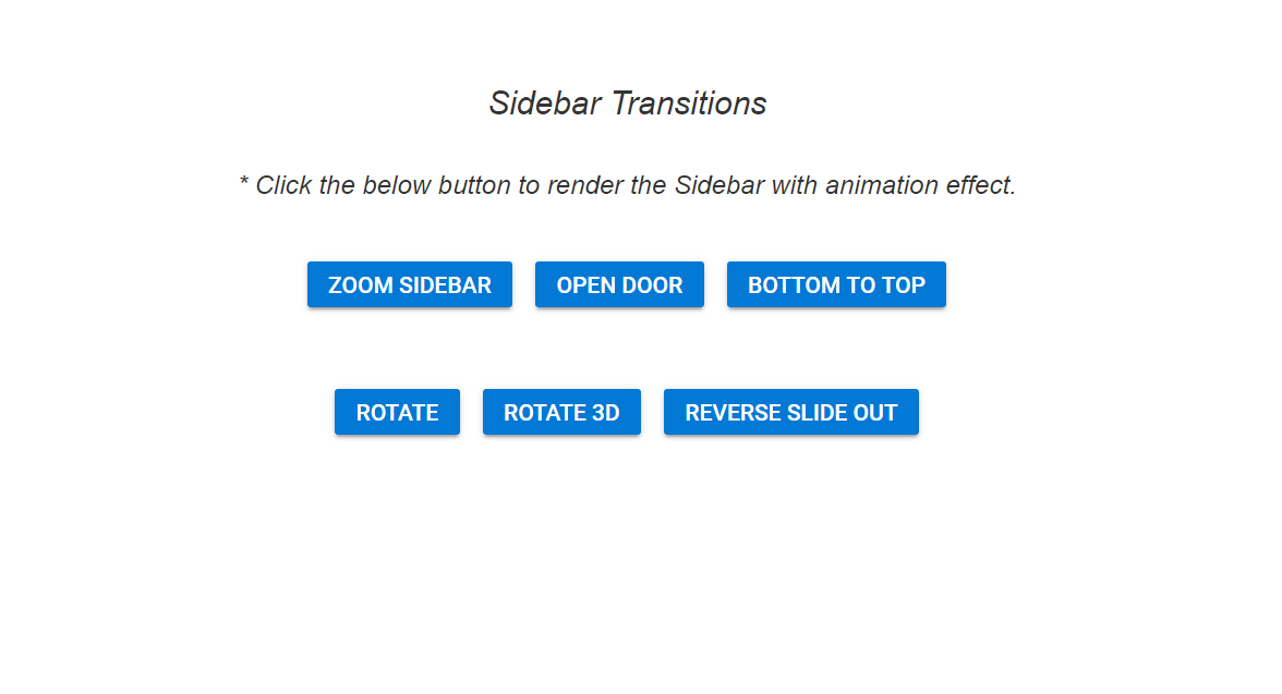
In the following example, the sidebar is rendered with custom animation effects. Click the buttons available in the main content area to check how the custom animations works with sidebar.
Sidebar will automatically adjust expanding animation to match any custom size specified in CSS styles.
@{Html.EJS().Sidebar("sidebar-element")
    .ShowBackdrop(true)
    .Width("280px")
    .ContentTemplate(@<div>
        <div class="title"> Sidebar content</div>
        <div class="sub-title">
            * Sidebar is rendered with animation effect
        </div>
        <div class="center-align">
            @Html.EJS().Button("close_btn").Content("CloseSidebar").Render()
        </div>
    </div>).Render();
}
<div>
    <div class="title">Sidebar Transitions</div>
    <div class="sub-title"> * Click the below button to render the Sidebar with animation effect.</div>
    <div style="padding:20px" class="center-align">
        <!-- button element declaration -->
        @Html.EJS().Button("zoom").Content("Zoom Sidebar").CssClass("e-info").Render()
        @Html.EJS().Button("open_door").Content("Open Door").CssClass("e-info").Render()
        @Html.EJS().Button("bottom_top").Content("Bottom To Top").CssClass("e-info").Render()
    </div>
    <div style="padding:20px" class="center-align">
        <!-- button element declaration -->
        @Html.EJS().Button("rotate").Content("Rotate").CssClass("e-info").Render()
        @Html.EJS().Button("rotate_3d").Content("Rotate 3D").CssClass("e-info").Render()
        @Html.EJS().Button("reverse").Content("Reverse Slide Out").CssClass("e-info").Render()
    </div>
</div>

<script type="text/javascript">
    document.addEventListener('DOMContentLoaded', function () {
        //create instances for sidebar element
        var sidebarElement = document.getElementById("sidebar-element").ej2_instances[0];
        sidebarElement.element.classList.add("sidebar");
        // Zoom sidebar
        document.getElementById('zoom').onclick = function () {
            sidebarElement.show();
            sidebarElement.element.classList.add("w3-animate-zoom");
        }
        // Open Door
        document.getElementById('open_door').onclick = function () {
            sidebarElement.show();
            var sidebar = document.getElementsByClassName("e-sidebar-overlay")[0];
            sidebar.classList.add("move");
        }
        // Bottom to Top
        document.getElementById('bottom_top').onclick = function () {
            sidebarElement.show();
            sidebarElement.element.classList.add("w3-animate-bottom");
        }
        // Rotate sidebar
        document.getElementById('rotate').onclick = function () {
            sidebarElement.show();
            sidebarElement.element.classList.add("rotate");
        }
        // Rotate 3D sidebar
        document.getElementById('rotate_3d').onclick = function () {
            sidebarElement.show();
            sidebarElement.element.classList.add("rotate_3d");
        }
        // Reverse Slide Out
        document.getElementById('reverse').onclick = function () {
            sidebarElement.show();
            sidebarElement.element.classList.add("reverse_slide_out");
        }
        // Close the sidebar
        document.getElementById('close_btn').onclick = function () {
            sidebarElement.element.classList.remove("sidebar");
            sidebarElement.element.classList.remove("rotate");
            sidebarElement.element.classList.remove("w3-animate-zoom");
            sidebarElement.element.classList.remove("w3-animate-bottom");
            sidebarElement.element.classList.remove("rotate_3d");
            sidebarElement.element.classList.remove("reverse_slide_out");
            sidebarElement.hide();
        }
    });
</script>

<style>
    /* sample level styles */
    .center-align {
        text-align: center;
        padding: 20px;
    }

    .title {
        text-align: center;
        font-size: 20px;
        padding: 15px;
        font-style: italic;
    }

    .sub-title {
        text-align: center;
        font-size: 16px;
        padding: 10px;
        font-style: italic;
    }

    .center-align {
        text-align: center;
        padding-top: 20px;
    }
    /* Animation styles */
    .move {
        transform: rotateX(-20deg);
    }

    .w3-animate-bottom {
        animation-name: animatebottom;
        animation-duration: 1s;
    }

    @@keyframes animatebottom {
        from {
            margin-top: 100%;
        }

        to {
            margin-top: 0%;
        }
    }

    .w3-animate-zoom {
        animation-name: animatezoom;
        animation-duration: 1s
    }

    @@keyframes animatezoom {
        from {
            transform: scale(0)
        }

        to {
            transform: scale(1)
        }
    }

    .rotate {
        animation-name: rotate1;
        animation-duration: 1s
    }

    @@keyframes rotate1 {
        from {
            transform: rotateX(150deg)
        }

        to {
            transform: rotateX(360deg)
        }
    }

    .rotate_3d {
        animation-name: rotate;
        animation-duration: 1s
    }

    @@keyframes rotate {
        from {
            transform: rotateY(150deg)
        }

        to {
            transform: rotateY(360deg)
        }
    }

    .reverse_slide_out {
        animation-name: reverse1;
        animation-duration: 1s
    }

    @@keyframes reverse1 {
        from {
            transform: rotateY(-65deg);
            margin-left: 200px;
        }

        to {
            margin-left: 0%;
        }
    }
    /*End of animation styles*/
    /* Button styles */
    #close, #close:hover, #close:active, #close:focus { /* csslint allow: adjoining-classes*/
        background: #fafafa;
        color: black
    }

    #close_btn, #close_btn:hover, #close_btn:active, #close_btn:focus { /* csslint allow: adjoining-classes*/
        background: #fafafa;
        color: black
    }

    button {
        margin: 5px;
    }
    /* sidebar element styles */
    .sidebar {
        animation-name: rotate_sidebar;
        animation-duration: 2s
    }
    @@keyframes rotate_sidebar {
        from {
            transform: rotateY(150deg)
        }

        to {
            transform: rotateY(360deg)
        }
    }

    #sidebar-element {
        background-color: rgb(25, 118, 210);
        color: #ffffff;
    }
</style>
using System;
using System.Collections.Generic;
using System.Linq;
using System.Threading.Tasks;
using Microsoft.AspNetCore.Mvc;
namespace WebApplication.Controllers
{
public partial class SidebarController : Controller
{
public IActionResult animation()
{
return View();
}
}
}Output be like the below without animation.
Output be like the below, after applying animation to the Sidebar element.