Items in ASP.NET MVC Ribbon control
30 Apr 202424 minutes to read
Ribbon renders various built-in items based on the item Type property. By default, the type property is set as Button which renders the Button.
Built-in items
You can render the built-in Ribbon items by using the Items property, to specify the Type property.
The following table explains the built-in items and their actions.
| Built-in Ribbon Items | Actions |
|---|---|
| Button | Renders button as ribbon item. |
| CheckBox | Renders checkbox as ribbon item. |
| DropDown | Renders dropdownbutton as ribbon item. |
| SplitButton | Renders splitbutton as ribbon item. |
| ComboBox | Renders combobox as ribbon item. |
| ColorPicker | Renders color picker as ribbon item. |
| GroupButton | Renders groupbutton as ribbon item. |
Button items
You can render the built-in button Ribbon item by setting the Type property as Button. You can also customize the button item using the RibbonButtonSettings, which provides options such as iconCss, content, isToggle and more.
Toggle button
The IsToggle property can be used to define whether the button act as a toggle button or not. By default the value is false.
@using Syncfusion.EJ2.Ribbon
@using Syncfusion.EJ2.Navigations

@Html.EJS().Ribbon("ribbon").Tabs(tab =>
{
    tab.Header("Home").Groups(group =>
    {
        group.Header("Clipboard").Collections(collection =>
        {
            collection.Items(item =>
            {
                item.Type(RibbonItemType.Button).ButtonSettings(button =>
                {
                    button.IconCss("e-icons e-cut").Content("cut").IsToggle(true);
                }).Add();
            }).Add();
        }).Add();
    }).Add();
}).Render()
CheckBox items
You can render the built-in checkBox Ribbon item by setting the Type property to CheckBox. You can also customize the checkBox item using the RibbonCheckBoxSettings, which provides options such as labelPosition, label, checked and more.
Checkbox state
You can use the Checked property to handle the checked or unchecked state. By default, the value is false.
@using Syncfusion.EJ2.Ribbon
@using Syncfusion.EJ2.Navigations

@Html.EJS().Ribbon("ribbon").Tabs(tab =>
{
    tab.Header("Home").Groups(group =>
    {
        group.Header("View").Collections(collection =>
        {
            collection.Items(item =>
            {
                item.Type(RibbonItemType.CheckBox).CheckBoxSettings(checkBox =>
                {
                    checkBox.Checked(true).Label("Ruler");
                }).Add();
            }).Add();
        }).Add();
    }).Add();
}).Render()
Defining label
You can use the Label property to add a caption for the CheckBox. The label position can be set Before or After, by using the LabelPosition property. By default, the labelPosition is After.
@using Syncfusion.EJ2.Ribbon
@using Syncfusion.EJ2.Navigations

@Html.EJS().Ribbon("ribbon").Tabs(tab =>
{
    tab.Header("Home").Groups(group =>
    {
        group.Header("View").Collections(collection =>
        {
            collection.Items(item =>
            {
                item.Type(RibbonItemType.CheckBox).CheckBoxSettings(checkBox =>
                {
                    checkBox.Checked(true).Label("Ruler").LabelPosition("Before");
                }).Add();
            }).Add();
        }).Add();
    }).Add();
}).Render()
DropDown button items
You can render the built-in dropDown Ribbon item by setting the Type property to DropDown. You can also customize the dropDown item through RibbonDropDownSettings, which provides options such as iconCss, content, target and more.
Target
The Target property specifies the element selector to be displayed in the DropDownButton popup.
@using Syncfusion.EJ2.Ribbon
@using Syncfusion.EJ2.Navigations

@{
    string[] pictureOptions = new string[] { "This device", "Stock Images", "Online Images" };
}

@Html.EJS().Ribbon("ribbon").Tabs(tab =>
{
    tab.Header("Home").Groups(group =>
    {
        group.Header("Illustrations").Collections(collection =>
        {
            collection.Items(item =>
            {
                item.Type(RibbonItemType.DropDown).DropDownSettings(dropdown =>
                {
                    dropdown.IconCss("e-icons e-image").Content("Pictures").Target("#listView");
                }).Add();
            }).Add();
        }).Add();
    }).Add();
}).Render()
@Html.EJS().ListView("listView").ShowHeader(true).HeaderTitle("Insert Picture From").DataSource(pictureOptions).Render()
Customize dropdown button item
You can customize the dropdown button item by specifying a custom cssClass using the beforeItemRender event.
The following sample showcases how to customize a specific dropdown item.
@using Syncfusion.EJ2.Ribbon
@using Syncfusion.EJ2.Navigations

@{
    List<MenuItem> tableOptions = new List<MenuItem>() { new MenuItem { Text = "Insert Table" }, new MenuItem { Text = "This device" }, new MenuItem { Text = "Convert Table" }, new MenuItem { Text = "Excel SpreadSheet" } };
}
@Html.EJS().Ribbon("ribbon").Tabs(tab =>
{
    tab.Header("Insert").Groups(group =>
    {
        group.Header("Tables").Collections(collection =>
        {
            collection.Items(items =>
            {
                items.Type(RibbonItemType.DropDown).DropDownSettings(dropDown =>
                {
                    dropDown.IconCss("e-icons e-table").Content("Table").Items(tableOptions).BeforeItemRender("function(args){beforeItemRenderEvent(args)}");
                }).Add();
            }).Add();
        }).Add();
    }).Add();
}).Render()

<script>
    function beforeItemRenderEvent(args) {
        if (args.item.text === 'Insert Table') {
            args.element.classList.add("e-custom-class");
        }
    }
</script>

<style>
    .e-custom-class {
        color: green;
    }
</style>
Create dropdown popup on demand
You can handle the creation of popups, by using the createPopupOnClick property. If set to true, the popup will only be created upon opening. By default the value is false.
@using Syncfusion.EJ2.Ribbon
@using Syncfusion.EJ2.Navigations

@{
    List<MenuItem> tableOptions = new List<MenuItem>() { new MenuItem { Text = "Insert Table" }, new MenuItem { Text = "This device" }, new MenuItem { Text = "Convert Table" }, new MenuItem { Text = "Excel SpreadSheet" } };
}
@Html.EJS().Ribbon("ribbon").Tabs(tab =>
{
    tab.Header("Insert").Groups(group =>
    {
        group.Header("Tables").Collections(collection =>
        {
            collection.Items(items =>
            {
                items.Type(RibbonItemType.DropDown).DropDownSettings(dropDown =>
                {
                    dropDown.IconCss("e-icons e-table").Content("Table").Items(tableOptions).CreatePopupOnClick(true);
                }).Add();
            }).Add();
        }).Add();
    }).Add();
}).Render()
Split button items
You can render the built-in splitButton Ribbon item by setting the Type property to SplitButton you can render a splitButton item. You can also customize the SplitButton item through RibbonSplitButtonSettings, which provides options such as IconCss, Items, Target and more.
Target
The Target property specifies the element selector to be displayed in the SplitButton popup.
@using Syncfusion.EJ2.Ribbon
@using Syncfusion.EJ2.Navigations

@{
    string[] pictureOptions = new string[] { "This device", "Stock Images", "Online Images" };
}

@Html.EJS().Ribbon("ribbon").Tabs(tab =>
{
    tab.Header("Home").Groups(group =>
    {
        group.Header("Illustrations").Collections(collection =>
        {
            collection.Items(item =>
            {
                item.Type(RibbonItemType.SplitButton).SplitButtonSettings(splitbutton =>
                {
                    splitbutton.IconCss("e-icons e-image").Content("Pictures").Target("#listView");
                }).Add();
            }).Add();
        }).Add();
    }).Add();
}).Render()
@Html.EJS().ListView("listView").ShowHeader(true).HeaderTitle("Insert Picture From").DataSource(pictureOptions).Render()
Combobox items
You can render the built-in comboBox Ribbon item by setting the Type property to ComboBox you can render a comboBox item. You can also customize the ComboBox item through RibbonComboBoxSettings, which provides options such as AllowFiltering, AutoFill, Index, SortOrder and more.
Filtering
You can use the AllowFiltering property to filter the data items. The filtering operation is initiated automatically, as soon as you start typing characters. If no match is found, the value of the noRecordsTemplate property will be displayed. By default, the value is false.
@using Syncfusion.EJ2.Ribbon
@using Syncfusion.EJ2.Navigations

@{
    List<string> fontStyle = new List<string>() { "Algerian", "Arial", "Calibri", "Cambria", "Cambria Math", "Courier New", "Candara", "Georgia" };
}

@Html.EJS().Ribbon("ribbon").Tabs(tab =>
{
    tab.Header("Home").Groups(group =>
    {
        group.Header("View").Collections(collection =>
        {
            collection.Items(item =>
            {
                item.Type(RibbonItemType.ComboBox).ComboBoxSettings(combobox =>
                {
                    combobox.DataSource(fontStyle).AllowFiltering(true);
                }).Add();
            }).Add();
        }).Add();
    }).Add();
}).Render()
Index
You can use the Index property to get or set the selected item in the combobox.
@using Syncfusion.EJ2.Ribbon
@using Syncfusion.EJ2.Navigations

@{
    List<string> fontStyle = new List<string>() { "Algerian", "Arial", "Calibri", "Cambria", "Cambria Math", "Courier New", "Candara", "Georgia" };
}

@Html.EJS().Ribbon("ribbon").Tabs(tab =>
{
    tab.Header("Home").Groups(group =>
    {
        group.Header("View").Collections(collection =>
        {
            collection.Items(item =>
            {
                item.Type(RibbonItemType.ComboBox).ComboBoxSettings(combobox =>
                {
                    combobox.DataSource(fontStyle).Index(3);
                }).Add();
            }).Add();
        }).Add();
    }).Add();
}).Render()
SortOrder
You can use the SortOrder property to specify the order in which the DataSource should be sorted.
| `None` | The data source is not sorted. |
| `Ascending` | The data source is sorted in ascending order. |
| `Descending` | The data source is sorted in descending order. |
@using Syncfusion.EJ2.Ribbon
@using Syncfusion.EJ2.Navigations

@{
    List<string> fontStyle = new List<string>() { "Algerian", "Arial", "Calibri", "Cambria", "Cambria Math", "Courier New", "Candara", "Georgia" };
}

@Html.EJS().Ribbon("ribbon").Tabs(tab =>
{
    tab.Header("Home").Groups(group =>
    {
        group.Header("View").Collections(collection =>
        {
            collection.Items(item =>
            {
                item.Type(RibbonItemType.ComboBox).ComboBoxSettings(combobox =>
                {
                    combobox.DataSource(fontStyle).SortOrder("Descending");
                }).Add();
            }).Add();
        }).Add();
    }).Add();
}).Render()
Colorpicker items
You can render the built-in colorPicker Ribbon item by setting the Type property to ColorPicker. You can also customize the colorPicker item through RibbonColorPickerSettings, which provides options such as Value, Columns, ShowButtons and more.
Value
You can use the Value property to specify the color value. The value should be specified as Hex code.
@using Syncfusion.EJ2.Ribbon
@using Syncfusion.EJ2.Inputs
@using Syncfusion.EJ2.Navigations

@Html.EJS().Ribbon("ribbon").Tabs(tab =>
{
    tab.Header("Home").Groups(group =>
    {
        group.Header("View").Collections(collection =>
        {
            collection.Items(item =>
            {
                item.Type(RibbonItemType.ColorPicker).ColorPickerSettings(colorpicker =>
                {
                    colorpicker.Value("035a");
                }).Add();
            }).Add();
        }).Add();
    }).Add();
}).Render()
Groupbutton items
You can render the built-in groupbutton Ribbon item by setting the Type property to GroupButton. You can also customize the groupbutton item using the RibbonGroupButtonSettings, which provides options such as Selection and Items.
Items
You can render the groupbutton items by using Items property. You can also customize the groupbutton items through RibbonGroupButtonItem, which provides options such as Content, IconCss, Selected and more.
Item content
You can use the Content property to define the text content for the groupbutton.
@using Syncfusion.EJ2
@using Syncfusion.EJ2.Ribbon
@using Syncfusion.EJ2.Navigations

@{
    List<RibbonGroupButtonItem> groupButtonContent = new List<RibbonGroupButtonItem>() {

      new RibbonGroupButtonItem { IconCss = "e-icons e-align-left", Content = "Align Left" },
      new RibbonGroupButtonItem {IconCss = "e-icons e-align-center", Content = "Align Center" },
      new RibbonGroupButtonItem {IconCss = "e-icons e-align-right", Content = "Align Right" },
      new RibbonGroupButtonItem { IconCss = "e-icons e-justify", Content = "Justify" }
    };
}


@Html.EJS().Ribbon("ribbon").Tabs(tab =>
{
    tab.Header("Home").Groups(group =>
    {
        group.Header("Paragraph").Collections(collection =>
        {
            collection.Items(items =>
            {
                items.Type(RibbonItemType.GroupButton).AllowedSizes(RibbonItemSize.Medium).GroupButtonSettings(groupButton =>
                {
                    groupButton.Items(groupButtonContent);
                }).Add();
            }).Add();
        }).Add();
    }).Add();
}).Render()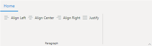
Icon only
You can use the IconCss property to customize the groupbutton icon. If the IconCss property is not defined, the groupbutton will not be rendered.
@using Syncfusion.EJ2
@using Syncfusion.EJ2.Ribbon
@using Syncfusion.EJ2.Navigations

@{
    List<RibbonGroupButtonItem> groupButtonIcon = new List<RibbonGroupButtonItem>() {

      new RibbonGroupButtonItem { IconCss = "e-icons e-align-left" },
      new RibbonGroupButtonItem {IconCss = "e-icons e-align-center" },
      new RibbonGroupButtonItem {IconCss = "e-icons e-align-right" },
      new RibbonGroupButtonItem { IconCss = "e-icons e-justify" }
    };
}


@Html.EJS().Ribbon("ribbon").Tabs(tab =>
{
    tab.Header("Home").Groups(group =>
    {
        group.Header("Paragraph").Collections(collection =>
        {
            collection.Items(items =>
            {
                items.Type(RibbonItemType.GroupButton).AllowedSizes(RibbonItemSize.Small).GroupButtonSettings(groupButton =>
                {
                    groupButton.Items(groupButtonIcon);
                }).Add();
            }).Add();
        }).Add();
    }).Add();
}).Render()
Selection
You can use the Selected property to select the groupbutton item initally. When set to true, the button will be selected. By default the Selected property is false.
@using Syncfusion.EJ2
@using Syncfusion.EJ2.Ribbon
@using Syncfusion.EJ2.Navigations

@{
    List<RibbonGroupButtonItem> groupButtonSelected = new List<RibbonGroupButtonItem>() {

      new RibbonGroupButtonItem { IconCss = "e-icons e-align-left", Content = "Align Left" },
      new RibbonGroupButtonItem {IconCss = "e-icons e-align-center", Content = "Align Center", Selected = true },
      new RibbonGroupButtonItem {IconCss = "e-icons e-align-right", Content = "Align Right" },
      new RibbonGroupButtonItem { IconCss = "e-icons e-justify", Content = "Justify" }
    };
}


@Html.EJS().Ribbon("ribbon").Tabs(tab =>
{
    tab.Header("Home").Groups(group =>
    {
        group.Header("Paragraph").Collections(collection =>
        {
            collection.Items(items =>
            {
                items.Type(RibbonItemType.GroupButton).AllowedSizes(RibbonItemSize.Small).GroupButtonSettings(groupButton =>
                {
                    groupButton.Items(groupButtonSelected);
                }).Add();
            }).Add();
        }).Add();
    }).Add();
}).Render()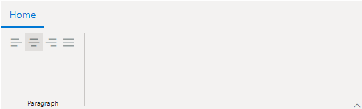
Single selection
You can set the Selection property value as RibbonGroupButtonSelection.Single to make one selection at a time. It automatically deselects the previous choice when a different item is clicked.
@using Syncfusion.EJ2
@using Syncfusion.EJ2.Ribbon
@using Syncfusion.EJ2.Navigations

@{
    List<RibbonGroupButtonItem> singleSelection = new List<RibbonGroupButtonItem>() {

      new RibbonGroupButtonItem { IconCss = "e-icons e-align-left", Content = "Align Left" },
      new RibbonGroupButtonItem {IconCss = "e-icons e-align-center", Content = "Align Center", Selected = true },
      new RibbonGroupButtonItem {IconCss = "e-icons e-align-right", Content = "Align Right" },
      new RibbonGroupButtonItem { IconCss = "e-icons e-justify", Content = "Justify" }
    };
}


@Html.EJS().Ribbon("ribbon").Tabs(tab =>
{
    tab.Header("Home").Groups(group =>
    {
        group.Header("Paragraph").Collections(collection =>
        {
            collection.Items(items =>
            {
                items.Type(RibbonItemType.GroupButton).AllowedSizes(RibbonItemSize.Small).GroupButtonSettings(groupButton =>
                {
                    groupButton.Selection(RibbonGroupButtonSelection.Single).Items(singleSelection);
                }).Add();
            }).Add();
        }).Add();
    }).Add();
}).Render()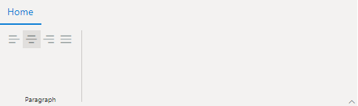
Multiple selection
You can set the Selection property value as RibbonGroupButtonSelection.Multiple to select more than one button at a time. Users can select a button one by one to select multiple buttons.
@using Syncfusion.EJ2
@using Syncfusion.EJ2.Ribbon
@using Syncfusion.EJ2.Navigations

@{
    List<RibbonGroupButtonItem> multipleSelection = new List<RibbonGroupButtonItem>() {

      new RibbonGroupButtonItem { IconCss = "e-icons e-bold", Content = "Bold" },
      new RibbonGroupButtonItem {IconCss = "e-icons e-italic", Content = "Italic", Selected = true },
      new RibbonGroupButtonItem {IconCss = "e-icons e-underline", Content = "Underline" },
      new RibbonGroupButtonItem { IconCss = "e-icons e-strikethrough", Content = "Strikethrough", Selected = true }
    };
}


@Html.EJS().Ribbon("ribbon").Tabs(tab =>
{
    tab.Header("Home").Groups(group =>
    {
        group.Header("Paragraph").Collections(collection =>
        {
            collection.Items(items =>
            {
                items.Type(RibbonItemType.GroupButton).AllowedSizes(RibbonItemSize.Small).GroupButtonSettings(groupButton =>
                {
                    groupButton.Selection(RibbonGroupButtonSelection.Multiple).Items(multipleSelection);
                }).Add();
            }).Add();
        }).Add();
    }).Add();
}).Render()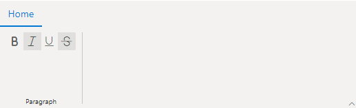
Groupbutton in simplified mode layout
In simplified mode, the groupbutton will be rendered as a dropdownbutton. The dropdownbutton icon will be updated based on the button item selected. The initial button icon will be the set, if none of the buttons are selected.
@using Syncfusion.EJ2
@using Syncfusion.EJ2.Ribbon
@using Syncfusion.EJ2.Navigations

@{
    List<RibbonGroupButtonItem> groupButtonSelected = new List<RibbonGroupButtonItem>() {

      new RibbonGroupButtonItem { IconCss = "e-icons e-align-left", Content = "Align Left" },
      new RibbonGroupButtonItem {IconCss = "e-icons e-align-center", Content = "Align Center", Selected = true },
      new RibbonGroupButtonItem {IconCss = "e-icons e-align-right", Content = "Align Right" },
      new RibbonGroupButtonItem { IconCss = "e-icons e-justify", Content = "Justify" }
    };
}


@Html.EJS().Ribbon("ribbon").ActiveLayout(RibbonLayout.Simplified).Tabs(tab =>
{
    tab.Header("Home").Groups(group =>
    {
        group.Header("Paragraph").Collections(collection =>
        {
            collection.Items(items =>
            {
                items.Type(RibbonItemType.GroupButton).AllowedSizes(RibbonItemSize.Small).GroupButtonSettings(groupButton =>
                {
                    groupButton.Selection(RibbonGroupButtonSelection.Single).Items(groupButtonSelected);
                }).Add();
            }).Add();
        }).Add();
    }).Add();
}).Render()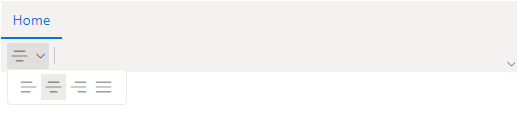
Custom items
You can customize the ribbon items with non-built-in items or HTML content by setting the Type property to Template. This provides an option to customize the ribbon items with greater flexibility.
@using Syncfusion.EJ2.Ribbon
@using Syncfusion.EJ2.Navigations

@Html.EJS().Ribbon("ribbon").Tabs(tab =>
{
    tab.Header("Home").Groups(group =>
    {
        group.Header("Templates").IsCollapsible(false).Collections(collection =>
        {
            collection.Items(item =>
            {
                item.Type(RibbonItemType.Template).ItemTemplate("<div class="custom-template ${activeSize}"><label for="fname">First name:</label><input type="text" id="fname" name="fname"/><br/><br/><label for="lname">Last name:</label><input type="text" id="lname" name="lname"></div>").Add();
            }).Add();
        }).Add();
        group.Header("Multimedia").Collections(collection =>
        {
            collection.Items(item =>
            {
                item.Type(RibbonItemType.Template).ItemTemplate("<span class='ribbonTemplate ${activeSize}'><span class='e-icons e-video'></span><span class='text'>Video</span></span>").Add();
            }).Add();
        }).Add();
    }).Add();
}).Render()

<style>

    .ribbonTemplate {
        display: flex;
        align-items: center;
        justify-content: center;
        cursor: pointer;
    }

        .ribbonTemplate.Large {
            flex-direction: column;
        }

            .ribbonTemplate.Large .e-icons {
                font-size: 35px;
            }

        .ribbonTemplate.Medium .e-icons,
        .ribbonTemplate.Small .e-icons {
            font-size: 20px;
            margin: 15px 5px;
        }

        .ribbonTemplate.Small .text {
            display: none;
        }

        .custom-template input {
            margin-left: 10px;
            width: 100px;
        }

        .custom-template.Medium {
            display: flex;
            align-items: center;
        }
        .custom-template.Medium input {
            height: 14px;
            margin-right: 10px;
        }
</style >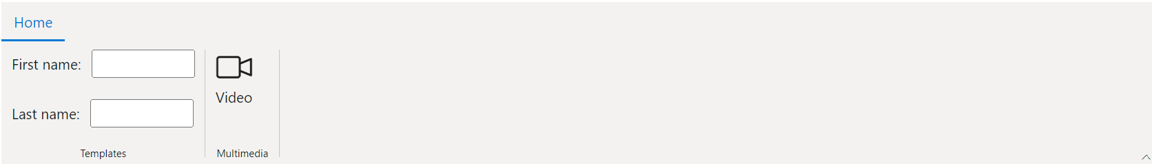
Items display Mode
You can use the DisplayOptions property to display the items in the Ribbon.
| `Auto` | The items are displayed in all layouts based on the ribbon's overflow state. |
| `Classic` | The items are displayed only in the classic layout group. |
| `Simplified` | The items are displayed only in the simplified layout group. |
| `Overflow` | The items are displayed only in the overflow popup. |
Display items in Classic only
To diplay the items only in the classic layout group, set the mode as DisplayMode.Classic in the DisplayOptions property.
@using Syncfusion.EJ2.Ribbon
@using Syncfusion.EJ2.Navigations

@Html.EJS().Ribbon("ribbon").Tabs(tab =>
{
    tab.Header("Home").Groups(group =>
    {
        group.Header("Clipboard").Collections(collection =>
        {
            collection.Items(item =>
            {
                item.Type(RibbonItemType.Button).DisplayOptions(Syncfusion.EJ2.Ribbon.DisplayMode.Classic).ButtonSettings(button =>
                {
                    button.IconCss("e-icons e-cut").Content("cut");
                }).Add();
            }).Add();
        }).Add();
    }).Add();
}).Render()
Display items in Simplified only
To diplay the items only in the simplified layout group, set the mode as DisplayMode.Simplified in the DisplayOptions property.
@using Syncfusion.EJ2.Ribbon
@using Syncfusion.EJ2.Navigations

@Html.EJS().Ribbon("ribbon").Tabs(tab =>
{
    tab.Header("Home").Groups(group =>
    {
        group.Header("Clipboard").Collections(collection =>
        {
            collection.Items(item =>
            {
                item.Type(RibbonItemType.Button).DisplayOptions(Syncfusion.EJ2.Ribbon.DisplayMode.Simplified).ButtonSettings(button =>
                {
                    button.IconCss("e-icons e-cut").Content("cut");
                }).Add();
            }).Add();
        }).Add();
    }).Add();
}).Render()
Display items in Overflow popup only
To diplay the items only in the overflow, set the mode as DisplayMode.Overflow in the DisplayOptions property.
@using Syncfusion.EJ2.Ribbon
@using Syncfusion.EJ2.Navigations

@Html.EJS().Ribbon("ribbon").Tabs(tab =>
{
    tab.Header("Home").Groups(group =>
    {
        group.Header("Clipboard").Collections(collection =>
        {
            collection.Items(item =>
            {
                item.Type(RibbonItemType.Button).DisplayOptions(Syncfusion.EJ2.Ribbon.DisplayMode.Overflow).ButtonSettings(button =>
                {
                    button.IconCss("e-icons e-cut").Content("cut");
                }).Add();
            }).Add();
        }).Add();
    }).Add();
}).Render()
Enable or disable items
You can use the Disabled property to disable a Ribbon item. It prevents the user interaction when set to true. By default, the value is false.
@using Syncfusion.EJ2.Ribbon
@using Syncfusion.EJ2.Navigations

@Html.EJS().Ribbon("ribbon").Tabs(tab =>
{
    tab.Header("Home").Groups(group =>
    {
        group.Header("Clipboard").Collections(collection =>
        {
            collection.Items(item =>
            {
                item.Type(RibbonItemType.Button).Disabled(true).ButtonSettings(button =>
                {
                    button.IconCss("e-icons e-cut").Content("cut");
                }).Add();
                item.Type(RibbonItemType.CheckBox).Disabled(true).CheckBoxSettings(checkBox =>
                {
                    checkBox.Checked(true).Label("Ruler");
                }).Add();
                item.Type(RibbonItemType.DropDown).Disabled(true).DropDownSettings(dropdown =>
                {
                    dropdown.IconCss("e-icons e-table").Content("Table");
                }).Add();
            }).Add();
        }).Add();
    }).Add();
}).Render()