Paging in ASP.NET MVC Pivot Table
27 Aug 202617 minutes to read
Paging divides the Pivot Table data into manageable pages so the component can render large datasets efficiently. The row axis (members of the row fields) and the column axis (members of the column and value fields) are paginated independently. Users navigate rows and columns page by page using the built-in pager UI or custom controls.
To enable paging, set the EnablePaging property to true (type boolean, default false).
Paging can be configured at initial render using the PageSettings property, which accepts the following options:
| Property | Type | Default | Description |
|---|---|---|---|
CurrentRowPage |
double |
1 |
The current row page number to display. |
CurrentColumnPage |
double |
1 |
The current column page number to display. |
RowPageSize |
double |
10 |
The number of records displayed on each page of the row axis. |
ColumnPageSize |
double |
5 |
The number of records displayed on each page of the column axis. |
The Virtualization and Paging features in the Pivot Table should not be enabled simultaneously. You can use either feature at a time, but not both together, as they are designed to handle data rendering differently and may conflict when used together.
Pager UI
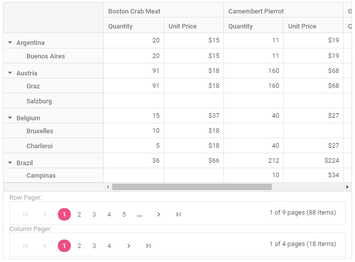
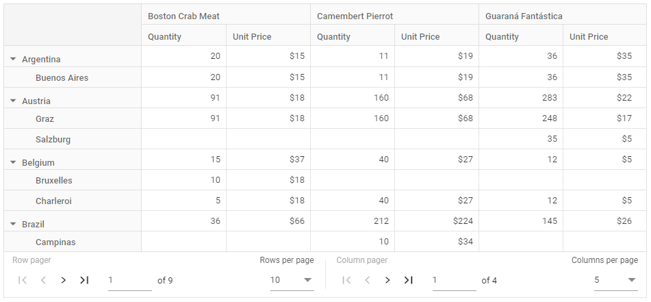
When paging is enabled, a built-in pager UI appears at the bottom of the Pivot Table by default. The UI provides navigation buttons, a page-input box, and dropdowns for changing the page size on each axis.
You can change the position, visibility, compact view, and template of the row and column pagers using the PagerSettings property. The available sub-properties are summarized below:
| Property | Type | Default | Description |
|---|---|---|---|
Position |
PagerPosition |
Bottom |
Places the pager UI at the Top or Bottom of the Pivot Table. |
IsInversed |
boolean |
false |
When true, swaps the column pager to the left and the row pager to the right. |
EnableCompactView |
boolean |
false |
When true, shows only the previous and next navigation buttons. |
ShowRowPager |
boolean |
true |
Shows or hides the row pager. |
ShowColumnPager |
boolean |
true |
Shows or hides the column pager. |
ShowRowPageSize |
boolean |
true |
Shows or hides the “Rows per page” dropdown. |
ShowColumnPageSize |
boolean |
true |
Shows or hides the “Columns per page” dropdown. |
RowPageSizes |
double[] |
null |
The list of page sizes offered in the “Rows per page” dropdown. |
ColumnPageSizes |
double[] |
null |
The list of page sizes offered in the “Columns per page” dropdown. |
Template |
string |
'' |
The ID of an HTML element that replaces the built-in pager UI. |
@using Syncfusion.EJ2.PivotView

@Html.EJS().PivotView("PivotView").Height("350").EnablePaging(true).DataSourceSettings(dataSource => dataSource.DataSource(dataManger =>
{
    dataManger.Url("https://bi.syncfusion.com/northwindservice/api/orders").CrossDomain(true).Adaptor("WebApiAdaptor");

}).ExpandAll(true).ShowAggregationOnValueField(false).EnableSorting(true)
    .FormatSettings(formatsettings =>
    {
        formatsettings.Name("UnitPrice").Format("C0").UseGrouping(true).Add();
    }).Rows(rows =>
    {
        rows.Name("ShipCountry").Add(); rows.Name("ShipCity").Add();
    }).Columns(columns =>
    {
        columns.Name("ProductName").Caption("Product Name").Add();
    }).Values(values =>
    {
        values.Name("Quantity").Caption("Quantity").Add(); values.Name("UnitPrice").Caption("Unit Price").Add();
    })
    ).PageSettings(pageSettings => pageSettings.ColumnPageSize(5).RowPageSize(10).CurrentColumnPage(1).CurrentRowPage(1)
    ).PagerSettings(pagerSettings => pagerSettings.Position(PagerPosition.Bottom).EnableCompactView(false).IsInversed(false).ShowColumnPager(true)
    .ShowRowPager(true).ShowRowPageSize(true).ShowColumnPageSize(true).RowPageSizes(ViewBag.RowPageSizes).ColumnPageSizes(ViewBag.ColumnPageSizes)
    ).GridSettings(gridSettings => gridSettings.ColumnWidth(120)).Render()
public ActionResult Index()
{
ViewBag.ColumnPageSizes = new double[] { 5, 10, 20, 50, 100 };
ViewBag.RowPageSizes = new double[] { 10, 50, 100, 200 };
return View();
}
Show pager UI at top or bottom
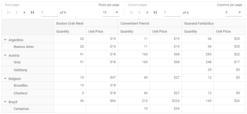
The Pivot Table component lets you place the pager UI at the top or bottom of the Pivot Table by setting the Position property within the PagerSettings configuration. By default the pager UI appears at the bottom; set position to 'Top' to place it above the Pivot Table.
The following example demonstrates how to configure the pager UI to appear at the top of the Pivot Table:
@using Syncfusion.EJ2.PivotView

@Html.EJS().PivotView("PivotView").Height("350").EnablePaging(true).DataSourceSettings(dataSource => dataSource.DataSource(dataManger =>
{
    dataManger.Url("https://bi.syncfusion.com/northwindservice/api/orders").CrossDomain(true).Adaptor("WebApiAdaptor");

}).ExpandAll(true).ShowAggregationOnValueField(false).EnableSorting(true)
    .FormatSettings(formatsettings =>
    {
        formatsettings.Name("UnitPrice").Format("C0").UseGrouping(true).Add();
    }).Rows(rows =>
    {
        rows.Name("ShipCountry").Add(); rows.Name("ShipCity").Add();
    }).Columns(columns =>
    {
        columns.Name("ProductName").Caption("Product Name").Add();
    }).Values(values =>
    {
        values.Name("Quantity").Caption("Quantity").Add(); values.Name("UnitPrice").Caption("Unit Price").Add();
    })
    ).PageSettings(pageSettings => pageSettings.ColumnPageSize(5).RowPageSize(10).CurrentColumnPage(1).CurrentRowPage(1)
    ).PagerSettings(pagerSettings => pagerSettings.Position(PagerPosition.Top)
    ).GridSettings(gridSettings => gridSettings.ColumnWidth(120)).Render()
public ActionResult Index()
{
return View();
}
Inverse pager
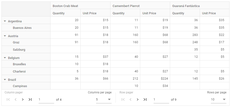
By default, the row pager appears on the left side of the pager UI and the column pager on the right. To swap these positions, set the IsInversed property to true within the PagerSettings configuration.
@using Syncfusion.EJ2.PivotView

@Html.EJS().PivotView("PivotView").Height("350").EnablePaging(true).DataSourceSettings(dataSource => dataSource.DataSource(dataManger =>
{
    dataManger.Url("https://bi.syncfusion.com/northwindservice/api/orders").CrossDomain(true).Adaptor("WebApiAdaptor");

}).ExpandAll(true).ShowAggregationOnValueField(false).EnableSorting(true)
    .FormatSettings(formatsettings =>
    {
        formatsettings.Name("UnitPrice").Format("C0").UseGrouping(true).Add();
    }).Rows(rows =>
    {
        rows.Name("ShipCountry").Add(); rows.Name("ShipCity").Add();
    }).Columns(columns =>
    {
        columns.Name("ProductName").Caption("Product Name").Add();
    }).Values(values =>
    {
        values.Name("Quantity").Caption("Quantity").Add(); values.Name("UnitPrice").Caption("Unit Price").Add();
    })
    ).PageSettings(pageSettings => pageSettings.ColumnPageSize(5).RowPageSize(10).CurrentColumnPage(1).CurrentRowPage(1)
    ).PagerSettings(pagerSettings => pagerSettings.IsInversed(true)
    ).GridSettings(gridSettings => gridSettings.ColumnWidth(120)).Render()
public ActionResult Index()
{
return View();
}
Compact view
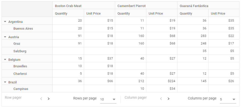
The Pivot Table provides a compact view for the pager UI, displaying only the previous and next navigation buttons to minimize the interface. To enable the compact view, set the EnableCompactView property to true within the PagerSettings configuration. This streamlined layout focuses on essential navigation controls, which is ideal for layouts requiring a simplified paging experience.
@using Syncfusion.EJ2.PivotView

@Html.EJS().PivotView("PivotView").Height("350").EnablePaging(true).DataSourceSettings(dataSource => dataSource.DataSource(dataManger =>
{
    dataManger.Url("https://bi.syncfusion.com/northwindservice/api/orders").CrossDomain(true).Adaptor("WebApiAdaptor");

}).ExpandAll(true).ShowAggregationOnValueField(false).EnableSorting(true)
    .FormatSettings(formatsettings =>
    {
        formatsettings.Name("UnitPrice").Format("C0").UseGrouping(true).Add();
    }).Rows(rows =>
    {
        rows.Name("ShipCountry").Add(); rows.Name("ShipCity").Add();
    }).Columns(columns =>
    {
        columns.Name("ProductName").Caption("Product Name").Add();
    }).Values(values =>
    {
        values.Name("Quantity").Caption("Quantity").Add(); values.Name("UnitPrice").Caption("Unit Price").Add();
    })
    ).PageSettings(pageSettings => pageSettings.ColumnPageSize(5).RowPageSize(10).CurrentColumnPage(1).CurrentRowPage(1)
    ).PagerSettings(pagerSettings => pagerSettings.EnableCompactView(true)
    ).GridSettings(gridSettings => gridSettings.ColumnWidth(120)).Render()
public ActionResult Index()
{
return View();
}
Show or hide paging option
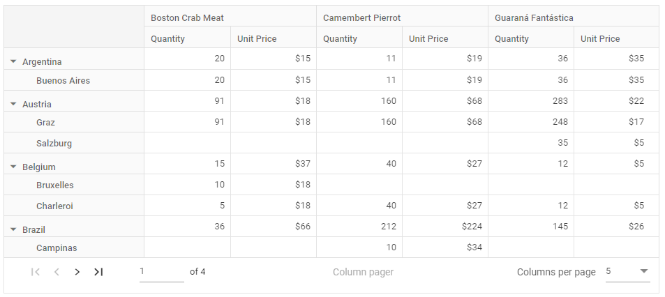
The Pivot Table allows you to control the visibility of the row and column pagers in the pager UI using the ShowRowPager and ShowColumnPager properties within the PagerSettings configuration. By default, both row and column pagers are visible in the pager UI. To hide either the row pager or the column pager, set the corresponding property to false. This allows you to display only the necessary navigation controls based on your layout requirements.
The following code demonstrates how to hide the row pager by setting the ShowRowPager property to false.
@using Syncfusion.EJ2.PivotView

@Html.EJS().PivotView("PivotView").Height("350").EnablePaging(true).DataSourceSettings(dataSource => dataSource.DataSource(dataManger =>
{
    dataManger.Url("https://bi.syncfusion.com/northwindservice/api/orders").CrossDomain(true).Adaptor("WebApiAdaptor");

}).ExpandAll(true).ShowAggregationOnValueField(false).EnableSorting(true)
    .FormatSettings(formatsettings =>
    {
        formatsettings.Name("UnitPrice").Format("C0").UseGrouping(true).Add();
    }).Rows(rows =>
    {
        rows.Name("ShipCountry").Add(); rows.Name("ShipCity").Add();
    }).Columns(columns =>
    {
        columns.Name("ProductName").Caption("Product Name").Add();
    }).Values(values =>
    {
        values.Name("Quantity").Caption("Quantity").Add(); values.Name("UnitPrice").Caption("Unit Price").Add();
    })
    ).PageSettings(pageSettings => pageSettings.ColumnPageSize(5).RowPageSize(10).CurrentColumnPage(1).CurrentRowPage(1)
    ).PagerSettings(pagerSettings => pagerSettings.ShowRowPager(false)
    ).GridSettings(gridSettings => gridSettings.ColumnWidth(120)).Render()
public ActionResult Index()
{
return View();
}
Show or hide page size
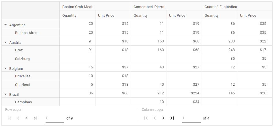
The Pivot Table allows you to control the visibility of the “Rows per page” and “Columns per page” dropdowns in the pager UI using the ShowRowPageSize and ShowColumnPageSize properties within the PagerSettings configuration. These dropdowns display a list of predefined or user-defined page sizes, enabling you to adjust the number of rows or columns displayed per page at runtime. By default, both dropdowns are visible in the pager UI. To hide either the “Rows per page” or “Columns per page” dropdown, set the corresponding property to false.
@using Syncfusion.EJ2.PivotView

@Html.EJS().PivotView("PivotView").Height("350").EnablePaging(true).DataSourceSettings(dataSource => dataSource.DataSource(dataManger =>
{
    dataManger.Url("https://bi.syncfusion.com/northwindservice/api/orders").CrossDomain(true).Adaptor("WebApiAdaptor");

}).ExpandAll(true).ShowAggregationOnValueField(false).EnableSorting(true)
    .FormatSettings(formatsettings =>
    {
        formatsettings.Name("UnitPrice").Format("C0").UseGrouping(true).Add();
    }).Rows(rows =>
    {
        rows.Name("ShipCountry").Add(); rows.Name("ShipCity").Add();
    }).Columns(columns =>
    {
        columns.Name("ProductName").Caption("Product Name").Add();
    }).Values(values =>
    {
        values.Name("Quantity").Caption("Quantity").Add(); values.Name("UnitPrice").Caption("Unit Price").Add();
    })
    ).PageSettings(pageSettings => pageSettings.ColumnPageSize(5).RowPageSize(10).CurrentColumnPage(1).CurrentRowPage(1)
    ).PagerSettings(pagerSettings => pagerSettings.ShowRowPageSize(false).ShowColumnPageSize(false)
    ).GridSettings(gridSettings => gridSettings.ColumnWidth(120)).Render()
public ActionResult Index()
{
return View();
}
Customize page size
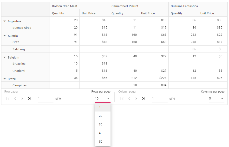
The Pivot Table allows you to specify a list of page sizes for the “Rows per page” and “Columns per page” dropdowns in the pager UI using the RowPageSizes and ColumnPageSizes properties within the PagerSettings configuration. By default, the “Rows per page” dropdown includes page sizes of 10, 50, 100, and 200, while the “Columns per page” dropdown includes page sizes of 5, 10, 20, 50, and 100. To define a different set of page sizes, assign an array of numbers to the RowPageSizes or ColumnPageSizes properties.
The following example sets the “Rows per page” dropdown with page sizes of 10, 20, 30, 40, and 50, and the “Columns per page” dropdown with page sizes of 5, 10, 15, 20, and 30:
@using Syncfusion.EJ2.PivotView

@Html.EJS().PivotView("PivotView").Height("350").EnablePaging(true).DataSourceSettings(dataSource => dataSource.DataSource(dataManger =>
{
    dataManger.Url("https://bi.syncfusion.com/northwindservice/api/orders").CrossDomain(true).Adaptor("WebApiAdaptor");

}).ExpandAll(true).ShowAggregationOnValueField(false).EnableSorting(true)
    .FormatSettings(formatsettings =>
    {
        formatsettings.Name("UnitPrice").Format("C0").UseGrouping(true).Add();
    }).Rows(rows =>
    {
        rows.Name("ShipCountry").Add(); rows.Name("ShipCity").Add();
    }).Columns(columns =>
    {
        columns.Name("ProductName").Caption("Product Name").Add();
    }).Values(values =>
    {
        values.Name("Quantity").Caption("Quantity").Add(); values.Name("UnitPrice").Caption("Unit Price").Add();
    })
    ).PageSettings(pageSettings => pageSettings.ColumnPageSize(5).RowPageSize(10).CurrentColumnPage(1).CurrentRowPage(1)
    ).PagerSettings(pagerSettings => pagerSettings.RowPageSizes(ViewBag.RowPageSizes).ColumnPageSizes(ViewBag.ColumnPageSizes)
    ).GridSettings(gridSettings => gridSettings.ColumnWidth(120)).Render()
public ActionResult Index()
{
ViewBag.RowPageSizes = new double[] { 10, 20, 30, 40, 50 };
ViewBag.ColumnPageSizes = new double[] { 5, 10, 15, 20, 30 };
return View();
}
Template
The Pivot Table allows you to define a custom layout for the pager UI using the Template property within the PagerSettings configuration. By default, the pager UI displays built-in navigation controls. To replace these with custom HTML elements, assign the ID of the custom elements to the Template property. This enables you to create a unique pager interface that aligns with your application’s design requirements.
The following example shows how to create a custom template for both row and column pagers. The HTML element IDs are assigned to the Template property. Then, during the DataBound event, the standalone Syncfusion Pager control is appended to the designated HTML elements. You can configure the pager by setting properties like pageSize, totalRecordsCount, and currentPage. When you click on a custom row or column pager, the CurrentRowPage and CurrentColumnPage properties in PageSettings are updated, enabling navigation with the custom pager.
@Html.EJS().PivotView("PivotView").Height("350").EnablePaging(true).DataSourceSettings(dataSource => dataSource.DataSource(dataManger =>
{
    dataManger.Url("https://bi.syncfusion.com/northwindservice/api/orders").CrossDomain(true).Adaptor("WebApiAdaptor");

}).ExpandAll(true).ShowAggregationOnValueField(false).EnableSorting(true)
    .FormatSettings(formatsettings =>
    {
        formatsettings.Name("UnitPrice").Format("C0").UseGrouping(true).Add();
    }).Rows(rows =>
    {
        rows.Name("ShipCountry").Add(); rows.Name("ShipCity").Add();
    }).Columns(columns =>
    {
        columns.Name("ProductName").Caption("Product Name").Add();
    }).Values(values =>
    {
        values.Name("Quantity").Caption("Quantity").Add(); values.Name("UnitPrice").Caption("Unit Price").Add();
    })
    ).PageSettings(pageSettings => pageSettings.ColumnPageSize(5).RowPageSize(10).CurrentColumnPage(1).CurrentRowPage(1)
    ).PagerSettings(pagerSettings => pagerSettings.Template("#template")
    ).GridSettings(gridSettings => gridSettings.ColumnWidth(120)).DataBound("onDataBound").Render()

<script id="template" type="text/x-template">
    <div class="pager-label">Row Pager: </div>
    <div id="row-pager" class="e-pagertemplate"></div>
    <div class="pager-label">Column Pager: </div>
    <div id="column-pager" class="e-pagertemplate"></div>
</script>
<script>
    function onDataBound() {
        updateTemplate();
    }
    function updateTemplate() {
        var pivotObj = document.getElementById('PivotView').ej2_instances[0];

        rowPager = new ej.grids.Pager({
            pageSize: pivotObj.pageSettings.rowPageSize,
            totalRecordsCount: pivotObj.engineModule.rowCount,
            currentPage: pivotObj.pageSettings.currentRowPage,
            pageCount: 5,
            click: rowPageClick
        });
        rowPager.appendTo('#row-pager');

        columnPager = new ej.grids.Pager({
            pageSize: pivotObj.pageSettings.columnPageSize,
            totalRecordsCount: pivotObj.engineModule.columnCount,
            currentPage: pivotObj.pageSettings.currentColumnPage,
            pageCount: 5,
            click: columnPageClick
        });
        columnPager.appendTo('#column-pager');
    }

    function rowPageClick(args) {
        var pivotObj = document.getElementById('PivotView').ej2_instances[0];
        pivotObj.pageSettings.currentRowPage = args.currentPage;
    }

    function columnPageClick(args) {
        var pivotObj = document.getElementById('PivotView').ej2_instances[0];
        pivotObj.pageSettings.currentColumnPage = args.currentPage;
    }
</script>
<style>
    .e-pivot-pager {
        display: flex;
    }

    .pager-label {
        color: #9e9e9e;
        margin-right: 10px;
    }

    #row-pager {
        margin-right: 10px;
    }
</style>
public ActionResult Index()
{
return View();
}