Add Icons to Buttons in Dialog Component
23 Feb 20224 minutes to read
You can add icons to the dialog buttons using the Buttons property or FooterTemplate property . For detailed information about dialog buttons, refer to the documentation section.
In the following sample, dialog footer buttons are customized with icons using Buttons property.
@using Syncfusion.EJ2.Popups
<div id="target" class="col-lg-12 control-section">
@Html.EJS().Button("normalbtn").Content("Open").Render()
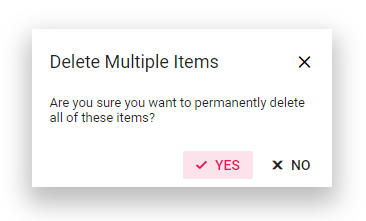
@Html.EJS().Dialog("dialog").AnimationSettings(a=>a.Effect(DialogEffect.Zoom)).Header("Delete Multiple Items").Content("Are you sure you want to permanently delete all of these items?").ShowCloseIcon(true).CloseOnEscape(true).Width("500px").Target("#target").Buttons(btn=> {
btn.Click("dlgButtonClick").ButtonModel(ViewBag.DefaultButtons1).Add();
btn.Click("dlgButtonClick").ButtonModel(ViewBag.DefaultButtons2).Add();
}).Render()
</div>
<script>
document.getElementById('normalbtn').onclick = function () {
var dialogObj = document.getElementById('dialog').ej2_instances[0];
dialogObj.show();
};
function dlgButtonClick() {
var dialogObj = document.getElementById('dialog').ej2_instances[0];
dialogObj.hide();
}
</script>
<style>
.control-section {
padding-left: 10px;
}
#target {
height: 100%;
min-height: 350px;
}
.e-ok-icon::before {
content: '\e7ff';
}
.e-close-icon::before {
content: '\e825';
}
</style>public class HomeController : Controller
{
public class ButtonModel
{
public string content { get; set; }
public bool isPrimary { get; set; }
public string iconCss { get; set; }
}
public ActionResult Index()
{
ViewBag.DefaultButtons1 = new ButtonModel() { content = "YES", isPrimary = true, iconCss = "e-icons e-ok-icon" };
ViewBag.DefaultButtons2 = new ButtonModel() { content = "NO", iconCss = "e-icons e-close-icon" };
return View();
}
}Output be like the below.
In the following sample, dialog footer buttons are customized with icons using FooterTemplate property.
@using Syncfusion.EJ2.Popups

<div id="target" class="col-lg-12 control-section">
    @Html.EJS().Button("normalbtn").Content("Open").Render()
    @Html.EJS().Dialog("dialog").Created("onLoad").AnimationSettings(a => a.Effect(DialogEffect.Zoom)).Header("Delete Multiple Items").Content("Are you sure you want to permanently delete all of these items?").ShowCloseIcon(true).CloseOnEscape(true).Width("500px").Target("#target").FooterTemplate("<div><button id='Button1' class='e-control e-btn e-primary e-flat' data-ripple='true'><span class='e-btn-icon e-icons e-ok-icon e-icon-left'></span>Yes</button><button id='Button2' class='e-control e-btn e-flat' data-ripple='true'><span class='e-btn-icon e-icons e-close-icon e-icon-left'></span>No</button></div>").Render()
</div>
<script>
    var dialogObj = document.getElementById('dialog').ej2_instances[0];
    document.getElementById('normalbtn').onclick = function () {
        dialogObj.show();
    };
    function onLoad() {
        document.getElementById('Button1').onclick = function () {
            dialogObj.hide();
        };
        document.getElementById('Button2').onclick = function () {
            dialogObj.hide();
        };
    }
</script>
<style>
    .control-section {
        padding-left: 10px;
    }

    #target {
        height: 100%;
        min-height: 350px;
    }

    .e-ok-icon::before {
        content: '\e7ff';
    }

    .e-close-icon::before {
        content: '\e825';
    }
</style>
public class HomeController : Controller
{
public ActionResult Index()
{
return View();
}
}Output be like the below.