Types and Styles in ASP.NET MVC Avatar Control
26 Dec 20255 minutes to read
This section explains different types of Avatar.
Avatar size
The Essential® JS 2 Avatar has the following predefined sizes that can be used with the .e-avatar class to change the appearance of the Avatar.
| Class Name | Description |
|---|---|
| e-avatar-xlarge | Displays xlarge size Avatar. |
| e-avatar-large | Displays apply large size Avatar. |
| e-avatar | Displays apply default size Avatar. |
| e-avatar-small | Displays apply small size Avatar. |
| e-avatar-xsmall | Displays apply xsmall size Avatar. |
<div id='element'>
    <span class="e-avatar e-avatar-xlarge"></span>
    <span class="e-avatar e-avatar-large"></span>
    <span class="e-avatar"></span>
    <span class="e-avatar e-avatar-small"></span>
    <span class="e-avatar e-avatar-xsmall"></span>
</div>

<style>
    #element {
        display: block;
        width: 300px;
        margin: 100px auto;
        border-radius: 3px;
    }

    .e-avatar {
        background-image: url('@Url.Content("https://ej2.syncfusion.com/aspnetmvc/Content/avatar/images/pic01.png")');
        margin: 2px;
    }
</style>
using System;
using System.Collections.Generic;
using System.Linq;
using System.Web;
using System.Web.Mvc;
namespace EJ2MVCSampleBrowser.Controllers
{
public class HomeController : Controller
{
public ActionResult Index()
{
return View();
}
}
}
Avatar types
The types of Essential® JS 2 Avatar are:
- Default
- Circle
Default
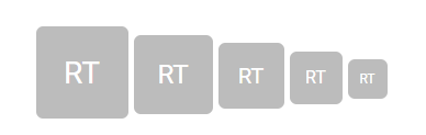
The default style of the Avatar is rectangular shape with rounded corners, which can be applied from adding the modifier class .e-avatar to the target element.
<div id='element'>
    <span class="e-avatar e-avatar-xlarge">RT</span>
    <span class="e-avatar e-avatar-large">RT</span>
    <span class="e-avatar">RT</span>
    <span class="e-avatar e-avatar-small">RT</span>
    <span class="e-avatar e-avatar-xsmall">RT</span>
</div>

<style>
    #element {
        display: block;
        width: 260px;
        margin: 100px auto;
        border-radius: 3px;
    }
</style>
using System;
using System.Collections.Generic;
using System.Linq;
using System.Web;
using System.Web.Mvc;
namespace EJ2MVCSampleBrowser.Controllers
{
public class HomeController : Controller
{
public ActionResult Index()
{
return View();
}
}
}
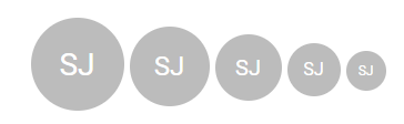
Circle
The circle Avatar style can be applied by adding the modifier class .e-avatar-circle to the target element.
<div id='element'>
    <span class="e-avatar e-avatar-xlarge e-avatar-circle">SJ</span>
    <span class="e-avatar e-avatar-large e-avatar-circle">SJ</span>
    <span class="e-avatar e-avatar-circle">SJ</span>
    <span class="e-avatar e-avatar-small e-avatar-circle">SJ</span>
    <span class="e-avatar e-avatar-xsmall e-avatar-circle">SJ</span>
</div>

<style>
    #element {
        display: block;
        width: 300px;
        margin: 100px auto;
        border-radius: 3px;
    }
</style>
using System;
using System.Collections.Generic;
using System.Linq;
using System.Web;
using System.Web.Mvc;
namespace EJ2MVCSampleBrowser.Controllers
{
public class HomeController : Controller
{
public ActionResult Index()
{
return View();
}
}
}
NOTE