Pie and Doughnut in ASP.NET MVC Accumulation Chart
7 Aug 202624 minutes to read
Pie Chart
To render a pie series, use the series Type as Pie.
@Html.EJS().AccumulationChart("container").Series(series =>
            {
                series.DataSource(ViewBag.dataSource)
                      .XName("xValue")
                      .YName("yValue")
                      .Name("Browser")
                      .Type(Syncfusion.EJ2.Charts.AccumulationType.Pie)
                      .ExplodeIndex(0).Add();
            })
            .EnableSmartLabels(true)
            .Title("Mobile Browser Statistics")
            .LegendSettings(ls => ls.Visible(false)).Render()
public ActionResult Index()
{
List<PieChartData> chartData = new List<PieChartData>
{
new PieChartData { xValue = "Chrome", yValue = 37 },
new PieChartData { xValue = "UC Browser", yValue = 17 },
new PieChartData { xValue = "iPhone", yValue = 19 },
new PieChartData { xValue = "Others", yValue = 4 },
new PieChartData { xValue = "Opera", yValue = 11 },
new PieChartData { xValue = "Android", yValue = 12 },
};
ViewBag.dataSource = chartData;
return View();
}
public class PieChartData
{
public string xValue;
public double yValue;
}Radius Customization
By default, radius of the pie series will be 80% of the size (minimum of chart width and height). You can customize this using Radius property of the series.
@Html.EJS().AccumulationChart("container").Series(series =>
            {
                series.DataSource(ViewBag.dataSource)
                      .XName("xValue")
                      .YName("yValue")
                      .Name("Browser")
                      .Type(Syncfusion.EJ2.Charts.AccumulationType.Pie)
                      .Radius("50%")
                      .ExplodeIndex(0).Add();
            })
            .EnableSmartLabels(true)
            .Title("Mobile Browser Statistics")
            .LegendSettings(ls => ls.Visible(false)).Render()
public ActionResult Index()
{
List<PieChartData> chartData = new List<PieChartData>
{
new PieChartData { xValue = "Chrome", yValue = 37 },
new PieChartData { xValue = "UC Browser", yValue = 17 },
new PieChartData { xValue = "iPhone", yValue = 19 },
new PieChartData { xValue = "Others", yValue = 4 },
new PieChartData { xValue = "Opera", yValue = 11 },
new PieChartData { xValue = "Android", yValue = 12 },
};
ViewBag.dataSource = chartData;
return View();
}
public class PieChartData
{
public string xValue;
public double yValue;
}Pie Center
The center position of the pie can be changed by Center X and Center Y. By default, center value of the pie series x and y is 50%. You can customize this using Center property of the series.
@{
        var piecenter = new
        {
            x = "60%",
            y = "60%"
        };

       }
             @Html.EJS().AccumulationChart("container").Series(series =>
            {
                series.DataLabel(dl => dl.Visible(true).Name("text").Position(Syncfusion.EJ2.Charts.AccumulationLabelPosition.Inside).Font(ft => ft.FontWeight("600")))
                      .XName("xValue")
                      .YName("yValue")
                      .Name("Browser")
                      .Type(Syncfusion.EJ2.Charts.AccumulationType.Pie)
                      .Radius("70%")
                      .DataSource(ViewBag.dataSource).Add();
            })
            .Center(piecenter)
            .EnableSmartLabels(true)
            .EnableAnimation(false)
            .Title("Mobile Browser Statistics")
            .LegendSettings(ls => ls.Visible(false))
            .Tooltip(tp => tp.Enable(true)).Render()
public ActionResult Index()
{
List<PieChartData> chartData = new List<PieChartData>
{
new PieData { xValue = "Chrome", yValue = 37, text = "37%" },
new PieData { xValue = "UC Browser", yValue = 17, text = "17%" },
new PieData { xValue = "iPhone", yValue = 19, text = "19%" },
new PieData { xValue = "Others", yValue = 4, text = "4%" },
new PieData { xValue = "Opera", yValue = 11, text = "11%" },
new PieData { xValue = "Android", yValue = 12, text = "12%" },
};
ViewBag.dataSource = chartData;
return View();
}
public class PieChartData
{
public string xValue;
public double yValue;
public string text;
}Various Radius Pie Chart
You can use radius mapping to render the slice with different Radius pie and also use Border , fill properties to customize the point. dataLabel is used to represent individual data and its value.
@Html.EJS().AccumulationChart("container")
    .Series(sr =>
    {
    sr.Type(Syncfusion.EJ2.Charts.AccumulationType.Pie)
    .XName("xValue")
    .YName("yValue")
    .DataLabel(dl => dl.Visible(true).Name("xValue").Position(Syncfusion.EJ2.Charts.AccumulationLabelPosition.Outside))
    .InnerRadius("20%")
    .Radius("r")
    .DataSource(ViewBag.dataSource).Add();
    })
    .EnableSmartLabels(true)
    .EnableAnimation(true)
    .Tooltip(tp => tp.Enable(true).Format("${point.x} <br />Composition: <b>${point.y}</b>"))
    .LegendSettings(leg => leg.Visible(true)).Render()
public ActionResult Index()
{
List<PieChartData> chartData = new List<PieChartData>
{
new PieRadiusChartData { xValue = "Argentina", yValue = 505370, r = "100"},
new PieRadiusChartData { xValue = "Belgium", yValue = 551500, r = "118.7"},
new PieRadiusChartData { xValue = "Cuba", yValue = 312685 , r = "124.6"},
new PieRadiusChartData { xValue = "Dominican Republic", yValue = 350000 , r = "137.5"},
new PieRadiusChartData { xValue = "Egypt", yValue = 301000 , r = "150.8"},
new PieRadiusChartData { xValue = "Kazakhstan", yValue = 300000, r = "155.5"},
new PieRadiusChartData { xValue = "Somalia", yValue = 357022, r = "160.6"}
};
ViewBag.dataSource = chartData;
return View();
}
public class PieChartData
{
public string xValue;
public double yValue;
public string r;
}Doughnut Chart
To achieve a doughnut in pie series, customize the InnerRadius property of the series. By setting value greater than 0%, a doughnut will appear. The InnerRadius property takes value from 0% to 100% of the pie radius.
@Html.EJS().AccumulationChart("container").Series(series =>
            {
                series.DataSource(ViewBag.dataSource)
                      .XName("xValue")
                      .YName("yValue")
                      .Name("Browser")
                      .Type(Syncfusion.EJ2.Charts.AccumulationType.Pie)
                      .InnerRadius("40%")
                      .ExplodeIndex(0).Add();
            })
            .EnableSmartLabels(true)
            .Title("Mobile Browser Statistics")
            .LegendSettings(ls => ls.Visible(false)).Render()
public ActionResult Index()
{
List<PieChartData> chartData = new List<PieChartData>
{
new PieChartData { xValue = "Chrome", yValue = 37 },
new PieChartData { xValue = "UC Browser", yValue = 17 },
new PieChartData { xValue = "iPhone", yValue = 19 },
new PieChartData { xValue = "Others", yValue = 4 },
new PieChartData { xValue = "Opera", yValue = 11 },
new PieChartData { xValue = "Android", yValue = 12 },
};
ViewBag.dataSource = chartData;
return View();
}
public class PieChartData
{
public string xValue;
public double yValue;
}Multiple Doughnut Series
You can create multiple doughnut within a single chart by adding multiple series with different InnerRadius and Radius values. This allows you to compare multiple data sets with the same categories. Each series can have different data, colors, and customizations. You can also use the MappingKey property in LegendSettings to map the legend items based on the specified field from the data source. When set, points with matching MappingKey values are grouped into a single legend item.
@{
    ViewBag.Title = "Multiple Pie Series";
}

<div class="control-section">
    <div class="content-wrapper">
        @{
            Html.EJ2().AccumulationChart("pie-container")
                .Title("Product Sales vs Profit Analysis")
                .Subtitle(sub => sub.Text("Comparing total sales revenue with profit margins by product category"))
                .Series(series =>
                {
                    series.Add()
                        .DataSource(ViewBag.totalSalesData)
                        .XName("x")
                        .YName("y")
                        .Name("Total Sales")
                        .Type(AccumulationType.Pie)
                        .Radius("90%")
                        .InnerRadius("60%")
                        .DataLabel(dl => dl
                            .Visible(true)
                            .Name("text")
                            .Position(ChartDataLabelPosition.Outside)
                            .ConnectorStyle(cs => cs
                                .Type(ConnectorType.Curve)
                                .Color("black")
                                .Width(2)
                                .DashArray("2,1")
                                .Length("5")
                            )
                        )
                        .Tooltip(tt => tt.MappingName("x"));

                    series.Add()
                        .DataSource(ViewBag.totalProfitData)
                        .XName("x")
                        .YName("y")
                        .Name("Total Profit")
                        .Type(AccumulationType.Pie)
                        .Radius("50%")
                        .InnerRadius("50%")
                        .DataLabel(dl => dl
                            .Visible(true)
                            .Name("text")
                            .Position(ChartDataLabelPosition.Inside)
                            .ConnectorStyle(cs => cs
                                .Type(ConnectorType.Curve)
                                .Color("black")
                                .Width(2)
                                .DashArray("2,1")
                                .Length("5")
                            )
                        )
                        .Tooltip(tt => tt.MappingName("x"));
                })
                .Tooltip(tt => tt
                    .Enable(true)
                    .Format("<b>${point.x}</b><br/>Value: <b>$${point.y}</b><br/>Percentage: <b>${point.percentage}%</b>")
                )
                .LegendSettings(ls => ls.MappingKey("x"))
                .EnableBorderOnMouseMove(false)
                .Border(b => b.Color("#333").Width(2))
                .Render();
        }
    </div>
</div>

<style>
    #pie-container {
        display: block;
    }
</style>
using System;
using System.Collections.Generic;
using System.Linq;
using System.Web;
using System.Web.Mvc;
namespace WebApplication1.Controllers
{
public partial class AccumulationChartController : Controller
{
public ActionResult MultipleSeries()
{
List<MultiplePieSeriesData> totalSalesData = new List<MultiplePieSeriesData>
{
new MultiplePieSeriesData { x = "Electronics", y = 45000, text = "45K" },
new MultiplePieSeriesData { x = "Fashion", y = 32000, text = "32K" },
new MultiplePieSeriesData { x = "Home & Garden", y = 18000, text = "18K" },
new MultiplePieSeriesData { x = "Sports", y = 15000, text = "15K" },
new MultiplePieSeriesData { x = "Books", y = 8000, text = "8K" }
};
List<MultiplePieSeriesData> totalProfitData = new List<MultiplePieSeriesData>
{
new MultiplePieSeriesData { x = "Electronics", y = 18000, text = "18K", profit = "40%" },
new MultiplePieSeriesData { x = "Fashion", y = 12800, text = "12.8K", profit = "40%" },
new MultiplePieSeriesData { x = "Home & Garden", y = 6300, text = "6.3K", profit = "35%" },
new MultiplePieSeriesData { x = "Sports", y = 4500, text = "4.5K", profit = "30%" },
new MultiplePieSeriesData { x = "Books", y = 2400, text = "2.4K", profit = "30%" }
};
ViewBag.totalSalesData = totalSalesData;
ViewBag.totalProfitData = totalProfitData;
ViewBag.border = new { color = "#333", width = 2 };
return View();
}
}
public class MultiplePieSeriesData
{
public string x { get; set; }
public double y { get; set; }
public string text { get; set; }
public string profit { get; set; }
}
}Start and End angles
You can customize the start and end angle of the pie series using the StartAngle and EndAngle properties. The default value of StartAngle is 0 degree, and EndAngle is 360 degrees. By customizing this, you can achieve a semi pie series.
@Html.EJS().AccumulationChart("container").Series(series =>
            {
                series.DataSource(ViewBag.dataSource)
                      .XName("xValue")
                      .YName("yValue")
                      .Name("Browser")
                      .Type(Syncfusion.EJ2.Charts.AccumulationType.Pie)
                      .StartAngle(90)
                      .EndAngle(270).Add();
            })
            .EnableSmartLabels(true)
            .Title("Mobile Browser Statistics")
            .LegendSettings(ls => ls.Visible(false)).Render()
public ActionResult Index()
{
List<PieChartData> chartData = new List<PieChartData>
{
new PieChartData { xValue = "Chrome", yValue = 37 },
new PieChartData { xValue = "UC Browser", yValue = 17 },
new PieChartData { xValue = "iPhone", yValue = 19 },
new PieChartData { xValue = "Others", yValue = 4 },
new PieChartData { xValue = "Opera", yValue = 11 },
new PieChartData { xValue = "Android", yValue = 12 },
};
ViewBag.dataSource = chartData;
return View();
}
public class PieChartData
{
public string xValue;
public double yValue;
}Color & Text Mapping
The fill color and the text in the data source can be mapped to the chart using PointColorMapping in series and Name in datalabel respectively.
@Html.EJS().AccumulationChart("container").Series(series =>
            {
                series.DataSource(ViewBag.dataSource)
                      .XName("xValue")
                      .YName("yValue")
                      .Name("Browser")
                      .Type(Syncfusion.EJ2.Charts.AccumulationType.Pie)
                      .PointColorMapping("fill")
                      .DataLabel(ViewBag.datalabel).Add();
            })
            .EnableSmartLabels(true)
            .Title("Mobile Browser Statistics")
            .LegendSettings(ls => ls.Visible(false)).Render()
public ActionResult Index()
{
List<PieChartData> chartData = new List<PieChartData>
{
new PieChartData { xValue = "Chrome", yValue = 37, text = "37%", fill="#498fff"},
new PieChartData { xValue = "UC Browser", yValue = 17, text = "17%", fill="#ffa060"},
new PieChartData { xValue = "iPhone", yValue = 19, text = "19%", fill="#ff68b6"},
new PieChartData { xValue = "Others", yValue = 4 , text = "4%", fill="#81e2a1"},
};
ViewBag.dataSource = chartData;
return View();
}
public class PieChartData
{
public string xValue;
public double yValue;
}Border radius
You can create rounded corners for each slice by using the BorderRadius option, which gives the chart a modern and polished appearance.
@Html.EJS().AccumulationChart("container").Series(series =>
{
    series.Type(Syncfusion.EJ2.Charts.AccumulationType.Pie)
        .XName("X")
        .YName("Y")
        .BorderRadius(8)
        .DataSource(ViewBag.dataSource)
        .Add();
}).Render()
public ActionResult Index()
{
List<PieChartData> chartData = new List<PieChartData>
{
new PieChartData { X = "Jan", Y = 3 },
new PieChartData { X = "Feb", Y = 3.5 },
new PieChartData { X = "Mar", Y = 7 },
new PieChartData { X = "Apr", Y = 13.5 },
new PieChartData { X = "May", Y = 19 },
new PieChartData { X = "Jun", Y = 23.5 },
new PieChartData { X = "Jul", Y = 26 },
new PieChartData { X = "Aug", Y = 25 },
new PieChartData { X = "Sep", Y = 21 },
new PieChartData { X = "Oct", Y = 15 }
};
ViewBag.dataSource = chartData;
return View();
}
public class PieChartData
{
public string X;
public double Y;
}Customization
Individual points can be customized using the PointRender event.
@Html.EJS().AccumulationChart("container").Series(series =>
            {
                series.DataSource(ViewBag.dataSource)
                      .XName("xValue")
                      .YName("yValue")
                      .Name("Browser")
                      .Type(Syncfusion.EJ2.Charts.AccumulationType.Pie)
                      .Add();
            })
            .EnableSmartLabels(true)
            .PointRender("pointRender")
            .Title("Mobile Browser Statistics")
            .LegendSettings(ls => ls.Visible(false)).Render()

 <script>
            var pointRender = function (args) {
                if ((args.point.xValue as string).indexOf('iPhone') > -1) {
                    args.fill = '#f4bc42';
                     }
                       else {
                     args.fill = '#597cf9';
                     }
            };
</script>
public ActionResult Index()
{
List<PieChartData> chartData = new List<PieChartData>
{
new PieChartData { xValue = "Chrome", yValue = 37 },
new PieChartData { xValue = "UC Browser", yValue = 17 },
new PieChartData { xValue = "iPhone", yValue = 19 },
new PieChartData { xValue = "Others", yValue = 4 },
new PieChartData { xValue = "Opera", yValue = 11 },
new PieChartData { xValue = "Android", yValue = 12 },
};
ViewBag.dataSource = chartData;
return View();
}
public class PieChartData
{
public string xValue;
public double yValue;
}Patterns
You can apply different patterns to the pie slices using the ApplyPattern property in the series and the PointRender event.
@Html.EJS().AccumulationChart("container").Series(series =>
{
    series.Type(Syncfusion.EJ2.Charts.AccumulationType.Pie)
        .XName("X")
        .YName("Y")
        .ApplyPattern(true)
        .DataSource(ViewBag.dataSource)
        .Add();
}).Render()
public ActionResult Index()
{
List<PieChartData> chartData = new List<PieChartData>
{
new PieChartData { X = "Jan", Y = 3 },
new PieChartData { X = "Feb", Y = 3.5 },
new PieChartData { X = "Mar", Y = 7 },
new PieChartData { X = "Apr", Y = 13.5 },
new PieChartData { X = "May", Y = 19 },
new PieChartData { X = "Jun", Y = 23.5 },
new PieChartData { X = "Jul", Y = 26 },
new PieChartData { X = "Aug", Y = 25 },
new PieChartData { X = "Sep", Y = 21 },
new PieChartData { X = "Oct", Y = 15 }
};
ViewBag.dataSource = chartData;
return View();
}
public class PieChartData
{
public string X;
public double Y;
}Hide pie or doughnut border
By default, the border will appear in the pie/doughnut chart while mouse hover on the chart. You can disable the the border by setting EnableBorderOnMouseMove property is false.
@Html.EJS().AccumulationChart("container").EnableBorderOnMouseMove(false).Series(series =>
            {
                series.DataSource(ViewBag.dataSource)
                      .XName("xValue")
                      .YName("yValue")
                      .Name("Browser")
                      .Type(Syncfusion.EJ2.Charts.AccumulationType.Pie)
                      .Add();
            })

            .Title("Mobile Browser Statistics")
            .LegendSettings(ls => ls.Visible(false)).Render()
public ActionResult Index()
{
List<PieChartData> chartData = new List<PieChartData>
{
new PieChartData { xValue = "Chrome", yValue = 37 },
new PieChartData { xValue = "UC Browser", yValue = 17 },
new PieChartData { xValue = "iPhone", yValue = 19 },
new PieChartData { xValue = "Others", yValue = 4 },
new PieChartData { xValue = "Opera", yValue = 11 },
new PieChartData { xValue = "Android", yValue = 12 },
};
ViewBag.dataSource = chartData;
return View();
}
public class PieChartData
{
public string xValue;
public double yValue;
}Color Palette
You can customize the color the of the point using the Palettes property.
@Html.EJS().AccumulationChart("container").EnableBorderOnMouseMove(false).Series(series =>
            {
                series.DataSource(ViewBag.dataSource)
                      .XName("xValue")
                      .YName("yValue")
                      .Name("Browser")
                      .Type(Syncfusion.EJ2.Charts.AccumulationType.Pie)
                      .palettes("['teal', 'skyblue', 'green', 'red']")
                      .Add();
            })

            .Title("Mobile Browser Statistics")
            .LegendSettings(ls => ls.Visible(false)).Render()
public ActionResult Index()
{
List<PieChartData> chartData = new List<PieChartData>
{
new PieChartData { xValue = "Chrome", yValue = 37 },
new PieChartData { xValue = "UC Browser", yValue = 17 },
new PieChartData { xValue = "iPhone", yValue = 19 },
new PieChartData { xValue = "Others", yValue = 4 },
new PieChartData { xValue = "Opera", yValue = 11 },
new PieChartData { xValue = "Android", yValue = 12 },
};
ViewBag.dataSource = chartData;
return View();
}
public class PieChartData
{
public string xValue;
public double yValue;
}Multi-level pie chart
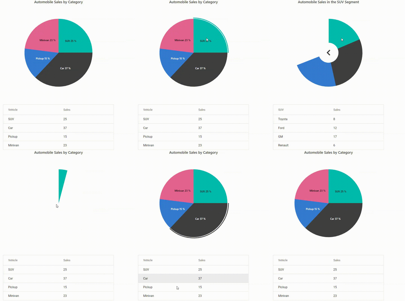
You can achieve a multi-level drill down in pie and doughnut charts using PointClick event. If user clicks any point in the chart, that corresponding data will be shown in the next level and so on based on point clicked.
You can also achieve drill-up (back to the initial state) by using ChartMouseClick event. In below sample, you can drill-up by clicking back button in the center of the char
<div>
    @(Html.EJS().AccumulationChart("Chart").Series(
               series =>
               {
                   series.DataLabel(dl => dl.Visible(true).Name("text").Position(Syncfusion.EJ2.Charts.AccumulationLabelPosition.Inside).Font(ft => ft.FontWeight("600"))).
                XName("x").
                YName("y").
                Name("Project").
                Type(Syncfusion.EJ2.Charts.AccumulationType.Pie).
                Radius("70%").
                StartAngle(0).
                EndAngle(360).
                DataSource(ViewBag.dataSource).
                Explode(false).Add();
               }).EnableSmartLabels(true).Title("Automobile Sales by Category").TextRender("textRender").LegendSettings(
               legend =>
               {
                   legend.Visible(false);
               }).PointClick("pointClick").ChartMouseClick("chartMouseClick").Render()
         )
    @Html.EJS().Grid("Grid").DataSource((IEnumerable<object>)ViewBag.dataSource).Columns(col =>
    {
           col.Field("x").HeaderText("Vehicles").Type("string").Add();
           col.Field("y").HeaderText("Sales").Type("string").Add();
       }).Render()
</div>
<script>
    var pointIndex = -1;
    var data = [
        {
            x: 'SUV',
            y: 25,
            z: [
                {
                    title: 'Automobile Sales in the SUV Segment',
                    x: 'Toyota',
                    y: 8,
                    z: [
                        { x: '2000', y: 20 },
                        { x: '2001', y: 30 },
                        { x: '2002', y: 40 },
                    ],
                },
                { x: 'Ford', y: 12 },
                { x: 'GM', y: 17 },
                { x: 'Renault', y: 6 },
            ],
        },
        {
            x: 'Car',
            y: 37,
            z: [
                { title: 'Automobile Sales in the Car Segment', x: 'Toyota', y: 7 },
                { x: 'Chrysler', y: 12 },
                { x: 'Nissan', y: 9 },
                { x: 'Ford', y: 15 },
            ],
        },
        {
            x: 'Pickup',
            y: 15,
            z: [
                { title: 'Automobile Sales in the Pickup Segment', x: 'Nissan', y: 9 },
                { x: 'Chrysler', y: 4 },
                { x: 'Ford', y: 7 },
                { x: 'Toyota', y: 20 },
            ],
        },
        {
            x: 'Minivan',
            y: 23,
            z: [
                { title: 'Automobile Sales in the Minivan Segment', x: 'Hummer', y: 11 },
                { x: 'Ford', y: 5 },
                { x: 'GM', y: 12 },
                { x: 'Chrysler', y: 3 },
            ],
        },
    ];

    var textRender = function (args) {
        args.text = args.point.x + ' ' + args.point.y + ' %';
    };

    var chartMouseClick = function (args) {
        var pie = document.getElementById("Chart").ej2_instances[0];
        var grid = document.getElementById("Grid").ej2_instances[0];
        if (args.target.indexOf('back') > -1) {
            if (pie.series[0].name === 'Level 3') {
                pie.series[0].dataSource = data[window.pointIndex].z;
                pie.series[0].name = 'Level 2';
                pie.title = data[window.pointIndex].z[0].title;
                pie.series[0].innerRadius = '30%';
                grid.dataSource = pie.series[0].dataSource;
                grid.columns[0].headerText = data[window.pointIndex].x;
                grid.refresh();
                pie.refresh();
            } else if (pie.series[0].name === 'Level 2') {
                pie.series[0].dataSource = data;
                pie.series[0].name = 'Level 1';
                pie.series[0].innerRadius = '0%';
                pie.title = 'Automobile Sales by Category';
                pie.annotations = [{}];
                pie.pointClick = pointClick;
                grid.dataSource = pie.series[0].dataSource;
                grid.columns[0].headerText = 'Vehicle';
                grid.refresh();
                pie.refresh();
            }
        }
        grid.dataSource = pie.series[0].dataSource;
    };
    var pointClick = function (args) {
        var pie = document.getElementById("Chart").ej2_instances[0];
        var grid = document.getElementById("Grid").ej2_instances[0];
        if (
            ej.charts.getElement(
                pie.element.id +
                '_Series_' +
                args.seriesIndex +
                '_Point_' +
                args.pointIndex
            )
        ) {
            pie.series[0].dataSource = data[args.pointIndex].z;
            pie.title = data[args.pointIndex].z[0].title;
            window.pointIndex = args.pointIndex;

            pie.series[0].name = 'Level 2';
            pie.series[0].innerRadius = '30%';
            pie.annotations = [
                {
                    content:
                        '<div id="back" style="cursor:pointer;padding:3px;width:30px; height:30px;">' +
                        '<img src="https://ej2.syncfusion.com/javascript/demos/src/chart/images/back.png" id="back" />',
                    region: 'Series',
                    x: '50%',
                    y: '50%',
                },
            ];
            pie.pointClick = click;
        }
        grid.dataSource = pie.series[0].dataSource;
        grid.columns[0].headerText = data[args.pointIndex].x;
        grid.refresh();
        pie.refresh();
    }
    var click = function (args) {
        var pie = document.getElementById("Chart").ej2_instances[0];
        var grid = document.getElementById("Grid").ej2_instances[0];
        if (pie.series[0].name !== 'Level 3') {
            switch (args.pointIndex) {
                case 0:
                    pie.series[0].dataSource = data[0].z[0].z;
                    pie.title = 'SUV Sales by Years';
                    pie.series[0].name = 'Level 3';
                    grid.columns[0].headerText = 'Year';
                    grid.refresh();
                    pie.refresh();
                    break;
            }
            grid.dataSource = pie.series[0].dataSource;
        }
    };
</script>
public IActionResult Index()
{
List<CategoryData> chartData = new List<CategoryData>
{
new CategoryData { x = "SUV", y = 25 },
new CategoryData { x = "Car", y = 37 },
new CategoryData { x = "Pickup", y = 15 },
new CategoryData { x = "Minivan", y = 23 },
};
ViewBag.datalabel = new
{
visible = true,
position = "Inside",
name = "text",
font = new
{
fontWeight = "600"
}
};
ViewBag.dataSource = chartData;
return View();
}
public class CategoryData
{
public string x;
public double y;
}