Column Chooser in ASP.NET CORE Tree Grid Component
29 Aug 202515 minutes to read
The column chooser has options to show or hide columns dynamically. It can be enabled by defining the showColumnChooser as true.
<ejs-treegrid id="TreeGrid" dataSource="@ViewBag.data" showColumnChooser="true" toolbar="@(new List<string>() { "ColumnChooser"} childMapping="Children" treeColumnIndex="1" allowPaging="true">
    <e-treegrid-columns>
        <e-treegrid-column field="TaskId" headerText="Task ID" textAlign="Right" width="100"></e-treegrid-column>
        <e-treegrid-column field="TaskName" headerText="Task Name" showInColumnChooser="true" width="190"></e-treegrid-column>
        <e-treegrid-column field="StartDate" headerText=" Start Date" textAlign="Right" format="yMd" type="date" width="120"></e-treegrid-column>
        <e-treegrid-column field="Duration" headerText="Duration" textAlign="Right" width="110"></e-treegrid-column>
        <e-treegrid-column field="Progress" headerText="Progress" textAlign="Right" width="110"></e-treegrid-column>
    </e-treegrid-columns>
</ejs-treegrid>
public IActionResult Index()
{
var tree = TreeData.GetDefaultData();
ViewBag.data = tree;
return View();
}NOTE
You can hide the column names in column chooser by defining the
showInColumnChooserproperty ofe-treegrid-columntag helper as false.
Open column chooser by external button
The Column chooser can be displayed on a page through external button by invoking the openColumnChooser method with X and Y axis positions.
<ejs-button id="show" content="OPEN COLUMN CHOOSER"></ejs-button>
 <ejs-treegrid id="TreeGrid" dataSource="@ViewBag.data" showColumnChooser="true" childMapping="Children" treeColumnIndex="1" allowPaging="true">
    <e-treegrid-columns>
        <e-treegrid-column field="TaskId" headerText="Task ID" textAlign="Right" width="100"></e-treegrid-column>
        <e-treegrid-column field="TaskName" headerText="Task Name" showInColumnChooser="true" width="190"></e-treegrid-column>
        <e-treegrid-column field="StartDate" headerText=" Start Date" textAlign="Right" format="yMd" type="date" width="120"></e-treegrid-column>
        <e-treegrid-column field="Duration" headerText="Duration" textAlign="Right" width="110"></e-treegrid-column>
        <e-treegrid-column field="Progress" headerText="Progress" textAlign="Right" width="110"></e-treegrid-column>
    </e-treegrid-columns>
 </ejs-treegrid>

 <script>
    document.getElementById('show').addEventListener("click", function(){
        var treegrid = document.getElementById('TreeGrid').ej2_instances[0];
        treegrid.columnChooserModule.openColumnChooser(200, 50); // give X and Y axis
    });
</script>
public IActionResult Index()
{
var tree = TreeData.GetDefaultData();
ViewBag.data = tree;
return View();
}Column chooser template in Syncfusion ASP.NET CORE TreeGrid
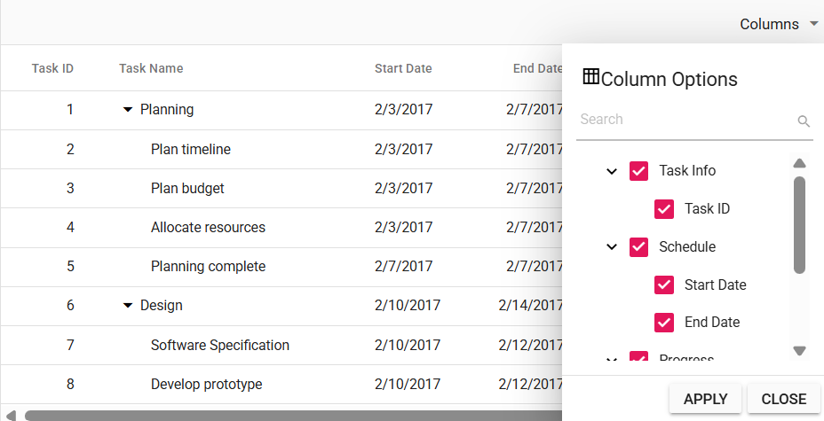
The Column Chooser Template feature allows full customization of the column chooser’s header, content, and footer, making it easier to manage column visibility. To enable the column chooser, set showColumnChooser to true and add ColumnChooser to the toolbar property.
To implement a custom column chooser template in the TreeGrid, use the following properties:
-
columnChooserSettings.headerTemplate - Defines the header template of the column chooser.
-
columnChooserSettings.template- Defines the content template.
-
columnChooserSettings.footerTemplate - Defines the footer template.
-
columnChooserSettings.renderCustomColumnChooser - Allows you to override the default column chooser UI with a fully customized layout.
In this example, a Syncfusion TreeView component is rendered inside the column chooser. To use the TreeView component, install the Syncfusion TreeView package as described in the documentation. The columnChooserSettings.template property defines a element with the id set to tree, providing as a container for the TreeView component. The columnChooserSettings.renderCustomColumnChooser method initializes the TreeView with checkboxes and appends it to this template. Checkbox selection is handled using the nodeClicked and keyPress events, which organize columns into Task Info, Schedule, and Progress.
The column chooser footer is customized using columnChooserSettings.footerTemplate, replacing the default buttons with customized Apply and Close buttons. The Apply button updates column visibility based on selection, while the Close button closes the column chooser via the onClick event. Additionally, the header is customized using columnChooserSettings.headerTemplate to include a title and an icon.
<ejs-treegrid id="TreeGrid" dataSource="@ViewBag.data" childMapping="subtasks" treeColumnIndex="1" height="315" toolbar="@(new List<string>() { "ColumnChooser" })" showColumnChooser="true">
    <e-treegrid-columnChooserSettings  headerTemplate="#ccHeaderTemplate" template="#ccContentTemplate" footerTemplate="#ccFooterTemplate" enableSearching="true"> </e-treegrid-columnChooserSettings>
    <e-treegrid-columns>
        <e-treegrid-column field="taskID" headerText="Task ID" textAlign="Right" width="90"></e-treegrid-column>
        <e-treegrid-column field="taskName" headerText="Task Name" width="240" showInColumnChooser="false"></e-treegrid-column>
        <e-treegrid-column field="startDate" headerText="Start Date" width="110" format="yMd"></e-treegrid-column>
        <e-treegrid-column field="endDate" headerText="End Date" width="110" textAlign="Right" type="date" format="yMd"></e-treegrid-column>
        <e-treegrid-column field="duration" headerText="Duration" width="100" textAlign="Right"></e-treegrid-column>
        <e-treegrid-column field="progress" headerText="Progress" width="100" textAlign="Right"></e-treegrid-column>
        <e-treegrid-column field="priority" headerText="Priority" width="90"></e-treegrid-column>
    </e-treegrid-columns>
</ejs-treegrid>

<!-- Templates -->
<script id="ccHeaderTemplate" type="text/x-template">
    <div class="cc-header">
        <span class="e-icons e-columns"></span>
        <span>Column Options</span>
    </div>
</script>

<script id="ccContentTemplate" type="text/x-template">
    <div id="treeViewContainer"></div>
</script>

<script id="ccFooterTemplate" type="text/x-template">
    <div class="cc-footer">
        <button id="submitButton">Apply</button>
        <button id="abortButton">Close</button>
    </div>
</script>

<script>
    var treeObj;
    var treeData = [];

    function renderCustomColumnChooser(targetElement, columns) {
        var parentNodes = [
            { id: 1, name: 'Task Info', hasChild: true, expanded: true },
            { id: 2, name: 'Schedule', hasChild: true, expanded: true },
            { id: 3, name: 'Progress', hasChild: true, expanded: true }
        ];

        treeData = columns.map(function (column) {
            var parentId;
            switch (column.field) {
                case 'taskID':
                case 'taskName':
                    parentId = 1;
                    break;
                case 'startDate':
                case 'endDate':
                    parentId = 2;
                    break;
                case 'duration':
                case 'progress':
                case 'priority':
                    parentId = 3;
                    break;
            }
            return {
                id: column.uid,
                name: column.headerText,
                pid: parentId,
                isChecked: column.visible
            };
        });

        var uniquePids = [...new Set(treeData.map(item => item.pid))];
        var filteredParents = parentNodes.filter(parent => uniquePids.includes(parent.id));
        treeData.push(...filteredParents);

        treeObj = new ej.navigations.TreeView({
            fields: { dataSource: treeData, id: 'id', parentID: 'pid', text: 'name', hasChildren: 'hasChild' },
            showCheckBox: true,
            nodeClicked: nodeCheck,
            keyPress: nodeCheck,
            cssClass: "no-border"
        });

        treeObj.appendTo(targetElement);
    }

    function nodeCheck(args) {
        var node = args.node;
        var getNodeDetails = treeObj.getNode(node);
        var checkedNode = [node];

        if (args.event.target.classList.contains('e-fullrow') || args.event.key === "Enter") {
            if (getNodeDetails.isChecked === 'true') {
                treeObj.uncheckAll(checkedNode);
            } else {
                treeObj.checkAll(checkedNode);
            }
        }
    }

    function columnChooserSubmit() {
        var checkedElements = [];
        var uncheckedElements = [];

        var treeItems = document.querySelectorAll('.e-list-item');
        treeItems.forEach(function (item) {
            var itemDetails = treeObj.getNode(item);
            if (!itemDetails.hasChildren) {
                if (item.getAttribute('aria-checked') === 'true') {
                    checkedElements.push(itemDetails.text);
                } else {
                    uncheckedElements.push(itemDetails.text);
                }
            }
        });

        var visibleColumns = checkedElements;
        var hiddenColumns = uncheckedElements;

        var treeGridObj = document.getElementById('TreeGrid').ej2_instances[0];
        treeGridObj.grid.columnChooserModule.changeColumnVisibility({ visibleColumns, hiddenColumns });
    }

    function onCreated() {
        new ej.buttons.Button().appendTo('#submitButton');
        new ej.buttons.Button().appendTo('#abortButton');

        document.getElementById('submitButton').onclick = columnChooserSubmit;
        document.getElementById('abortButton').onclick = function () {
            var treeGridObj = document.getElementById('TreeGrid').ej2_instances[0];
            treeGridObj.grid.columnChooserModule.hideDialog();
        };
    }

    document.addEventListener('DOMContentLoaded', function () {
        var treeGridObj = document.getElementById('TreeGrid').ej2_instances[0];
        treeGridObj.columnChooserSettings.renderCustomColumnChooser = renderCustomColumnChooser;
        treeGridObj.created = onCreated;
    });
</script>
public IActionResult Index()
{
var tree = TreeData.GetFormatData();
ViewBag.data = tree;
return View();
}
NOTE
You can refer to our
ASP.NET Core Tree Gridfeature tour page for its groundbreaking feature representations. You can also explore our ASP.NET Core Tree Grid exampleASP.NET Core Tree Grid exampleto knows how to present and manipulate data.