How can I help you?
Animation in Tooltip Control
3 May 20249 minutes to read
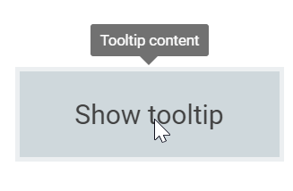
To animate the Tooltip, a set of specific animation effects are available, and it can be controlled using the animation property. The animation property also allows you to set delay, duration, and various other effects of your choice.
AnimationModel is derived from base to apply the chosen animation effect, duration, etc. on Tooltips.
By default, Tooltip entrance occurs over 150 ms using the ease-out timing function. It exits also at 150 ms, but uses ease-in timing function.
<ejs-tooltip id="tooltip" content="Tooltip content" animation="ViewBag.animation" position="TopCenter">
    <e-content-template>
        <ejs-button id="target" content="Show tooltip">
        </ejs-button>
    </e-content-template>
</ejs-tooltip>

<style>

    #tooltip {
        position: absolute;
        left: calc( 50% - 60px);
        top: 38%;
    }
</style>
public ActionResult TooltipAnimation()
{
ViewBag.animation = new
{
open = new { effect = "ZoomIn", duration = 1000, delay = 0 },
close = new { effect = "ZoomOut", duration = 500, delay = 0 }
};
return View();
}Output be like the below.

The default animation effect for the Tooltip is set to FadeIn for its open action, and FadeOut for its close action. The default duration is set to 150 ms and delay is set to 0.
Animation effects
The animation effects that are applicable to Tooltips are:
FadeInFadeOutFadeZoomInFadeZoomOutFlipXDownInFlipXDownOutFlipXUpInFlipXUpOutFlipYLeftInFlipYLeftOutFlipYRightInFlipYRightOutZoomInZoomOutNone
When the effect is specified as None, no effect will be applied to the Tooltip, and animation is considered to be set to off.
NOTE
Some of the above animation effects suits the Tooltip better when its tip pointer is hidden.
This can be achieved by setting theshowTipPointerto false.
Animating via open/close methods
Animations can also be applied on Tooltips dynamically through open and close methods. These methods accept the animation model as an optional parameter. If you pass TooltipAnimationSettings, animation takes this model; otherwise, it takes the values from the animation property. It is also possible to pass different animations for Tooltips on each target.
Refer to the code snippet below to apply animations using public methods.
<ejs-tooltip id="tooltip" content="Tooltip content" opensOn="Custom" created="created" position="TopCenter">
    <e-content-template>
        <ejs-button id="target" content="Show tooltip">
        </ejs-button>
    </e-content-template>
</ejs-tooltip>

<style>
    #tooltip {
        position: absolute;
        left: calc( 50% - 60px);
        top: 38%;
    }
</style>

<script>
    function created() {
        document.getElementById('target').addEventListener("click", function () {
            var tooltip = document.getElementById('tooltip').ej2_instances[0];
            if (this.getAttribute("data-tooltip-id")) {
                var closeAnimation = { effect: 'FadeOut', duration: 1000 }
                tooltip.close(closeAnimation);
            } else {
                var openAnimation = { effect: 'FadeIn', duration: 1000 }
                tooltip.open(this, openAnimation);
            }
        });
    }
</script>
public ActionResult TooltipAnimation()
{
return View();
}Output be like the below.

Apply transition
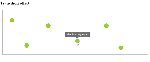
The transition effect can be applied on Tooltips by using the beforeRender event as given in the following work-around code example.
<ejs-tooltip id="tooltip" target=".circletool" beforeRender="onBeforeRender" afterClose="onAfterClose" closeDelay=1000 animation="ViewBag.animation" position="TopCenter">
    <e-content-template>
        <div>
            <h3> Transition effect </h3>
            <div id="box" class="e-prevent-select">
                <div class="circletool" style="top:18%;left:5%" title="This is Turtle !!!"></div>
                <div class="circletool" style="top:30%;left:30%" title="This is Snake !!!"></div>
                <div class="circletool" style="top:80%;left:80%" title="This is Croc !!!"></div>
                <div class="circletool" style="top:65%;left:50%" title="This is String Ray !!!"></div>
                <div class="circletool" style="top:75%;left:15%" title="This is Blob Fish !!!"></div>
                <div class="circletool" style="top:30%;left:70%" title="This is Mammoth !!!"></div>
            </div>
        </div>
    </e-content-template>
</ejs-tooltip>

<style>
    #box {
        border: 1px solid #c8c8c8;
        box-sizing: border-box;
        height: 200px;
        margin-left: 10px;
        margin-right: 10px;
        position: relative;
    }

    .circletool {
        background: yellowgreen;
        border-radius: 50px;
        height: 20px;
        position: absolute;
        width: 20px;
    }
</style>

<script>
    function onBeforeRender(args) {
        if (args.element) {
            // here prevent animation while apply transition
            this.animation = { open: { effect: 'None' } };
            args.element.style.display = 'block';
            args.element.style.transitionProperty = 'left,top';
            args.element.style.transitionDuration = '1000ms';
        }
    }
    function onAfterClose(args) {
        // restore the animation effects
        this.animation = { open: { effect: 'ZoomIn', duration: 500 }, close: { effect: 'ZoomOut', duration: 500 } };
    }
</script>
public ActionResult TooltipAnimation()
{
ViewBag.animation = new
{
open = new { effect = "ZoomIn", duration = 500 },
close = new { effect = "ZoomOut", duration = 500 }
};
return View();
}Output be like the below.
