How can I help you?
Customization in ASP.NET CORE Timeline control
30 Jan 20258 minutes to read
You can customize the Timeline items dot size, connectors, dot borders, dot outer space and more to personalize its appearance. This section explains the different ways for styling the items.
Connector styling
Common styling
You can define the styles applicable to the all the Timeline item connectors.
@using Syncfusion.EJ2.Layouts;

<div class="container" style="height: 250px">
    <ejs-timeline id="timeline" cssClass="custom-connector">
        <e-timeline-items>
            <e-timeline-item content="Eat"></e-timeline-item>
            <e-timeline-item content="Code"></e-timeline-item>
            <e-timeline-item content="Repeat"></e-timeline-item>
        </e-timeline-items>
    </ejs-timeline>
</div>

<style>
    .custom-connector .e-timeline-item.e-connector::after {
        border-color: #f7c867;
        border-width: 1.4px;
    }
</style>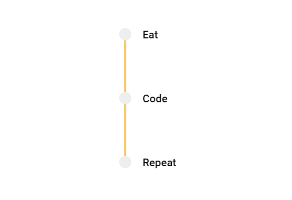
Individual styling
You can also apply unique styles to individual connectors, to differentiate specific items within the Timeline.
@using Syncfusion.EJ2.Layouts;

<div class="container" style="height: 250px">
    <ejs-timeline id="timeline" cssClass="custom-connector">
        <e-timeline-items>
            <e-timeline-item content="Eat" cssClass="state-initial"></e-timeline-item>
            <e-timeline-item content="Code" cssClass="state-intermediate"></e-timeline-item>
            <e-timeline-item content="Repeat"></e-timeline-item>
        </e-timeline-items>
    </ejs-timeline>
</div>

<style>
    .custom-connector .e-timeline-item.state-initial.e-connector::after {
        border: 1.5px #f8c050 dashed;
    }
    .custom-connector .e-timeline-item.state-intermediate.e-connector::after {
        border: 1.5px #4d85f5 dashed;
    }
</style>
Dot styling
Dot color
You can modify the color of the dots to highlight the specific Timeline items.
@using Syncfusion.EJ2.Layouts;

<div class="container" style="height: 250px">
    <ejs-timeline id="timeline" cssClass="dot-color">
        <e-timeline-items>
            <e-timeline-item content="Ordered" cssClass="state-completed"></e-timeline-item>
            <e-timeline-item content="Shipped" cssClass="state-progress"></e-timeline-item>
            <e-timeline-item content="Delivered"></e-timeline-item>
        </e-timeline-items>
    </ejs-timeline>
</div>

<style>
    .dot-color .state-completed .e-dot {
        background-color: #ff9900;
        outline: 1px dashed #ff9900;
        border-color: #ff9900;
    }

    .dot-color .state-progress .e-dot {
        background: #33cc33;
        outline: 1px dashed #33cc33;
        border-color: #33cc33;
    }
</style>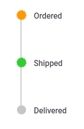
Dot size
You can adjust the size of the dot to make it larger or smaller by using the --dot-size variable.
@using Syncfusion.EJ2.Layouts;

<div class="container" style="height: 250px">
    <ejs-timeline id="timeline" cssClass="dot-size">
        <e-timeline-items>
            <e-timeline-item content="Extra Small" cssClass="x-small"></e-timeline-item>
            <e-timeline-item content="Small" cssClass="small"></e-timeline-item>
            <e-timeline-item content="Medium" cssClass="medium"></e-timeline-item>
            <e-timeline-item content="Large" cssClass="large"></e-timeline-item>
        </e-timeline-items>
    </ejs-timeline>
</div>

<style>
    .dot-size .e-dot {
        background: #33cc33;
    }

    .dot-size .x-small .e-dot {
        --dot-size: 12px;
    }

    .dot-size .small .e-dot {
        --dot-size: 18px;
    }

    .dot-size .medium .e-dot {
        --dot-size: 24px;
    }

    .dot-size .large .e-dot {
        --dot-size: 30px;
    }
</style>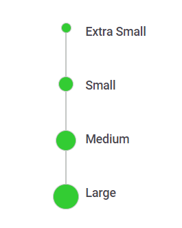
Dot shadow
You can add shadow effects to the Timeline dots to make it feel visually engaging by using the --dot-outer-space & --dot-border variables.
@using Syncfusion.EJ2.Layouts;

<div class="container" style="height: 250px">
    <ejs-timeline id="timeline" cssClass="dot-shadow">
        <e-timeline-items>
            <e-timeline-item content="Ordered"></e-timeline-item>
            <e-timeline-item content="Shipped"></e-timeline-item>
            <e-timeline-item content="Delivered"></e-timeline-item>
        </e-timeline-items>
    </ejs-timeline>
</div>

<style>
    .dot-shadow .e-dot {
        --dot-outer-space: 3px;
        --dot-border: 3px;
        --dot-size: 20px;
        outline-color: #dee2e6;
        border-color: #fff;
        box-shadow: 3px 3px 10px rgba(0, 0, 0, 0.5), 2px -2px 4px rgba(255, 255, 255, 0.5) inset;
    }
</style>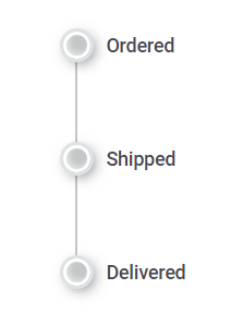
Dot variant
You can achieve the desired dot variant by customizing the border, outline and background colors of the Timeline dots.
@using Syncfusion.EJ2.Layouts;

<div class="container" style="height:250px">
    <ejs-timeline id="timeline" cssClass="dot-variant">
        <e-timeline-items>
            <e-timeline-item content="Filled" cssClass="dot-filled"></e-timeline-item>
            <e-timeline-item content="Flat" cssClass="dot-flat"></e-timeline-item>
            <e-timeline-item content="Outlined" cssClass="dot-outlined"></e-timeline-item>
        </e-timeline-items>
    </ejs-timeline>
</div>

<style>
    .dot-variant .dot-filled .e-dot::before {
        content: 'A';
        color: #fff;
    }

    .dot-variant .dot-flat .e-dot::before {
        content: 'B';
        color: #fff;
    }

    .dot-variant .dot-outlined .e-dot::before {
        content: 'C';
    }

    .dot-variant .dot-filled .e-dot {
        background: #33cc33;
        --dot-outer-space: 3px;
        outline-color: #81ff05;
        --dot-size: 25px;
    }

    .dot-variant .dot-flat .e-dot {
        background: #33cc33;
        --dot-size: 25px;
        --dot-radius: 10%;
    }

    .dot-variant .dot-outlined .e-dot {
        outline-color: #33cc33;
        --dot-outer-space: 3px;
        background-color: unset;
        --dot-size: 25px;
    }
</style>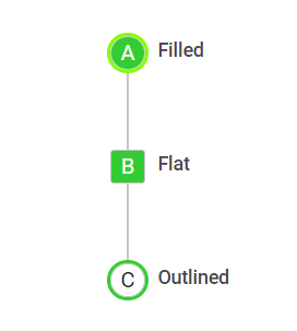
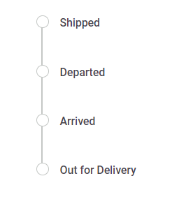
Dot outline
By adding the e-outline class to the Timeline cssClass property it enables the dots to have an outline state.
@using Syncfusion.EJ2.Layouts;

<div class="container" style="height: 250px">
    <ejs-timeline id="timeline" cssClass="e-outline">
        <e-timeline-items>
            <e-timeline-item content="Shipped"></e-timeline-item>
            <e-timeline-item content="Departed"></e-timeline-item>
            <e-timeline-item content="Arrived"></e-timeline-item>
            <e-timeline-item content="Out for Delivery"></e-timeline-item>
        </e-timeline-items>
    </ejs-timeline>
</div>