How can I help you?
Customize Slider Thumb
30 Jan 20255 minutes to read
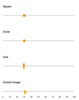
Slider appearance can be customized through CSS. By overriding the slider CSS classes, you can customize the thumb. By default, slider has unique class e-handle for slider thumb. You can override the following class as per your requirement. Here, in the sample, the slider thumb has been customized to square, circle, oval shapes, and background image has also been customized.
.e-control.e-slider .e-handle {
    background-image: url('https://ej2.syncfusion.com/demos/src/slider/images/thumb.png');
    background-color: transparent;
    height: 25px;
    width: 25px;
}
#square_slider.e-control.e-slider .e-handle {
    border-radius: 0%;
    background-color: #f9920b;
    border: 0;
}
#circle_slider.e-control.e-slider .e-handle {
    border-radius: 50%;
    background-color: #f9920b;
    border: 0;
}
#oval_slider.e-control.e-slider .e-handle {
    height: 25px;
    width: 8px;
    top: 3px;
    border-radius: 15px;
    background-color: #f9920b;
}<div id='container'>
<div class="col-lg-12 control-section">
<div class="slider-content-wrapper">
<div class="slider_container">
<div class="labelText slider-userselect">Square</div>
<ejs-slider id="square_slider" value="30"></ejs-slider>
</div>
<div class="slider_container">
<div class="labelText slider-userselect">Circle</div>
<ejs-slider id="circle_slider" value="30"></ejs-slider>
</div>
<div class="slider_container">
<div class="labelText slider-userselect">Oval</div>
<ejs-slider id="oval_slider" value="30"></ejs-slider>
</div>
<div class="slider_container">
<div class="labelText slider-userselect">Custom image</div>
<ejs-slider id="image_slider" value="30">
<e-slider-tooltipdata isVisible="true" placement="After"></e-slider-tooltipdata>
</ejs-slider>
</div>
</div>
</div>
</div>
<style>
.slider-content-wrapper {
width: 40%;
margin: 0 auto;
min-width: 185px;
}
.slider-userselect {
-webkit-user-select: none;
/* Safari 3.1+ */
-moz-user-select: none;
/* Firefox 2+ */
-ms-user-select: none;
/* IE 10+ */
user-select: none;
/* Standard syntax */
}
.labelText {
text-align: left;
font-weight: 500;
font-size: 13px;
padding-bottom: 10px;
}
.slider_container {
margin-top: 40px;
}
.e-bigger .content-wrapper {
width: 80%;
}
#square_slider .e-handle {
border-radius: 0;
background-color: #f9920b;
border: 0;
}
#circle_slider .e-handle {
background-color: #f9920b;
border-radius: 50%;
border: 0;
}
#image_slider .e-handle {
height: 25px;
width: 24px;
background-size: 24px;
}
#image_slider .e-handle {
background-image: url('https://ej2.syncfusion.com/demos/src/slider/images/thumb.png');
background-repeat: no-repeat;
background-color: transparent;
border: 0;
}
#square_slider .e-tab-handle::after,
#circle_slider .e-tab-handle::after {
background-color: #f9920b;
}
#image_slider .e-tab-handle::after {
background-color: transparent;
}
#oval_slider .e-handle {
height: 25px;
width: 8px;
top: 3px;
border-radius: 15px;
background-color: #f9920b;
}
</style>public ActionResult TimeFormat()
{
return View();
}